Archive

Author Archive

E-commerce: 3 tactics retailers are rolling out for the holidays

November 12th, 2013

This holiday season might be another tough one for retailers. According to The National Retail Federation, sales could rise 3.9% to $602.1 billion. Not great when compared to the 5% gain seen in 2011 and 2010.

This means that competition among retailers just got tougher. For instance, it has been reported that close to 50% of retailers will start their holiday campaign sooner than usual.

So, I decided to browse around 20 top online retailers’ sites and explore whether they had launched any holiday campaign or not. To my surprise, my small sample more or less confirmed the forecast.

Out of the 20 retailers I checked, seven had some sort of holiday campaign going on.

So, how are these seven retailers getting a head start with the holidays? Mainly by using one of these three tactics.


Tactic #1. Sneak peek-terest Black Friday board


Lowes is running an interesting and unique Black Friday campaign using Pinterest. Many items have been added to its new Black Friday Deal Reveal board, but they are disguised.

Followers are asked to guess what the items are, which in turn generates good engagement and excitement for the shopping day.

The nice aspect about this campaign is how it leverages the core value of Pinterest as a social network. People in this channel are interested in collecting pictures with a purpose: their lifestyle, seasonal or tactical. By tactical, I mean that Pinterest is slowly becoming the holiday shopping list of online consumers.

Why keep a list on paper when you can pin the items you like or want for the holidays? Even better, you can share your board with family and friends.


Tactic #2. Email sneak peeks

There’s nothing tactically new here, except the campaigns are rolling out just a little earlier than usual due to the lackluster sales I mentioned earlier.

But, there is something to be learned from these front-runners. 


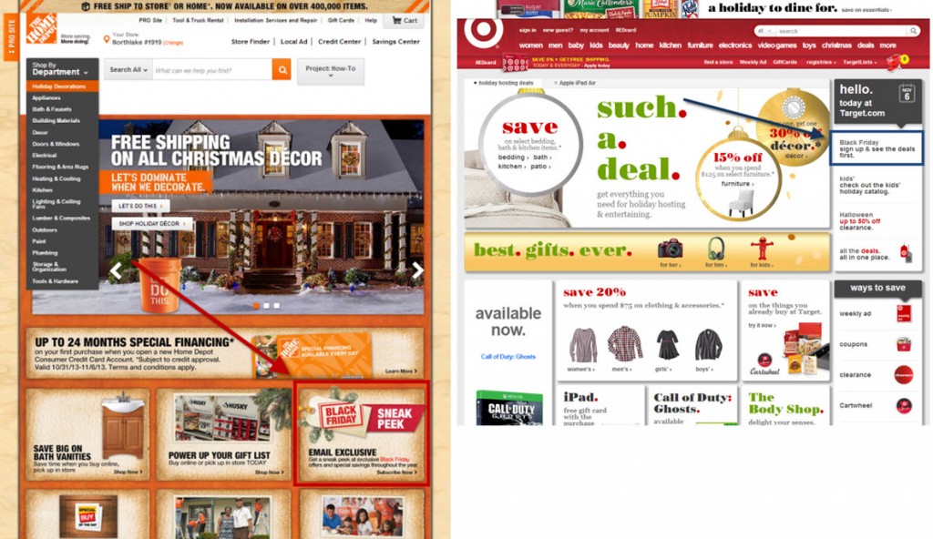
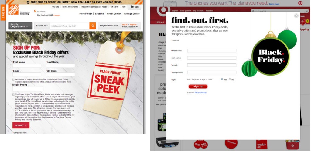
In these cases, The Home Depot and Target are asking visitors to give up their email address or mobile phone number to receive updates on special offers.


There is no clear value of what customers will receive beyond exclusive offers. Even worse, the disclaimers clearly suggest they will be targeted to receive any type of offer year-round, not just Black Friday offers.

That is disappointing.

Starting holiday campaigns sooner than your competitors is one thing, but putting out a campaign without clear value because it’s too far ahead of the crowd is another.

By launching holiday campaigns sooner, some retailers may feel the illusion of a head start.

But how will that illusion hold up as the Black Friday creep controversy continues to push shopping further into Black Thanksgiving territory?


Tactic #3. Holiday gift guides

This is also not a new tactic, but there are some interesting new spins on it.

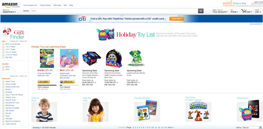
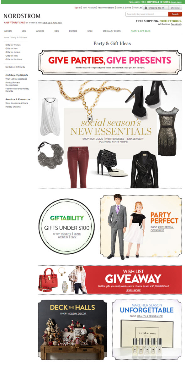
Amazon.com, Nordstrom, West Elm and Barnes & Noble are all running holiday gift guides. Visitors can search products by price, gender, interest and other filters. Only Amazon.com and Nordstrom have added some features to generate engagement with their guides.


Amazon.com offers a holiday-specific forum where visitors can solve any type of concern they might have. There were already 316 discussion strings when I was writing this post and the list was growing! To me, this reflects that people are indeed not just thinking about what to buy, but actively researching the best buys.


Nordstrom, on the other hand, is trying to go viral. The company is running a sweepstakes that requires visitors to create their wish list and share it with friends and family in order to be eligible to win a $5,000 gift card. Pretty nice incentive.

  Read more…

Mobile Marketing: What 4 top B2B companies can teach us about mobile

October 7th, 2013

Originally published on B2B LeadBlog

We all are hearing time spent with mobile devices will surpass time spent with desktops.

Well, it is already happening in the B2C world, according to a recent study from Millennial Media and comScore. It won’t be too long before it starts happening in the B2B world.

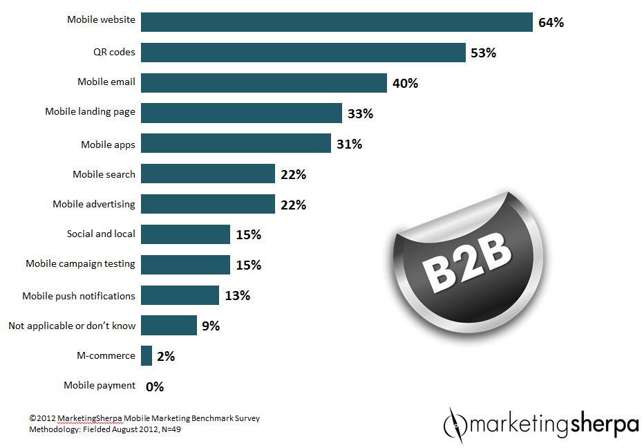
According to the MarketingSherpa 2012 Mobile Marketing Benchmark Report (free excerpt at that link), when asked, “Which mobile marketing tactic does your company use?” 64% of B2B companies listed mobile websites as their number one mobile marketing strategy in use.

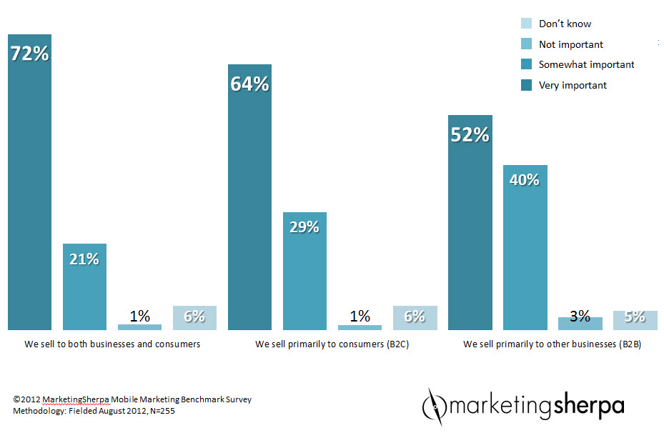
Moreover, when asked, “How important is mobile to your organizations growth in the next three years?” 52% of marketers considered mobile marketing very important to influence their company growth in the next three years.

Knowing this, I thought it would be interesting to see how some top B2B companies are using mobile sites to influence business.

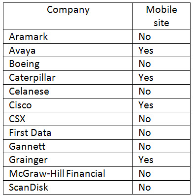
So, I went to the Fortune 500 list and randomly picked 12 B2B companies I was familiar with (no science behind the selection method) and found only four out of 12 have a mobile site.

To be honest, I was surprised to see so many companies without a mobile site. But at the same time, I felt relieved to see interesting strategies from those that had mobile sites. Now, let’s take a deeper look at the mobile offerings.

Caterpillar: Not a desktop replica

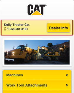
Caterpillar offers a versatile mobile site that allows visitors to not only to check products’ specifications, but also find dealers, rental locations and start the quote process, if they so desire.

The value of Caterpillar’s mobile site is that it’s not a replica of the desktop version. Instead, it is designed to meet “on-the-go” needs.

The categories tab helps users find machinery and tools needed in the field by providing navigation that is simple and direct.

One nice feature here is the “save preferred dealers” option that lets users keep them on hand for quick access.

As one would expect, Caterpillar’s customers or prospects may run into unexpected situations on a field where the only available device is either a cell phone or a tablet. Therefore, a mobile site makes a huge difference and can win someone’s business in the field.

The site has still opportunities to improve since not all of the sections are optimized to the mobile experience. But overall, it offers a great experience and satisfies diverse needs.

Cisco Systems: Customized mobile experience

Cisco’s main website uses responsive design, so it adapts well to different screen sizes, providing a seamless experience among devices.

But, that is not the nicest part of its online presence.

Cisco is putting thought into customizing the mobile experience. The site not only adapts to different screens, but it also prioritizes content to each form factor.

The section “Tomorrow Starts Here” takes first place in the mobile version while it is not even noticeable in the desktop version.

“Tomorrow starts here” reviews trendy topics in different and engaging formats like videos, infographics and articles.

This is a good example of providing content that fits well with on-the-go needs. Plus, through mobile-friendly content, Cisco can accomplish two important things:

  • Users spend more time on the site
  • Cisco’s brand remains top-of-mind

The only downside I found was the main rotational banner and some site sections redirect visitors to pages not optimized for mobile, which in turn, abruptly disrupts the user experience.

Grainger: Mobile site for prospects, App for customers

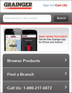
Grainger’s mobile store has the standard features one would expect from a B2B e-commerce site.

Users can search products, browse product categories, and make purchases.

The site layout is a simple and clean design that allows users to quickly find what they need. For example, two popular mobile activities like “Finding a Branch” and “Call Us” are just one click away.

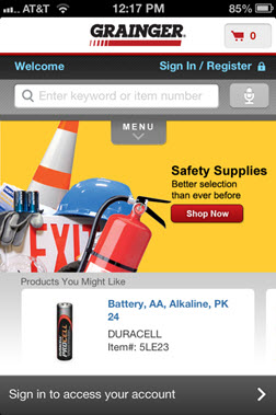
Grainger is a good example of why it may be advantageous to have a mobile app in addition to a mobile site.

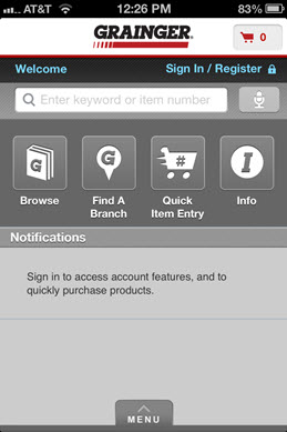
When you take a closer look at the app, you can hint that the app was mainly designed for existing customers. The elements and user options are more tailored for customers that have purchased from Grainger before or are frequent buyers.

The homepage presents “Products You Might Like” instead of “Browse Products.”

Instead of product categories, the app menu options are: Browse, Find a Branch, Quick Item Entry and Info.

Notice the quick order form option. This option is genius in that it really simplifies purchasers’ lives by letting them place a quick order on-the-go.

Even though apps require additional development and maintenance, they bring two important and unique benefits:

  • Push notifications
  • Physical presence on a customer’s phone screen

Both are very powerful tools to stay top-of-mind with your customers. But with that said, it is very important for the app to have a unique purpose. If not, there is no reason for someone to download or use it.

Avaya: Thoughtful mobile experience

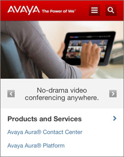
Avaya offers a very functional and engaging mobile site.

Four aspects stood out for me:

1. Designed with mobile user in mind

The mobile site is another good example of adjusting content to mobile needs.

Although the mobile site has similar categories as the desktop version, the mobile categories are prioritized differently.

For example, “How to buy,” is option two in desktop menu, while it is the last option in the mobile version.

Avaya recognizes visitors are using the mobile platform differently and likely more for research purposes than for actual transactions.

2. Allows continued reading on desktop

Many sections of its main site are not optimized for mobile yet. But instead of letting users either become frustrated by doing a lot of zooming in and out or leaving the site altogether, Avaya uses an interim page to inform visitors the content they are about to see is not on the mobile site, but in the desktop version.

I liked that it gave users the option to continue, go back or “email me a link.” The email a link option allows users to continue reading where they left off once they return to a desktop.

3. Provides a variety of content

Besides its products and solutions, the mobile site brings the “Avaya Magazine” front and center.

The magazine offers users content to find inspiration and information to help them stay on top of technology trends. Topics are presented in a variety of formats including articles, videos and charts.

4. Option to stay connected

Social icons are not in the way of the mobile experience, but are clearly visible in the footer.

This allows users to follow them at any point during their visit. This is important considering recent research reveals 31% of a U.S. smartphone user’s total Web activity is spent engaging in social activity.

Overall, I hope this review provides you with some ideas for your mobile sites. Please feel free to comment or share any other mobile sites you recommend that are great examples of where marketers are getting it right in the mobile space.

Related Resources:

B2B Content Marketing: 5 questions every marketer should ask themselves when using native advertising

B2B Marketing: 3 reasons for adopting video content into your marketing mix

B2B Digital Marketing: How Volvo Construction drove site visits through its email campaigns