Archive

Author Archive

Mobile Interaction: Website or app? Optimize for both

January 20th, 2015

Over the past several years, marketers have often been faced with the conundrum of where to allocate funds in order to better compete in the mobile space. Should I focus my budget on the mobile app for my business, on making the website optimized for multiple device types (responsive or adaptive) or should I attempt to do both?


Take user behavior into account

While I feel like the question above has been well documented in other resources, I think one of the most important concepts to keep in mind is that whether you are focusing on a mobile app or on your website, user behavior should be considered first.

As the expectations of the billions of users with mobile devices continue to converge, the question should no longer focus on which medium (the mobile web or an app) you should focus on connecting with your users on, but instead on how you can most effectively connect with them no matter which medium you choose.

Luckily, there are numerous transferable principles between the world of app interaction and web design that can be applied with relatively little effort on your part.


Visual attention vs. interaction

Visual attention vs interaction


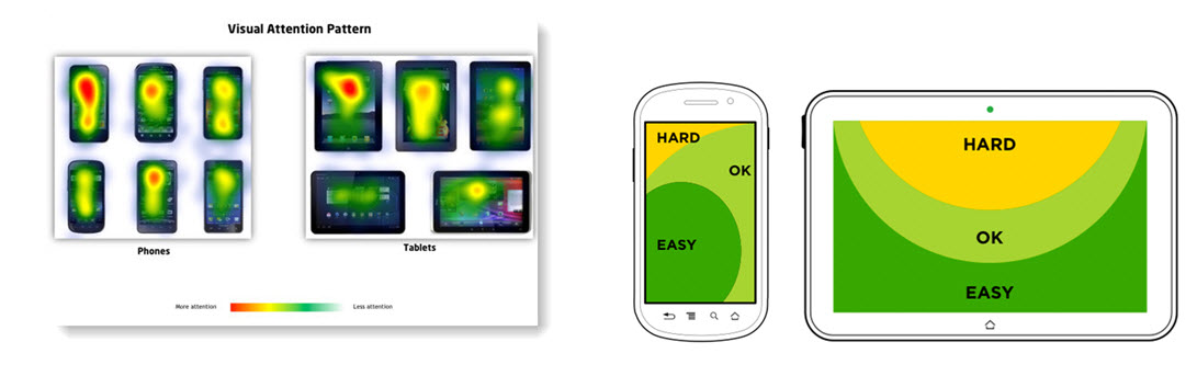
Don’t forget the classics. Despite the ever-expanding screen sizes of devices,  in most regions, people still start reading at the top left of their device. However, it is important to remember that on touch-reliant devices, interacting with content at the top of the screen with your thumb has become increasingly more difficult as screen sizes in mobile devices have grown.

Why do you think Apple implemented a new “Reachability” control on the iPhone 6 that brings content from the top of the screen down about a third of the phone?

This being said, whether you have an app or a mobile site, make sure you prioritize content you want read at the top of the screen, but be selective in placing content you want interacted with at the top of most screens.

For items such as buttons, filters, drop-downs, quick navigation, etc., consider utilizing real-estate toward the bottom of the screen instead of toward the top to make the user’s life easier. Menus and navigation are still generally better at the top of the screen as the menu “hamburger” (see screenshot below) now seems to be so ubiquitous that it has become web-standard for responsive sites  Techcrunch also offers a great article on mobile navigation and reasons to “kill the hamburger” here.

Read more…

Mobile Marketing: How mobile impacts customer awareness

January 9th, 2015

I’ve always felt that the aphorism about true wisdom being a byproduct of first admitting you don’t know everything to be accurate.

When I attended the ClickZ Live conference in Chicago last October, I got the chance to be exposed to some great new content. However, I felt one of the stories still being told was something I’ve been hearing on repeat since 2011. The story I’m talking about is that of mobile marketing and how it is the “wave of the future.”

We here at Sherpa have been preaching the shift in marketing budgets to mobile for years as well — just take a look back at this chart from last April.

chartofweek-04-15-14


Taking a look at some of the mobile channel data

I don’t think there’s any argument on where the industry is going anymore. That being said, I do feel that some of the most convincing data about focus on mobile is being under-utilized by marketers, or even worse, it’s being used by marketers to justify decisions that are not in the best interest of their business — decisions that will not show the best ROI and could be spent more effectively in other channels.

Working on partnerships in different industries over the past several years, I have seen both the good side and bad side of the mobile revolution, while making plenty of mistakes along the way. Seeing just how terrible mobile conversion rates can be compared to other channels is often disheartening.

It’s not enough to just say “mobile is the future.” We need something more actionable. Marketers admitting as an industry that we don’t know everything is the first step.

Read more…

Marketing Process: Managing your business leader’s testing expectations

June 25th, 2013

Every Research Partner wants a lift, but we know sometimes, those lifts aren’t achievable without learning more about their customers first.

And often, our biggest lifts are associated with radical redesign tests that really shake things up on a landing page. That is because the changes are more drastic than a single-factor A/B test that allows for pinpointing discoveries.

So, how can you strike a balance between using these two approaches while still delivering results that satisfy expectations?

You can achieve this by managing your client’s or business leader’s expectations effectively.

It sounds easier said than done, but there are a few things you can do to satisfy a client’s or business leader’s needs for lifts and learnings. 


Step #1. Start with radical changes that challenge the paradigm

At MECLABS, we often recommend a strategic testing cycle with radical redesign testing (multiple clusters as opposed to a single-factor A/B split) to identify any untapped potential that may exist on a Research Partner’s landing page.

However, you must make sure you are not making random changes to a page to achieve a radically different control and treatment, but are truly focused on challenging the control’s paradigms and assumptions currently being made on the page by testing with a hypothesis.

For example, Sierra Tucson, an addiction and mental health rehabilitation facility, found with a radical redesign from a landing page focused on luxury to a landing page focused on trust resulted better with its target audience. The company also generated 220% more leads with the test to boot.


Step #2. Zoom in on general areas your radical redesign test has identified as having a high potential for impacting conversion

Next, we suggest refining with variable cluster testing, also known as select clusters.

If you identify a radical shift in messaging to be effective, as Sierra Tucson did, you might next want to try different copy, different designs or different offers, just to name a few options.

Read more…

Online Marketing: 4 sources of customer insight on your website

April 11th, 2013

“The meaning of a test is to get a learning, not a lift.” 

Chances are, you’ve heard the above from us before. At MECLABS, we often speak of online testing as a means to learn insights directly from the customer, prospect, visitor, etc.

Well, what if you could be overlooking areas of your website that can give you valuable customer insight without testing anything at all. Would you be interested in using this information to improve your online operations and maybe increase conversion? I know I would. Could you use this information to inform future test ideas and test plans?

You could. And probably should.

While the following information may not seem revolutionary – or even unique, for that matter – you might be surprised by just how many large corporations fail to take such readily available information into account, even though it is supplied to them directly from the customer or prospect.

There are numerous places on your website that reference the customer. But, the areas we need to focus on are the ones in which the customer provides direct feedback, in their own words.


1. Comment boxes in form fields

Everyone has seen the ubiquitous form field box on contact forms across the Web, but who actually takes the time to fill these out? Depending upon the complexity of the product and your traffic levels, there could be quite a few.

Now, if you take those few comments you receive daily and extrapolate them over a lengthier period – let’s say three months – you might begin seeing trends in the types of comments or questions your customers are asking.

Yes, this would take some analysis from a staff member, but the payoff could be huge. Just remember, the analysis doesn’t have to be complicated, and this type of quick analysis can be applied across the other areas.

You can use any program you like, but take the time to quickly go through the comments and categorize those matching or sharing a similar root problem or theme.

Once you have completed the analysis phase, see if  any comment groups emerge as a significant portion of the overall sample. If so, then you have likely identified an area of friction that could be addressed on the website to potentially aid in conversion.

How you go about addressing the issues should also be considered. Will a simple copy improvement suffice, or is there a larger issue with the website or process needing to be addressed? It’s ultimately your decision, but before rewriting all your Web copy, remember you’re working with a fraction of your overall traffic. There is no need to revamp areas that don’t need it.

Read more…