Archive

Posts Tagged ‘design’

Marketing 101: What are grids (design)?

June 12th, 2020

Marketing has a language all its own. This is our latest in a series of posts aimed at helping new marketers learn that language. What term do you find yourself explaining most often to new hires during onboarding? Let us know.

This article was originally published in the MarketingSherpa email newsletter.

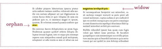
In a previous Marketing 101 post on MarketingSherpa, you might have read about the rule of thirds, “… a basic guideline for framing and image composition that results in the viewer seeing a balanced, more naturally flattering image.” (Check out the blog post here if you haven’t read it yet.)

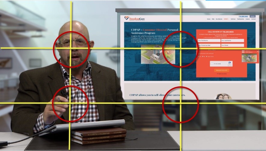
The rule of thirds is an example of a grid, specifically a 3 x 3 grid that’s used primarily for images, photographs, paintings, and possibly other mediums, such as landing pages. While it may be the most well-known grid, there are a whole lot of other grids out there that can help structure the layout of your landing page, approved by web designers everywhere.

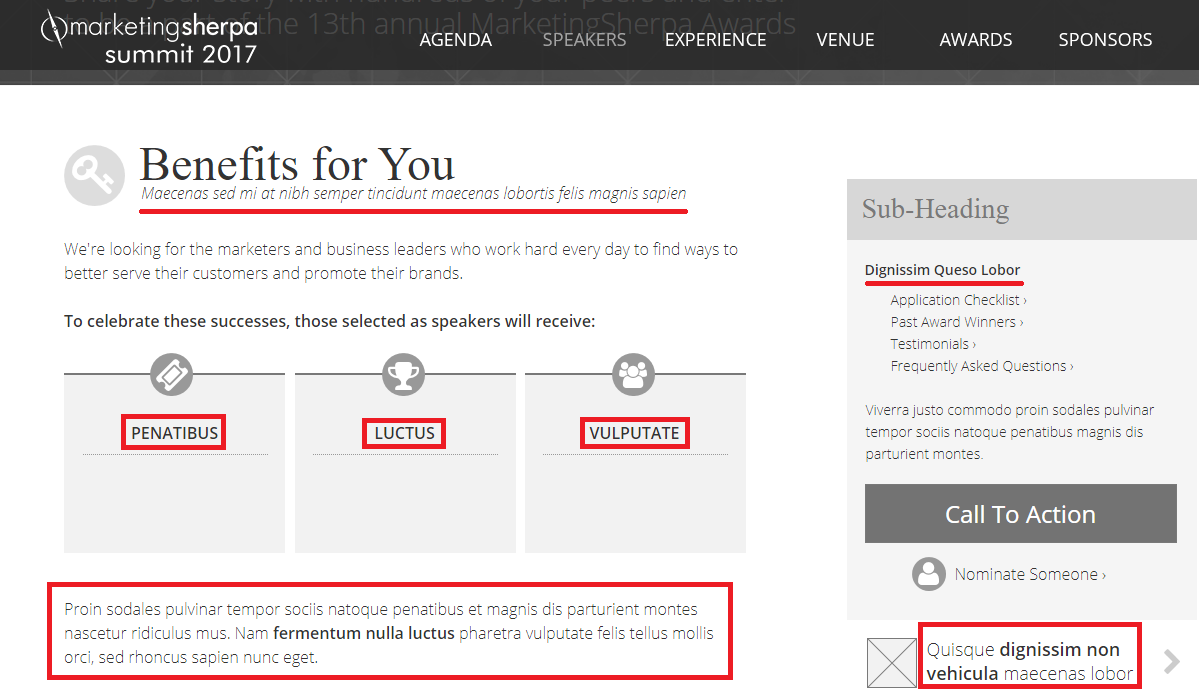
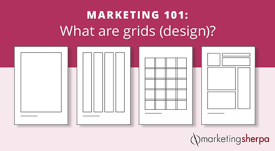
A grid is a framework of intersecting vertical and horizontal (or angular) lines that are used to subdivide a page into margins, columns and modules (boxes) to structure content on a layout. Basically, it’s a visible guide for placing images, text and graphic elements onto a page with purpose or rational logic.

Why should you use grids?

  • It saves a lot time.

After some practice, it becomes easier and faster for you to see where text and images could perfectly align. You also don’t have to design the grid yourself (unless you want to) as there are many popular grids used in web design layouts that are one Google search away (and mentioned below.)

  • It makes collaborations run smoother.

Grids can become part of a guideline that each member of a  design team must follow, making it easier to collaborate on a project. It keeps the layout design consistent.

  • Webpages look organized and balanced overall.

Using the same grid or similar grids for multiple pages will help unify them, making these pages predictable for visitors and easy to navigate — alth­­­ough be careful not to make it so predictable that the layout becomes boring.

How do you use grids?

Grids have basic elements; here’s an overview:

Read more…

Marketing 101: What are widows and orphans (in design)?

October 13th, 2017

Marketing has a language all its own. This is our latest in a series of posts aimed at helping new marketers learn that language. What term do you find yourself explaining most often to new hires during onboarding? Let us know.

“Widows” and “orphans” sound incredibly morbid, and the designer who coined these terms was definitely a macabre lady or gent. However, it does accurately convey how seriously design lovers take this faux pas.

In typesetting, widows and orphans are lines at the beginning or end of a paragraph that are left dangling at the top or bottom of a column. This separates them from the rest of the paragraph and, generally speaking, is considered unpleasant looking by the design community.

I personally have experienced the woe of having an orphan and widow when working on a downloadable book with our design team. Reviewing the finished copy, the team was distressed over some parts of the copy that when put into the template, created these widows and orphans.

Read more…

Marketing 101: What is the rule of thirds?

September 22nd, 2017

Marketing has a language all its own. This is our latest in a series of posts aimed at helping new marketers learn that language. What term do you find yourself explaining most often to new hires during onboarding? Let us know.

The rule of thirds is one of the first principles that all graphic designers, videographers, photographers and other creative roles learn. It’s a basic guideline for framing and image composition that results in the viewer seeing a balanced, more naturally flattering image.

To apply the rule, take your image and divide it into three parts vertically and again horizontally (it should look similar to a tic-tac-toe board.)

The rule states that the audience’s eye is naturally more drawn to the areas of the image nearest the intersection points. So, when you’re designing an image for a landing page, a social post, a PowerPoint slide, or even if you’re shooting a video, be sure to put the most important pieces of your image near these intersection points.

Applying the rule to video

Here is an example of a video frame from one of the most recent recent Quick Win Clinics published by our sister company, MarketingExperiments. The Quick Win Clinic series helps marketers with problems that are easy to solve but difficult to detect. Every week, Flint McGlaughlin, Managing Director, MECLABS Institute, takes a page submitted by the audience and optimizes it on the fly.

The primary piece of information we’d like the audience to see in this image is the person speaking, in this case, Flint McGlaughlin. You can see that Flint’s eyes are framed near the top left intersection point. As people, we are taught to look into the eyes of another person when talking to them. So framing an image so that a person’s eyes are near one of the points where the audience’s eye is naturally drawn makes a lot of sense.

Read more…

Marketing 101: What is lorem ipsum?

July 28th, 2017

If you’ve ever collaborated with your design team to create a landing page, an email template, print advertisement, etc., they probably sent over a mock-up layout that shows the general aesthetic that the collateral will have. If you looked closely at that mock-up, chances are you saw it filled with text that made no sense (like the one below). Something you may not know? That nonsensical text actually has a name: lorem ipsum.

Lorem ipsum (sometimes referred to as “greeking” or “filler text”) is the standard dummy text used in the publishing and printing industry. Basically, it’s mock text used to represent the copy that will eventually live in a design, template, publication, etc. I read an article on the history of lorem ipsum from priceonomics.com to get the specifics on the topic.

With word length comparable to a real language and commas and periods creating an illusion of grammar, lorem ipsum looks more like a legitimate language than just repeating “text here” over and over or typing a slew of random letters like “skdghwejghsgskjhgdgngowklrgjlsdjgs.” That’s why using it accurately shows designers how much space is available in a layout for text. This way, they can give copywriters specific character counts when they are actually crafting copy.

Read more…

Marketing 101: What is a hamburger menu?

June 30th, 2017

There are no dumb questions, only dumb marketers who don’t bother to ask. That’s why we’ve decided to begin publishing quick, snackable posts that will help you expertly navigate any project, no matter what team you’re working with.

Today’s term is one you might encounter when working with your dev or design teams, and it has a particularly delicious moniker: the hamburger menu.

It’s something you’ve seen a thousand times before, and now you’re cocking your head thinking, “Huh. That DOES kind of look like a hamburger.”

Read more…

Designing Slides That Don’t Suck: 20 questions to ask before you present

March 24th, 2015

When I first started at MarketingSherpa, I was hired under the title of “Visual Storyteller.” Although that title is ambiguous, I learned that I was hired to address a pain point that many professionals face: using PowerPoint efficiently.

My title has since changed, but I remain an advocate for fluent visual expression in the same way that editors are keen on using words efficiently.

As part of my position, I’ve consulted with many speakers over the past few years on creating effective presentations.

Time and time again, I find that confusion lies in how to treat PowerPoint. Many think of PowerPoint as a presentation buddy — that content is on the slides and coming out of the speaker’s mouth and bullet points are simply needed to reinforce the speaker’s message.

This is not true. A person can only process about 1.6 conversations at a time. He can choose to either listen to you or read your slides. The other .6 gets split between emails, texts and interior monologue, to name just a few other channels.

The dictators of any presentation include: audience, context, purpose and design.

audience content purpose design

Read more…

One Spark 2014: Marketing as an art

May 2nd, 2014

At MarketingSherpa’s headquarters in Jacksonville, Fla., we’re lucky to have the One Spark festival right in our backyard.

If you’re not familiar with the event, One Spark is a large crowdfunding festival that draws entrepreneurs, artists, inventors and amazing food trucks together for five days of elevator pitching to the masses. The festival lasts for five days and is held in the heart of downtown Jacksonville.

According to the One Spark website, this year’s event drew more than 260,000 attendees and generated $3.25 million in capital investments for project creators.

Not too shabby for a festival only in its second year.

The event also had a great speaker series that I had the privilege to attend where thought leaders in the crowdfunding space shared their ideas on marketing and design.

In today’s post, I wanted to share a few snippets of those presentations to give you an idea of how some experts are approaching marketing concepts in an emerging industry.


Value propositions need consistency amid flexibility for growth and evolution

ross-unger-onesparkTechnology has changed the way that marketers engage with their customers, and as a result, how you deliver your value proposition has to adjust, too.

Ross Unger, Experience Design Director, GE Capital Americas, explained how ideas and their value evolves, using Jim Henson, creator of the Muppets, as an example.

Ideas, according to Ross, are constantly changing and evolving. Henson’s idea for loveable creatures made of foam started from a high school project, and moved to commercials before eventually evolving further into movies, toys and attractions at Disney theme parks.

The Muppets had flexibility to grow as their audiences changed, but the idea of Kermit remained the consistent.


Staying creative means staying interested

If marketing is the “pen” in communications with customers, then design is the “paintbrush.” The trick, according to Jeff Barlow, Creative Manager, Starbucks Global Creative, to painting amazing pictures for your customers is to keep your work interesting.

“You don’t do anything really amazing unless some people love it and some people hate it,” Jeff said.

“If you have to make great ideas,” Jeff explained, “it’s a good idea to be continuously curious.”

Jeff used a project based on blues music as an example. He had his team create a design campaign based on the music genre.

To do it, Jeff had them dig deep.

Instead of just creating designs based on what came to mind when they envisioned the phrase “blues music,” they instead took time first to research the history of the blues.

The team covered the lifestyles of famous artists and popular venues, then putting it all together into one piece, pouring heart and soul into a single design they felt encompassed the full weight of the subject.

Jeff also touched on the importance of drawing inspiration from everywhere – not just for the clock.

“It was really, really hot one day,” he explained, “so I made a logo for the sun.”

Jeff admitted it was nothing that he could sell, but it was something he imagined and it kept the creative juices flowing.

He even had his team make a visual design around a fortune in a fortune cookie.

It was a challenge that broke up a work day for his team and exercised their creative minds. Having assignments outside of deadlines, and having the courage to “always explore” keeps things fresh and interesting.

  Read more…