In my dream world, every single email inbox acts the same. No matter whether your recipients see your email newsletter or campaign in Hotmail, Yahoo!, Outlook or whatever … they would all see the same exact thing.
And, that standardized email box would allow huge creativity for marketers. You would be able to use Flash, animated gifs and background colors and add forms into your email, including prefilled order forms.
Unfortunately, no one has ever shared this dream with the programmers. The programmers behind Outlook 2007 never met anyone in marketing. (Or, if they did, they didn’t like them.)
Office 2007, which launched Nov. 30 for business users and Jan. 30 for consumers, has finally gotten enough users, especially for at-work email accounts, so that millions of email users see your messages using Outlook 2007. And they think many of your emails look pretty stinky.
Julian Scott, Creative Director over at ESP Responsys, sent me this handy Tip Sheet he wrote to help train email designers in tweaking campaign design to render properly in Outlook 2007.
“If you already adhere to the commonly accepted email creative and HTML best practices, you likely have nothing to worry about, with several minor exceptions concerning animated gifs and borders,” Scott says. “If you do not, then the bad news is you will have to change how you code your emails if you want them to render correctly.”
Biggest email marketing design limitations:
o No support for animated gifs (only a static representation of the first frame displays).
o No support for Flash or other plug-ins (a red “X” shows in the area where the Flash would display).
o No support for background images (HTML or CSS).
o Limited CSS support; no support for CSS floats or for CSS positioning. With the exception of color, CSS background properties are not supported; this includes background-attachment, background-position, background-repeat and background-image.
o No support for HTML form submissions.
o No support for JavaScript events, such as on mouse-down.
o No support for replacing bullets with images in unordered lists.
Scott adds, “In addition, several unexpected issues have been identified that should be accounted for in the design process:
o Outlook 2007 imposes a 2-pixel height minimum for
cells. As an example, if an email contains 1-pixel transparent and a background color, the horizontal line will appear thicker than expected.
o Stretched images (e.g., bars, borders, gradients, etc.) may not render correctly. All graphics should have their correct dimensions in the file properties. Do *not* rely on HTML-defined dimensions for images that are critical to the email’s layout.
o Modules with fixed width and height may not display correctly for the same reason cited above. If horizontal and vertical spacing is determined by spacer graphics (as opposed to the email’s content), be aware that customized spacing and alignment may be impossible in some cases. For best results, try using a combination of transparent spacer images and the HTML height attribute on the
| cell.”
Even if you’re not technically minded enough to understand all of the above, one thing is clear: most of the neat-o stuff you would like to do with email isn’t possible.
Scott’s advice, “Email should be treated as a ‘stepping stone’ to a landing page where you have complete control over how you represent your brand and communicate your message. Save the ‘fancy’ coding for there.”
Couldn’t have said it better myself.
Useful links related to this blog:
Word 2007 HTML and CSS Rendering Capabilities in Outlook 2007, Part I:
http://msdn2.microsoft.com/en-us/library/aa338201.aspx
Word 2007 HTML and CSS Rendering Capabilities in Outlook 2007, Part II:
http://msdn2.microsoft.com/en-us/library/aa338200.aspx
Responsys – the email service provider Scott works for:
http://www.responsys.com
I’m dancing around with a crazy grin on my face because last week was the first burst of decent sunny weather we’ve had in New England all year. It’s *finally* warming up for spring, and the relief is profound.
Which, as it turns out, is a very good thing because, otherwise, I would be horribly depressed. You see, I went up an entire dress size while coping with six months of gray unrelenting winter. So, now, I’m having to replace nearly every painfully tight item in my spring and summer wardrobe — from linen trousers to swimsuits. Which is why my personal email in-box is now overflowing with online receipts and shipping notices.
One thing is *missing* from most of them. No promotions.
Very few online retailers, aside from travel sites, bother to put house ads on shipping and sales receipts. Instead, there seems to be a church and state divide between transactional and promotional emails.
Plus, looking at most, you would never even guess they came from the same company.
Most transactional are text only and sound like they were written by a robotic computer. They read like banking statements. Meanwhile, most promotions are HTML with big pictures and exclamation-ridden copy!
Why should you care? Check out this chart from MarketingSherpa’s new Ecommerce Marketing Study (plus, see below for a free chapter download hotlink):
Chart: Consumer Readership of Transactional vs Promotional Emails
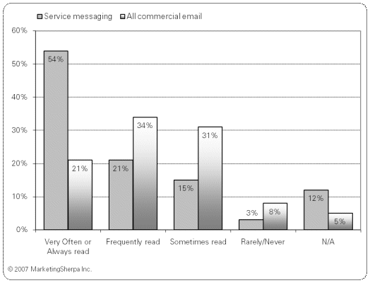
Source: MarketingSherpa, StrongMail and Survey Sampling International, Transactional Email and Marketing Study, January 2007
Methodology: A survey of 1,323 consumers was fielded on Jan. 19 and closed on Jan. 25. The respondents were members of Survey Sampling International’s online consumer panel and are representative of the US online population over age 18.
As dry and text-blah-y as transactional emails are, consumers are far, far more likely to open and review them than they are to look at your promotions. I can’t explain this. But I can recommend that you react to it.
For those of you who might be scared about adding house ads in transactional emails, MarketingSherpa’s research team has good news. We have been surveying consumers for four years now asking them how they feel about promos included in transactionals. At first, opinions were sharply divided. Some consumers loved the idea — why not get a special offer from a trusted merchant you just bought from? Some consumers hated the idea: just say no to more commercials!
However, our latest surveys show that the strong emotions of past surveys have subsided. Now, consumers have received enough promotions that they don’t really seem to care one way or another. As long as their transactional message contains the facts they expect it to, it’s no skin off their noses if you toss in a promo offer, too.
Some retailers have reacted to this news in a pussy-footing manner, by adding house ads, but putting them at the very bottom of the page. So, ads are there, but no one will ever see or object to them. I think given today’s climate you can test moving your ads a bit higher up now.
How? Why not copy Sprint Nextel’s transactional messaging tests? They redesigned their transactionals into a two-column format. The wider, left column had the basic transactional facts. The thinner promotional column had special offers for additional items related to whatever their customer had just bought.
Results? Sales from these offers embedded into transactional messages did better than many of the companies 100% promotional broadcasts to the same list. Which, given the chart above, along with the rest of our Ecommerce 2007 data is to be expected.
For a free sample chapter PDF of MarketingSherpa’s new Ecommerce Study, go to:
http://www.marketingsherpa.com/exs/Ecom07Summ.pdf
This week, MarketingSherpa published the results from our third annual reader study on viral marketing. Viral is the art of creating a message so engaging and compelling that people can’t help but tell other people about it.
Given the number of calls our own research department has been fielding recently from reporters at places, such as The Wall Street Journal and The New York Times, it seems viral marketing itself is going viral. Viral is hot, hot, hot!
In fact, 57% of the 2,914 Sherpa readers who took our questionnaire said they were planning at least one viral campaign this year. However, this overall number is misleading. Why? Newbies who were interested in viral but had never conducted a campaign were two to three times *less* likely to conduct a viral campaign in 2007 than their more experienced competitors.
There’s a chasm in viral marketing — an experience chasm. It gives anyone with viral experience a significant edge over the competition.
For example, marketers who’ve tested viral in the past are more likely to:
o Pick the right goal — 13% of newbies hope to make direct sales from a viral campaign. Experienced marketers use viral as step one in a relationship or brand-building campaign that ultimately leads to a sale.
o Use multiple tactics — experienced marketers are more likely to pour it on, using video, audio, microsites, games and email. Newbies may test one tactic.
o Budget realistically — the numbers that newbies gave for videos, ecards and microsites were often laughably smaller than those from experienced marketers.
Anyway, you can see 15 charts of detailed data from this new study at the link below. In the meantime, based on the data, you can bet I’m going to consider launching a quiz or cool microsite (or, better yet, both) for marketers in the coming year.
Useful links related to this article
Special Report: Viral Marketing 2007 – 15 Data Charts, Top Tactics & ROI
http://www.marketingsherpa.com/article.php?ident=29941
Two weeks ago I asked if you knew of any research into online typography that dug beyond general understandings from usability and eyetracking studies.
The problem is that while these studies are very valuable in their place, they don’t completely resolve nitty-gritty typeface disputes that marketers often find themselves in with the Web and email design departments. Such as, which is better for body copy: Times New Roman or a sans serif font, such as Arial or Verdana?
Sherpa reader Sarah Naasko of Market Strategies Inc. wrote to let me know about a great collection of related studies placed online by the folks at The Wichita State University Software Usability Research Laboratory. The studies don’t resolve all my questions (such as ragged right vs justified right or 10 point vs 12 point vs 14 point), but at least they are a pretty good starting point.
The most interesting findings from my perspective across several of the studies listed in this collection are:
o Web surfers like Times New Roman and read it roughly as quickly as a sans serif font. So the “sans serif is better online because people read it more quickly” argument many Web designers have tried out on me isn’t true all the time.
o Researchers almost invariably used type in 10 or 12 point size for the reading comprehension tests. Few seem to have tested much smaller fonts, such as 8 or 9, mainly because they assumed that small wouldn’t be a good idea (i.e., no one will be dumb enough to put type that small, so why test it?).
o Researchers also didn’t test color type such as pale gray vs black on white. Again, I assume because they knew from offline type tests anything that’s not black on white is harder to read, so what Web designer would think putting body copy in other colors is a good idea?
Obviously, most of these tests were conducted before blogs made tiny gray type fashionable. And, just as obviously, what’s fashionable is not always what’s comfortable. Not for my feet, nor for my eyes.
In my opinion, using type smaller than 10 points and/or body copy that’s not black on white is the equivalent of asking your Web visitors to wear extremely pointy shoes with 5-inch spike heels as they walk around your site. Sure, some young women (my stepdaughter in particular) would be more than happy to. But she does not represent the vast majority of the Web population.
Anyway, rant over. Here’s a link to that useful collection of font studies:
http://psychology.wichita.edu/surl/INDEX%20FOLDER/ABCindex.htm#F
20 years ago, I put together my very first direct marketing campaign. The tiny publishing company I had just joined was in a cash crunch. This campaign *had* to work so we could meet payroll.
It was quick and simple. I wrote the copy and had the Kinkos around the corner print the fliers. Then, I personalized each one with sticky labels that I had printed on my little inkjet printer with our past customers’ names and addresses.
As I folded and stuffed each flier into the envelopes, I found myself fiercely thinking to the imagined recipient, “You are so psyched to get this flier. This looks great. You’ll respond right away. Yeah!”
Then I carted the campaign down to the local post office and held my breath.
Within two weeks, checks were rolling in. We wound up with a double-digit paid response rate and met payroll just in time.
Of course, the list and offer had nearly everything to do with that success. Past customers are great responders, especially when you offer them something directly related to their last purchase.
But, I’ve always suspected that my strong, mental visualization of success played a role as well. From that day forward, I’ve felt in the pit of my stomach that when I really believe in a product and in the benefits customers will get from it, then my campaigns always have better results.
The key is in really believing — solidly, calmly and completely. Over-the-top hypey excitement doesn’t work. It has to be centered in your stomach and dead honest.
I always suspected that top ad agencies knew this secret tactic for success, too, because they rule that account execs must personally use the client’s product. You can’t brush your teeth with Crest and write ad copy for Colgate.
This secret for success is also the reason why I suspect some B-to-B high-tech marketers create such horrible ads. They can’t believe in the product from their guts, because they can hardly understand — much less personally use — the product. So, they throw a lot of buzzwords and BS-y happy talk around (“We’re the leading blah blah blah”) hoping to obscure the fact that they can’t visualize the true benefits customers would get.
Anyway, the power of visualization and gut-level-belief is not a marketing tactic I’ve ever mentioned publicly before because, well, I was a little afraid I might get laughed at. After all, where’s the science? Where are the A/B test results? What are the numbers?
As it turns out, there’s a bunch of scientific data already out there related to this, as well as a big experiment under way that all of us can join in on to learn more.
I heard about it thanks to Sherpa Reader Steve Kayser at Cincom, who sent me a new book that’s *packed* with science from highly reputable labs (think Harvard), all about how the human mind really does affect reality — including marketing campaign results — far more than we suspected.
Just published Jan. 7, 2007, the hardcover book, ‘The Intention Experiment: Using Your Thoughts to Change Your Life and the World’ is *not* new-age gobbledegook or get-rich-quick dreck. Instead, it’s an educated, well-footnoted, review of the science — especially quantum physics — around your thoughts’ power over reality.
The best part is: author Lynne McTaggart has issued a call for additional experiments. Her goal is to continue the science and add to the knowledge already collected on this topic.
I like that a lot. She doesn’t just ask you to trust her research but to help extend it for the good of all.
If you’re as interested as I am, here’s where you can learn more about the book and how to participate in global experiments testing how the mind influences reality:
http://www.theintentionexperiment.com
And, before you launch your next campaign, close your eyes and picture the legions of thrilled recipients. Trust the science — it works!
In 1984, the Newspaper Ad Bureau of Australia published a research pamphlet that should have been laminated and hung on the walls of every single marketing art department in the world.
In fact, to this day I think every graphic designer should be forced to take a quiz on this data before you allow them anywhere near your marketing design project.
Why? Because it spells out what typefaces and layout design people can read most easily … and what’s nearly impossible for the human eye to comprehend.
For example: Headlines set in Times New Roman upper and lower case have a 92% comprehension rate. However, headlines in sans serif type (think Arial) all caps cause a 59% drop in comprehension rate.
Another example: Reverse type, such as white lettering on a black background, has 0% good comprehension (that’s right, zero.) Ink colors, such as bright red on a white background, aren’t much better at 10% good comprehension.
One more example: 80% of readers will look at a vertical shape or graphic before they’ll look at a horizontal one.
Does this data carry over to the Web? Whenever I ask Web designers for research about comprehension and online typography, they have told me they make choices based on what they see on most other sites. I guess designers think, “If everyone else is doing it, it must be right.”
MarketingSherpa and other organizations (most notably the Poynter Institute, which studies what works for newspaper publishing online and off) have conducted eyetracking tests that indicate certain broad rules about online design that works. (The fact that the eye skitters about fairly quickly and does not read everything on the page in order, nor often entire headlines or sentences from start to finish.)
However, to my knowledge, no one has conducted a specific study on online typography. Example: Are sans serif fonts used extensively online because science told us to do it, or is it just design habit based on a decade of common usage?
Solutions? Well, first of all, if you oversee or sign off on any print marketing materials, such as brochures, space ads, marcom, PDFs that are meant to be printed, etc., get yourself a copy of the 1984 study. Get your art director a copy, too.
It’s now available as a paperback book at most major bookstores. Ask for the title, ‘Type & Layout: Are You Communicating or Just Making Pretty Shapes’ by Colin Wheildon.
Also, if you know of any true research (not just opinions without referenced data) on the topic of online typography please do post a reply to this blog so Sherpa’s research department can look into it for everyone right away.
Third, we’re strongly considering conducting our own research on the topic. It will be a giant undertaking, but I think well worth the work. Wouldn’t it be nice to at last be able to walk into Web design meetings with data in your hands? So, watch this blog for a posting when we start the project. We’ll definitely need test subjects to come into the lab and read Web pages to help us. If you’d like to volunteer, let us know.
Thanks!
| 


