Preview Panes, Image Blocking and My Pitch to Have Microsoft Outlook Turn Images on by Default
My “official” blog post will begin in a minute, but first here’s a quick tale from the road:
Some marketers from Microsoft attended the Email Essentials Workshop in Seattle, Washington last month. The creative they brought to share didn’t leverage the preview pane as effectively as it could have when images were blocked.
We were discussing ways to address this as a group, when I just couldn’t resist. I suggested that, since Outlook was a Microsoft product, they just talk to the developers at their company and change the default from “images blocked” to “images on.”
The room broke out in laughter and a little applause; the other attendees were definitely on board with this idea. One of the people from Microsoft jokingly said he’d speak to Steve Ballmer about it right away. Who says that talking about email marketing can’t be fun!
Some of the most interesting discussions in the MarketingSherpa Email Essentials Workshop Training sessions I’ve been leading center around creative execution, preview panes and image blocking.
Workshop attendees bring samples of their email marketing efforts that we review as a group, identifying areas where the creative mirrors standards and best practices, and also looking for things the marketer might test to improve performance. It’s surprising to me how few marketers take image blocking into account when developing their email creative.
In the latest MarketingSherpa Email Marketing Benchmark Report, a survey of email recipients found that only 33% have images turned on by default. That means that 67% – or two-thirds of recipients – don’t.
The preview pane is your prime real estate to pull people into your email. In conjunction with the sender address and subject line, it’s the key to getting people to read your email. When I’m looking at image blocking, I focus on the preview pane view. This is the place that having images on, or off, makes the most impact.
More than 80% of business people and more than 50% of consumers utilize the preview pane view on their email clients. More than 75% are using a horizontal (rather than vertical) preview pane (data, again, comes from Marketing Sherpa’s 2010 Email Marketing Benchmark Report).
So you should all know what the preview pane view of your email looks like, both with and without images.
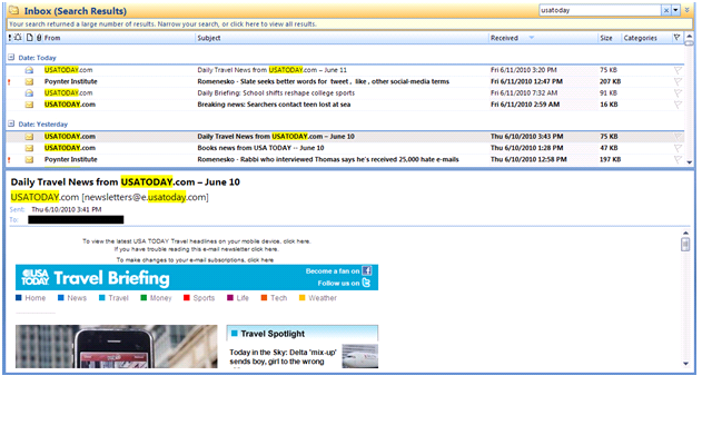
Exhibit A: A recent issue of one of USATODAY’s email newsletters (see below).
With the images turned on, I can see that it’s the Travel Briefing and even get part of an image and a headline to pull me into the email.
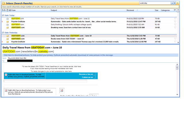
But that’s not the case when images are blocked (see below).
With images turned off I can see the “housekeeping” messages at the very top, as well as the copy associated with the Facebook and Twitter links, but nothing else.

At the very least, the “Travel Briefing” headline should be in rich text, as the social media copy is. Many companies prefer to make newsletter titles and even headlines images because it allows them control over the font for branding purposes. That’s fine on a website, but for email anything that can be rich text should be. That way the words will show even if images are blocked.
Also fine on websites are large “hero photos” which appear under the header — but they’re not so good in email. The caption for the photo at the top left, which is also the story headline, is “Top 10 Free Travel Apps.” It’s directly below the image. If USATODAY moved this above the image it would make the preview pane, with or without images blocked, much more engaging.
One more thing: With images blocked the content of the email is shifted down. So even though the headline on the right appears when images are on, it gets bumped below the preview pane when images are blocked. Without images there’s not a lot here to engage readers and pull them in to read the email.
Developing email creative to take full advantage of your preview pane prime real estate when images are blocked isn’t difficult or expensive. It just takes a little thought. If you don’t know what your email looks like in the preview pane with images blocked, now’s your chance to check.
So check how your messages appear in the preview pane when images are off. And if you don’t like what you see, fix it — and see your engagement and click-through rates rise. At least until my Microsoft marketing contact convinces Steve Ballmer to have the developers make “images on” the default setting for Outlook…
Editor’s Note: Jeanne Jennings is teaching MarketingSherpa’s Email Essentials Workshop Training in 10 locations around the country this year; the next one takes place in Atlanta on June 25th. She’ll be blogging about the course material and her experiences during the tour. We’re excited to have her on board and contributing to the blog.
Categories: Email Marketing Email Essentials Workshop Training, image blocking, preview panes


This is an interesting topic to bring up.So,probably another way of encountering this problem would be to use headers of the email with small punch lines .
Amen Jeanne – kudos for bringing up the topic in public with Microsoft representatives attending!
Just curious, does anyone know why Microsoft chose to block images in the preview pane in the 1st place? Perhaps because of viruses that trigger when an image is shown?
Great info, Jeanne! I would add that marketers should also be cognizant of (and send) multi-part messages when campaigning. Not only do a large percentage of recipients have images turned off by default, many aren’t able to view images at all. Widespread adoption of devices like the iPhone is changing this, but many readers can’t parse HTML emails and therefore default to the text-only version contained in the multi-part message.
When sending multi-part messages, be sure to keep your text concise, and be sure to use full string URLs. Your readers will appreciate the extra effort/details.
Cheers.
Great post! Thanks for mentioning this to the Microsoft folks. Outlook 2007 is a nightmare to design for 🙂
I think another important issue to address would be: how effective are a lot of the graphical elements that companies like to use in their email newsletters?
Often, we’re in love with our creatives and want a “nice” looking message.
Most of the image emails that are being send today do a better job at satisfying the feelings of the people who sent them, rather than motivating the recipients to take an action or be interested.
As a web designer with experience designing “nice” email newsletters, I have to recommend he use of inline CSS use. Your headlines can be as pretty as you want and text is well formatted. If they can’t see your images, they can still get the most out of your email.