Marketing has a language all its own. This is our latest in a series of posts aimed at helping new marketers learn that language. What term do you find yourself explaining most often to new hires during onboarding? Let us know.
This article was originally published in the MarketingSherpa email newsletter.
A design brief is a concise document that presents all the necessary information a graphic designer needs to produce a design element for marketing (e.g. a logo or web page layout).
Some marketing departments and advertising agencies have official design briefs templates that must be filled out for each project. Other times a design brief is a fairly informal, ad hoc process.
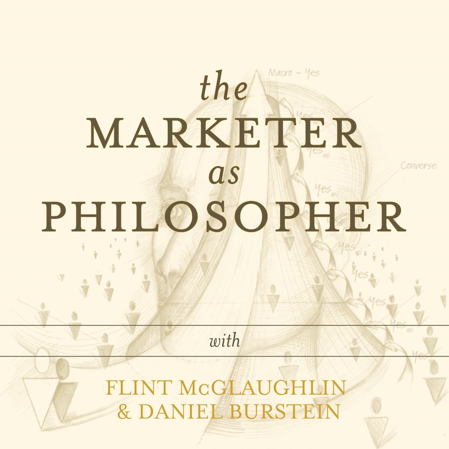
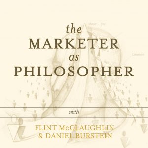
Here is an example for a very small project. We are about to launch a podcast. This is the “ad hoc” design brief I sent for the creation of podcast graphics.
Creative Sample #1: “Ad hoc” design brief” for podcast graphics
_____________________________________________________________________________________
Title
The Marketer as Philosopher (with Flint McGlaughlin and Daniel Burstein)
Author
Flint McGlaughlin and Daniel Burstein
Look and feel
Elements should include:
- The Marketer as Philosopher (most prominent)
- with Flint McGlaughlin & Daniel Burstein (second most prominent)
- Have the look and feel of The Marketer as Philosopher book – https://map.flintmcglaughlin.com/
Specs
We need something that really stands out in a crowded iTunes (or other podcast distributor)
- We need the cover art for the overall podcast
- 3000 x 3000 pixels (square)
- 72 dpi
- .jpg or .png
- RGB colorspace
Source: https://99designs.com/blog/design-other/how-to-design-a-podcast-cover-the-ultimate-guide/
- We need a template we can update with the episode title for each individual podcast. Two sizes…
- Thumbnail – 3000 x 3000px (square), 72 dpi, .jpg or .png, RGB colorspace
- Widespread – 1920x1080px at least a 72dpi, .jpg or .png, RGB colorspace
Source: https://help.libsynsupport.com/hc/en-us/articles/360041221031-Working-with-Episode-Artwork
Description
(highlight shows the approximate amount of text they will see before clicking on the “more” link)
We’ll warn you up front – this is a little different than most marketing content. The key to transformative marketing is a transformed marketer. And so our focus is squarely on you.
Here is a sample of the content discussed:
Asking “how” leads to information; asking “why” leads to wisdom. Yet marketers are all too busy asking how: How do I improve conversion? How do I drive more visits? How do I meet my numbers? We are so busy asking “how,” we have no time to ask “why.” Indeed, we are so busy “trying,” we have no time to reflect.
Sometimes we need to slow down in order to go fast. Action is overrated; action should be grounded in contemplation. Admittedly, contemplation without action is anemic… Ancient philosophy was concerned with wisdom (sophos), and especially loving it (philos). The marketer should love (customer) wisdom. Indeed, the marketer should be the philosopher of the organization—for the vigorous action of sales needs to be grounded in the rigorous contemplation of marketing.
Based on the book, The Marketer as Philosopher, and on the MECLABS FastClass series “Become a master at creating and optimizing high-converting web pages,” Flint McGlaughlin (Founder of MECLABS) and Daniel Burstein (Senior Director of Content and Marketing at MarketingSherpa and MarketingExperiments) discuss the fundamental power of marketing.
Feel free to email editor@meclabs.com to let us know how we can make these podcast discussions more helpful to you…or any other way we can help. And you can participate in the full, free FastClass series at MECLABS.com/FastClass.
YouTube channel
Flint McGlaughlin
Opening stinger voiceover
Welcome to The Marketer as Philosopher podcast. Our goal is to help you re-envision your role and your work as a marketer or entrepreneur. Now here are you hosts – Flint McGlaughlin, joining us from the rugged mountains of Wolf Creek, Montana…and Daniel Burstein, joining us from the beautiful beaches of Jacksonville, Florida.
Closing stinger voiceover
Thank you for joining us on The Marketer as Philosopher podcast with Flint McGlaughlin and Daniel Burstein. If you like what you heard today, we encourage you to get actionable takeaways you can apply to your marketing right now in the free “Become a master at creating and optimizing high-converting web pages” FastClass series. Just visit MECLABS.com/FastClass. That’s M-E-C-L-A-B-S dot com slash fast class.
_____________________________________________________________________________________
Include the value proposition
Really, I could have just sent the designer the look and feel along with the specs.
However, you don’t just want to just get design files when working with a designer. You want their best thinking. So it is crucial to include the value proposition as well. In this case, I felt that the podcast’s description was the best expression of the value proposition.
Help them understand what they are building
I once heard a very moving story on NPR. The reporter was interviewing a factory worker who glued a chip to a motherboard all day long, day after day, month after month.
The reporter showed the factory worker what she was building – an iPad – and the factory worker cried. Previously, she had no idea what the final output of her work actually was. When she saw the iPad, she was touched that she could be part of building something so amazing.
I can’t say our podcast will be on par with the “wow” factor the iPad generated when it was first released. But I include the opening and closing voiceovers because I wanted the designer to get a feel for what they are helping to build, what the designer is a part of to, again, get their best thinking not just a .jpeg file with fonts and images in the right place.
Creative Sample #2: One of the podcast graphics created from the “ad hoc” design brief
Next, let’s look at an example of a more official, templated design brief for a much bigger project…
Creative Sample #3: Templated design brief for educational website for retail staff
_____________________________________________________________________________________
MEA DIGITAL
8/4/04
Project: iTeachU Redesign – Design Brief
Overview
Iteachu provides an engaging and intuitive way for resellers of Kyocera products to learn, and demo Kyocera phones. Each visitor will experience a user-centric navigation, while becoming fully saturated with product literature in a cool and hip fashion. Once the user is ready, each will be encouraged to take a mastery test for the specific product.
Objectives
- To provide a traditional online “educational” experience that equips, guides, and trains store managers for the specific skill and knowledge of “selling” Kyocera phones to customers
- Integrate the Kyocera brand and utilize brand elements that bring value to the educational experience
- Remarket to carrier store managers announcing new products or boost awareness of existing phones (i.e. Slider refresh program/incentive program, or active marketing plans)
- Promote users to collect certificates for each phone (Comac to provide certificate fulfillment)
Target Audience
- Primary Audience: Generation Y – In-store staff members currently in college, quick learners, tech savvy (on computers as early as nursery school), fast-paced, confident, independent and intelligent, with attitude. They trust their friends and the Intemet. In terms of how communication is perceived, they prefer to be truthful and straightforward.
- ‘ProSumers. (Professional Consumers)- In-store managers who understand and buy leading technology products
- Primary Demographics: M/F, Skew male 18-34, with some disposable income on technology products
- Psychographics: Wireless communication and entertainment is important to us. We buy technology products to enhance the quality of our lives. We are also interested in brands that make us feel hip and popular. We resent structure and rigidity. We value work/family balance, diversity, flexibility, fun service work.
- Mediagraphics: I listen to the radio. I watch a lot of MTV, and surf the Intemet. Media saturated.
Branding/Design Elements/Navigation: The main design features of the site include –
Branding
- Successfully communicate Kyocera branding,”The Power of Simplicity”
- Maintain approved color-palette throughout, including specific color palettes for each phone
- Where appropriate, include approved illustrations/photography that bring value and brightness/fun to the experience
- Illustrate brand on a white background
- Support brand character, such as innovative, world-leaders, simple, and high-quality
- Fonts: Variations of Foundry Sterling Book, Demi, and Bold will be used for graphics and verdana, arial, sans-serif for HTML
Design/Navigation
- Crisp, clean, user-centric design; navigation that is expected on each page (more traditional)
- Elements of the design will feel fun/hip and include some animation, but not distract from the integrity of the site, which is to educate, and sell-through products
- Given that the training material serves two different purposes: 1) A quick reference/guide for users wanting to access and take the “test” and 2) Managers who need to download the full PowerPoint content, MEA to develop a model/organize documents and define pointers for each user to best know where to start and how to collect information that will be most relevant to them
- Promote (motivation pointers) the collection of mastery test certificates and return visits
Functionality Requirements
- Site is easy to update/maintain by building HTML in a modular fashion, using templates server side includes, and cascading style sheets where possible.
- Flash 6+, HTML and some JavaScript
- High speed Internet connection (90-95% have hi-speed)
- Mac OSX compatible
- IE 5x and IE 6+ (Include general web usage stats)- general web stats show approximately 77% of Internet users using IE 6.x; 16% using IE 5.x.
Agency Approved:_______________________________________ Date:_____________________
Note how extensive the focus on the target audience is, along with specific brand, design, and functionality requirements.
This design brief is from the case study Revamped Online University Increases Reseller Rep Participation 50% : How to Educate Sales Reps. For the revamp, the marketing team put together this detailed design brief for the Web department based on market research which informed internal brainstorming sessions. The design brief was the vehicle to communicate the most essential discoveries from that research, along what the marketing team wanted to produce to best serve that audience.
The creative brief
Every marketing department, agency-client relationship and campaign is different. Sometimes a design brief is necessary because all that’s needed is some simple graphics for a larger project (like the first example above, the podcast graphics) or the project is large but is primarily design driven (like the second example above, the educational website redesign).
However, in other cases – like an ad campaign that requires a creative concept – it is more effective to foster collaboration. In that case, a creative brief is the way to go.
Essentially, a design brief is a more focused version of a creative brief, which is a concise document that presents all the necessary information a creative team (for example, a writer and art director) needs to produce a piece of marketing (like an advertisement or landing page) or an entire marketing campaign.
I find it’s more effective to have the writer and designer collaborate from the beginning as a team, instead of a marketing exec, account exec or writer dictating the idea to an art director of graphic designer. In an ideal world, you want the best of their thinking. That is what creatives bring to the table. As I’ve written, “I call this bottled lightning – taking a run-of-the-mill creative brief in a restrictive medium and adding a creative jolt.” (from Bottled Lightning: 3 creative approaches to email marketing (yes, email marketing)).
On the flip side, creative and design briefs can also be used by an agency or consultant to propose a campaign to a client at a brand. Again, the goal is clarity for all parties, a simple and concise transfer of the most important information.
These briefs can also be called a marketing brief, design blueprint, statement of work, or job starter.
Who writes a creative or design brief?
In an agency, the account executive should write the design brief. In a marketing department, the marketing director should.
Of course, they should collaborate with all of the other key players – content writers and copywriters, project manager, art director, CMO, marketing managers, content lead, CRO (conversion rate optimization) expert, etc.
How specific should a creative or design brief be?
It depends how involved the designer is in the project. Again, it would be better to get a creative brief (which includes the value prop) and have the designer collaborate with the writer from the beginning.
If that is not the case but the designer or design team has already worked extensively on the website, just the copy (words for the webpage) should be enough. You could also include callouts for specific design elements that are crucial to communicating the message.
If the designer has no previous relationship to the project, you want to be as specific as possible – clearly spelling out what type of design/graphic should go where. At that point, the designer becomes closer to a software operator than a true designer. But sometimes, that all you need (or all your budget will allow).
You can follow Daniel Burstein, Senior Director, Content & Marketing, MarketingSherpa and MECLABS Institute, on Twitter @DanielBurstein.
If you are interested in design briefs, you might also like…
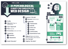
Design Layout: How to structure your web page or email for maximum conversion
The End of Web Design: Don’t design for the web, design for the mind
Web Design: 4 mini marketing case studies about design changes big and small
“True Blood” Vampire Fangs from the Dentist: When you’re too successful at driving the wrong traffic to your website – Podcast Episode #5
If you are interested in entry-level marketing content, you might also like…
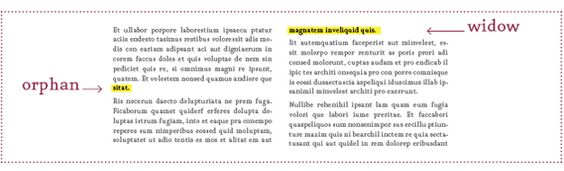
Marketing 101: What are widows and orphans (in design)?
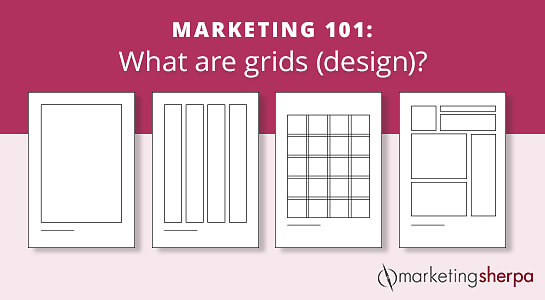
Marketing 101: What are grids (design)?
The Beginner’s Guide to Digital Marketing: 53 articles (and 1 video) to help with onboarding