Archive

Author Archive

Red Bull Media House’s Advice for Successful Content Marketing

September 19th, 2014

Red Bull is running circles around every other name in the content marketing game.

Currently, the energy drink company has its wings dipped in a whole gamut of media channels — we’re talking digital, mobile, TV, print and music. People — millions of people — are actually consuming this content. (What a concept, right?)

But audiences aren’t tuning in because the company is marketing its energy drink. In fact, Red Bull continues to rise above the rest in content marketing by doing somewhat of the opposite. The company earned its spot on the content marketing throne by pushing its product to the side and its audience to the front in an extreme way.

Instead of a skinny aluminum can, Red Bull focuses its content on the sports, culture and lifestyle of its adventurous drinkers. In 2007, the company even launched Red Bull Media House — its very own media company that develops all of the company’s content pieces and manages its social media channels. 

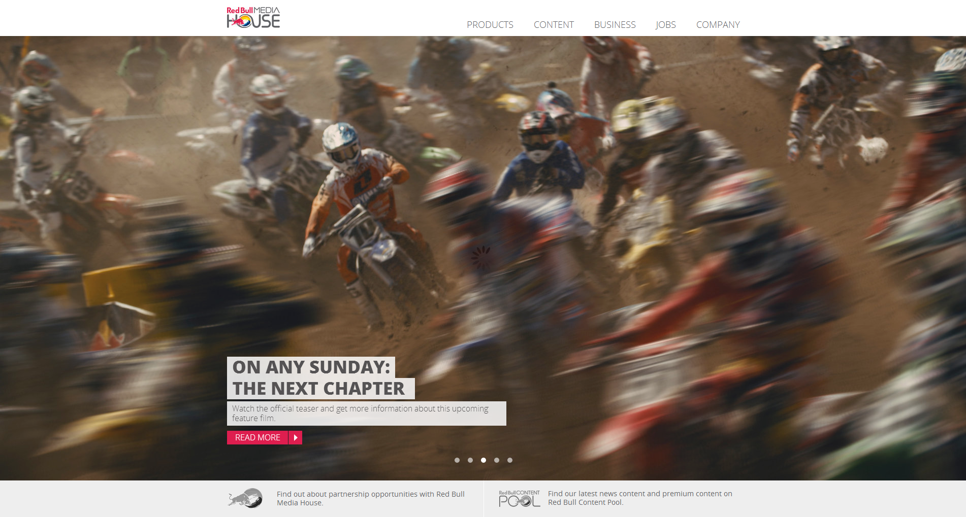
Red Bull Media House Website


Some of the media house’s highlights? Take a look at Red Bull’s YouTube page (if you haven’t already as one of its 3.7 million subscribers). These sports action videos have views that rank in the thousands — some in the millions.

On the day this blog post was published, Danny MacAskill — “Way Back Home” had 32,988,764 views:


Read more…

Mobile Marketing: 3 tips from ModCloth on mobile app engagement

August 8th, 2014

Seldom do I condone a selfie.

Nothing makes me want to cut a slice of humble pie for someone more than a pointless, self-taken snapshot. If you’re doing absolutely nothing but think you look darn good, it’s pretty clear you’re pulling for some strokes to the ol’ ego.

In the driver’s seat of your car? Not a photo op. Working at your computer but having a great hair day? Don’t click the cam.

However, I do think there are some exceptions — and perhaps even necessary occasions — for a selfie. If I run into Jennifer Aniston on the street but no one’s there to take the pic, you best bet I’ll hold up my iPhone and do it on my own.

While my iPhone’s photo album doesn’t have celebrity-accompanied shots (I’m working on it), it’s not selfie-free, which brings me to my other exception: fashion.

Putting an outfit together or buying a piece of clothing is often stressful. I can look in the mirror as long as I want to see if I think a shirt looks funny or if my shoes go with my dress, but there’s nothing better than a second opinion.

I can get that second opinion by taking a photo of myself in the outfit, texting it to my girlfriends to weigh in. What do you think of this top? How does this skirt look with these earrings? Should I buy it? All of my friends and I do this.

Fashion retailer ModCloth, a brand my wallet knows all too well, integrated this selfie behavior into its mobile app. I learned all about it when ModCloth’s Chief Technology Officer Udi Nir chatted with me in the MarketingSherpa Media Center at IRCE.


Udi co-hosted an IRCE session in Chicago titled, “Mobile Commerce: Get Ready Today for Tomorrow,” where he gave me the scoop on ModCloth selfies along with how crucial it is to have a strong mobile presence.

“It’s really important because that’s where our girl, our customer, is,” Udi told me. “We are wherever she is. If we want to serve her, we have to be in all those places she wants to access our site.”

On the marketing side, mobile unlocks new opportunities for marketers to reach customers in ways and at times they couldn’t have before.

“Mobile basically provides us new moments of found time,” he said. “Those two minutes in line, a few minutes on the bus or whatnot that weren’t able to be used before.”

ModCloth has channeled its mobile focus into its app, which has helped the company achieve both entertainment and engagement among its customers.

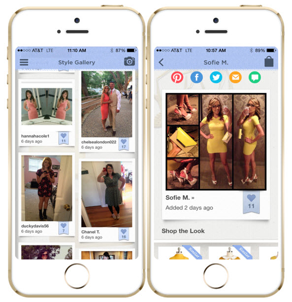
One particular feature is the app’s Style Gallery, a place where ModCloth customers can upload their outfit photos to show how they’ve styled their clothing to give others inspiration, Udi explained.

modcloth-style-gallery

  Read more…

Email Marketing: Necessity is the mother of invention

May 13th, 2014

Because it was our first year running the Media Center at MarketingSherpa Email Summit, we didn’t know what to expect. The plan was to plant a fancy set on the exhibition floor, let me play Erin Andrews and invite marketing guests to join me for some impromptu interviews.

The beauty of doing things freestyle is that unexpectedness – you don’t know what’s going to happen. Let’s not forget the real Erin Andrews’ infamous interview with Richard Sherman.

While none of our guests claimed they were the best marketer in the game, there were some surprises. Silverpop’s Loren McDonald did his “Gmail tabs” dance, Dan Ariely discussed dating and things got deep when Eventful’s Vice President of Operations Paul Ramirez quoted ancient Greek philosopher Plato.

“Necessity is the mother of invention.”

Translated from Plato’s The Republic, it means that when you must do something, you’ll discover a way to do it. It’s not as scholarly when you say it like that, though. This fit Eventful’s situation perfectly.


Eventful, our E-commerce Best in Show winner for this year’s MarketingSherpa Email Awards, had historically flourished in the realm of revenue, page views and user acquisition, but one day, everything went south.

“When Google released Panda and our traffic attributable to search tanked, that was like the necessity and we started talking about necessity being the mother of invention,” Paul said. “It was an external force that caused us to do something.”

The Google algorithm update had punished the Eventful site because it viewed the e-commerce company as a content aggregator. While Eventful once enjoyed a super successful search strategy, it was now as if the website was completely offline.

Paul was joined by Ryan Blomberg, Director of Engineering, also of Eventful, and discussed this on-stage during their Email Summit session, “How an e-commerce site transformed its email program to increase purchases by 66%.”

Watch Eventful’s full session from MarketingSherpa Email Summit 2014. View a brief preview below:


While page views overall were plummeting, the portion of Eventful emails contributing to page views was actually growing. Google’s Panda update wasn’t affecting email performance and Eventful’s email program was still highly engaging with solid metrics, with open rates from 20% to 60%.

Eventful had success running “Performer Alert” emails, notifying customers when their favorite artist was coming to town. But the Eventful team thought they could be pushing more Performer Alerts – not for the one artist they’ve already told Eventful they like, but with additional artists they’re fond of.

“Nobody has just one artist in their iPod,” Paul said. “Everybody has hundreds of artists in their iPod. So how do we get that data so that we can speak to our users with more personalization, with more relevance and with greater frequency to increase page views?”

Cue the invention.

Read more…

Email Templates: Don’t let routine cramp your style

April 29th, 2014

Take a good, hard look at the things you do.

Perhaps you pour yourself a bowl of Raisin Bran every morning. Maybe you trot your dog along a certain path at the end of each day or peruse the same half-dozen websites during your lunch hour.

Now ask yourself why you do these things. Often, the answer is simply because you’ve always done them.

Such was the case for one of our MarketingSherpa Email Summit speakers.

Jessica Andreasen, Digital Marketing Manager, ZAGG, didn’t touch on her breakfast habits nor site surfing routines, but rather ZAGG’s habit of employing the same email template: a headline, supporting copy, multiple images, bullet points, one or two banner ads and multiple CTAs.

“We were using the same templates over and over,” Jessica told me in the Email Summit Media Center. “Our results were declining and we knew we had to do something different.”


For a customer appreciation campaign, the ZAGG team wanted to focus on a conversational tone, thanking the company’s loyal customers. However, when putting this together, the current template was restricting that message. Despite the fact the template was used again and again, Jessica implemented a change.

“I threw the template out and started with a clean slate and just decided what I wanted it to do,” she said. “What did I want this email to do and say?”

In her presentation, “Email Templates: How the No. 1 maker of mobile accessories tweaked promo emails to produce a 152% increase in revenue per email,” Jessica shared insights on how changing a template can significantly affect your results.

You can learn about what changes ZAGG made to its templates by watching Jessica’s full session from Email Summit. View a brief excerpt below:


When we chatted in the Media Center after her session, Jessica said she hoped the audience gained this key takeaway: step back and don’t let the template get in the way of what you want to say.

“You don’t have to stay with that same thing that you’ve always done,” she said.

Who knows, maybe you’ll even become inspired to swap your cereal for scrambled eggs today.

  Read more…

Email Marketing: A canvas for visual storytelling

April 22nd, 2014

Since the Stone Age and beyond, storytelling has been paramount for mankind. Sure, the modes and means have changed, but its prevalence certainly hasn’t.

But storytelling is getting better. Our ancestors may have only been armed with their voices (or grunts) and a rock on a wall to tell their tales. Now, our modern world is overflowing with ways to convey our stories.

Of course, we still have the old favorites like our voices and the written word, but with multimedia capabilities like GIFs, videos and PowerPoints, there’s no stopping our stories. In the email marketer’s world, the email is your canvas for a story, so why not approach it that way? Dell did.

David Sierk, Consumer & Small Business Email Strategy, Dell, joined us in Las Vegas as a speaker at MarketingSherpa Email Summit 2014 back in February to talk about it. Dell needed to find a way to communicate the capabilities of its new product, the Dell XP 12 Convertible Ultrabook, which is a hybrid of a laptop and a tablet. A photo in an email wasn’t going to work. A bunch of text? Not happening.

“How do we visually tell a story of what this product does?” David asked me when we chatted in the Email Summit Media Center.


The Dell team decided that utilizing a GIF in the email marketing campaign would be the best way to effectively tell the Ultrabook’s story, ultimately lifting revenue 109%. If you weren’t at Summit this year (or just want to see it again), you can view David’s full session from Email Summit, “Old Dog, New Tricks: How Dell designed an email with old technology to launch a new product.” Watch a brief excerpt of this presentation below:


“I think now more than ever with the deluge of emails in a customer’s inbox, trying to get them to click on something is so important,” David said. “People are very visual so it’s tremendously beneficial to give them something to look at instead of forcing them to read through a ton of text.”

Visual storytelling isn’t easy. It’s a delicate craft that requires a certain eye. But when it’s done right, it’s invaluable.

At MarketingSherpa, we understand the importance of visual storytelling. In fact, we’ve implemented a position on our staff dedicated entirely to that skill (we’re hiring now). 

Read more…

Lead Generation: How to establish a connection offline

April 21st, 2014

Originally published on B2B LeadBlog

Typically, we’re the ones asking the hard-hitting questions during our MarketingSherpa webinars. But in a recent live broadcast, the roles were reversed.

Bob Birge, Director of Marketing, Blue Pillar, put webinar host and MECLABS Director of Editorial Content Daniel Burstein on the spot.

“When’s the last time you got a personal letter at work?” Bob asked.

“I can’t even remember,” Daniel said. “If I really think back, maybe three, six months ago from a job interviewee I had thanking me for the job interview I did with them.”

Bob was backing up a recent study claiming that the typical business person only receives a personal letter once every seven weeks, yet receives an excess of 100 emails a day. These findings served as inspiration for Blue Pillar’s marketing campaign that was the heart of the MarketingSherpa webinar, “How to Use a Multichannel Campaign to Reach Key Decision-Makers.”

Bob shared insights into the critical power company’s process in sending a tangible, personalized direct mail piece to target customers.

“I think part of the brilliance of what you did here, Bob, is a lot of times as marketers, we follow the trend — what’s the word in the cloud, what’s everyone doing in mobile, social and everything,” Daniel said. “We just get kind of mixed in with the noise of that, and you really looked to zig where others zagged.”

The end goal of Blue Pillar’s marketing efforts was to schedule briefings with the decision-makers of target companies. This included those from hospitals, data centers, universities and research facilities — people who are typically swamped with daily emails.

The marketers at Blue Pillar decided to take themselves out of the crowded email sphere and eliminate that major challenge altogether.

“We’re very confident that when we get in front of the right person — people that can understand what we do and the complexities of it — good things happen,” Bob said. “A light goes off and we’re off and running, but that first step needs to happen — get in front of the right person. Sometimes, that’s a lot more difficult than it sounds.”

The team usually shoots right for the top of organizations, directing email campaigns and phone calls to C-suite executives. The results weren’t ideal. Bob shared that one of Blue Pillar’s email campaigns sent to 200 targets amounted to zero briefings.

“It was really more on the execution, or the lack of results, that we got hurt, and then we needed to establish a connection,” Bob said. “Those were two important steps: Who are you trying to reach, and then what do you do to establish that connection? And that’s where we were stumbling.”

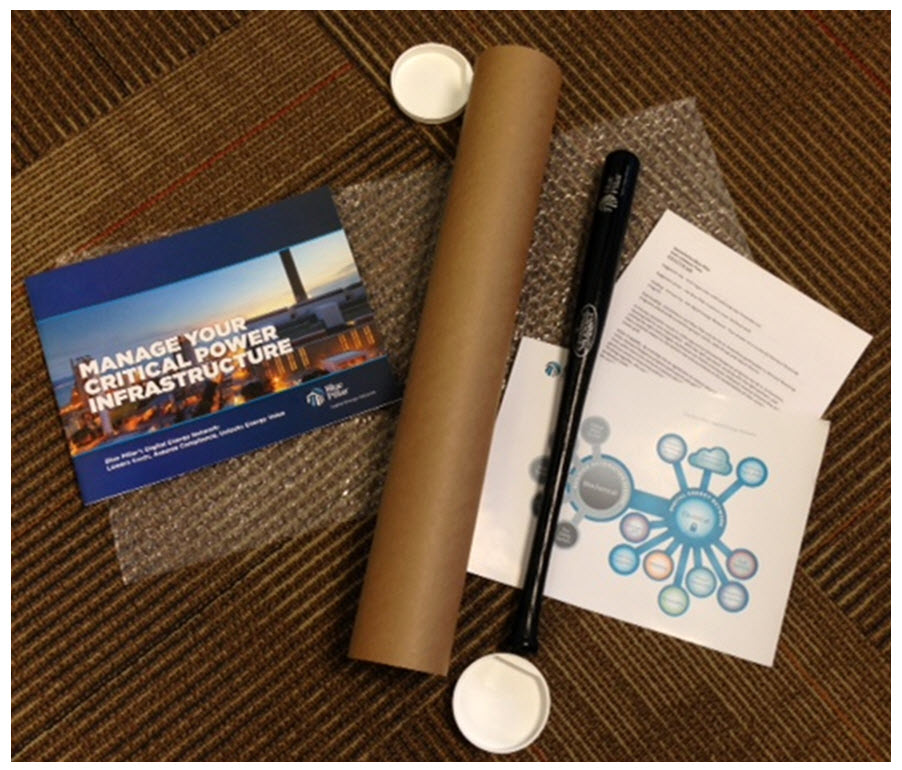
blue-pillar-louisville-sluggerAfter looking at results from Blue Pillar’s email efforts as well as that study Bob mentioned earlier, the team concluded that using emails for introductions to prospects wasn’t the way to go. Because of the limited amount of personal mail people receive, Blue Pillar sought to stick out with a mailer.

Bob explained that years ago, he had success by using a mini Louisville Slugger baseball bat in a campaign. Because Blue Pillar’s effort was set to run in early summer, Blue Pillar opted to use this item again while also employing multiple channels for a baseball-themed effort.

Blue Pillar targeted 100 individuals positioned in the C-suite of organizations. The first piece of the campaign was the mailer that contained:

  • direct-mail-pieceA mini Louisville Slugger baseball bat stamped with the Blue Pillar logo
  • Collateral pieces on Blue Pillar (what the company is, what it offers)
  • A personal letter to the target

The letter was considered truly “personal” not only because it directly addressed the target by name, but because it included several details about the target’s company, such as where the target was located, as well as how many facilities it had. Sticking with the baseball analogy, the letter outlined strikes (problems), and then Blue Pillar’s solutions (single, double, triple, homerun).

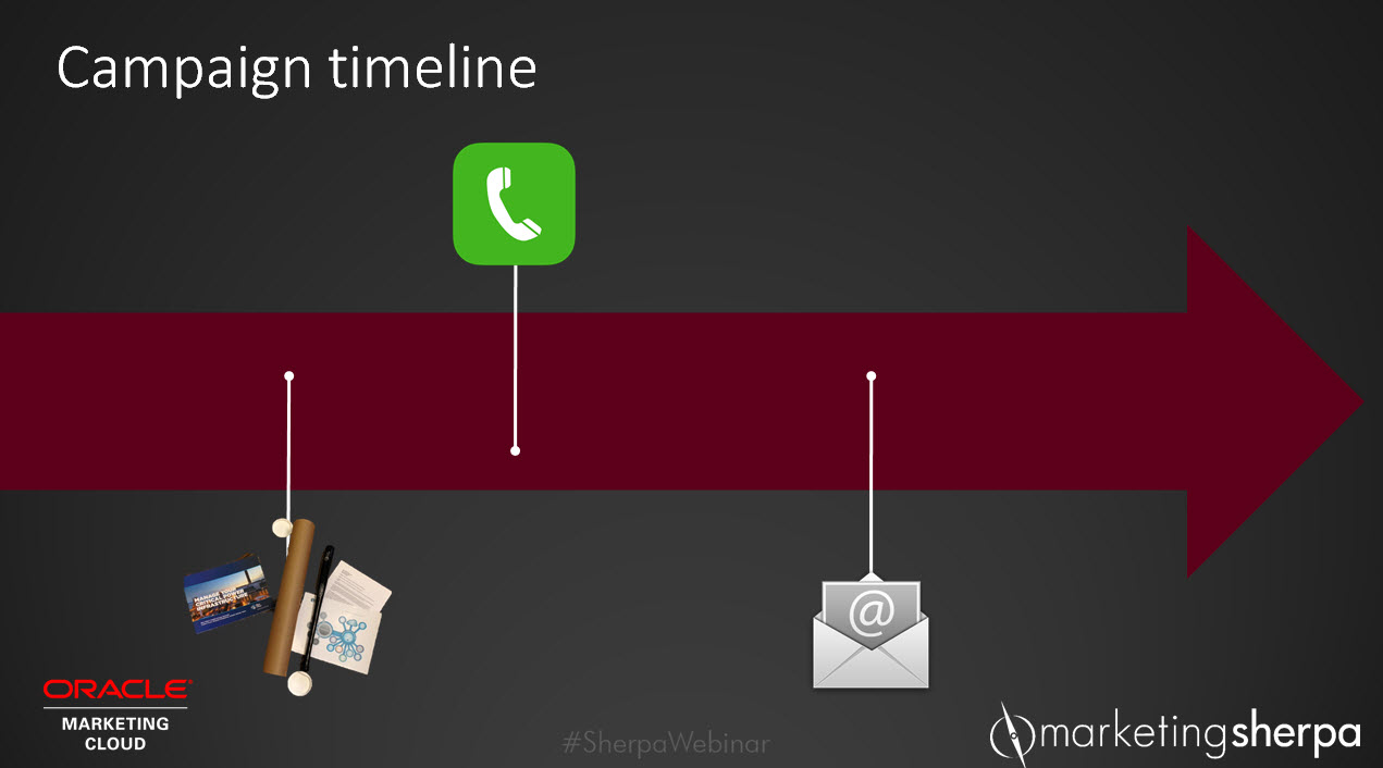
The team waited two weeks after dropping the packages in the mail before conducting follow-up phone calls to ensure they were received. Beginning the conversation with the baseball bat served as an instant ice breaker, and Bob made many of these calls himself.

“[I said,] ‘Hey, about two weeks ago I sent a package. It would have included a black mini Louisville Slugger baseball bat,’ and a light went on. All of a sudden, I became their best friend.”

Asking about the bat, Bob explained, was a far more memorable item to recall than calling to ask about the delivery of an email.

“I knew that between the last two weeks, they probably didn’t get any other mini Louisville Slugger baseball bats,” he said. “So now we’ve connected.”

Rather than utilizing an email as its starter, Blue Pillar put it to play as its closer. The final piece of the campaign was following up with the target via email — after the connection was established — to schedule that briefing.

campaign-timeline-direct-mail

It worked. Take a look at Blue Pillar’s stats from the campaign:

  • 100% of the targets received the package
  • 14 executive briefing calls scheduled
  • 21 calls completed with engineers and facility managers

At the close of the 30-minute webinar, Bob shared his top takeaways:

  • Connect where others neglect
  • Establish an offline connection
  • Use emails to keep things moving
  • Be original

“It goes back to the basics: learn your product, learn your audience and then [find] a way to reach them,” Bob said.

For even more of Bob’s story, check out the full MarketingSherpa webinar replay of, “How to Use a Multichannel Campaign to Reach Key Decision-Makers.”

You may also like

Multichannel Marketing: Direct mail, phone and email combine to lift executive briefing calls 50% [Case study]

Lead Generation: Does your teleprospecting deliver value to prospects? [More from the blogs]

2013 Year in Review: Top 6 focus areas for B2B marketers this year [More from the blogs]

Web Optimization: How AARP Services boosted renewals by increasing usability

March 11th, 2014

Eyeglasses launched across the table. A focus group member was irritated, experiencing difficulty reading the AARP Services website.

“‘I can’t see this content because you’ve got a grey background!” the member complained. “There is no place for me to increase the font size!”

This was just one of the observations that helped drive the optimization of the AARP Services website, making it more user-friendly for its senior demographic. At Optimization Summit 2013, two members of the company’s team shared AARP Services’ secrets to success.

In this excerpt of the presentation “How AARP Services increased referrals and membership renewals,” we learned how focus groups helped fuel the first test’s goal – make the site easy to read and share.


Preeti Sood, Digital Channel Manager, AARP Services, admitted that she was initially opposed to using a focus group. However, by observing frustrations of customers, AARP Services was able to use data from a focus group to convince management to perform additional testing around readability and social media sharing.

This short clip showcases how changing the background color, font size and placement of the “email” button resulted in a 12% decrease in page bounce rate and 7% increase in social sharing – all beginning with information collected from a focus group.

Gaurva Bhatia, VP of Digital Strategy, AARP, also said he was skeptical about focus groups, especially given the subject matter at hand. He thought that website visitors could easily just change font size through their browsers. Why waste time and effort on this? After witnessing the frustrations from the focus group, it became clear that this was an area that needed priority when it came to testing.

This left Guarva with a valuable lesson.

“Listen to the members,” he explained. “Test what they’re telling you versus assuming about them and doing what you think is right.”

Watch the full free session from Optimization Summit 2013 to discover:

  • How AARP Services adopted a “teach and learn” culture
  • The benefits that can come from focus groups
  • Items to keep in mind with the “newspaper generation”
  • And much more

  Read more…

Web Optimization: How The Boston Globe used customer insight to test value proposition

February 14th, 2014

The time period just before you dive into testing can feel like peering into a beehive. While the hive is abuzz with activity, the commotion seems overwhelming and, perhaps, a little dangerous.

What should you be paying attention to? Where do you even start?

In a testing and optimization program, test plans seek to give you order, helping to communicate what you’re trying to accomplish and when you’re going to take action. For The Boston Globe, testing certainly had the potential to get messy.

At Optimization Summit 2013, the media giant unveiled that it ran more than 20 tests to help market its new digital access website, bostonglobe.com.

But The Globe had to start somewhere.

The news hub was already armed with an established print subscription base which helped direct the brand’s evolution digitally. In this excerpt of the presentation, “Boston Globe: Discovering and optimizing a value proposition,” Peter Doucette, Executive Director of Circulation, Sales & Marketing, The Boston Globe, provides us a deeper look into the development of the company’s  testing plan.

“We’re managing this total consumer business, but it’s also about understanding the unique groups, the unique segments,” Peter explained. “Building this knowledge of our customer base kind of set the stage for how we went about testing.”


Peter told Pamela Markey, Senior Director of Marketing, MECLABS, that the team utilized customer lifestyle stages as the “foundation” to build testing and optimization, as understanding the differences between its print and digital audiences was key.

Testing was formed around the following customer lifecycle stages and goals:

  • (Potential) prospects — attract
  • Prospects — engage
  • New customers — convert
  • High-value customers — grow
  • At-risk customers — retain
  • Former customers — win back

“We think about customers, where they are in that cycle and then that naturally bleeds into, ‘OK, so we know we have to target customers in this stage. What are we going to do? What’s the biggest opportunity? How quickly can we go to market?’” Peter asked.

Read more…

Ecommerce: 10 case studies to help you excel in content marketing, social media and website optimization

November 26th, 2013

Shopping from your seat is a beautiful thing.

Customers relish the convenience and ease of online shopping, but those on the other side of the screen know the process isn’t so effortless. Ecommerce can present itself as a multidimensional demon, frightening marketers with shopper abandonment and confusing consumer behavior.

However, there are plenty of marketers who have slain the beast on their way to success. Our MarketingSherpa reporters know this because they have penned many of these marketing heroes’ tales of triumph.

Let’s take a look back at the lessons we learned from these 10 ecommerce case studies.


Case Study #1. Ecommerce: Edible Arrangements’ countdown ad lifts same-day orders 8%

Lesson: Don’t assume your company’s existing features or services are on the customers’ radar.

The basis for a stellar marketing campaign doesn’t have to revolve around a new service, product or feature. Your company could have a pre-existing item that could use some additional awareness. Take Edible Arrangements’ same-day delivery service. Kaitlin Reiss, Vice President of Ecommerce, Edible Arrangements, told MarketingSherpa the service was the company’s “hidden gem.”

“A lot of people don’t realize that we have same-day delivery, even though it is not something new for us, so we realize that we will need to do even more to promote it,” Reiss said.
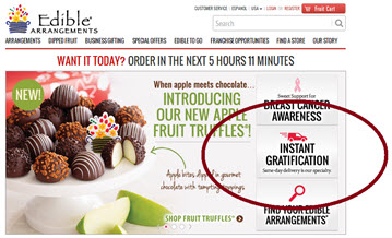
The hub of tasty fruit bouquets utilized simple promotion through a variety of channels to increase both email open rates and its same-day orders, too. Are your company’s pre-existing services being promoted to its greatest potential?

Doubtful. Despite the fact that those features may not be new to the company, it could be new to consumers.


Case Study #2. Ecommerce: Moving beyond shopping cart abandonment nets 65% more checkout conversions

Lesson: Targeting customer abandonment is worth it.

We’ve all been there. Perusing products on the Internet when the phone rings, it’s time for dinner or the dog is barking for a walk. No matter what it is that pulls us away from the computer, distractions are inevitable.

As an ecommerce marketer, understanding and reeling your consumers back in is crucial for garnering conversions. Many ecommerce companies have found success recovering customers through abandonment emails.
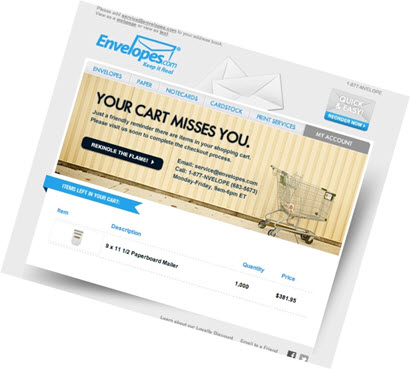
The case study above examines how Envelopes.com targeted category, cart and checkout abandonment with emails sent less than a week after the customer left the site. The campaign lifted the company to net 65% more checkout conversions.

Examine why your ecommerce site isn’t earning those sales. Is it internal, or could it just be the busy lives of your consumers? Sometimes, all it takes is a little reminder.


Case Study #3. Email Marketing: How an ecommerce site eschews discounts in favor of eco-friendly content

Case Study #4. Ecommerce: How Wine Enthusiast increased organic traffic 154% with content marketing

Lesson: Content can help you connect with consumers while building trust, too.

As an ecommerce marketer, you’re not face-to-face with your consumers — your computer screen is. Establishing trust and connecting with them is a feat of its own. In these two case studies, ecommerce companies utilized content to increase traffic and awareness of their brands to stand out in a crowded Internet space.
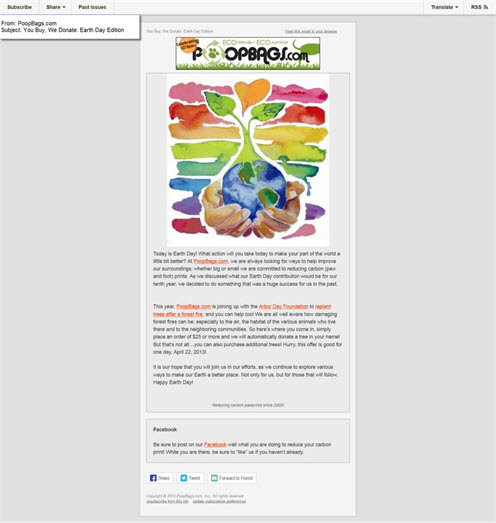
PoopBags.com – yes, you read that right – built an email marketing strategy on eco-friendly content. As a biodegradable bag for pups’ – er – business, the brand developed email content emphasizing environmental causes, charities and pet-related issues.

“It makes it easy to bond with people … knowing that we write about things that are so important, and we care passionately about, makes [writing email content] pretty easy to do,” Paul Cannella, Owner, Poopbags.com, told MarketingSherpa of the company’s content strategy.

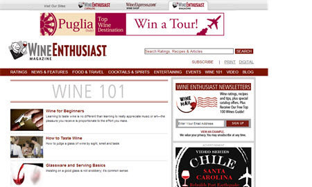
Retailer Wine Enthusiast also put content into play to earn trust with consumers. The company’s website features wine reviews, articles and videos to help build an audience. The content helped yield a 50% increase in monthly email opt-ins.

“We put time into creating helpful content that helps people either make a buying decision or entertain them,” said Erika Strum, Director of Internet Marketing, Wine Enthusiast Companies. “Even if they aren’t making that purchase in the moment, we feel that they will come back to us as a great source of information.”
Do you have something to offer your consumers other than a great product or service? Look to content to form valuable trust and relationships in your market.


Case Study #5. B2B Ecommerce: Redesigned online form increases quotes 67.68%

Lesson:  Your website must align with the way people shop online.

A website is never a finished product – it’s forever evolving. After all, it has to. Think about what would happen if you kept your website the same year after year. You couldn’t do that and be successful. The Internet is constantly changing as is the way customers expect to shop online. Failure to take this into account with the structure of your website has the potential to lead to your company’s downfall.

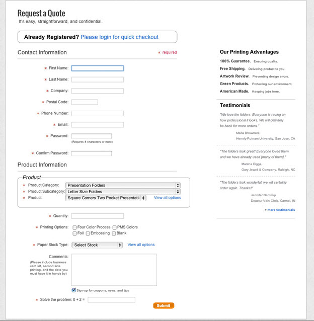
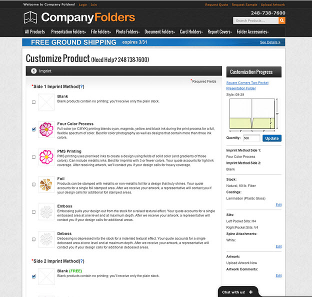
Take our case study on Company Folders, a company that provides businesses with custom folders. Prior to its marketing efforts, the company’s website was out-of-date and had a quote form that wasn’t conducive to the ease-of-use online shoppers expected.

By redesigning the website and online form, Company Folders experienced a 67.68% increase in total quotes.

The old online form: 
 

The new online form:
 

Company Folders CEO Vladimir Gendelman explained to MarketingSherpa how crucial it was for his company’s website to keep in the consumer in mind.

“In order to tackle this, and do all this, we had to think just like a customer would,” Gendelman said. “A redesign is not just like making [the website] look pretty. It is about making it extremely easy for [website] function.”


Case Study #6. Ecommerce: Adding trustmark boosts sales conversion 14%

Lesson: Small changes can lead to big differences.

Optimization doesn’t have to involve some huge website overhaul. Even the seemingly smallest of things can make a huge difference for your company and our case study on Modern Coin Mart certainly demonstrated that.
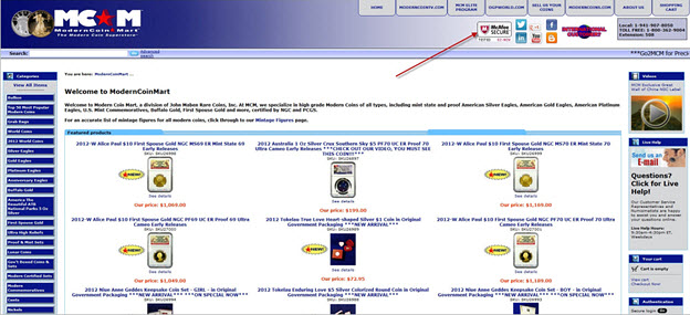
The self-described “Modern Coin Superstore” added a simple trustmark to its ecommerce site to ease customers’ anxieties about the purchasing process. A tiny graphic produced monumental results, boosting sales conversions to 14%.

What can you as an ecommerce marketer take from this? Don’t think you have to exhaust yourself to yield impressive results – even small changes can lead to big successes.


Case Study #7. Social Media Marketing: How a small ecommerce site attracted 293,000 Facebook fans

Lesson: Social media fosters marketing by the consumer.

What’s on your mind? Facebook gives its users a platform to speak their minds, share their photos and  promote your products. Yes, promote your products.

It may not be what Mark Zuckerberg initially had in mind, but Facebook can offer huge boosts to your company. It’s so simple for a customer to take a photo of your product, which provides your company with a testimonial, review and super sharable content that is free.

Does the product or service you’re selling suit the Facebook realm? In other words, is it sharable? Could it be? This can lead to impressive results. Look at our case study on Diamond Candles, a company that features rings beneath the wax of its candles. By utilizing customer-contributed photos on its Facebook page, Diamond Candles upped conversion rates and attracted more than 290,000 new Facebook fans.
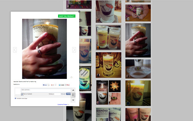
For minimal effort, your ecommerce site has the potential to produce maximum results. Determine how your product can start a conversation in consumers’ social networks and then capitalize on it.

Read more…

Email Deliverability: Is Gmail’s tabbed inbox a B2B challenge?

November 18th, 2013

Originally published on B2B LeadBlog

Just when you thought you had this whole deliverability thing down, another challenge rises to the surface.

This time, it’s in the form of Gmail’s tabbed inbox.


Google’s new email feature automatically classifies users’ email messages into categorized tabs, including:

  • Primary: friends, family, highly valued messages
  • Social: social network updates
  • Promotions: deals, offers
  • Updates: bills, receipts
  • Forums: online groups, discussion boards, mailing lists

The tabs seek to make email a less overwhelming process for users. However, for marketers, it’s provoked the opposite response. Marketers are worried about their messages being ignored if their emails don’t get delivered to the primary inbox.

While Gmail’s tabbed inbox has incited its fair share of panic in the marketing world since its rollout a few months ago, does it prove to be something you should be concerned about as a B2B marketer?

After all, Gmail is typically consumer-focused, presenting these tabs as more of a B2C hurdle.

In the B2B marketplace, you’re dealing with deliverability to in-house email platforms, so this won’t be an issue, right?

Well, not so fast.

Tom Sather, Senior Director of Research, Return Path, explained the idea of a market-specific email platform is fading. Sather referenced research published by Garter that predicted “at least 10% of enterprise email seats will be based on a cloud or software-as-a-service model.”

“I think we’re going to start to see those lines blur between what a B2B domain is versus what a B2C domain is,” Sather said. “There’s always been a clear-cut difference between them [previously].”

But, even if some of the consumers you’re targeting haven’t outsourced their email platforms, it’s still likely that those consumers do have a personal Gmail account.

This, of course, presents another opportunity for you as a B2B marketer. That’s more real estate you can target to get those consumers to convert, Sather said.

Gmail tabs also allow marketers to purchase ad space within the promotions tab – another viable tactic to pounce on. It parallels the concept of your typical display ad.

“You can purchase an ad and it doesn’t matter whether you’re actually sending to Gmail users or not,” Sather explained.

Though Gmail’s tabbed inbox presents such opportunities for marketers, it has still invoked fear through negative media attention in the marketing realm.

Spencer Kollas, Global Director of Delivery Services, Experian Marketing Services, said the tabs tool has already been practiced in the industry for years via Hotmail and Yahoo’s “other inbox” plug-in.

“We’ve been through these types of fire drills in the past in this industry,” Kollas said. “The bottom line is if you are sending relevant information to users that want it, they’re going to find a way to open it and they are going to engage with your brand.”

Studies are disproving the scare tactics, too.

Return Path published “Analysis: Gmail Tabs Don’t Stop Shoppers” pulling data one week after the tabs were publicly introduced, illustrating early on that tabs aren’t a bad development for email marketers.

The report showed that highly engaged users – those consumers who matter most to a marketer – increased their read rate with tabs by 2.11%. The study explained “Gmail’s tab feature made it easier to do something they like doing: shop.”

Based on the above findings and opportunities, Gmail’s tabbed feature could make it easier to do something you like doing, too: attracting consumers.

Related Resources:

Email Marketing: Your Deliverability Questions Answered

B2B Email Marketing: How reputation, content and brand management affect deliverability

Email Deliverability: Getting into Gmail?s ?Priority Inbox?