B2B Marketing: What an 11% drop in conversion taught a live audience about lead gen
Originally published on B2B LeadBlog
Recently, we ran a live test for our audience at MarketingSherpa Lead Gen Summit 2013 and as I discovered, this isn’t the easiest thing to do.
The greatest difficulty rests in thinking about lead generation and optimization in new ways – and hoping those ideas produce significant results.
For example, the design process forced us to examine two important questions: what is a quality lead, and how do we measure it?
Live test background
For the past couple of months, we’ve been planning and designing a live test for the recently held Lead Gen Summit 2013.
During that planning, we had to address a paradox that exists in lead generation.
Marketers typically want more information about their leads. This translates to more form fields on a lead generation form.
What they are also doing is adding more friction to the lead capture process, which increases the likelihood for a potential lead to say “no” to your form and abandon the entire process.
So, how do you find the right balance between lead quality and quantity?
For our test, we tried to meet in the middle.
Control
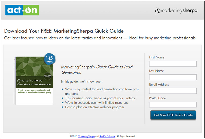
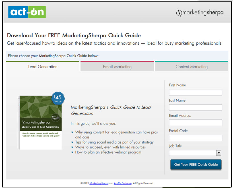
The control lead gen page design was a single offer, short form page that featured only four form fields with a free downloadable MarketingSherpa Quick Guide, a $45 value, as an incentive.
We needed to identify a baseline for comparison to the other treatments. This control allowed us the opportunity to test multiple aspects of lead generation in one test.
Does choice of incentive lead to higher perceived value which results in more lead completions? Will this perceived value be enough for visitors to battle more friction in a longer lead generation form?
Treatment #1
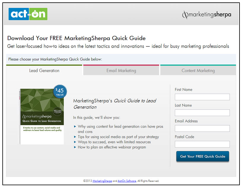
In Treatment #1, the design was also a short form layout. We hypothesized offering a choice of Quick Guides would allow visitors to perceive the incentives as having a higher value and increase overall lead captures.
And the crowd goes wild conservative
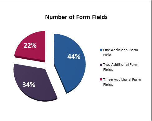
We left Treatment #2 up to the audience at Summit to design. We asked them how many additional form fields they wanted and what those form fields should be.
Surprisingly, 44% of our attendees decided to be conservative with their selection.
They chose to only add one additional form field. This could be a representation of what attendees were learning at Summit in regards to form length and completion rate.
But keep in mind, even though one additional form field was the majority vote in this case, there were still many attendees who wanted more form fields (56%). We did not have a chance to ask them why they made the decision they did, but I think it is reasonable to assume they wanted more lead information.
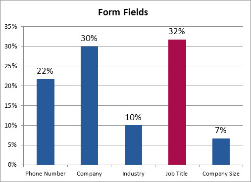
Now, let’s look at what type of form fields the audience wanted to add.
The audience’s choices continued to intrigue us. Job title was the top pick for the additional form. The majority may have decided a deeper context over direct contact was more valuable.
These marketers may have suspected that a phone number field was risky (phone number fields are susceptible to fake numbers) and decided to play it safe with job title.
Treatment #2
A concern our team had based on the audience’s treatment design was that the variation between the control and treatments had relatively low friction to begin with. How much friction can one additional form field about job title really add?
Apparently, it created a lot.
Results
There was no statistically significant difference between the control and Treatment #1, where the only difference was a choice of offers.
However, there was a statistical difference between Treatment #2 and the control. Treatment #2 decreased lead generation by 11.9% at a 99% level of confidence.
One form field had a significant impact and it wasn’t even a high friction question, just job title.
Our live test reiterated the point that marketers need to be strategic with lead generation forms. Prioritize the information you ask for and limit what you do upfront because it may lead to a negative impact on your overall lead generation.
Related Resources:
Lead Generation: How using science increased teleprospecting sales handoffs 304%
Lead Gen: A proposed replacement for BANT
Lead Generation: Who knows the customer better – Marketing or Sales?


