B2B Mobile Marketing: 3 ideas on where to spend your next mobile budget
Originally published on B2B LeadBlog
It’s hard to believe that this December will mark 10 years since I received my first cell phone as a gift on Christmas morning.
It was a black and white Nokia that I used for three things:
- Phone calls
- The occasional text
- Playing “Snake”
Needless to say, mobile devices have come a long way in 10 short years, with Americans now consuming 12% of their media through mobile phones. While this evolution of mobile devices has widely made accessing the Internet far more convenient for consumers, it has added a whole new challenge for digital marketers.
Although this media consumption is centered on B2C consumers, it’s worth keeping watch for two key reasons:
- The lines between B2C and B2B are growing more blurry (and debated) as B2I grows in relevance
- More than half (52%) of B2B marketers consider mobile marketing very important to influence their company growth in the next three years
We all know that mobile users are different. They want to find their valuable information quickly and easily. This is not always an easy task given the small screen size and touch functionality found on most mobile devices, but it is certainly not impossible to provide users with a compelling, user-friendly mobile experience.
In today’s B2B Lead Roundtable Blog, I’m going to share three spend ideas to help you balance value and reduce the overall user friction in your mobile experience.
Spend #1. Make convenience essential
Mobile users are exactly what their name entails. They are typically on-the-go and may not have long periods of time to learn how to navigate a site.
Ensuring that prospects can find the information they want as quickly and easily as possible is essential to ensure users have an enjoyable visit.
This is often difficult as mobile visitors expect a level of value similar to your website in a simplified format. But, there are options available to make your mobile site very convenient.
Utilizing one-touch tools across your mobile site will allow visitors to easily navigate without having to select multiple small calls-to-action.
One-touch CTAs allow the user to perform actions such as calling for assistance, finding a location near them, and adding an item to the cart. These are to ensure that a user can navigate as easily as possible.
Spend #2. Keep the mobile experience simple
As I’ve mentioned, your mobile experience should be convenient and user-friendly, allowing the visitor to easily access the information they are looking for.
Presenting them with a cluttered layout is the quickest way to get a user to bounce from your mobile site. Therefore, keeping it simple is the key to your success. While this may seem fairly intuitive, making this step a reality can be difficult.
Users come to a mobile site expecting it to have the same functionality as the desktop version, but on a screen a fraction of the size. It is extremely important to test your mobile site to determine the information and features that are most important to visitors, eliminating all unnecessary clutter.
While there will always be people in your organization that argue against the removal of certain information and features from a site, maintaining a simple layout is crucial to the success of your mobile site.
Spend #3. Keep the experience congruent across devices
This may be the one of the most difficult steps to accomplish when developing a mobile site, but in terms of continuity, it’s vital.
While your mobile site must be optimized for the mobile user, it should still have a similar feel to your desktop experience.
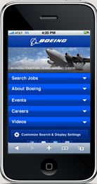
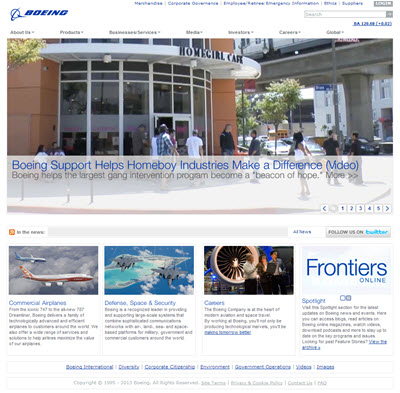
Let’s use Boeing as an example of what I’m talking about in terms of keeping your aesthetics congruent across multiple devices.
Many mobile visitors will already have a familiarity with your brand and have likely visited your desktop site prior to accessing the mobile version.
 So ideally, you want to ensure that the form and function of your mobile site are similar to that of your desktop version.
This will give these users a sense of familiarity with the site, even if it is their first mobile visit.
Even when your mobile site uses a similar structure, many users may still prefer the desktop version of a site. Make sure that you include an easy-to-find link – typically placed in the footer – allowing visitors to switch to the desktop version of your site on their mobile devices.
While creating an engaging mobile experience is not an easy feat to accomplish, it is certainly not impossible given the tools and resources available today.
Hopefully these three ideas will help you strike the right balance between value and friction on your own mobile site.
Also, share any tips you have for helping marketers develop a great mobile experience in the comments below.
Related Resources:
Mobile Marketing: What 4 top B2B companies can teach us about mobile
Lead Generation: Who knows the customer better – Marketing or Sales?


