


Marketing 101: What is the rule of thirds?
Marketing has a language all its own. This is our latest in a series of posts aimed at helping new marketers learn that language. What term do you find yourself explaining most often to new hires during onboarding? Let us know.
The rule of thirds is one of the first principles that all graphic designers, videographers, photographers and other creative roles learn. It’s a basic guideline for framing and image composition that results in the viewer seeing a balanced, more naturally flattering image.
To apply the rule, take your image and divide it into three parts vertically and again horizontally (it should look similar to a tic-tac-toe board.)
The rule states that the audience’s eye is naturally more drawn to the areas of the image nearest the intersection points. So, when you’re designing an image for a landing page, a social post, a PowerPoint slide, or even if you’re shooting a video, be sure to put the most important pieces of your image near these intersection points.
Applying the rule to video
Here is an example of a video frame from one of the most recent recent Quick Win Clinics published by our sister company, MarketingExperiments. The Quick Win Clinic series helps marketers with problems that are easy to solve but difficult to detect. Every week, Flint McGlaughlin, Managing Director, MECLABS Institute, takes a page submitted by the audience and optimizes it on the fly.
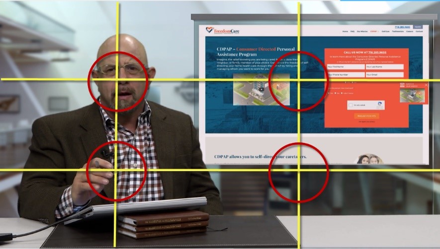
The primary piece of information we’d like the audience to see in this image is the person speaking, in this case, Flint McGlaughlin. You can see that Flint’s eyes are framed near the top left intersection point. As people, we are taught to look into the eyes of another person when talking to them. So framing an image so that a person’s eyes are near one of the points where the audience’s eye is naturally drawn makes a lot of sense.
The secondary piece of information in this image is the landing page at the top right of the frame. This is positioned so that the center of the page is near the top right intersection point, allowing the viewer to easily go from looking at Flint to looking at the page he is referencing.
Applying the rule to other mediums
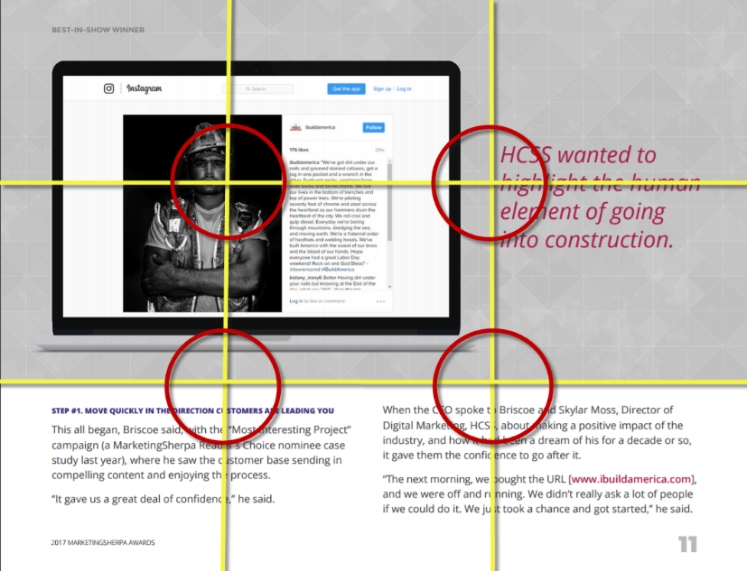
You can use this rule in more than just video though, below is an example of a page from the MarketingSherpa 2017 Awards book. You can see that when designing this page, our graphic designers used the rule of thirds to give a more natural feel to the divide in the page, as well as make sure the construction worker’s eyes were near one of the intersection points.
When it’s OK to break the rule
Just like most rules, there are certain circumstances when it’s OK to not use the rule of thirds. One of the most popular reasons to break the rule is when you have a symmetrical image.
It is well known that humans are naturally drawn to symmetry. For example, generally people whose faces are symmetrical are viewed as more attractive. We find beauty in natural balance. So anytime you are able to incorporate symmetry in your image, you should. Here’s a very recognizable example:

Source
Not only is the Taj Mahal itself a symmetrical building, but the photographer of this image used the reflection in the water as another form of symmetry, making it a very flattering image to the eye.
Next time you’re designing an image for a piece of marketing collateral, think about using the rule of thirds.
You might also like…
Should you focus on design or usability
Email Marketing: Combining design and content for mobile success
Get free reports, how-to guides and tools to help you improve your marketing
Categories: Design design, marketing 101, marketing terms, rule of thirds, video


