Mobile Interaction: Website or app? Optimize for both
Over the past several years, marketers have often been faced with the conundrum of where to allocate funds in order to better compete in the mobile space. Should I focus my budget on the mobile app for my business, on making the website optimized for multiple device types (responsive or adaptive) or should I attempt to do both?
Take user behavior into account
While I feel like the question above has been well documented in other resources, I think one of the most important concepts to keep in mind is that whether you are focusing on a mobile app or on your website, user behavior should be considered first.
As the expectations of the billions of users with mobile devices continue to converge, the question should no longer focus on which medium (the mobile web or an app) you should focus on connecting with your users on, but instead on how you can most effectively connect with them no matter which medium you choose.
Luckily, there are numerous transferable principles between the world of app interaction and web design that can be applied with relatively little effort on your part.
Visual attention vs. interaction
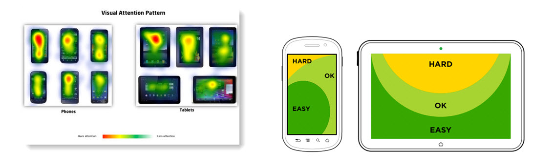
Don’t forget the classics. Despite the ever-expanding screen sizes of devices, in most regions, people still start reading at the top left of their device. However, it is important to remember that on touch-reliant devices, interacting with content at the top of the screen with your thumb has become increasingly more difficult as screen sizes in mobile devices have grown.
Why do you think Apple implemented a new “Reachability” control on the iPhone 6 that brings content from the top of the screen down about a third of the phone?
This being said, whether you have an app or a mobile site, make sure you prioritize content you want read at the top of the screen, but be selective in placing content you want interacted with at the top of most screens.
For items such as buttons, filters, drop-downs, quick navigation, etc., consider utilizing real-estate toward the bottom of the screen instead of toward the top to make the user’s life easier. Menus and navigation are still generally better at the top of the screen as the menu “hamburger” (see screenshot below) now seems to be so ubiquitous that it has become web-standard for responsive sites Techcrunch also offers a great article on mobile navigation and reasons to “kill the hamburger” here.