


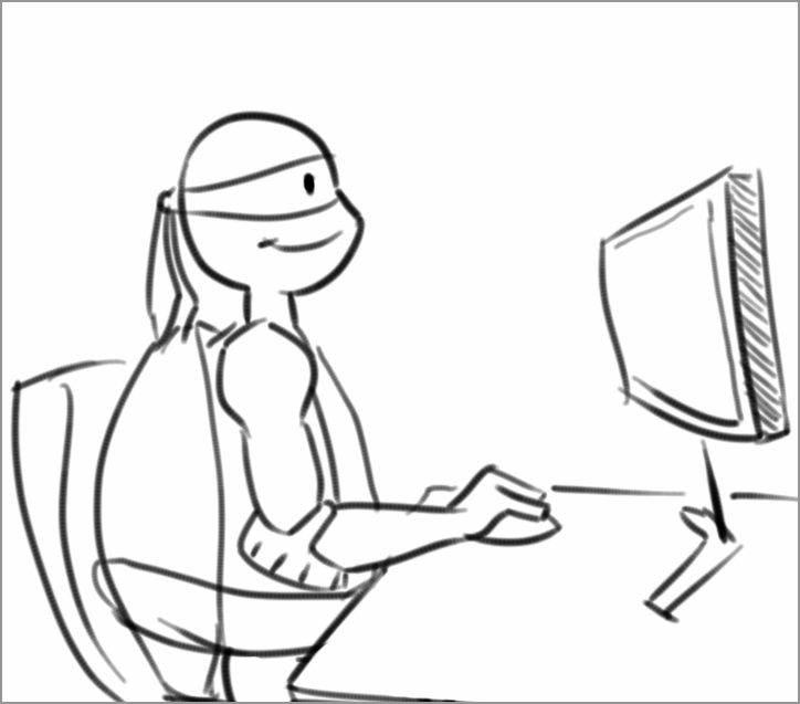
Landing Page Optimization: Which ninja turtle is your page?
 Assuming you don’t live in a shell, you have probably seen or heard of the Teenage Mutant Ninja Turtles. They’re the immensely popular superhero group that began as a comic in the 80s, and reached peak popularity in the 90s, and to this day, maintains a cult following with children and adults alike.
Even as fun and interesting as the premise is, we can still ask the question: Why have they stayed so popular over the years?
My take is it’s because of the characters.
The dynamic brothers, consisting of Leonardo, Raphael, Donatello and Michelangelo, have so much variety in their personalities, which allows them to approach problem-solving situations in any multitude of ways. This also allows for a lot of creative freedom on the creators’ end.
Personality is what captures an audience, as well as builds a brand.
Your landing page has, or can have, just as much personality as a character, whether you realize it or not. Below are four different characteristics of landing pages, named after the four different turtles:
- Leo: clear, simple, collected, peaceful
- Raph: aggressive, loud, attention-grabbing, urgent
- Donnie: calm, intelligent, factual, to-the-point
- Mikey: fun, silly, lighthearted, nonchalant, social
This can all be traced back to the Four Temperaments (or Four Humors) that the turtle characters are based on.
The four temperaments is a psychological theory that suggests that there are four fundamental personality types, which can be applied to marketing campaigns (and thus landing pages) as well.
Below are examples of different pages and how they fit into each of the four categories. A well-rounded page may fit into multiple categories, with the “perfect” page containing features of the entire cast.
Type #1. Leo
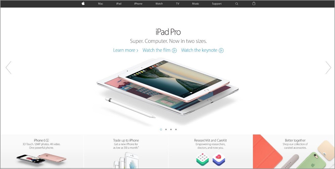
Source: Apple
Used most ideally by tech giants for casual market, this page is sleek, simple, elegant and relaxed. These pages also tend to be very clear, showcasing the hottest or newest product right off the bat, which provides the consumer an immediate call-to-action.
This page is for highly aesthetic products that have a clear value proposition, and cater to a savvy customer group who typically would have their desired product already in mind.
On the page above, you can see the new iPad Pro, with links to recent information and videos describing it. This page will change based on whatever product needs to be highlighted, though it’s function and layout would most likely stay the same.
Type #2. Raph

Source: KOHL’S
Used most ideally by ecommerce sites, nonprofits and sometimes political campaigns, these pages tend to be loud, demanding and busy.
This page, for example, is shouting all of Kohl’s sales and promotions from the get-go. While too much information at once can be harmful for the wrong audience, Kohl’s seems to understand that its audience is entering the site needing a nudge or small incentive into the purchase funnel.
Assuming that customers are entering the site to buy a specific item, these offers have the potential to encourage them to buy more while they’re looking around. Also, the timed sales and the frantic layout combines to create a sense of urgency.
Type #3. Donnie
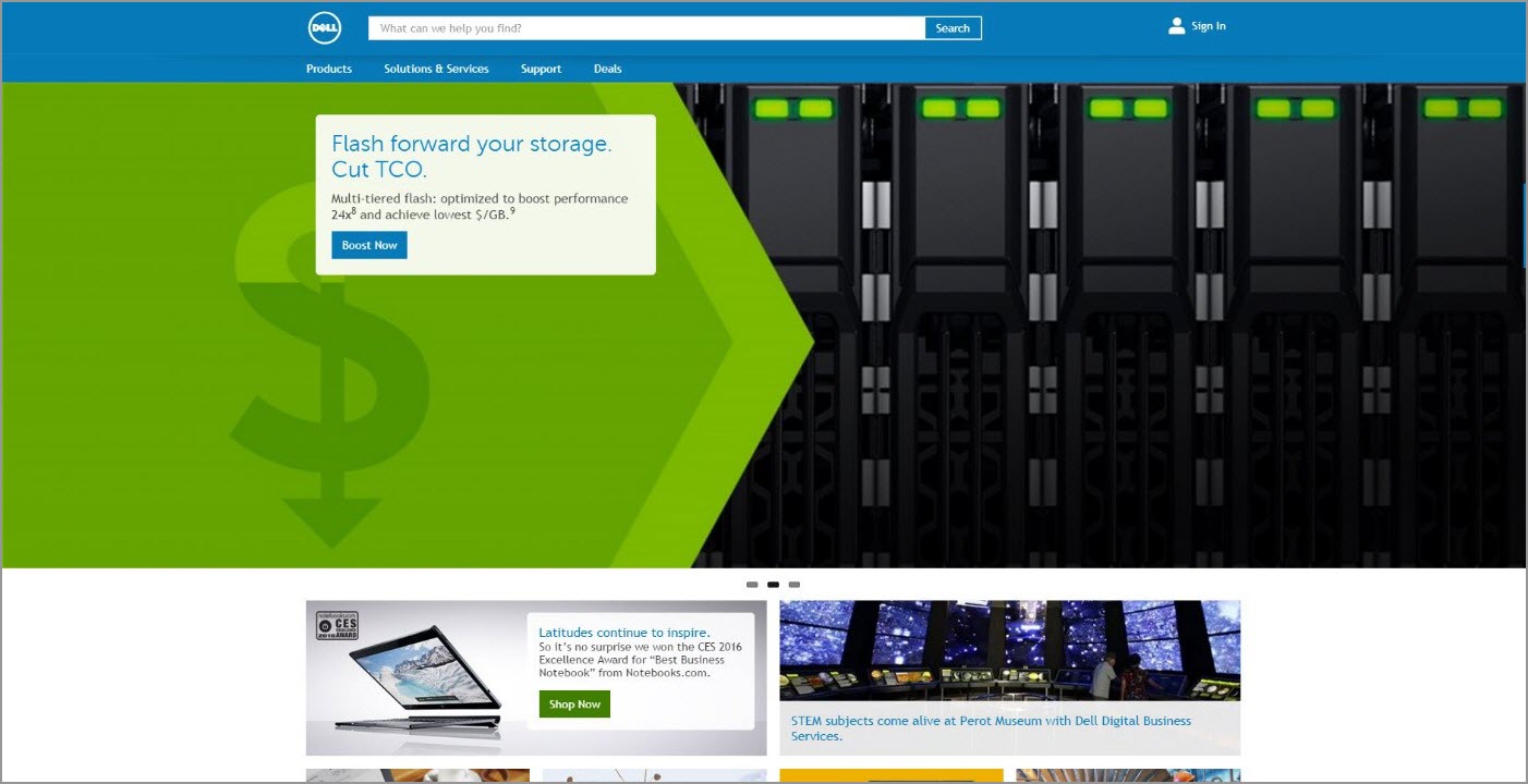
Source: Dell
This type is used most ideally for sites catering to consumers seeking specifics, such as tech giants, healthcare or medical sites, B2Bs and news organizations. The focus is on presenting visitors with factual and technical information.
Dell’s page, for example, shows off various products with descriptions of main value proposition. While Apple consumers do buy machines with performance in mind, there’s definitely a large consumer base (one might argue a “fan base”) that continue to buy Apple’s iPads and iPhones because they’re comfortable, easy to use and attractive.
People buying Dell’s, on the other hand, need the product for work or high-end gaming and computing. That means they want to see the specs right off the bat, before clicking through to the product’s page.
Type #4. Mikey
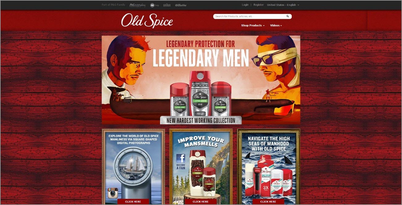
Source: Old Spice
These landing pages are usually associated with legacy brands that may have a very specific voice with an established following. This following allows brands to be riskier and more familiar with customers. They often focus more on personality than on the all-mighty “ask.”
The entire team
If you watched the show or read the comics, you’ll know that when the Ninja Turtles fight together, they create a mean, green, butt-kicking machine. While combining all of these personalities seems like it might create a cluttered mess, it actually produces a self-actualized, fully formed persona to attract a wide swath of customers.
Below is an example of a page that showcases each of the personality traits:
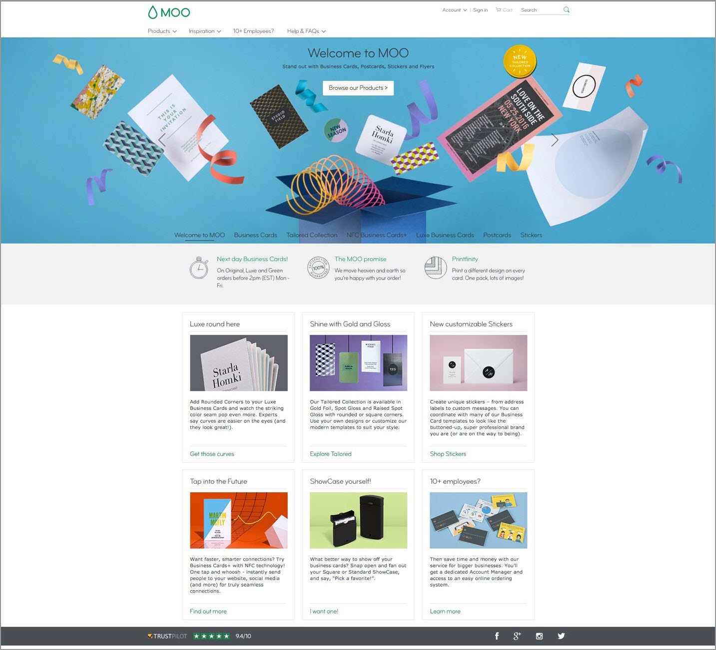
Source: MOO
Moo.com’s landing page is designed to show off all of the different designs and card stocks, so the personality combination approach works well for its diverse customer base. The page uses the given space excellently to showcase to the consumer each design and type of business card it would suit.
Its layout is collected and subtle, yet grabs your attention. It is smart and to-the-point, while maintaining a lighthearted and fun vibe. The text is written in a cordial way, yet also gives clarity to what the brand is driving customers to. This approach fully promotes the value and, more importantly, the quality of the service and product.
Do you know which ninja turtle your page would be? Let us know in the comments below.
You might also like
MECLABS Institute Landing Page Optimization Online Course [From MECLABS Institute, parent company of MarketingSherpa]
Landing Page Optimization: Simple, value-infused page increases leads 8% in 24-hour test [MarketingSherpa case study]
Content Marketing: Targeted persona strategy lifts sales leads 124% [MarketingSherpa Case Study]
Categories: Website And Landing Page Design b2b, B2C, landing page, optimization, personas, testing


Wonderful article. I am starting to get the idea that the home page is not the most important page on a website. Google wants to take the end user straight to the page with the content that he wants to read, not a home page. Thanks for the insight.