E-commerce: 3 test ideas to optimize the customer shopping experience
Last weekend, I was able to see the dichotomy between gathering valuable customer information and risking customer conversion play out before my very eyes.
I had roamed into a local Sears department store on a Sunday afternoon when I came across just the type of skirt I had been coveting.
Better yet, in my favorite color – and wait, 50% off?!
My motivation to have that skirt was high. As I sailed to the checkout line in the women’s apparel section, my shopper’s high began to dissipate as I observed an alarmingly long line. Although I wasn’t in a particular hurry, I promptly determined my time might be better spent searching for a shorter line in a different department.
As I walked swiftly past the stainless steel refrigerators and lawn mowers, I reluctantly joined a slightly less daunting checkout in the men’s department. As I waited patiently, I began to realize why my fellow bargain-hunters and I were not moving along as swiftly as one might project:
And can I have your ZIP code, please? And what is your phone number? And your email address? Yes, ma’am, an email address. And would you like to use your customer rewards today? Do you have any coupons? Would you like to sign up and save 20% today? It will just take a minute; we just need your driver’s license.
I continued to hear this same barrage of questioning to each and every individual ahead of me, young and old.
Many of the elderly shoppers appeared visibly anxious after the request for an email address, resulting in further delay while the cashier clarified what it was for.
“I thought I could just nip in and out of here!” groaned the lady behind me. “I’m putting these shoes back, I don’t need them that badly and my husband is waiting in the car.”
Another shopper in front of me commented, “I hear them asking about coupons, was there one in the paper today? Maybe I should come back later.”
As I watched these shoppers abandon their quest, I wondered if the benefit to gathering all of this wonderful personal information comes at too high of a cost. How does this same experience play out online?
How to transfer discoveries from brick-and-mortar peers to your website
Clearly, there are some important distinctions to be drawn between brick-and-mortar shopping experiences versus shopping online from the comfort of your couch.
However, visualizing how a website would play out in a physical store may help digital marketers develop their strategy for a more optimal experience for their visitors and spark testing ideas.
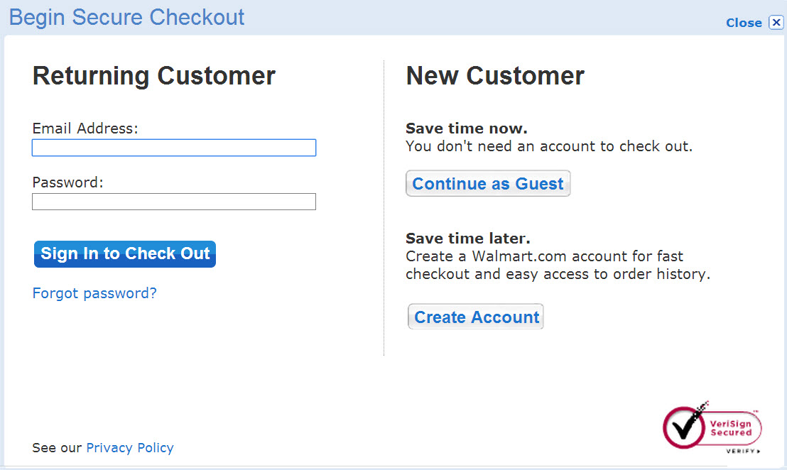
Idea #1. Test a guest option to speed up checkout
Providing a customer with the option to check out as a guest and forgo establishing a username, password and other non-vital fields may be advantageous to accommodate a visitor seeking to make a speedy transaction.
Research from Toluna found 25.6% of online consumers would abandon a purchase if they were forced to register first.
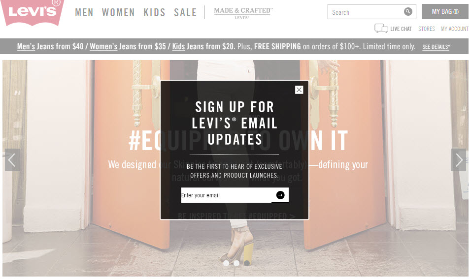
Idea #2. Cut out email overlays on the homepage
Would we have an employee posted at the entrance to a store requesting an email address before they can come in and shop?
Many of you savvy marketers are hopefully shaking your head. Of course not. I just want to come in and browse; why do you need my email address? However, many popular companies continue to greet visitors in this manner.
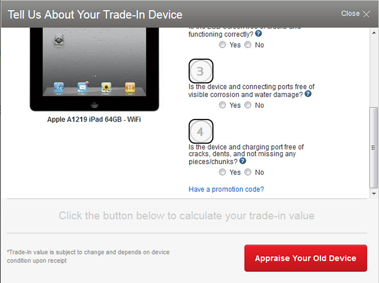
Idea #3. Coupon code boxes may be a conversion killer
When the shopper ahead of me at Sears heard there were coupons available, she quickly made the decision that her perceived value of the item no longer matched its cost without first hunting down that elusive coupon.
Many websites use coupon code boxes, but what is the effect of the field on conversion?
I imagine there are many customers like me who will halt at the sign of a coupon box and leave the page to commence a separate coupon search first.
If there’s a chance to save money floating around out there, I want to find it before I buy something for full price.
This begs the question: If customers can’t find that coupon, do they return to complete their purchase?
Perhaps it would be worth testing a coupon field that is de-emphasized to help deter the visitor from leaving before they complete the checkout process.
Building a winning shopping experience means putting customers first
At the end of the day, it’s important to realize that you’re surrounded by inspiration.
It can come from the customer interactions you see in front of you at the checkout line in your local supermarket, while bargain hunting a clearance rack, or even from your discovery of the perfect skirt.
But what really makes online testing so powerful is that it turns inspiration into discovery, which all boils down to finding new ways to put customers first in a shopping experience that better serves them.
You may also like
Marketing Research Chart: Measuring website optimization ROI [Research chart]
B2C Web Optimization: 23% lift in conversions by optimizing step one of funnel [Case study]
B2B Web Optimization: 140% surge in mobile transactions through responsive design effort [Case study]
Categories: Ecommerce Eretail improve customer experience, marketing insights, marketing strategy, reduce purchase abandonment




Thanks for sharing Laura. In my experience, #1 is a big one – it can often be better to move the registration to after the purchase. As for #2 (the email popup), I think it *can* be effective (email lists often convert very well), but certainly it needs to be measured and various approaches / styles should be tested to see what works best without alienating potential buyers. Great post!
Thanks so much for your feedback, Arun! Absolutely agree, 2 could be affective….depending on the incentive for signing up of course. Would make for a great test…weighing the increase in bounce rates resulting in lost conversions against the added conversions created from additional emails obtained, right?
Thanks for reading!
Hey Laura,
Nice post! I just wanted to reach out and let you know that I included it in the Nexcess roundup of April’s best Magento/eCommerce content. http://blog.nexcess.net/2014/05/02/aprils-best-expressionengine-wordpress-magento-content/ Thanks again for the valuable resource.
Ben