Archive

Author Archive

A/B Testing: How adding a second CTA increased clickthrough 291%

February 23rd, 2015

Originally published on B2B LeadBlog

How do you serve “ready to buy” customers and “just looking” prospects on the same page?

You don’t want to alienate one group while speaking to the other. However, you still need to offer both sets of customers the next step they need no matter their level of interest.

To answer that question and more for one B2B SaaS nonprofit, Jon Powell, Senior Executive Research and Development Manager, MECLABS Institute, worked with Shari Tishman, Director of Engagement, and Lauren Wagner, Senior Manager of Engagement, both of VolunteerMatch.

VolunteerMatch was selected as the “client” for this year’s Email Summit live test. The team designed a three-part series of experiments, the first two leading up the interactive live test to launch tomorrow, Feb. 24, here at Summit.

Since today marks the first day of Summit activities I’ll be giving you a behind the scenes look at Test No. 2 of the series. Check out the MarketingExperiments Blog to learn about the test background and call for treatment ideas and to learn about the results and what they mean. VolunteerMatch
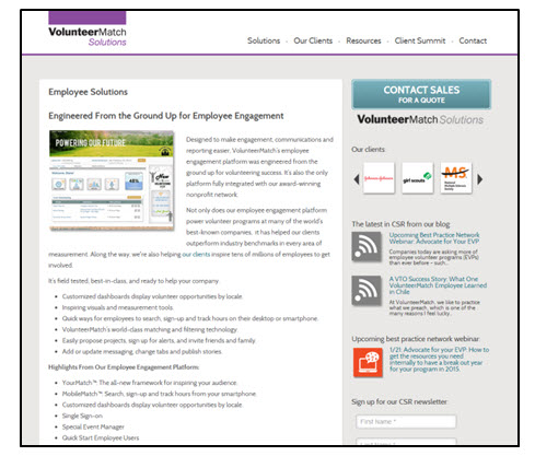
Before we get into the specifics of this test, let’s review why this test is important to the series. The solutions page test will help us to understand the most attractive derivative value for actual sales-ready leads to include in the call-to-action section of the email for optimization at the Summit.

Basically, we should be able to take what we previously learned about prospects and transfer it to another channel of testing: email.


Experiment background

Primary Research Question: Which call-to-action variable cluster will achieve the highest contact page conversion rate?

Secondary Question: Which call-to-action variable cluster will achieve the highest total page click-through rate?

Test Design: A/B split test

Before the test

Prior to the test and its control, the VolunteerMatch team had already updated the call-to-action (CTA) on the product page. The original CTA read, “Let’s Get Started Together.”CTA1 While the CTA did a good job of attracting customers across the spectrum of motivation levels, it seemed the pipeline became full of leads not motivated enough to move forward. This caused a lot of fruitless time for the sales staff. Motivation   That led the team to create a new CTA, which is the control for this test.

Control

To limit the amount of leads entering the pipeline, so that there are more qualified prospects, the team changed the copy to “Contact Sales for a Quote.”CTA2 Motivation2However, this left no option for those prospects simply trying to learn more. This lead to the creation of the two-option CTA for the treatment.

Treatment

When conducting analysis on the solutions page, click tracking showed that 2.39% of visitors were leaving the page to go to the demo page.

Since that would be a useful place for prospects to learn more if they weren’t ready to buy, the team thought it would make the most sense as a secondary CTA. Instead of letting those lower-motivated prospects blindly stumble around the site, a demo CTA would allow VolunteerMatch to guide them there. CTA3The copy of the Contact Sales CTA was also changed. The team hypothesized that “Contact Sales” could have produced a high-level of anxiety in visitors.
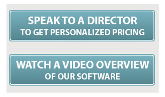
There was also a lack of clarity. What exactly does “contact” mean? And what will a quote consist of? To help answer some of those concerns, the team developed the “Speak to a Director” treatment of the CTA.

Results

Let’s look at the metric results to the secondary research question: overall clickthrough rate. ResultsAs you can see, adding another CTA increased overall clickthrough. The question after that would be if it this impacted the clickthrough to the Contact Sales CTA. However, there was no statistical difference between the control and the treatment.

In fact, no visitor who clicked through to the sales contact form page on the control filled out the form. However, of those who landed on the sales contact page from the treatment, 30% of visitors filled out the form.

Additionally, of the 8.1% visitors to click on the demo CTA, 12.5% of them converted on the demo.


What you need to know

It’s possible to serve two groups of prospects on one solutions or product page. There can be fear when adding a second CTA that you will lose clickthrough or leads, but you won’t know if you don’t test.

For VolunteerMatch, that wasn’t the case at all. The second CTA did not diminish clickthrough to the contact form page. Rather, it seems as if the update copy in addition with another option to learn more allowed better qualified visitors to click through, seeing as the rate of completion went up.

Additionally, we were able to better guide lower sales-ready visitors to a page that might be better suited for them: the demo.

Adding the demo CTA allowed us to decrease the need for unsupervised thinking on the part of visitors. If left to themselves, visitors might not have found the demo and could have left the site without gaining information that would have led to an eventual sale.


Email Summit live test

Be sure to attend Jon’s session tomorrow after lunch with VolunteerMatch – “Hands-on Live Test Lab: Learn how to improve your already successful marketing” – to contribute to the live test.

If you’re not able to join us here in Las Vegas this week, we’ll be sharing a case study about the Email Summit live test in the MarketingSherpa B2B Marketing newsletter after Summit.


If you liked to learn all of the top takeaways from Email Summit 2015, stay tuned to the MarketingSherpa Email Marketing Newsletter. An event recap with everything you need to know will be published in the coming weeks.

You can follow Selena Blue, Manager of Editorial Content, MECLABS Institute on Twitter at @SelenaLBlue.


You might also like

MarketingSherpa Email Summit 2015 – February 23-26, ARIA Resort, Las Vegas

Lead Management: How a B2B SaaS nonprofit decreased its sales cycle 99% [MarketingSherpa case study]

Lead Generation: The power of copy [More from the blogs]

5 Traits the Best Calls-to-action All Share in Common [More from the blogs]

Nonprofit Marketing: 3 tips to increase year-end revenue

November 14th, 2014

With the end of the year approaching fast, it’s not only retail industry marketers who have campaigns to implement. It’s also a busy season for nonprofit marketers – a time of the year for holiday giving and year-end contributions.

What can nonprofit marketers do to increase their fourth quarter revenue? We’re sharing three tips for you that have proven effective for others, and might prove useful for you, too.


Tip #1. Coordinate your offline and online marketing efforts

It can be hard to stand out in a crowded mailbox – both your physical mail box and email inbox. That’s why HealthConnect One wanted use both channels in its year-end campaign. The team had previously sent out direct mail including an appeal letter to its supporters, but they decided email might be a great way to reinforce the message.

By creating a four-email campaign around the direct mail piece, the nonprofit saw a 50% increase in revenue compared to the prior year. To see the emails and learn more about the campaign, check out the MarketingSherpa case study, “Email Marketing: Four short emails boost year-end revenue 50% for nonprofit organization.”


Tip #2. Provide “quick donate” links for previous donors

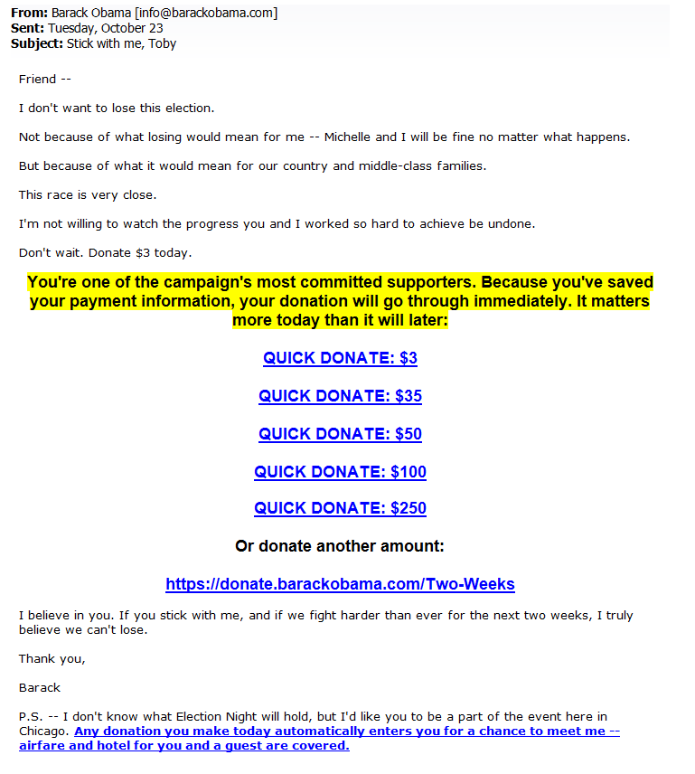
The Obama for America campaign wanted to enable repeat donors to effortlessly give again. This required a few steps.

First, they encouraged donors to save their payment information during checkout. Second, they sent out emails with multiple calls-to-action (CTA) for different contribution levels. Third, with one click of the CTA, donors could donate again without visiting a landing page or filling out a form.

obama-email


The result? Conversion rates increased 300% on average when using the links.

To learn more about this tip and other tactics the campaign used, read the MarketingSherpa case study, “Email Testing: How the Obama campaign generated approximately $500 million in donations from email marketing.”

Read more…

Email Marketing: Combining design and content for mobile success

July 1st, 2014

400%.

That’s how much mobile email opens have increased in just three years.

“Which is kind of crazy,” Justine Jordan, Marketing Director, Litmus, said following the recent statistics from Litmus’ research on mobile.

And she’s right. How many channels increase that much in usage in that short amount of time? Not many.

Because of the sudden growth, not all marketing departments have been able to keep up with the trend.

With 50% of emails being opened on a mobile device, mobile email strategy is worth considering for any market, even B2B companies.

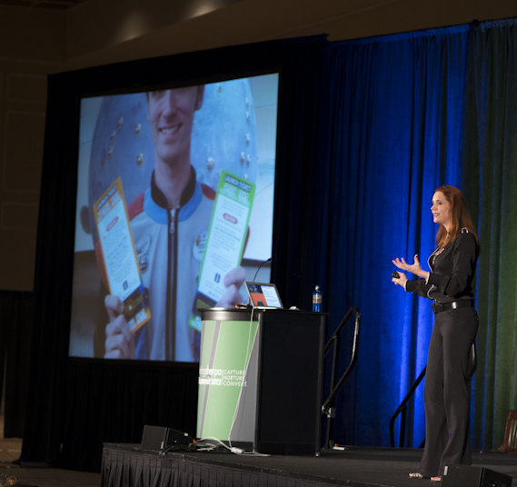
Justine spoke at MarketingSherpa Email Summit 2014 as an industry perspective in the session, “Email Design: How to optimize for ALL environments in a mobile world.”

She joined Allison Banko, Reporter, MECLABS, in the MarketingSherpa Email Summit 2014 Media Center. There, she recapped her industry perspective session, as well as hit on two mistakes she still sees among mobile emails: content strategy and best practices of mobile design.

“It’s key to get those two things working in tandem to really optimize the full experience,” she said.


In addition to her industry perspective session, Justine also joined a diverse panel of experts, solution providers and brand-side marketers on responsive email design. Watch a brief excerpt from that panel discussion below:

  Read more…

Content Marketing: 4 stages to mapping your content strategy

April 28th, 2014

Originally published on B2B LeadBlog

Effective content marketing starts with listening to customers to truly understand them, and then identifying the personas of your audience, according to Ninan Chacko, CEO, PR Newswire.

But it’s what you do with that gathered information that makes the biggest difference.

In his keynote at MarketingSherpa Lead Gen Summit 2013, Ninan explained the five steps to effective content marketing. The third step requires marketers to “map the content to the cognitive process of each persona.”

While each industry will vary, research has found four key milestones most lead nurturing processes have in common. Within each of those key stages, you can find common objectives and content types.

In the video excerpt above, Ninan discusses stage three — intent — which helps you map customer concerns to your content that addresses and alleviates those concerns.

To learn about the other four steps to content marketing, watch the full video presentation of Ninan’s keynote. In it, you’ll also learn:

  • How content has and will always impact media
  • The role content has in influencing decisions
  • How to discipline content marketing to influence decisions

You may also like

Content Marketing: Targeted persona strategy lifts sales leads 124% [Case study]

Do You Make These 5 Mistakes in Content Marketing? [More from the blogs]

Marketing Research Chart: Which channels do your peers produce content on? [Learn from your peers]

Email Marketing: 4 steps to optimize a mobile experience for better conversion

April 15th, 2014

Mobile is big, but just how big is it?

Justine Jordan, Marketing Director, Litmus, posed that question during her Industry Perspective session, “Email Design: How to optimize for all environments in a mobile world,” at MarketingSherpa Email Summit 2014.

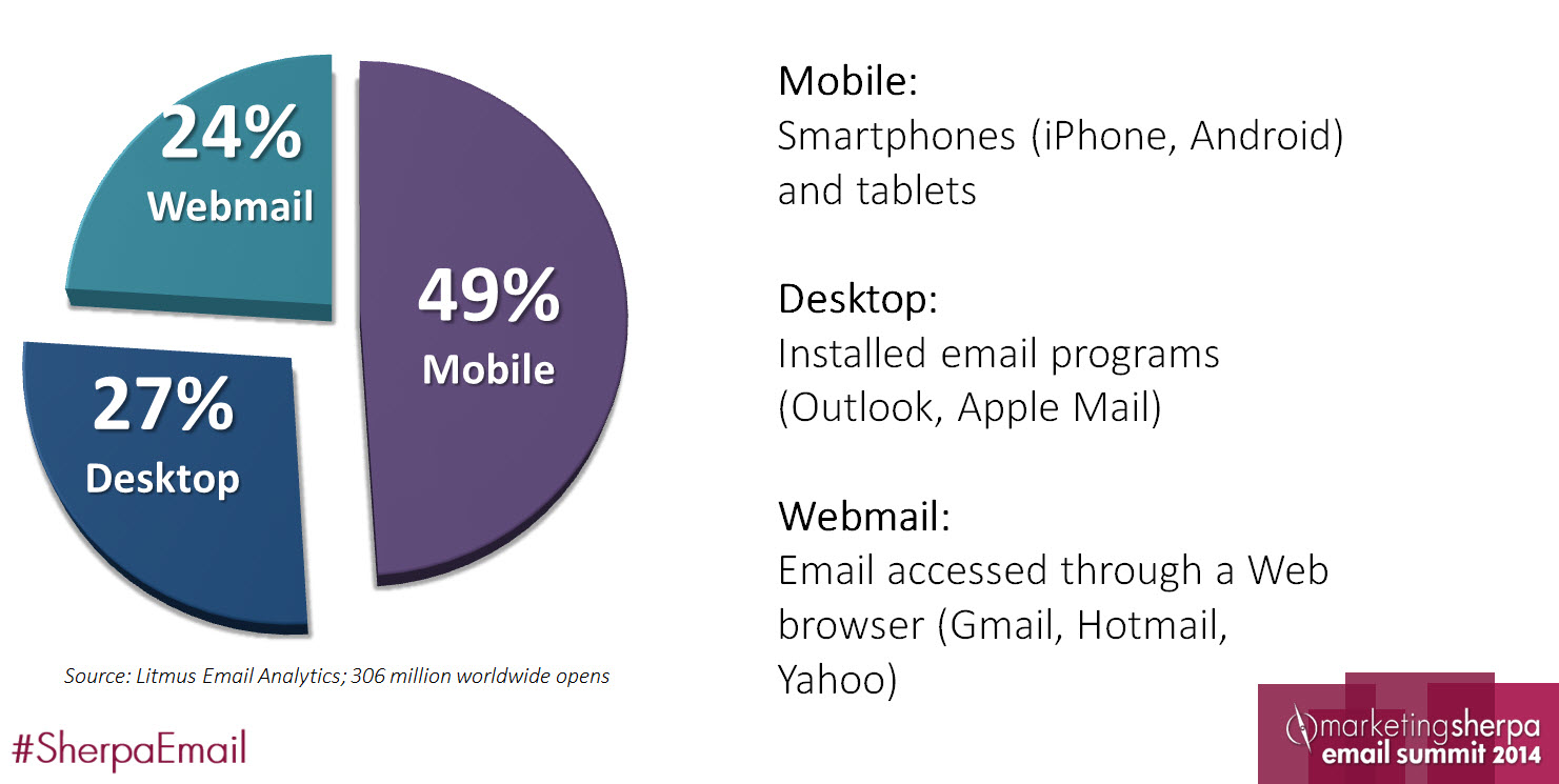
mobile-demographics-chart


Almost half of all emails are opened on mobile devices, according to Litmus research. That’s definitely big – especially since it was just three years ago that Litmus found only 10% of emails were opened on mobile.

So what can we do to capitalize on this drastic shift?

Justine said we need to re-examine the subscriber experience from the mobile user’s perspective. While she covered the whole path, we’ll hit on four of the steps subscribers experience.

 mobile-conversion-path


Step #1. Don’t ignore pre-header text

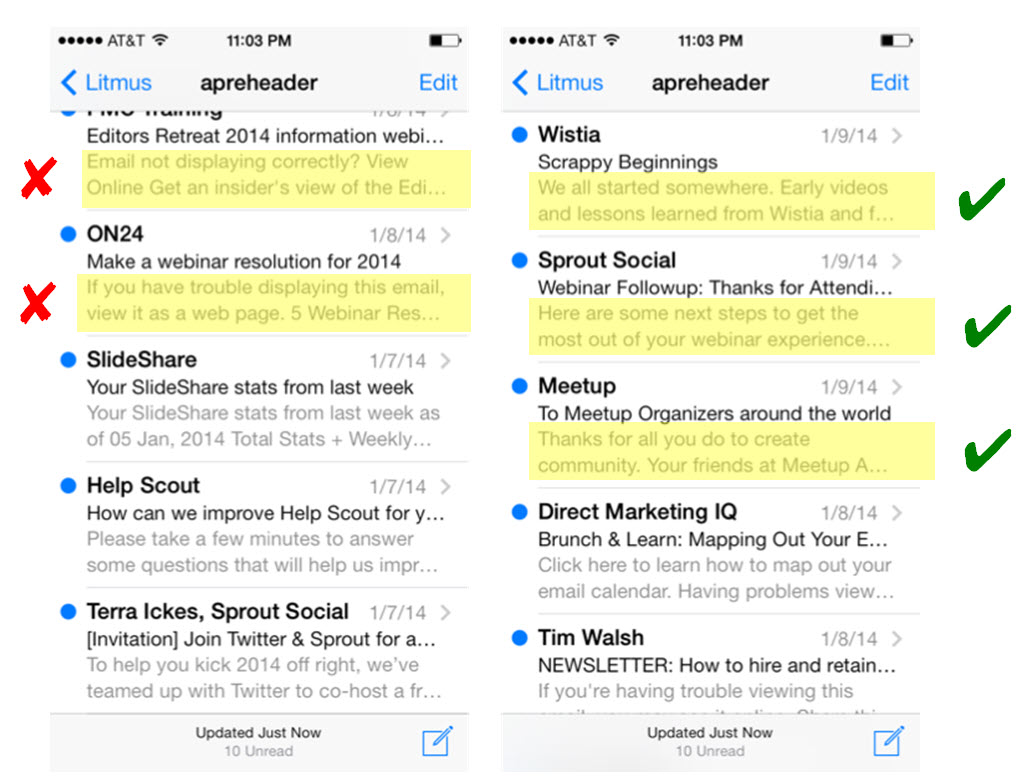
Many inboxes are formatted so that users can see not only the subject line, but also a line of additional text in the email. This text is pulled from the first bit of text at the top of your email. However, you can hide this text and still have it show in the pre-header area if you wish.

The default text for most templates is not very valuable messaging. She showed these examples of dos and don’ts to the Summit audience:

mobile-preheader-examples


“My challenge to you is, is this a positive brand experience? Is this really what you want people to associate with your ‘From’ name and subject line? Go back and re-evaluate your pre-header text – it’s showing up in mobile inboxes everywhere,” Justine advised.

She suggested making your pre-header “tie into the subject line, bringing [readers] in and encouraging the click.”

The pre-header is another opportunity to infuse value into your email – don’t let it go to waste. iPhones cut your subject lines off at about 35 characters.


Step #2. Embrace scrolling in an opened email

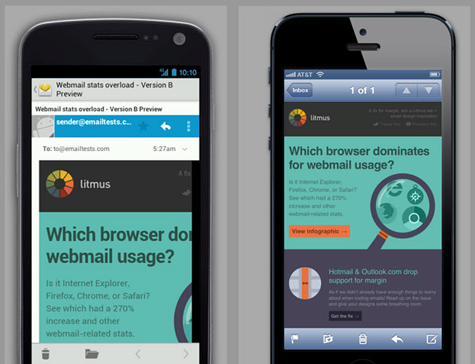
mobile-email-comparison


This is the same email but it looks completely different. Why?

“It’s because not every smartphone or mobile device is going to support HTML and CSS or even display the email in similar way,” Justine said.

Plus, Android devices vary in what they do and don’t support, so they can be challenging to work with. Some scale the email, some cut off the right side of an email and some support responsive design. Justine said iPhones are a little friendlier, scaling to a 320-pixel width.

But with scaling comes other issues to keep in mind: text and images resize as well.

Justine hit on another key aspect of the user’s experience after opening an email on your email: scrolling.

“Scrolling is a really natural behavior on any mobile device,” she said. “Clicking, or tapping, represents a decision. It’s a point of friction that people are going to either have to embrace or move past.”

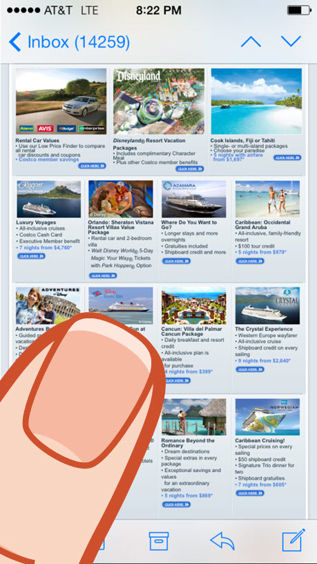
mobile-site-clicksIn an email like the one to the right, you don’t know where you’ll be tapping. Where will your finger land with so many small choices? You need to make the user experience more friendly in emails. You don’t need to compact as many options as possible “above the fold.” There is no fold on your iPhone.

“Embrace the scroll; people are inherently going to scroll on mobile devices,” Justine said.


Step #3. Recognize a finger is the new mouse

On mobile devices, people are not clicking. Instead, they’re tapping, rendering your “Click Here” call-to-action illogical. There is no mouse to click on a smartphone – only a finger, or stylus, to tap.

“’Click Here’ is a really crappy call-to-action anyway. You need to add a lot value, make sure the buttons are topical, and tell people what they’re going to get when they click or tap on your emails,” Justine said.

The “tap” experience is more than the text of your buttons and calls-to-action. It’s also about the area or location you want to physically tap.

Justine said, “You no longer have a one by one [pixel] target area. It’s more like a 40 by 40 target area.”

A finger requires more tapping space than a mouse needs clicking space. Make sure they can actually tap on that valuable CTA you crafted.

  Read more…

Top MarketingSherpa Blog Posts of 2013: 10 lessons in social media, content and email marketing

December 26th, 2013

After tallying up the number of times our audience shared posts, social media, content and email marketing are the areas to receive the most tweets from your peers. That means inbound marketing as a whole once again reigned supreme on the MarketingSherpa Blog, earning 10 of the top 15 spots of 2013. We’ll break down these three areas with key lessons we can learn and apply to our efforts in the new year.

And, since this list is all about the tweets, we’ll include some interesting ones about select posts. Carry on to learn the top 10 lessons of 2013.


Social Media Lessons

Lesson #1. Adapt your social content so that it is appropriate for each social media platform 

In his post, “Social Media Marketing: Which type of content is appropriate for different platforms?” Jonathan Greene, Business Intelligence Manager, MECLABS, used an unusual set of analogies to help marketers understand what tone and content to use on Facebook, Twitter and LinkedIn.

Read this post to learn about the personality each platform has, and how you can effectively put them to work.


Lesson #2. Be able to answer why customers should like or follow you

When it comes to social media buttons, you should ask yourself why your customers should follow you. This can be a tougher question for companies that aren’t natural content producers.

You must provide some value for customers in exchange for the privilege to show up in their newsfeed. Value can be ongoing, like exclusive discounts just for Twitter followers, or a one-time opportunity, such as a chance to win a prize.

Read more about this question, and three others, in the post, “Social Media Marketing: 4 questions to ask yourself about social media buttons.” You can also use value proposition to better answer this question, as described by Jonathan Greene in this post, “Social Media Marketing: Why should I like or follow you?


Lesson #3. Add visual elements to your social media content

While a quote is just words, it doesn’t mean you can’t bring a visual component to the content. The New York Public Library created graphics for an already popular content type –  celebrity quotes – to create a social media campaign with impressive results. Learn more about its efforts from Courtney Eckerle, Manager of Editorial Content, MECLABS: “Social Media Marketing: How New York Public Library increased card sign-ups by 35%.”

Interestingly, it seems this post was the most shared on Twitter for certain individuals:


Lesson #4. Go beyond the “like” to track your social media success

David Kirkpatrick, Manager of Editorial Content, MECLABS, broke down a chart covering social media marketing metrics tracking in the post, “Social Media Marketing: Social metrics from “likes” to ROI.” While social reach (e.g., “likes”) tops the list, some marketers are also measuring ROI, leads and conversion. See what other metrics your peers are using to benchmark success in their organizations.


Content Marketing Lessons

Lesson #5. Analyze your blog to identify areas for improvement

There are a lot of elements that make up your blog. When was the last time you stood back to evaluate if all of those pieces were working as well as they could?

In his post, “Content Marketing: An 8-point analysis for your blog,” Daniel Burstein, Director of Editorial Content, MECLABS, explained the eight points on which to focus your evaluation. From the frequency of your posts and their titles, to author bios and social media integration, you could have untapped potential waiting to be found.


Lesson #6. Use WordPress, or any tool, to its fullest potential

No matter what channel or platform you’re using, you want to get all you can out of it. For the post, “Content Marketing: 5 tips for WordPress blogging,” Erin Hogg, Copy Editor, MECLABS, broke down some ways she’s learned to improve a WordPress blog. Learn how to cross promote media with embedding, use basic HTML to improve the look and feel of a post, and more.


Lesson #7. Implement (and stick with) a style for your content

AP? Chicago? MLA? APA? There are many established styles, and one might work as-is for your organization. You could decide to create your own.  At MECLABS, we use the Associated Press Style Book as our foundation and supplement it with a set of our own guidelines.

No matter which direction you choose, it’s important to stick with the guide for all of your content. Having well-proofed and consistent content adds to the credibility of your content and builds the authority of your brand.

Erin Hogg explained this and other tips in her post, “Content Marketing: 7 copy editing tips to improve any content piece.”


Email Marketing Lessons

Lesson #8. Don’t forget about current customers when designing triggered email campaigns

In the post, “Email Marketing: 3 overlooked aspects of automated messages,” Daniel Burstein said nurturing current customers is one of the most overlooked automated email opportunities. He shared a list of triggered email types you can implement to strengthen relationships with you customers, including product education and upselling.

This post also features two other overlooked aspects of automated emails: customer lifetime value and the gap between what marketers should do and what they actually do.


Lesson #9. Test your emails to discover what really works for your audience

You could be using every best practice you’ve come across, but unless you know it’s best for your specific audience, then it might not be the practice you should be using. Testing lets you know what your audience best engages with.

Justin Bridegan, former Senior Marketing Manager, MECLABS, explained how testing revealed two segments of the MarketingSherpa email list prefer different email lengths. Read on to learn his other tips in the post, “Email Marketing: What I’ve learned from writing almost 1,000 emails for MarketingSherpa.”

Read more…

Mobile Marketing: 5 takeaways from MarketingSherpa case studies

February 28th, 2013

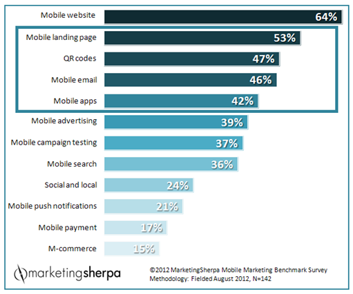
While looking through the MarketingSherpa 2012 Mobile Marketing Benchmark Report, I noticed a parallel between the top mobile tactics to be implemented within the next six months and the most recent case studies MarketingSherpa has published on mobile marketing.


Recent MarketingSherpa case studies have focused on four of the top five tactics, even touching on the top tactic, mobile website. Some marketers have started the implementation process of mobile marketing, and they have already seen great results. To help you get started on these top tactics, we pulled out the key takeaways from these case studies.

Read more…

12 Most-Tweeted MarketingSherpa Blog Posts of 2012: Inbound and email top the list

December 28th, 2012

This time last year, we put together the top 11 posts of the MarketingSherpa Blog for 2011, and social media marketing easily dominated the list. In 2012, email marketing put up a good fight, but social media marketing along with other inbound strategies and tactics still took the gold.

This year’s list focused on three areas: inbound, email and customer-centric marketing. Along with a brief summary of each post, you’ll also find some interesting tweets about select posts. Read on for 2012’s most popular MarketingSherpa Blog posts, as determined by your peers.


Inbound Marketing

Blog Awards: The 13 best marketing industry blogs (according to you)

Our top post of 2012 shared the results of the MarketingSherpa Reader’s Choice Awards, where we announced the 13 winning blogs, in a variety of categories, as decided by you, the MarketingSherpa Blog audience.

“If you’re looking for information to help you improve performance and advance your career, check these blogs out,” said Daniel Burstein, Director of Editorial Content, MECLABS, in the post.

Read more…

Customer-centric Marketing: 7 triggers to engage customers and build loyalty

August 30th, 2012

“How many of you believe you are more fascinating than the average person?”

Keynote speaker Sally Hogshead, who goes by Chief Fascination Officer at Fascinate, presented this question to the MarketingSherpa B2B Summit 2012 audience Tuesday afternoon.

Not many hands in the room went up, which supported Sally’s findings: Only 39% of people believe they are more “fascinating” than “average.”

What is fascination? According to Sally, it’s a moment of total emotional focus.

She has developed the 7 Triggers of Fascination, “which are deeply-rooted means of arousing intense interest.”  Each person, and brand, has primary and secondary triggers. These triggers indicate where your strength lies in fascinating others.

When your company fascinates your audience, your will get more engaged and loyal customers who are more likely to refer others.

That leaves marketers asking, “How can we create the moments of fascination with our consumers that use the same triggers we experience when we are fascinated?”

The seven triggers represent different paths or ways to fascinate your customers with your brand. So, let’s break down each one:

  Read more…

B2B Social Media Marketing: 5 career killers and how to overcome them

August 28th, 2012

Day one of B2B Summit 2012 has finally arrived.  Today, I had the opportunity to listen in on the panel discussion “5 B2B Social Media Career Killers … and how to overcome them.”

This session went beyond simply helping your company, and on to improving the future of your personal career.

MECLABS Director of Editorial Content Daniel Burstein moderated the panel of three B2B social media experts: Eddie Smith, Chief Revenue Officer, Topsy Labs; Chris Baggott, Chairman, Compendium; and Nichole Kelly, President, SME Digital.


With the introductions made, they jumped straight into the first B2B social media killer …

Read more…