Archive

Archive for the ‘Lead Generation’ Category

B2B Marketing: 3 simple tips for creating PPC ads

November 25th, 2013

Originally published on B2B LeadBlog

When it comes to PPC ads, writing copy with limited headline and description character spaces can be tough.

Copywriting in a confined space can feel more like an art, especially when you consider crafting social media PPC messaging for a highly targeted audience versus search engines ads, in which a keyword strategy impacts your message.

Overall, one thing I’ve seen in my experiences in working with our Research Partners is the basics of copywriting are often a first casualty in PPC ad design. Here are three basic tips for creating ads that you can use to help you communicate effectively with prospects.

Tip #1. Highlight your value proposition

If your value proposition is unclear, you are missing opportunities because prospects are naturally attracted to choices that provide them with the most value.

Your PPC ads should be focused on answering the central question that is at the heart of all your marketing: “If I am your ideal prospect, why should I click on your PPC ad instead of your competitors’?”

Delivering a marketing message that communicates value in less than 100 characters is difficult, but it’s not impossible and absolutely necessary.

Also, here are a few more questions every marketer should ask themselves in regard to value proposition development when crafting PPC ads:

  • What problems does our product or service solve for our prospects?
  • How will our products or services improve their business?

Tip #2. Prepare prospects for what to expect after they click

It’s important to remember the job of your ad is just to get a click from a prospect. A way to help you do this is by preparing visitors for the action they will be taking once they have clicked on the ad.

Including information about what visitors can use your website for such as “browsing,” “view pricing” and “save favorites” will clue prospects into what they can do on your landing page.

Tip #3. Relevant images matter

A PPC ad is a lot easier to change than a website. As I mentioned in the last tip, your ad needs to effectively communicate what the visitor can expect on the landing page. This idea is all about relevance.

LinkedIn ads specifically let you use images as part of your advertising, which is a boon to your communication efforts given the old adage that a picture is worth 1,000 words.

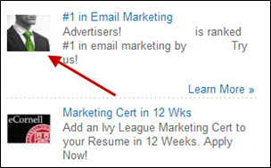
The screenshot above is from a few ads on my LinkedIn page that are a good example of why using the right image in your ads is important.

Maybe green neckties are somehow relevant to email marketing, but I’m not seeing the connection.

On the other ad, an image of Cornell’s logo and the 12-week certification copy make much more sense to me as a prospect. Granted, the ad also has some room for improvement, but the image and copy work together to set the right expectations.

To learn more, you can watch the free on-demand MarketingExperiments Web clinic replay of “Optimizing PPC Ads.” Also, feel free to share any recommended tips you have for PPC ads in the comments below.

Related Resources:

Social Media: How Motorola Solutions uses Facebook to generate more engagement

B2B Social Media Marketing: DocuSign’s targeted LinkedIn InMail strategy creates 3 large pipeline opportunities

Marketing Research Chart: What is the biggest B2B marketing challenge?

Email Deliverability: Is Gmail’s tabbed inbox a B2B challenge?

November 18th, 2013

Originally published on B2B LeadBlog

Just when you thought you had this whole deliverability thing down, another challenge rises to the surface.

This time, it’s in the form of Gmail’s tabbed inbox.


Google’s new email feature automatically classifies users’ email messages into categorized tabs, including:

  • Primary: friends, family, highly valued messages
  • Social: social network updates
  • Promotions: deals, offers
  • Updates: bills, receipts
  • Forums: online groups, discussion boards, mailing lists

The tabs seek to make email a less overwhelming process for users. However, for marketers, it’s provoked the opposite response. Marketers are worried about their messages being ignored if their emails don’t get delivered to the primary inbox.

While Gmail’s tabbed inbox has incited its fair share of panic in the marketing world since its rollout a few months ago, does it prove to be something you should be concerned about as a B2B marketer?

After all, Gmail is typically consumer-focused, presenting these tabs as more of a B2C hurdle.

In the B2B marketplace, you’re dealing with deliverability to in-house email platforms, so this won’t be an issue, right?

Well, not so fast.

Tom Sather, Senior Director of Research, Return Path, explained the idea of a market-specific email platform is fading. Sather referenced research published by Garter that predicted “at least 10% of enterprise email seats will be based on a cloud or software-as-a-service model.”

“I think we’re going to start to see those lines blur between what a B2B domain is versus what a B2C domain is,” Sather said. “There’s always been a clear-cut difference between them [previously].”

But, even if some of the consumers you’re targeting haven’t outsourced their email platforms, it’s still likely that those consumers do have a personal Gmail account.

This, of course, presents another opportunity for you as a B2B marketer. That’s more real estate you can target to get those consumers to convert, Sather said.

Gmail tabs also allow marketers to purchase ad space within the promotions tab – another viable tactic to pounce on. It parallels the concept of your typical display ad.

“You can purchase an ad and it doesn’t matter whether you’re actually sending to Gmail users or not,” Sather explained.

Though Gmail’s tabbed inbox presents such opportunities for marketers, it has still invoked fear through negative media attention in the marketing realm.

Spencer Kollas, Global Director of Delivery Services, Experian Marketing Services, said the tabs tool has already been practiced in the industry for years via Hotmail and Yahoo’s “other inbox” plug-in.

“We’ve been through these types of fire drills in the past in this industry,” Kollas said. “The bottom line is if you are sending relevant information to users that want it, they’re going to find a way to open it and they are going to engage with your brand.”

Studies are disproving the scare tactics, too.

Return Path published “Analysis: Gmail Tabs Don’t Stop Shoppers” pulling data one week after the tabs were publicly introduced, illustrating early on that tabs aren’t a bad development for email marketers.

The report showed that highly engaged users – those consumers who matter most to a marketer – increased their read rate with tabs by 2.11%. The study explained “Gmail’s tab feature made it easier to do something they like doing: shop.”

Based on the above findings and opportunities, Gmail’s tabbed feature could make it easier to do something you like doing, too: attracting consumers.

Related Resources:

Email Marketing: Your Deliverability Questions Answered

B2B Email Marketing: How reputation, content and brand management affect deliverability

Email Deliverability: Getting into Gmail?s ?Priority Inbox?

B2B Mobile Marketing: 3 ideas on where to spend your next mobile budget

November 11th, 2013

Originally published on B2B LeadBlog

It’s hard to believe that this December will mark 10 years since I received my first cell phone as a gift on Christmas morning.

It was a black and white Nokia that I used for three things:

  • Phone calls
  • The occasional text
  • Playing “Snake”

Needless to say, mobile devices have come a long way in 10 short years, with Americans now consuming 12% of their media through mobile phones. While this evolution of mobile devices has widely made accessing the Internet far more convenient for consumers, it has added a whole new challenge for digital marketers.

Although this media consumption is centered on B2C consumers, it’s worth keeping watch for two key reasons:

  1. The lines between B2C and B2B are growing more blurry (and debated) as B2I grows in relevance
  2. More than half (52%) of B2B marketers consider mobile marketing very important to influence their company growth in the next three years

We all know that mobile users are different. They want to find their valuable information quickly and easily. This is not always an easy task given the small screen size and touch functionality found on most mobile devices, but it is certainly not impossible to provide users with a compelling, user-friendly mobile experience.

In today’s B2B Lead Roundtable Blog, I’m going to share three spend ideas to help you balance value and reduce the overall user friction in your mobile experience.

Spend #1. Make convenience essential

Mobile users are exactly what their name entails. They are typically on-the-go and may not have long periods of time to learn how to navigate a site.

Ensuring that prospects can find the information they want as quickly and easily as possible is essential to ensure users have an enjoyable visit.

This is often difficult as mobile visitors expect a level of value similar to your website in a simplified format. But, there are options available to make your mobile site very convenient.

Utilizing one-touch tools across your mobile site will allow visitors to easily navigate without having to select multiple small calls-to-action.

One-touch CTAs allow the user to perform actions such as calling for assistance, finding a location near them, and adding an item to the cart. These are to ensure that a user can navigate as easily as possible.

Spend #2. Keep the mobile experience simple

As I’ve mentioned, your mobile experience should be convenient and user-friendly, allowing the visitor to easily access the information they are looking for.

Presenting them with a cluttered layout is the quickest way to get a user to bounce from your mobile site. Therefore, keeping it simple is the key to your success. While this may seem fairly intuitive, making this step a reality can be difficult.

Users come to a mobile site expecting it to have the same functionality as the desktop version, but on a screen a fraction of the size. It is extremely important to test your mobile site to determine the information and features that are most important to visitors, eliminating all unnecessary clutter.

While there will always be people in your organization that argue against the removal of certain information and features from a site, maintaining a simple layout is crucial to the success of your mobile site.

Spend #3. Keep the experience congruent across devices

This may be the one of the most difficult steps to accomplish when developing a mobile site, but in terms of continuity, it’s vital.

While your mobile site must be optimized for the mobile user, it should still have a similar feel to your desktop experience.

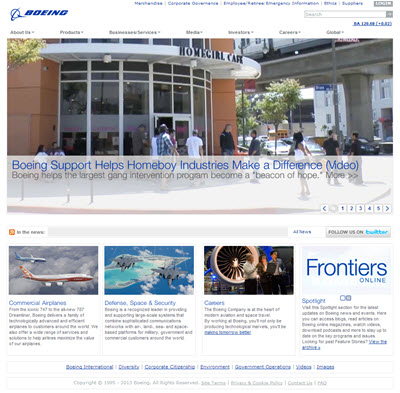
Let’s use Boeing as an example of what I’m talking about in terms of keeping your aesthetics congruent across multiple devices.

Many mobile visitors will already have a familiarity with your brand and have likely visited your desktop site prior to accessing the mobile version.

So ideally, you want to ensure that the form and function of your mobile site are similar to that of your desktop version.

This will give these users a sense of familiarity with the site, even if it is their first mobile visit.

Even when your mobile site uses a similar structure, many users may still prefer the desktop version of a site. Make sure that you include an easy-to-find link – typically placed in the footer – allowing visitors to switch to the desktop version of your site on their mobile devices.

While creating an engaging mobile experience is not an easy feat to accomplish, it is certainly not impossible given the tools and resources available today.

Hopefully these three ideas will help you strike the right balance between value and friction on your own mobile site.

Also, share any tips you have for helping marketers develop a great mobile experience in the comments below.

Related Resources:

Mobile Marketing: What 4 top B2B companies can teach us about mobile

Lead Generation: Who knows the customer better – Marketing or Sales?

Lead Management: 4 principles to follow

Lead Nurturing: How a social business strategy can help you move from selling to helping your prospects

November 4th, 2013

Originally published on B2B LeadBlog

At MarketingSherpa Lead Gen Summit 2013, I had the privilege of sitting in on a session with Todd Wilms, Head of Social Strategy, and Adriel Sanchez, VP, Demand Generation, both of SAP, as they discussed how they use a business model called “social business” to help their teams across the globe engage local audiences.

So, what is social business exactly?

While it would seem intuitive that social business is a social media best practice, that assumption could not be further from the truth.

Or as Todd declared, “The difference between social media and social business is the difference between throwing a bullet and shooting it.”

According to Todd, social media, social media marketing and social business are three very distinct concepts.

Todd said SAP uses social business as a strategy that employs social media, social software and social networks to drive a mutually useful connection between people, information and assets.

“Social business is really how do you take all of those concepts of social media, all of the things you’ve been doing around social media marketing, and define them against business outcomes for your organization,” Todd explained.

Sales leads as you know them are changing

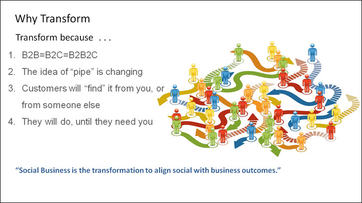
Todd made the case for transforming to a social business model by describing how the very idea of the “lead” is changing at a faster pace than Marketing can keep up with.

“This idea of moving from ‘sell’ to ‘helping your customers buy’ is at the heart of social business. It’s a model that the customer is going to make the decisions already, they’re going come to you when they are ready,” Todd said.

From strategy to practice

Adriel also mentioned as evolving buying habits exert more pressure on lead nurturing, today’s common lead nurture tactics — teleprospecting, webinars, trade shows, email, etc. — will need help from social media to remain effective.

“These tactics need help because they’re not giving you access to the full universe of people that are interested in buying your solutions,” Adriel said.

Here are three tips Adriel shared with the audience to help you use social media to aid your lead nurturing efforts.

Tip #1. Listen for what people aren’t telling you directly

Adriel explained SAP uses social listening tools to follow social media conversations by:

  • Filtering for keywords that indicate lead-relevant activity
  • Following key accounts directly
  • Understanding the needs of your customers’ customer

This allows the team to sift through the massive amount of conversations to find those that may be potential leads with an added bonus ?

“Listening to those conversations on social media can give you incredible insights into the types of content that you can use to nurture those leads,” Adriel explained.

Tip #2. Seed the conversation with what you want to talk about

Adriel advised if you want to steer the conversation toward your solutions in the marketplace, your approach should be consistent, but also smart.

Here are some of the key strategies he revealed SAP uses to guide social conversation:

  • Implement a pragmatic approach
  • Reward top contributors
  • Enterprise-wide advocacy management tool

Tip #3. Engage judiciously and in the right context

Adriel explained once you’ve identified lead-relevant conversations, the next challenge is engagement. Adriel also explained the context of how you engage in the social media channel is vital to success.

“You could be talking to the right people, have a great offer and terrific creative, and while that may work in email, it can fail in social media because the context is different.”

Here were some of his suggestions to help your company engage in the right context:

  • Educate your sales force on how to engage in social selling
  • Leverage your call center for inbound lead engagement
  • Bring customers and prospects together in social channels

Adriel warned in regard to the contextual differences between engagement in social media and different channels, prospects in those different channels will likely have different thresholds for how they absorb marketing messages.

“The accepted norms in that channel are different and peoples’ tolerance for marketing-related materials is different.”

Related Resources:

B2B Social Media: SAP Latin America boosts followers 900% [Part I]

B2B Social Media: SAP Latin America boosts followers 900% [Part II]

Social Media: How SAP operationalized social for replicated worldwide success

Why Social Media is the New Customer Service Hotline

Marketing Careers: Why gut instincts are only artificial marketing brilliance

B2B Marketing: What an 11% drop in conversion taught a live audience about lead gen

October 28th, 2013

Originally published on B2B LeadBlog

Recently, we ran a live test for our audience at MarketingSherpa Lead Gen Summit 2013 and as I discovered, this isn’t the easiest thing to do.

The greatest difficulty rests in thinking about lead generation and optimization in new ways – and hoping those ideas produce significant results.

For example, the design process forced us to examine two important questions: what is a quality lead, and how do we measure it?

Live test background

For the past couple of months, we’ve been planning and designing a live test for the recently held Lead Gen Summit 2013.

During that planning, we had to address a paradox that exists in lead generation.

Marketers typically want more information about their leads. This translates to more form fields on a lead generation form.

What they are also doing is adding more friction to the lead capture process, which increases the likelihood for a potential lead to say “no” to your form and abandon the entire process.

So, how do you find the right balance between lead quality and quantity?

For our test, we tried to meet in the middle.

Control

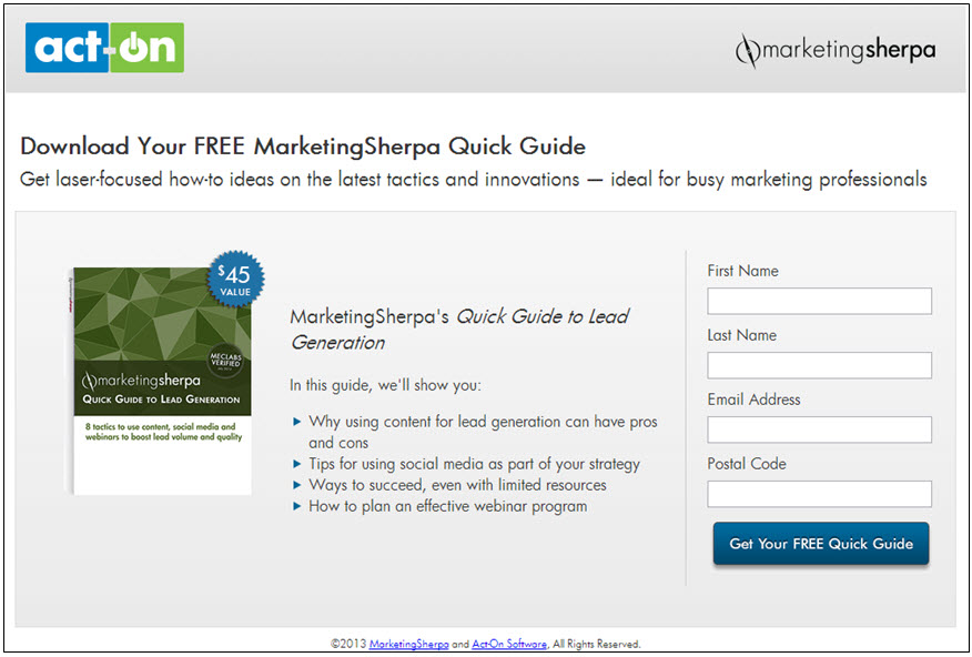
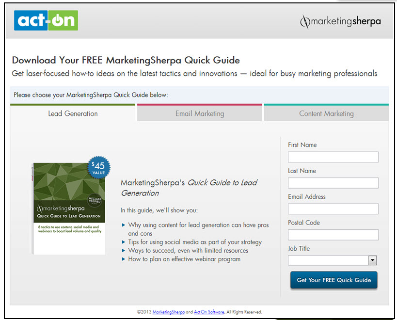
The control lead gen page design was a single offer, short form page that featured only four form fields with a free downloadable MarketingSherpa Quick Guide, a $45 value, as an incentive.

We needed to identify a baseline for comparison to the other treatments. This control allowed us the opportunity to test multiple aspects of lead generation in one test.

Does choice of incentive lead to higher perceived value which results in more lead completions? Will this perceived value be enough for visitors to battle more friction in a longer lead generation form?


Treatment #1

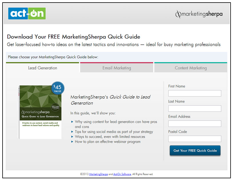
In Treatment #1, the design was also a short form layout. We hypothesized offering a choice of Quick Guides would allow visitors to perceive the incentives as having a higher value and increase overall lead captures.

And the crowd goes wild conservative

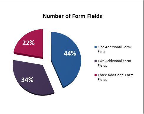
We left Treatment #2 up to the audience at Summit to design. We asked them how many additional form fields they wanted and what those form fields should be.

Surprisingly, 44% of our attendees decided to be conservative with their selection.

They chose to only add one additional form field. This could be a representation of what attendees were learning at Summit in regards to form length and completion rate.

But keep in mind, even though one additional form field was the majority vote in this case, there were still many attendees who wanted more form fields (56%). We did not have a chance to ask them why they made the decision they did, but I think it is reasonable to assume they wanted more lead information.

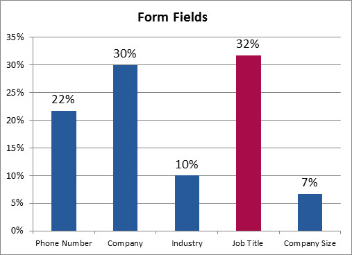
Now, let’s look at what type of form fields the audience wanted to add.

The audience’s choices continued to intrigue us. Job title was the top pick for the additional form. The majority may have decided a deeper context over direct contact was more valuable.

These marketers may have suspected that a phone number field was risky (phone number fields are susceptible to fake numbers) and decided to play it safe with job title.

Treatment #2

A concern our team had based on the audience’s treatment design was that the variation between the control and treatments had relatively low friction to begin with. How much friction can one additional form field about job title really add?

Apparently, it created a lot.

Results

There was no statistically significant difference between the control and Treatment #1, where the only difference was a choice of offers.

However, there was a statistical difference between Treatment #2 and the control. Treatment #2 decreased lead generation by 11.9% at a 99% level of confidence.

One form field had a significant impact and it wasn’t even a high friction question, just job title.

Our live test reiterated the point that marketers need to be strategic with lead generation forms. Prioritize the information you ask for and limit what you do upfront because it may lead to a negative impact on your overall lead generation.

Related Resources:

Lead Generation: How one additional form field decreased conversions 11% [Lead Gen Summit 2013 live test]

Lead Generation: How using science increased teleprospecting sales handoffs 304%

Lead Gen: A proposed replacement for BANT

Lead Generation: Who knows the customer better – Marketing or Sales?

Customer Relationship Management: 5 steps for finding the right vendor for your data hygiene

October 21st, 2013

Originally published on B2B LeadBlog

The quality of your database represents the quality of your customer and prospect relationships.

Here’s why: Effective marketing depends on relevant messaging, and relevant messaging depends on how well you know your customers.

For instance, at best, your email will be tuned out, ignored or lost. And, at worst, you’ll be labeled a spammer if you:

  • Use the wrong name in the salutation or send to someone who has left the company.
  • Send emails that detail tactical how-to’s while the recipient has long been promoted to a position that requires more strategic, bigger-picture knowledge.
  • Offer solutions that are obviously unaffordable for the recipient.

The problem is cleaning and appending databases — making sure they’re accurate and contain all of the information you need to send the most relevant information — isn’t as glamorous as branding or content strategy. So, it’s easy to overlook. But no matter how beautifully you decorate the house, if the plumbing doesn’t work, you can’t live there.

It would be great if cleaning and appending data was something you only needed to do once. However, much like the plumbing I mentioned, the things we rely on eventually need maintenance to uphold that reliability.

When you consider there will always be changes in buyer behavior at play that will likely result in the need for rapid changes to your B2B marketing efforts, it becomes apparent that effective data hygiene is an ongoing process. Conceivably, if you avoid cleaning data for a year, 60% of your database could be obsolete by the end of those twelve months.

Receive help with your data

With all of the demands made of marketers, keeping data clean can be almost impossible to do on your own.

That’s why I’m involved in hiring a vendor to support MECLABS with this monumental task.

There’s a multitude of data vendors and sometimes it can be easy to go with whoever is the cheapest. But, cheaply acquired data is often the most expensive — it can be rife with inaccuracies.

You want to make sure the vendor you choose can live up to its marketing. This is why it’s wise to invest the time and effort to test prospective vendors before hiring them.

Step #1. Compile a list of vendors

So, where do you begin to search?

For us, the ideal place to start was by compiling a list of vendors recommended to us or have been used previously for smaller projects.

Step #2. Determine what information is most important

In our case, it was:

  • Contact name
  • Job title
  • Company name and company address
  • Contact phone number and company phone number
  • Industry/SIC
  • Revenue

Step #3. Weigh each record field by value

Assign weighted values to each of the appended items depending on your needs. For instance, if job title is most important, then give it a higher weight than company address.

Here’s a weighted version of the list from the example above:

  • Job title: 5
  • Contact name: 4
  • Company name and address: 3
  • Contact phone number and company phone number: 3
  • Revenue: 2
  • Industry/SIC: 1

Step #4. Use a large enough list to sample test vendor accuracy

We started by taking a list of 100 records we knew to be highly accurate and stripped out some of the data.

Next, we added those 100 records to a list of 900 additional records to create a test list of 1,000 total records that we sent to each vendor.

Once a vendor finished appending, we then pulled the 100 records we knew were accurate from their work and cross-checked them for accuracy.

We also used additional verification sources like LinkedIn to help double check the data in the samples to make sure each vendor’s quality was accurately assessed.

Step #5. Add up the scores and consider any other factors

The vendor with the highest score from your testing will likely be your best choice, but there are factors of completion time, size, cost and complexity of data to consider in your overall decision.

Selecting a vendor can be difficult, so I hope these steps will help put you on the path to having the cleanest and most relevant customer information possible.

One more thing…

How do you handle data hygiene?

If you have any other data cleaning recommendations, I would love to hear about them in the comments section below.

Related Resources:

Do You Expect Your Inside Sales Team to Practice Alchemy?

How to Build a Quality List and Make Data Drive Leads

Webinar Replay: Teleprospecting that Drives Sales-Ready Leads

List Buying: 6 tips for buying the most effective lead list

Lead Generation: 3 questions every marketer should ask themselves about incentive

October 18th, 2013

Does your marketing team have experience to fall back on, or have you found yourself in team conversations like this one …

Marketer 1: “I have this great idea! We’ll build a landing page and put a lead generation form on it!”

Marketer 2: “That’s genius! Everyone’s doing it! When visitors land on the page, they will enter their information and VOILA! Leads generated!”

Marketer 3: “That’s great, but what are you going to gate with the form? Why would someone want to give you their information? What motivation do they have?”


Is your team following best practices because they are popular, or are they approaching your marketing initiatives with consideration for every possible variable and objective?

Now don’t get me wrong. We all do our best to create lead gen pages that provide value and build interest in what we’re selling, but our best intentions are not the problem.

It’s all too often that we simply forget to thoroughly examine one key element for success – the incentive we’re offering.

So, in today’s MarketingSherpa Blog post, I wanted to examine three questions every marketer should ask themselves about lead gen form incentives that you can use to tip the balance to your advantage.


Do our incentives provide tangible value to our visitors?

Incentives are something appealing that we can offer the visitor in return for their information.

They come in many forms and differing levels of value. Popular options visible in the digital landscape these days are discounts, educational content, product add-ons and free or expedited delivery.

Which should you choose? Which will provide value to your prospects?

There are two important things to consider when thinking about incentives:

  • Cost
  • Relevance

Will visitors to this landing page find the incentive relevant? Will it meet their needs or prove valuable to them? Does the incentive offer a high potential for return on the investment? Is it something you can even afford to offer?

Ultimately, the right incentive for your offer depends on the product and business model, the motivation of visitors, and how the incentive builds momentum through the buyer’s funnel.

When choosing, it’s important to find an incentive that provides added value by complementing your product or service and matching your visitors’ wants.

If you can offer a low-cost incentive that provides high value and ROI, that option is likely a good fit for you.


Is contact with a real person a valuable incentive?

Another approach to lead gen offers you can use is contact with a real person.

This can be contact with an expert on a widget or a representative who can help prospects navigate an extensive product line.

If you have a complex product offering or if there are many competing options that have muddied your market, this might be a good option for you. However, there are a few important things to consider here.

Do visitors need help with your product offering? Will speaking with a person help them make a better buying decision? Can contact with a representative expedite the buying process?

Be careful though, if your prospects don’t perceive a personal contact as valuable, you could scare some away. But, you’re almost assured that those who do make it into the funnel will be of a higher quality.

Read more…

Lead Generation: Who knows the customer better – Marketing or Sales?

October 14th, 2013

Originally published on B2B LeadBlog

I once worked with a field marketing vice president who was calm, cool and collected for every presentation she prepared for.

Well, all except one.

The only presentation that ever seemed to rattle her nerves – and just ever so slightly – was the annual presentation to Sales leaders, justifying her upcoming budget (and, perhaps, existence).


“We talk to the customer every day…”

Let me first say, I am a huge proponent of Sales-Marketing alignment.

But today, just for today, let’s vent a little, shall we?

We’re among friends, so let’s be honest with each other. When things are going well, Sales receives the credit for making plan, making Club, for meeting and exceeding quota.

However, when things go south, Marketing receives the blame for not keeping the pipeline full, not generating enough leads, oh, and if they are generating enough leads, it’s not enough of the right people … these aren’t decision makers!

No matter how things are going, Sales tends to like to stick its nose in the Marketing plan, with the justification being, “We know the customer better. We talk to them every day.”

That is a hard claim to refute, but today on the B2B Lead Roundtable blog, I’m going to give you a little ammo.

Keyword strategy research

I just got back from MarketingSherpa Lead Gen Summit 2013 in San Francisco (MarketingSherpa and the B2B Lead Roundtable blog are both owned by MECLABS). Leading up to Summit, I had the privilege of reviewing all of the presentations to make sure they met MECLABS presentations standards.

I reviewed hundreds of slides, but the information from a single slide I’m going to share with you today really caught my eye.

Marie Wiese, President, Marketing CoPilot, ran an experiment with Grantek.com, a North American B2B systems integration company, to create a keyword strategy that would support lead nurturing.

The team created an initial list of 3,000 keywords, and culled it down to 50.

The keyword topic suggestions came from two sources:

  • Sales-team suggestions
  • Data-driven keywords

The Results: Data trumps the golden gut

Let’s take a look at some of the keywords that were chosen, along with how they performed:

Sales-Team Suggested

  • Manufacturing electrical energy consumption – 6.95% clickthrough rate
  • Manufacturing infrastructure – 7.7%
  • CPU data – 5.9%

Keyword Strategy & Data-Analysis Driven

  • Machine guarding – 11.5% clickthrough rate
  • Manufacturing information technology – 10.6%
  • Machine safety – 11.0%
  • Manufacturing data – 10.3%
  • Plant safety – 13.5%
  • Access and control/access and control technology – 19.1%
  • Manufacturing cloud – 16.2%

Key Learning: Use numbers to help make your case in the organization

I had a lot of fun ribbing Sales in the beginning of this blog post. But, I don’t mean this at all as a negative statement about the Grantek sales team, or any sales team for that matter.

This is human nature. We all feel that we have a golden gut to some extent, especially when we’re interacting directly with customers.

But unless you’re Steve Jobs, you don’t. You have to realize potential customers, especially those that choose another vendor, may not always honestly tell you why. Heck, they may not even know why their organization did or did not buy your solution.

But, here is where things like data, metrics, analysis and tracking results can be so helpful.

While it’s easy to disagree with opinions, it is very hard to disagree with numbers.

Looking to improve your own internal standing with the Sales team, and get a better understanding of what really resonates with your potential customers? I’ll leave the final word on the subject to Marie.

Every marketer has experienced that dreaded moment when trying to pitch a strategy to the sales team and opinion influences tactical execution. A sound keyword strategy allows you to develop content and inbound marketing tactics using data.

It’s hard to agree to spend time, money and resources on a whitepaper about fixing infrastructure when your data suggests you’d get better conversion by addressing access and control. Just because the sales team wants to sell infrastructure consulting, doesn’t mean that’s the best topic to generate leads and support lead nurturing.

Keyword strategies help you understand the difference between selling and buying and decide the right time for both.

Related Resources:

Best in Show: Top takeaways from Lead Gen Summit 2013 – Upcoming October 16 SherpaWebinar

Event Marketing: How a technology start-up made a trade show splash booth-free

B2B Digital Marketing: How Volvo Construction drove site visits through its email campaigns

B2B Sales Cycle: 4 steps to avoid the wasteful ‘no decision’

Mobile Marketing: What 4 top B2B companies can teach us about mobile

October 7th, 2013

Originally published on B2B LeadBlog

We all are hearing time spent with mobile devices will surpass time spent with desktops.

Well, it is already happening in the B2C world, according to a recent study from Millennial Media and comScore. It won’t be too long before it starts happening in the B2B world.

According to the MarketingSherpa 2012 Mobile Marketing Benchmark Report (free excerpt at that link), when asked, “Which mobile marketing tactic does your company use?” 64% of B2B companies listed mobile websites as their number one mobile marketing strategy in use.
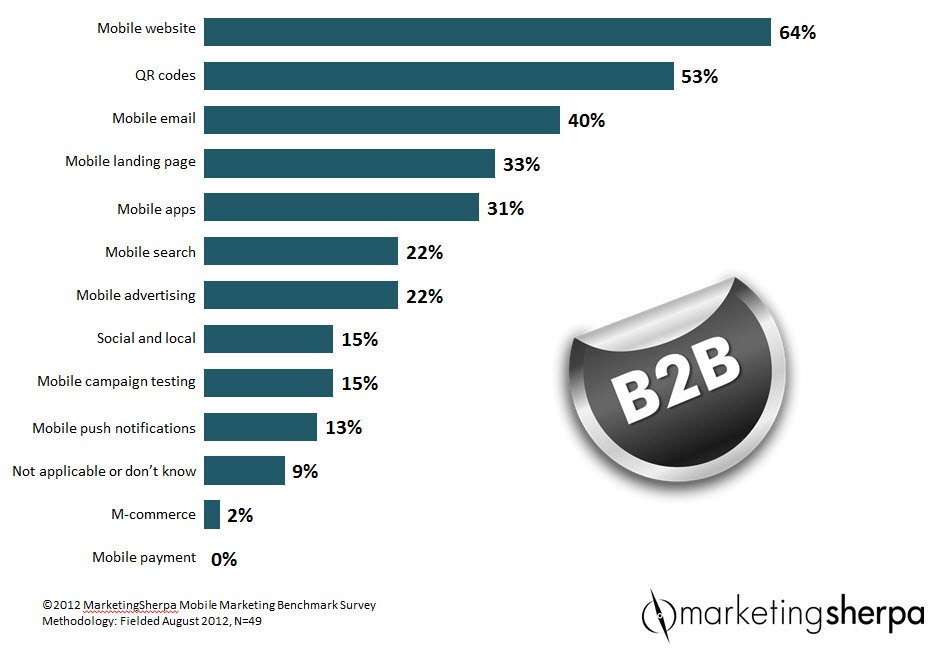
Moreover, when asked, “How important is mobile to your organizations growth in the next three years?” 52% of marketers considered mobile marketing very important to influence their company growth in the next three years.
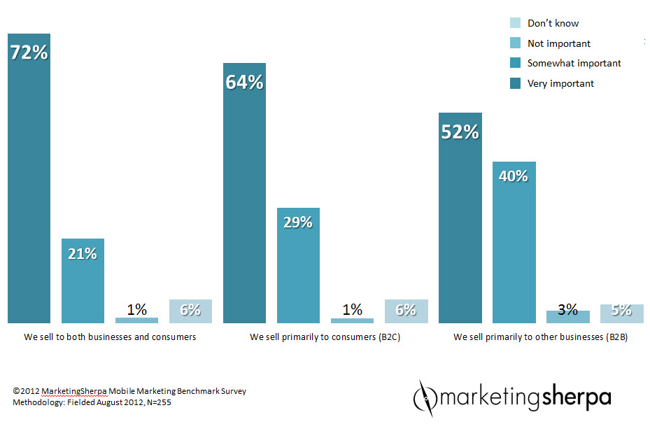
Knowing this, I thought it would be interesting to see how some top B2B companies are using mobile sites to influence business.

So, I went to the Fortune 500 list and randomly picked 12 B2B companies I was familiar with (no science behind the selection method) and found only four out of 12 have a mobile site.
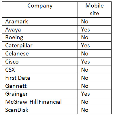
To be honest, I was surprised to see so many companies without a mobile site. But at the same time, I felt relieved to see interesting strategies from those that had mobile sites. Now, let’s take a deeper look at the mobile offerings.

Caterpillar: Not a desktop replica
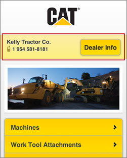
Caterpillar offers a versatile mobile site that allows visitors to not only to check products’ specifications, but also find dealers, rental locations and start the quote process, if they so desire.

The value of Caterpillar’s mobile site is that it’s not a replica of the desktop version. Instead, it is designed to meet “on-the-go” needs.

The categories tab helps users find machinery and tools needed in the field by providing navigation that is simple and direct.

One nice feature here is the “save preferred dealers” option that lets users keep them on hand for quick access.

As one would expect, Caterpillar’s customers or prospects may run into unexpected situations on a field where the only available device is either a cell phone or a tablet. Therefore, a mobile site makes a huge difference and can win someone’s business in the field.

The site has still opportunities to improve since not all of the sections are optimized to the mobile experience. But overall, it offers a great experience and satisfies diverse needs.

Cisco Systems: Customized mobile experience
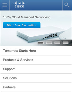
Cisco’s main website uses responsive design, so it adapts well to different screen sizes, providing a seamless experience among devices.

But, that is not the nicest part of its online presence.

Cisco is putting thought into customizing the mobile experience. The site not only adapts to different screens, but it also prioritizes content to each form factor.

The section “Tomorrow Starts Here” takes first place in the mobile version while it is not even noticeable in the desktop version.

“Tomorrow starts here” reviews trendy topics in different and engaging formats like videos, infographics and articles.

This is a good example of providing content that fits well with on-the-go needs. Plus, through mobile-friendly content, Cisco can accomplish two important things:

  • Users spend more time on the site
  • Cisco’s brand remains top-of-mind

The only downside I found was the main rotational banner and some site sections redirect visitors to pages not optimized for mobile, which in turn, abruptly disrupts the user experience.

Grainger: Mobile site for prospects, App for customers
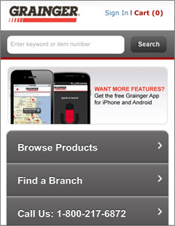
Grainger’s mobile store has the standard features one would expect from a B2B e-commerce site.

Users can search products, browse product categories, and make purchases.

The site layout is a simple and clean design that allows users to quickly find what they need. For example, two popular mobile activities like “Finding a Branch” and “Call Us” are just one click away.

Grainger is a good example of why it may be advantageous to have a mobile app in addition to a mobile site.

When you take a closer look at the app, you can hint that the app was mainly designed for existing customers. The elements and user options are more tailored for customers that have purchased from Grainger before or are frequent buyers.

The homepage presents “Products You Might Like” instead of “Browse Products.”
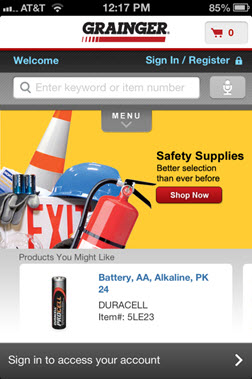
Instead of product categories, the app menu options are: Browse, Find a Branch, Quick Item Entry and Info.
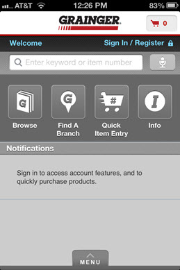
Notice the quick order form option. This option is genius in that it really simplifies purchasers’ lives by letting them place a quick order on-the-go.

Even though apps require additional development and maintenance, they bring two important and unique benefits:

  • Push notifications
  • Physical presence on a customer’s phone screen

Both are very powerful tools to stay top-of-mind with your customers. But with that said, it is very important for the app to have a unique purpose. If not, there is no reason for someone to download or use it.

Avaya: Thoughtful mobile experience
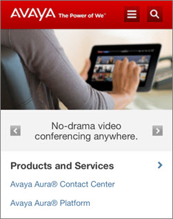
Avaya offers a very functional and engaging mobile site.

Four aspects stood out for me:

1. Designed with mobile user in mind

The mobile site is another good example of adjusting content to mobile needs.

Although the mobile site has similar categories as the desktop version, the mobile categories are prioritized differently.

For example, “How to buy,” is option two in desktop menu, while it is the last option in the mobile version.

Avaya recognizes visitors are using the mobile platform differently and likely more for research purposes than for actual transactions.

2. Allows continued reading on desktop

Many sections of its main site are not optimized for mobile yet. But instead of letting users either become frustrated by doing a lot of zooming in and out or leaving the site altogether, Avaya uses an interim page to inform visitors the content they are about to see is not on the mobile site, but in the desktop version.

I liked that it gave users the option to continue, go back or “email me a link.” The email a link option allows users to continue reading where they left off once they return to a desktop.

3. Provides a variety of content

Besides its products and solutions, the mobile site brings the “Avaya Magazine” front and center.

The magazine offers users content to find inspiration and information to help them stay on top of technology trends. Topics are presented in a variety of formats including articles, videos and charts.

4. Option to stay connected

Social icons are not in the way of the mobile experience, but are clearly visible in the footer.

This allows users to follow them at any point during their visit. This is important considering recent research reveals 31% of a U.S. smartphone user’s total Web activity is spent engaging in social activity.

Overall, I hope this review provides you with some ideas for your mobile sites. Please feel free to comment or share any other mobile sites you recommend that are great examples of where marketers are getting it right in the mobile space.

Related Resources:

B2B Content Marketing: 5 questions every marketer should ask themselves when using native advertising

B2B Marketing: 3 reasons for adopting video content into your marketing mix

B2B Digital Marketing: How Volvo Construction drove site visits through its email campaigns
Lead Management: 4 principles to follow

September 30th, 2013

Originally published on B2B LeadBlog

I’m at MarketingSherpa Lead Gen Summit 2013 in San Francisco on day one, live blogging the Lead Management Workshop that features a dive into larger topics including lead capture, lead qualification and lead nurture.

Flint McGlaughlin, Managing Director, MECLABS, presented the introduction to the workshop, and I’ve now had the opportunity to speak with Brandon Stamschror, Senior Director of Content Operations, MECLABS, and co-author of Lead Generation for the Complex Sale.

The main principles of the Lead Management Workshop were pulled from that book.

Brandon explains, “We updated the workshop material with a lot of the discoveries we’ve made over the past five or six years. It’s infused with MECLABS customer psychology process, so the workshop is really the best of both worlds – meaty lead generation strategy and tactics coming at it through the customer theory perspective that MECLABS has pioneered.”

Key principles of lead management

At the fundamental level, lead management is guided by four key principles:

1. Leads are people, not targets – Brandon says this goes back to the difference between company logic and customer logic. The focus should be on the customer.

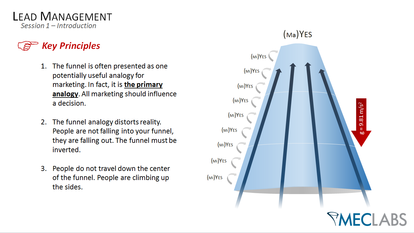
2. People are not falling into the funnel, they are falling out – “It creates an intriguing, and I think important, model about how to rethink the traditional marketing funnel,” Brandon explains. “Everyone thinks with a funnel people are going in and narrowing down and that’s not really the case.” The inverted funnel shows the pipeline is more of a climb, with micro-conversions all throughout the process.


3. We are not optimizing webpages or call scripts, we are optimizing thought sequences – this means getting into the psychology of the customer and understanding those thought sequences to achieve the desired conversion – whether it’s a click, a filled-out form, or even a sale.

4. To optimize thought sequences, we must enter into a conversation and guide it toward a value exchange – Brandon says this means the perceived value of the marketing goal must be greater than the perceived cost. An example would be a Web form. The cost is giving up information, the value is what that person receives in return for providing that information.

The entire process of lead management is based on the concept of the inverted funnel, and the idea that the buyer’s pipeline requires a series of “micro-yes(s)” before getting to that “macro-yes” in the form of the final conversion-to-sale.

“There are all the little micro-yes(s) that you’re having,” Brandon explains. “A marketer may not be able to look at all the micro-yes(s) in their funnel on day one, but as they start to break down each one of those micro-yes(s) and start to look at what the perceived value and perceived cost is at each stage, that marketer is putting themselves in the mindset of the customer over the company.”

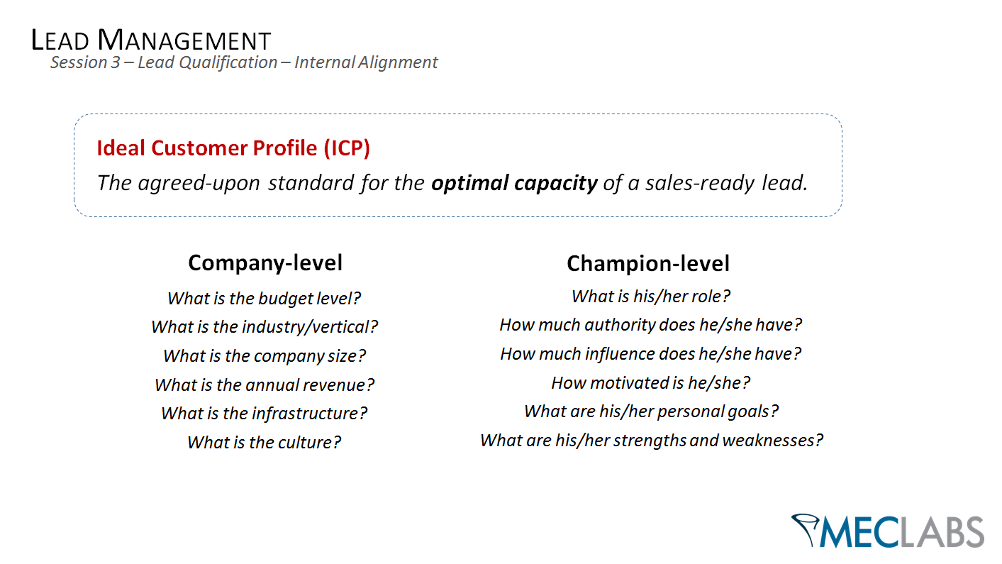
The ideal customer profile

In the lead qualification section of the workshop, understanding the ideal customer is a key concept.


Brandon says this is a place where marketers are not focused enough.

“You’re truly defining your ideal customer profile,” he says. “That ideal customer profile should be informed by your data. If you have contacts or companies on your list that don’t meet that ideal customer profile, then they shouldn’t be on your list. Or, you shouldn’t be marketing to them.”

To provide a set of guidelines for database form fields you might find valuable, here are two lists from the workshop.


Data to be collected

Basic:

  1. Company Information: Industry type, annual revenue, number of employees, URL, general contact info, etc.
  2. Champion Information: Number of contacts, roles and titles, level of authority/influence, contact information, etc.
  3. Relationship History: Number of touch points, type of touch points, records of correspondence (what was said), etc.
  4. Current Lead Status: Place in the funnel, lead scores, last actions, next steps, etc.

Advanced:

  1. Engagement Metrics: Email opens, webpage visits, clickthrough, types of articles downloaded, etc.
  2. Business Intelligence: Competitive data, industry trends, organizational changes, press releases, articles, quarterly reports, etc.
  3. Life-Cycle KPIs: Average sales cycle, longest/shortest cycle, touch point clusters, lead source and touch point contribution reporting, etc.
  4. Trend and ROI Reports: Lead flow, dials to disqualification, dials to leads, email success rates, revenue per customer, lead costs at various funnel stages, etc.
  5. All Communication Records: Track, report and archive all email messages, calls and voicemails from contacts that can be associated with accounts or companies.

Keep in mind that these are all guidelines, and your business needs will determine the form fields that are most valuable to your marketing needs, but both the basic and advanced data field lists provide a starting point to begin creating your ideal customer profile.

Related Resources:

Infographic: Customer experience in the digital age

Customer-centric Marketing: Learning from customers helps increase lead quality 130%, Sales-accepted leads 40%

Customer-centric Marketing: 7 triggers to engage customers and build loyalty

Online Marketing: 4 sources of customer insight on your website