Marketing 101: What is a mobile breakpoint?
Marketing has a language all its own. This is our latest in a series of posts aimed at helping new marketers learn that language. What term do you find yourself explaining most often to new hires during onboarding? Let us know.
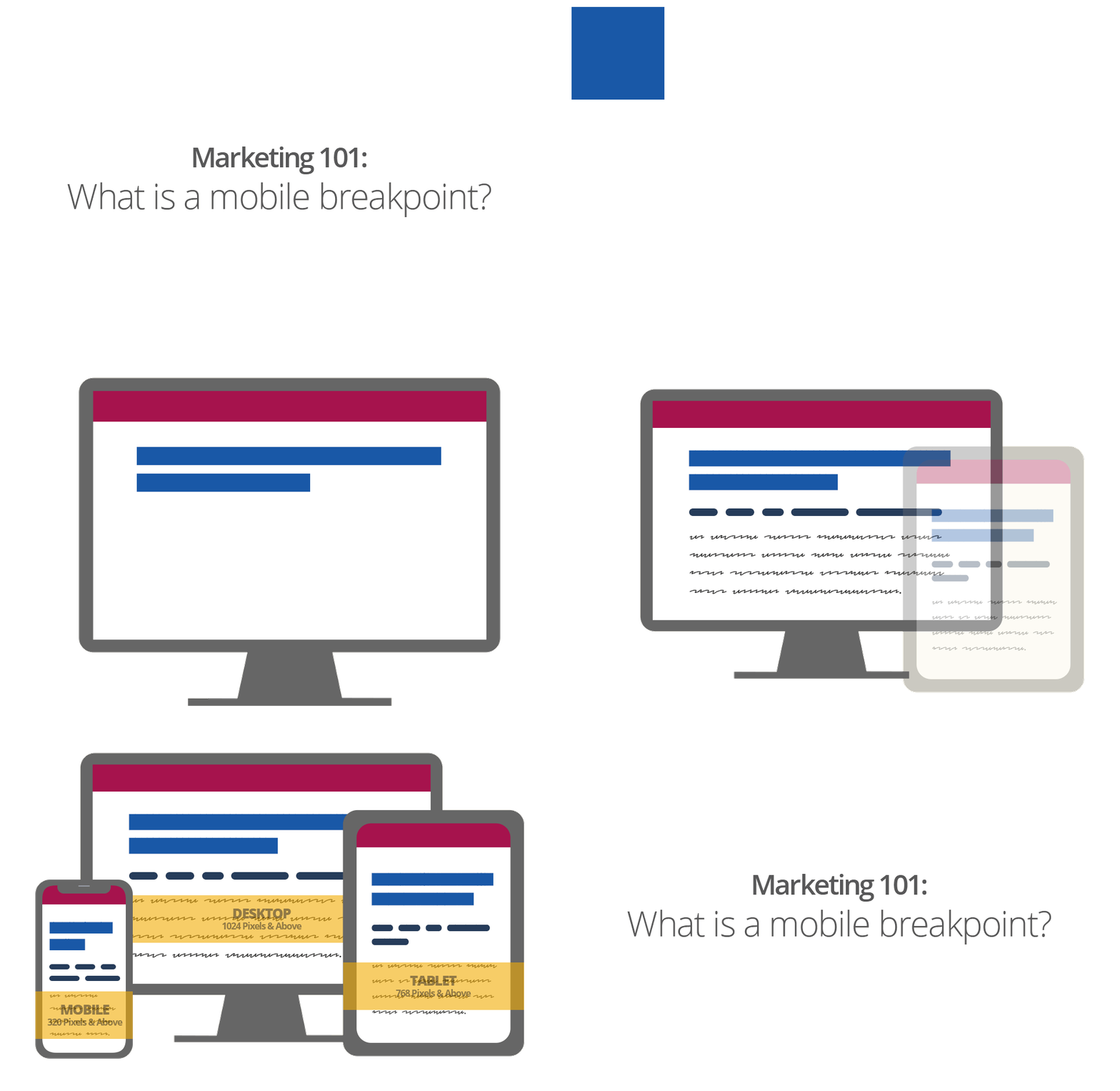
In responsive design, a breakpoint is where the layout of the webpage changes based on the size of the device. Mobile breakpoints are the sizes for mobile devices.
For example, a responsive design may have three sizes — desktop, tablet, smartphone. In that case, the mobile breakpoints would be the tablet and smartphone size. Here is a GIF created by MECLABS Institute Senior Designer/Web Specialist Charlie Moore that shows a website with three breakpoints.
You can choose which and how many breakpoints your website has. For example, instead of just the three referenced breakpoints mentioned above, you can add in a fourth breakpoint for small laptops.
If you have an established site, one tool that can help in this effort is your analytics platform. You can use your analytics platform to discover your website visitors’ most popular device categories or screen resolutions. (If you would like to view your website on different screens but are unsure what size they are, here is a handy free web utility — what is my screen resolution.)
You could decide to focus your breakpoints on the sizes that bring the most traffic. Or you could decide to focus your breakpoints on the sizes that get the most conversions or come from customers with the highest lifetime value.
Building your website infrastructure with breakpoints in mind
If you are engaged in conversion optimization for mobile and other devices, make sure to build in enough flexibility to make easy changes to your website.
It can help to build your website with a front-end framework that accounts for responsive design instead of hard coding your breakpoints based on fixed widths. For example, Bootstrap (a free, open-source framework) has a grid system that simplifies the creation of different layouts for different breakpoints. Other web layout systems that offer the flexibility for mobile responsiveness are Flexbox and CSS Grid.
Just remember, breakpoints are not an early 90s movie where Keanu Reeves plays an FBI agent who goes undercover to catch a gang of surfer/bank robber/ex-President mask wearers. That, of course, is “Point Break.”
You might also like …
Increase Mobile Conversion Rates – These five micro classes help you maximize the impact of your messages in a mobile environment
Conversion Optimization: Eight considerations to take into account when A/B testing in mobile
Email Marketing Chart: Mobile versus desktop conversions
Mobile Conversion Optimization – Better business results from deeper customer understanding
Categories: Design mobile marketing


