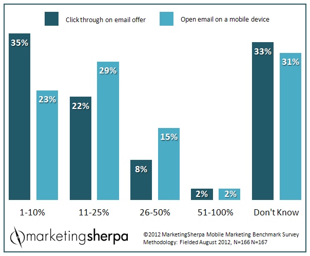
Mobile Marketing: 31% of marketers don’t know their mobile email open rate
In the MarketingSherpa Mobile Marketing Benchmark Report, we asked marketers about their mobile email marketing efforts …
Q: What percentage of customers/prospects interact with your organization’s mobile EMAIL messages?
Impact of the device itself on mobile email interaction
“I suspect the cost of service for data plans may impact and somewhat curb the degree of interaction on mobile devices,” said Lucia Panini, Marketing and Communications Manager, Betty Wright Swim Center – Abilities United. “The other factor could be optimization of display, which should become a lesser or no issue with the most recent large-screen phones.”
31% of email marketers do not know their mobile email open rate
“I’m most surprised that a full third of marketers don’t even know if their emails are being opened on mobile! With all the attention ‘mobile’ received in 2012, I would expect that number to be lower. Tracking clickthroughs seem to be a bit harder – I’d be eager to hear how other folks are accomplishing this, technology-wise,” said Justine Jordan, Marketing Director, Litmus.
Excellent point, and question, Justine. How do you track mobile email clickthroughs? Feel free to leave your thoughts in the comments sections of this blog post.
One rudimentary way to track clickthroughs at an aggregate level is by looking at your analytics to see which Web browsers access your site, as Medscape did in the MarketingSherpa case study, “Mobile Email Marketing: 53% higher clickthrough rate for mobile-optimized newsletter.”
“We are realizing that a lot of our visits and clicks are coming from mobile devices, where six months ago or a year ago, it wasn’t as high of a percentage. So we need to make sure that our emails are mobile-optimized,” said Erik Teng, Email Marketing Manager, Medscape.
“We see about 15% mobile opens on each of our newsletters, sometimes a bit higher or lower. That seems to be below average – some of our customers are seeing 50% or more mobile opens on some of their campaigns. Obviously this has a lot to do with your list demographics, your industry, your content, etc.,” Justine shared.
“Overall, most companies publishing industry stats, including ours, are seeing just under 50% mobile opens – our December stats showed 43% total mobile opens,” she added.
Mobile-friendly emails also tend to be reader-friendly for PC users
Now, you might argue that Justine is in a unique position: “We consistently see about 15% mobile opens for our newsletters. While’s that’s not a ‘majority,’ our customers receiving our emails also expect us to be on the cutting edge of email practices. We’re also sending them content about best practices for email marketing, frequently about mobile email marketing! Because we are creating content for our subscribers about how they can make their emails mobile-friendly, ignoring mobile email isn’t an option for us.”
However, I think we can all learn from her mobile approach: “Given the reasons above, we’ve decided to take a ‘mobile first’ approach to the emails we send. It’s a good balance between acknowledging that our mobile opens are relatively low, the resources we have available, and demonstrating what’s possible to our customers. The end result is a ‘scalable’ email design that uses a narrower width, single-column design, streamlined content, finger-friendly buttons and larger fonts. It’s designed with mobile in mind ‘first’ – so it looks good on mobile and on desktop.”
While her team has adopted it, Justine credits Luke Wroblewski with popularizing this mobile first concept for the Web:
“Mobile forces you to focus. Mobile devices require … teams to focus on only the most important data and actions. … There simply isn’t room in a 320 by 480 pixel screen for extraneous, unnecessary elements. You have to prioritize. So when a team designs mobile first, the end result is an experience focused on the key tasks users want to accomplish without the extraneous detours and general interface debris that litter today’s desktop-accessed websites. That’s good user experience and good for business.”
– Luke Wroblewski in Mobile First
For a chance to see your own advice published, sign up for the free MarketingSherpa Chart of the Week newsletter and add your actionable tips in the MarketingSherpa LinkedIn Group about a chart that piques your interest.
Related Resources:
MarketingSherpa Email Summit 2013 – February 19-22, 2013 in Las Vegas
Mobile Email Marketing: 50% more app downloads from device-targeted ads
How the Ritz-Carlton Destination Club enhanced the effectiveness of mobile email marketing campaigns
Rethinking Mobile Email Design (via Email Design Review)
Designing Email For Multiple Screens: Four options (via Email Insider)
Responsive & Scalable Email Design: What’s the difference? (via Litmus)
Responsive Email Design: Getting started(via Campaign Monitor)
Categories: Email Marketing, Marketing clickthroughs, Email, Email Marketing, mobile email, mobile marketing


How are you tracking mobile opens and click-thrus?
Great info in this post, thanks! Along the line of mobile-friendly emails, we’ve seen that responsive emails get more responses. http://marketing.anchormobile.net/blog/bid/228837/Email-Marketing-Responsive-Design-Drives-More-Results. Mobile is always growing and it’s here to stay, so businesses should prep for that. A clunky email that’s hard to navigate via mobile is very likely to get trashed on the spot/