Tips for Incorporating GIFs in Email
I am a serial email subscriber. If I think there’s even a chance that a company’s subscription list will provide me with discounts, fashion tips, insightful news stories or even just a joke every now and then, I will most likely click that sign up button.
This email addiction paired with my experience reporting for MarketingSherpa’s Email beat has transformed my promotional Gmail folder into a nest of virtual hoarding. But it has also given me insight into the latest trends in email marketing.
One trend that seems to overwhelm my inbox is adding GIFs to emails. If you’re unfamiliar, a GIF (commonly pronounced “JIF,” like the peanut butter) is a short animated graphic without sound that typically replays the same visual sequence on a loop.
In the Internet age where memes and GIFs seem to reign supreme, adding these fun graphics seems like an engaging and relatable strategy for companies to employ. However, as I’ve learned sifting through my inbox, there is a proper and an improper way to incorporate graphic animations.
Read on for a quick guide on the do’s and don’ts of GIFing while emailing.
Use a GIF when: Flat images would detract from a specific message
For the majority of emails, using an image that relates to its content is enough of an illustration. However, there are instances where using a flat image actually detracts from your overall message. Take a promotional campaign from Dell, for example.
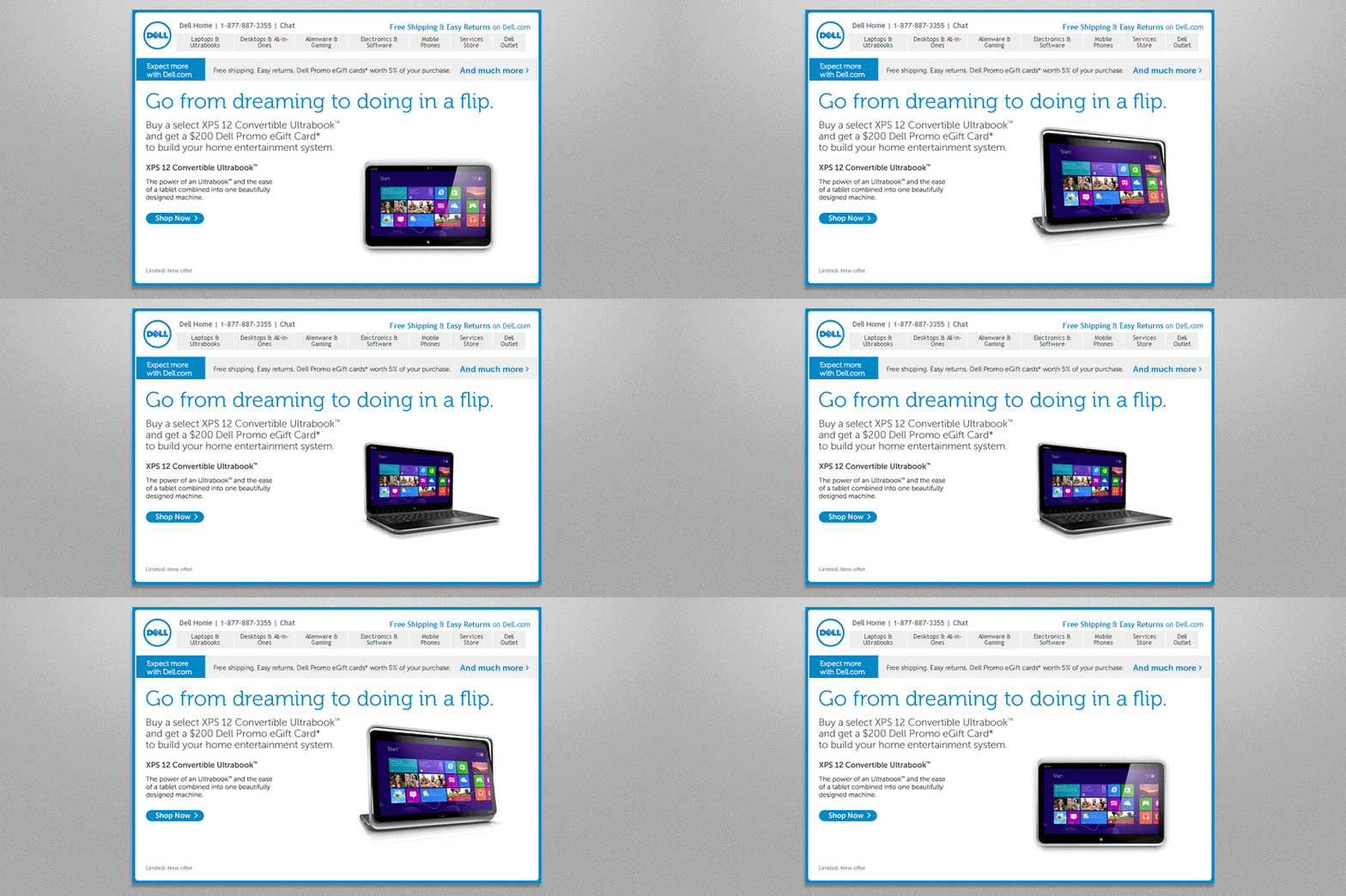
The computer company wanted to send out an email advertising its new Dell XPS 12 Convertible Ultrabook: a laptop with a hinge design that allowed it to transform into a tablet. While Dell could use flat images of the device in both computer and tablet mode, the company decided to instead use a GIF, showing the device’s transformation. This illustrated the full capabilities of the product in a fun way.
Compared to quarterly campaign benchmarks, this GIF-focused send resulted in a 103% increase in conversion rate and a 109% increase in revenue.
Similarly, Hulu used GIFs to promote the arrival of Shark Week. One of the main appeals of Discovery Channel’s animal-specific week of programming is to show these sharks in action. This summer, Hulu sent out an email send, advertising that 26 episodes of Shark Week were available on the streaming service.
While featuring flat images of sharks in the send would get the point across, Hulu decided to instead use GIFs of a shark in action, jumping out of the water with prey in its mouth. Hulu knew that these powerful action shots are a major appealing factor when it comes to Shark Week.
These selected GIFs paired with the inspiring headline to “Live every week like it’s Shark Week” adds a level of excitement to the send, encouraging users to watch the service’s marine-life-focused programming. Flat images probably wouldn’t inspire the same level of excitement.
Use GIFs as: A customer-centric, celebratory tactic
The above sends focused on using GIFs to promote a very specific product or aspect of a service, but what if your send is about a larger company change?
GIFs can still be utilized as long as the graphic adds value to the send’s overall message. In fact, GIFs are a great way to draw attention to a large change you want your customers to focus on because, at the end of the day, GIFs are ultimately an attention-grabbing tool.
For example, Marriott utilized a GIF to conclude its “This Year in Review” send. This email send chronicled every Marriott Rewards member’s 2014, showing each member personalized information, including how many cities they stayed in, how many nights they stayed at Marriott locations and how many points they earned. This email also showed Rewards Members how the hotel chain itself had grown throughout the year. This structure was specifically chosen to demonstrate how consumers and the chain had grown together over 2014.
According to Clark Cummings, Senior Manager of Member Marketing, Marriott International, “The way we wanted to think about it was we wanted to start with the member, so start with ‘you,’ and then talk about ‘us’ and then finish with the ‘we.'”
Because the send started with a personalized video, the ending GIF called back to the visual element of the beginning of the email while adding a bit of excitement to the approaching new year. This more-dynamic graphic also made Marriott’s 2015 announcement — that there would be free Wi-Fi for Marriott members — stand out more.
Don’t use a GIF: Just because everyone else is using them
Though they are fun, GIFs can come at a cost for the end user.
Just like more creative sends, many email programs require email users to download a special version of the send so the receiver can see the GIF. Also, a GIF-filled email can potentially take more time to load than one with static images.
All of this is to say, make sure the cost of loading the GIF is worth it for the receiver. Not only do GIFs need to contribute to the send’s larger message, but they should be visually dynamic enough to warrant the receiver’s time.
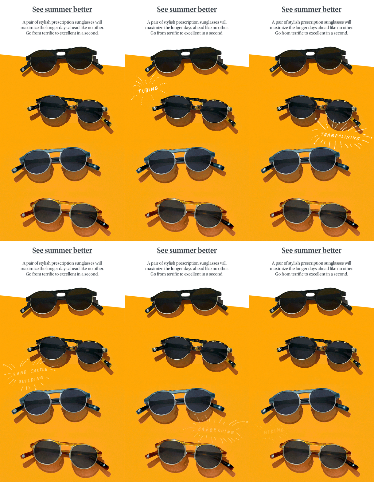
Take this visual glasses company Warby Parker used in a recent send. The GIF was used to announce a sale the company was having, and while it is somewhat engaging by nature of being a GIF, I don’t think the graphic adds enough to the send’s message to warrant the extra effort it may place on the receiver.
This isn’t to pick on Warby Parker. I’m one of the brand’s consumers and fans, but the potential cost of including this graphic is greater to me than its benefit.
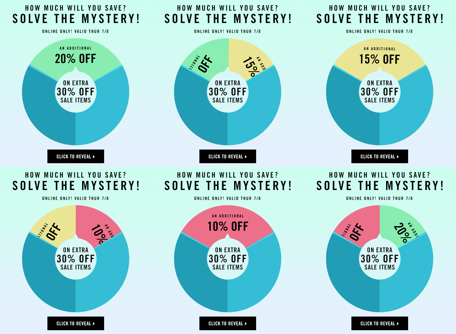
However, Forever 21 implemented the often-utilized sales GIF in a much more successful way. This is achieved primarily through the percentage-off randomization evident in the send.
By making the image look like the Wheel of Fortune wheel and including a call-to-action that says “Click to Reveal,” the movement of the GIF makes a typical promotional send seem more like a game. As a result, this send seems far more fun and compelling to me as a consumer than Warby Parker’s.
The only way to truly know whether or not including GIFs in your brand’s emails will increase receiver interest is to test, but hopefully this guide will give you some insight into incorporating GIFs that you can use in the future.
You might also like
Email Marketing: Dell lifts revenue 109% via GIF-centric campaign [MarketingSherpa case study]
Email Marketing: Marriott’s Year in Review send helps increase revenue 86% year-over-year [MarketingSherpa case study]
Email Marketing: How a creative throwback helped Dell boost revenue 109%
Simple Animated Gif in Email Lifts Conversions 49% – Test Results [MarketingSherpa case study]
Categories: Email Marketing content, Email, gifs, social media





Thank you for the great article it answered the question that I was thinking about using GIF since recently seeing some company start using it in their new email campaigns.
Loved the phrase: nest of virtual hoarding. I think a lot of people are doing this with their personal inbox…I know I am. Image helps to paint the picture that email competition is fierce and if you are going to stand out your email had better be eye-catching!
Nice summary on using motion graphics in emails. They can be very effective when appropriate. Just an aside, “GIF” should not be pronouced as “jif”. Think of the word “gift” and drop the “t”. That’s the correct pronunciation.
But for many years, email clients as MS Outlook avoid animated gifs to play inside the body message. Has it changed now? I can’t remenber last time I saw something moving on my Outlook inbox.