Marketing 101: What is a lightbox?
Lightboxes are controversial. It’s a website element that is basically the “West Side Story” of marketing — you’re either for them or against them. Sides are chosen, co-workers torn apart.
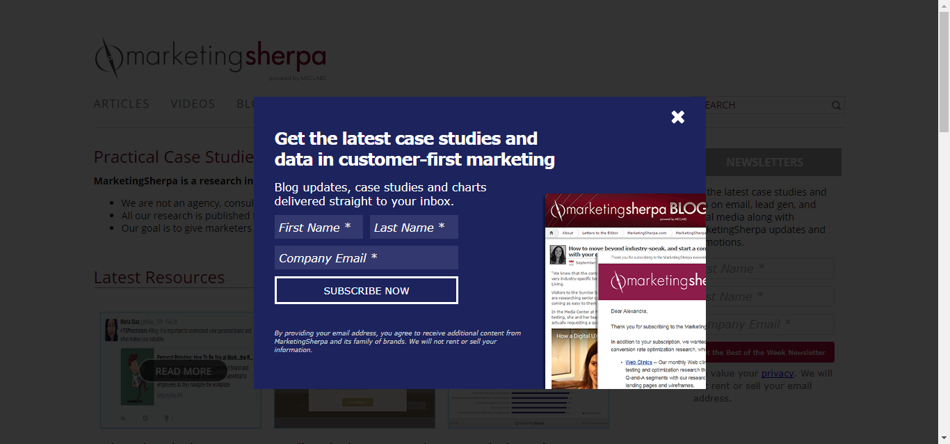
We went through this ourselves at MarketingSherpa. Hopefully, you noticed but were not incredibly annoyed that we feature a lightbox on our site. It appears to first-time visitors after they’ve been on a page for 10 seconds.
As with most, our lightbox is a website overlay that encourages visitors to sign up for our newsletters. Admittedly, we have received one complaint about them that was emailed to our customer service department. So, in response, we looked at the numbers.
Numbers don’t lie, and our numbers say that people use this lightbox. We get quite a few sign-ups to our newsletter with this tactic, and we’re not alone.
I went through our case study library to see what other information we had about marketers’ interactions with lightboxes and what they had found when testing them.
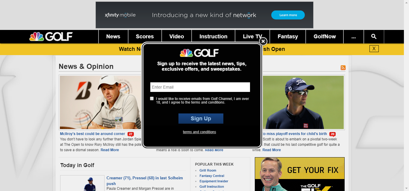
Golf Channel, for example, moved from a cumbersome email registration process with 13 required fields, to a simpler method of using a lightbox on the website that allowed people the option of going to the preference center.
The lightbox was a less complicated way to pull subscribers in, Carolina Castaneda, Digital Marketing Director, Golf Channel, said, because it targeted people who were already consuming content, and all they had to do was enter an email address and hit subscribe.
“We’re just trying to cast a broad net amongst our GolfChannel.com consumers because they’re already reading the articles we’re pushing out,” Castaneda said. “So why not let them know while they’re engaged in an article that tomorrow they don’t have to come to GolfChannel.com and try to figure out the story of the day? We can do that for them.”
It was important that the lightbox not be too intrusive — a concern of any marketer who is using one — and because of that, Golf Channel made the same choice MarketingSherpa did, deciding to only show it to first-time visitors.
A/B testing lightboxes
Golf Channel also tested different looks on the lightbox to further ensure that it wasn’t intrusive, and of course, to make sure that it was functioning properly with website visitors.
Castaneda and her team tested a homepage takeover lightbox, which is an overlay on your screen like a pop-up. They also looked at one that was right and then left-aligned, one that stayed at the bottom of the screen as you scrolled down, and another that would appear as a bar along the bottom of the site.
Currently, the Golf Channel email subscription lightbox is center-aligned with no shadowing.

By testing different looks for the lightbox, the team was able to determine which performed higher, and understand the correlation between lightbox type and the response in newsletter sign-ups.
Castaneda gave an example; the team moved away from featuring it as a bar along the bottom of the screen, choosing instead the overlay on the middle of the screen that they currently have, which performs best as a “higher visibility unit.”
Overall, in using a lightbox (alongside other tactics), Golf Channel was able to increase the size of its subscriber database by 32%.
So, while controversial, there’s a reason you see lightboxes pop up everywhere — they have a tendency to work. It’s just a matter of testing to understand if and how they can work for you.
You might also like …
Email Marketing: Golf Channel increases database size by 32% by easing sign-up process
Email Marketing: Subscriber list grows 68% with holiday ebook giveaway for digital content marketers
Download the free Quick Guide to Email Marketing
Email Marketing 2015: The top 8 MarketingSherpa case studies for your email program next year
The A-Z of A/B Testing: Handy guide to nearly 200 conversion optimization definitions
Categories: Email Marketing Email Marketing, email newsletters, lightbox, website design


