


CRO for CTAs: There is no perfect call-to-action, but these 6 checklists will help get your CTA pretty close
Isaac Newton’s first law of motion states that an object at rest remains at rest unless acted on by a net external force.
It’s a good reminder when we discuss the call-to-action. The customer’s natural state is inertia. They don’t care about our products or services without a clear, compelling reason.
The only reason they move is because the perceived value of the product (shaped by previous experiences, word of mouth, press mentions and especially your marketing) begins to pull them into motion. And usually the final piece that tips them from being at rest to in action is the aptly named call-to-action.
Which is why it’s surprising that so many calls-to-action don’t really live up to the name. CTAs like “submit” and “request a quote” give your customers very little reason to act.
Oh, let’s take a quick break for our own mid-blog post CTA:
This blog post was originally published in the MarketingSherpa email newsletter.
OK, we’re back. While the above call-to-action is not value-laced per se, our hope is that it’s surrounded by value. If you find this blog post helpful, and you would like to receive more helpful content like it in your email inbox, then making you aware of the email newsletter’s existence will encourage you to overcome inertia and act.
The quest for the perfect CTA
Now that we’ve talked about the bad, let’s talk about the good. We’ve been asked about the perfect CTA. What should the words say? What color should the button be? Friends, we can’t help you find the perfect call-to-action. It doesn’t exist.
Because CTAs are very context-dependent. The best thing you can do to improve your CTA is to understand your unique customers’ psychology as well as your own.
To help simplify that for you, we’ve created a nifty PDF download of checklists you and your team can go through as you seek to optimize the conversion rate of your CTAs. You can download it for free here: The Call to Action: Six quick checklists to help the busy marketer improve conversion rates.
I’ll walk through one of the checklists with you in this blog post, and you can get more background on the checklists along with a deeper understanding of how to improve your calls-to-action in 150 Experiments on the Call-to-Action: Six psychological conditions that hinder our results.
A purchase is a journey
In the digital world, it’s easy to forget that a purchase is a journey. Customers don’t just instantly buy a product. They go on a journey of the mind to get to the point of final purchase.
While that is virtual movement and not physical distance traveled, if you don’t guide them through the process, they can get lost or disoriented — in other words, they may get transitional vertigo.
Here’s a checklist to help you overcome that disorientation.
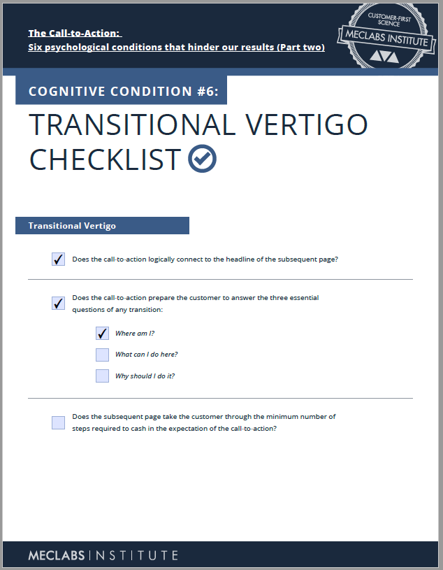
Source — The Call to Action: Six quick checklists to help the busy marketer improve conversion rates
◊ Does the call-to-action logically connect to the headline of the subsequent page? Something on the previous page or step (like an email, social media ad or even print ad) brought them to your landing page. Does your page pay off on that promise? If not, customers could feel lost or, even worse, deceived.
◊ Does the call-to-action prepare the customer to answer the three essential questions of any transition:
- Where am I? Is it clear that this is your company’s page. What is your company about? Is there a clear tagline? Does your nav provide context about what your company does? Is there useful information instantly on the page, or do customers have to wait for a timed animation to play out to help them understand where they are? Do your visuals provide an indication of what your company is (for example, many companies use generic stock photo images of smiling people that don’t communicate anything about the company.)
- What can I do here? For a home page, this may just be letting visitors know where they should go on your site. For a landing page, it may require clarity around a lead gen download or a product purchase. Be careful with witty but unclear language. It may make sense to you, but in the few moments visitors are trying to understand what they can do, they may not be able to make sense of it. Also, be careful with providing too many options. When you tell customers everything, you tell customers nothing. For example, I’ve been on the Las Vegas strip at night. And wow. Wow! Options everywhere screaming out at you. What should I do? Where should I go?
- I’ve also met a friend in upstate New York at night at a gas station (before the days of GPS). I asked, “How will I know if it’s the right gas station?” She said, “Trust me, you’ll know.” The gas station was literally the only building with bright lights in the whole darkened town. (If you live in a rural area with no street lights and plenty of deer, I sure hope you have quick reflexes). The reason she wanted to meet there was exactly because it was the only building in town with bright lights; she knew I would go to the right place.
- Why should I do it? This is the process-level value proposition. Why should I take this action? Why should I take this action with this company? (which relates to the “Where am I?” question) Essentially, have you given the customer a clear and compelling reason to click/act?
◊ Does the subsequent page take the customer through the minimum number of steps required to cash in the expectation of the call-to-action? If they heed your call and act, the journey continues. What does the next step look like? Does it live up to the promise you made in this step?
Here is an example. I was in a co-working space with some colleagues. To connect to the wifi, you have to go to a webpage. The webpage promises “We provide an enterprise class network to help maximize your productivity. Enter your email address and we’ll have you connected in no time” with a button that says “Continue.”
When I fill it out and click continue, I get to a 404 page that had a small 404 error code in a cold tech-font in the upper left of a plain white page. I kept doing it a few times until my colleague told me I actually was connected to the wifi. It did work. The page was so bare bones, I just assumed I couldn’t get on the internet.

Now, obviously, the 404 page wasn’t the desired customer experience this coworking space was intending. However, if they had an effective 404 page with better messaging and some design, even if a 404 error did occur, I would at least be able to see that a webpage clearly loaded and that I was in fact online.
Here is a less radical example. MVMT’s email campaign linked to the general collections page with a “Shop The Looks” CTA. When customers got to the page, they didn’t see “The Looks,” just a random assortment of watches.
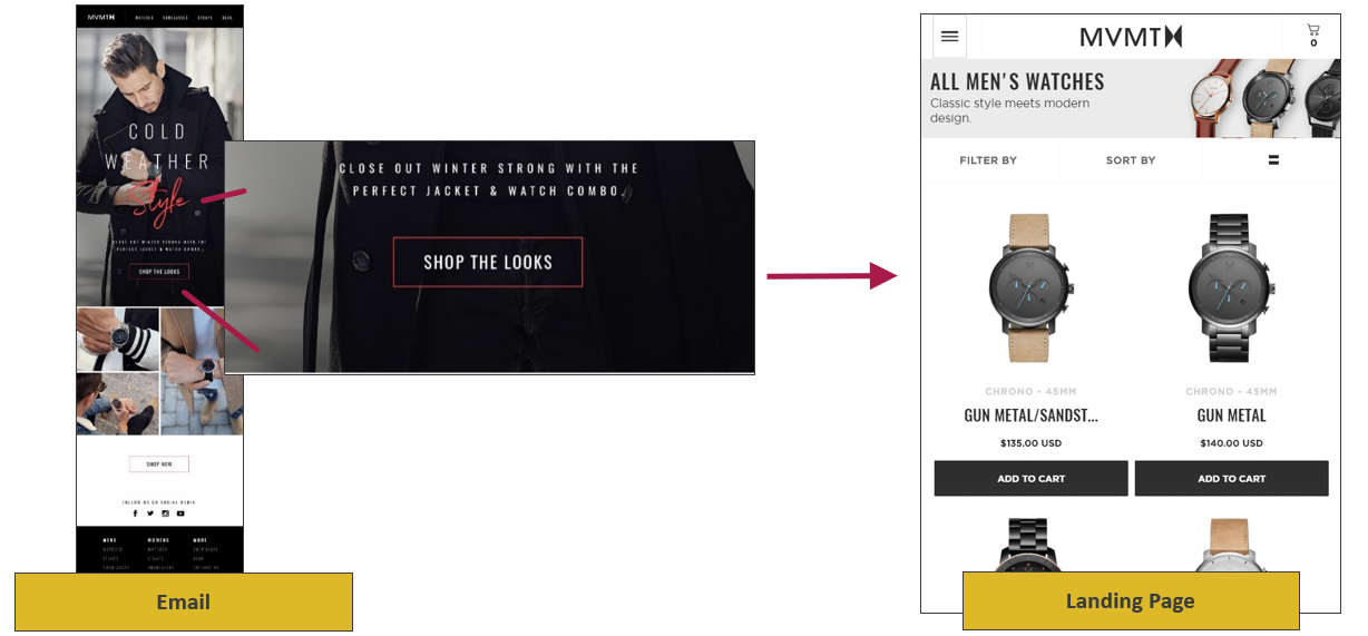
For the company’s Winter Escape campaign, the watch company made a change and linked the email to a specific landing page that connected with the email message.
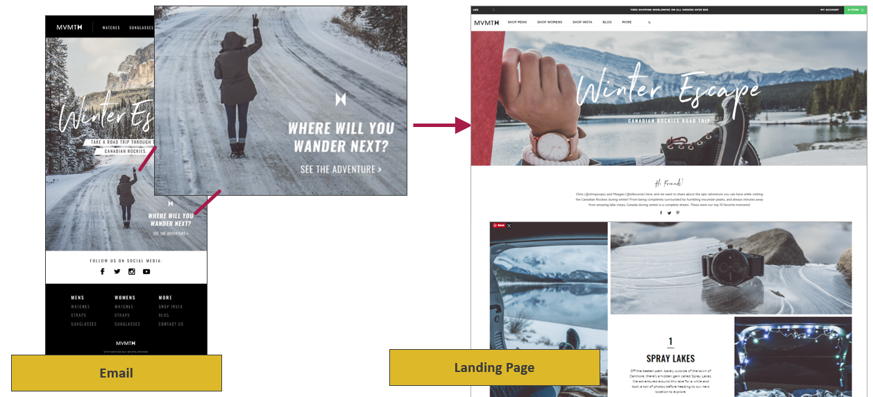
The campaign that linked to the specific landing page generated a 44% relative increase in conversion rate and 1.7x higher revenue.
I’ve gone through just one of the checklists. If you would like to get all six checklists for free, simply fill out the simple form here: The Call to Action: Six quick checklists to help the busy marketer improve conversion rates.
You can follow Daniel Burstein, Senior Director, Content & Marketing, MarketingSherpa and MECLABS Institute, on Twitter @DanielBurstein.
You might also like …
Effective CTAs: How the thought sequence of a call-to-action affects landing page performance
The Most Effective Calls-to-Action: 5 principles discovered for increasing customer response
Categories: Marketing call-to-action, call-to-action optimization, conversion marketing, CTA


