


3 Strategies for Overcoming Banner Blindness
To be honest, I don’t even see them most of the time. It is as if the top and sides of the webpage I’m looking at are blurred—I know they’re there, but I don’t even notice them. For this, I thank “banner blindness.”
Banner blindness is the result of templated or “best practice” page layouts that place banner ads in specific places, such as the very top center of the page or on the far right side of the page. See the red boxes below:
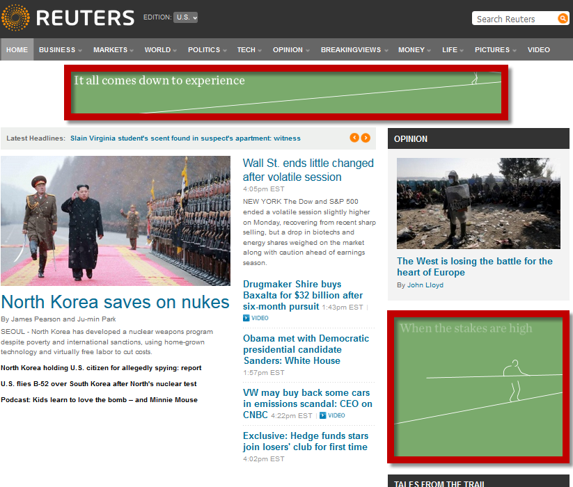
Why is it called “blindness”?
The ad is there, but we ignore it because our minds have “seen that, done that” so many times before. We have established the typical banner areas as distracting from our goal on the page.
As marketers, if we are stuck in these blind areas, what can we do to increase the effectiveness of our banner ads? For questions like this, I always like to refer to the MECLABS Institute’s (MarketingSherpa’s parent company) Online Ad Sequence heuristic for guidance:
Attract attention
We start with addressing the initial and most difficult hurdle for the marketer: attracting attention. Attention, even a second’s worth, could be the difference between a customer clicking through and the customer moving on. Specifically, marketers can attract consumer attention through design elements (contrasting color, thick borders, imagery, etc.) and motion (video or rotating ads).
Take a look at the below banner ads.
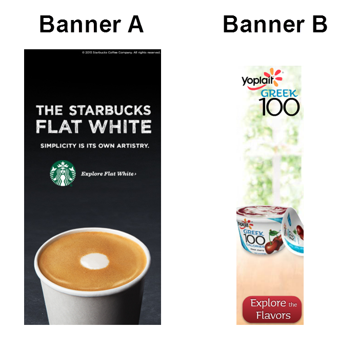
After looking these ads over, ask yourself some critical questions:
- Which ad would stand out better on the standard white background?
- Which ad would stand out better on a busy page? On a minimalist page?
- What elements are used in each ad to draw your attention?
Generate interest
Once we have the visitor’s attention, we need to keep it. This means our ad must be interesting and relevant. To do this, we need to understand our target audience. We (marketers) use cookies, among other data sources, and (should) strategically design banner ads with the best chance of reaching our target audience.
How do the ads below generate interest?
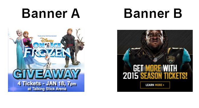
Now ask yourself:
- What strategies are the ads relying on to generate interest?
- Do you find one strategy stronger than the other? Why?
Ask for the click
“The worst they can say is ‘no’” mentality fits here.
First, a CTA is required to simply ask for the click. However, the key to success is not just asking for the click, but presenting the correct ask. The goal of a banner ad is to get a click, not necessarily to sell.
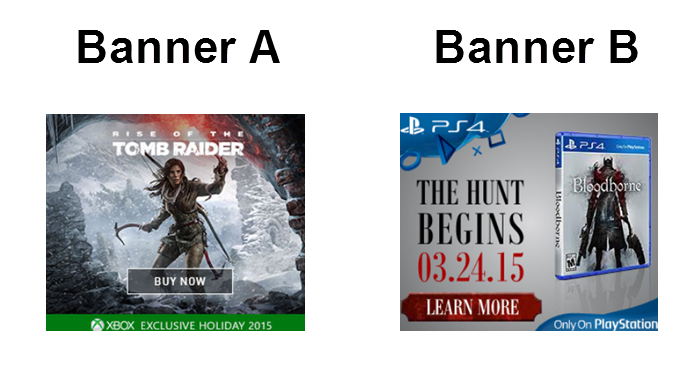
Ask yourself:
- Which ad best takes customer thought sequence into account?
- Which ad asks, and which ad demands?
- What ad are you more likely to click?
As a nod to other hardworking marketers, start paying attention to the banner ads you are presented with on the page. I suggest dissecting these ads to not only get ideas, but to also evaluate and compare against your own ads.
Have you created or seen some really effective or ineffective banner ads lately? If so, post in the comments what made them especially effective or ineffective, using the questions above as a guide to jumpstart your thinking.
You might also like
Marketing Process: Managing your business leader’s testing expectations
Marketing Strategy: How you can use emails to test your value proposition
Optimization: A discussion about an e-commerce company’s 500% sales increase [From MarketingSherpa]
Test Planning: 3 simple tips to keep your test planning and optimization on the right track [From the MarketingExperiments blog]
Categories: Online Advertising banner ads, landing page, testing


