Overcoming ‘Get Your Money’s Worth’ Syndrome in Your Facebook Timeline Cover Image
Let me talk about an old advertising problem I’ve seen raise its ugly head recently, thanks to Facebook’s shift to Timeline. I like to call it … “get your money’s worth” syndrome.
This is a problem as old as media buys.
Are you a white space hoarder?
And, it makes sense on the face of it. A marketer buys a specific piece of media, say, a quarter-page ad in the newspaper. Then, his agency creates a clean ad with a straightforward call-to-action.
But, before that ad gets published …
The marketer must approve it. He sees a lot of white space, so he starts to think, “Well, I paid $15,000 for this space in the newspaper. And, we’re only using a small portion of it. I can add in information about three other products we offer. And, more about our features and benefits. And, seals for some of the organizations we’re members of. And …”
The list can go on forever. In the agency business, we used to call this “trying to cram 10 pounds of, um, stuff, into a five-pound bag.”
The worst offenders tend to be small mom-and-pop shops, and you can see these in the free direct mail coupon advertising magazines that are sent to your house, with names like Mint Magazine, Money Saver Magazine, Clipper Magazine, etc.
Every square millimeter, wall-to-wall, is covered with ink. I was reminded of this recently while walking down The Strip in Las Vegas one night during Email Summit 2012. Everything screams for your attention.
If everything is emphasized, nothing is emphasized
I noticed the same problem while helping a local nonprofit adapt to Facebook Timeline with one of my neighbors. My neighbor is not in marketing, and she’s just under 35 (young unemployed people: I’ve noticed that pretty much anyone under 35 can consult on Facebook marketing to pretty much anyone over 50, and really add value).
We agreed on a simple image with a simple headline for the organization’s Facebook Timeline Cover, the new header photo that goes across the top of Facebook Pages now that Timeline has launched.
(Note: There is a common misconception that you cannot use any words in this cover photo. You can … you just can’t sell. Here are the guidelines directly from Facebook about what isn’t allowed in your cover image:
- Price or purchase information, such as “40% off” or “Download it at our website”
- Contact information, such as Web address, email, mailing address or other information intended for your Page’s About section
- References to user interface elements, such as Like or Share, or any other Facebook site features
- Calls to action, such as “Get it now” or “Tell your friends”)
After providing direction, I stepped back and let my neighbor and the nonprofiteer work on it over the next few weeks (ah … the life of a consultant).
I found out they went through several rounds of changes. Why? The well-intentioned philanthropist kept adding more and more details into that one simple photo, trying to get across every possible thing the organization could do for the visitor.
One and done
Keep in mind, that unlike the Bayeux Tapestry, the Facebook Cover is not meant to tell the entire story of your company (leave that for Timeline).
Most customers will only visit your Facebook Page once – when they first like it – and rarely return. Facebook is less like a billboard and more like a drip campaign … with your updates appearing in your audience’s news feed (well, hopefully, you do have to deal with EdgeRank). That is the prime way your company will likely interact with your followers on Facebook.
With that in mind, you can choose to invest significant resources in designing a really cool Cover. If that’s your plan, a simple Google search will show you some really creative examples.
Or, do what we did considering we have a jam-packed Design queue and most of our followers will only see that image once – go simple.
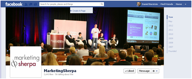
Here’s how the MarketingSherpa Facebook page looks …
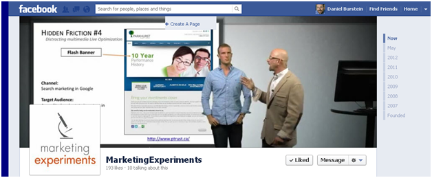
… and the MarketingExperiments Facebook page …
Of course, all these early drafts are not perfect by any means. We’re always optimizing.
Confession time
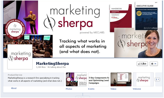
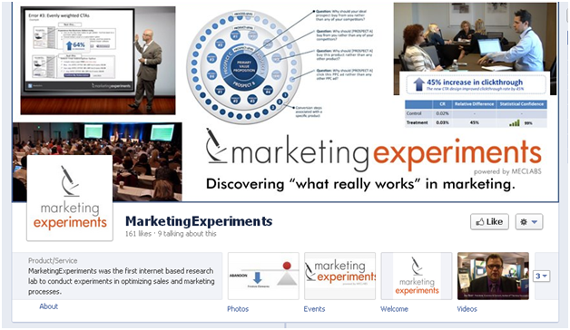
Hey, we’re no exception to having a moment of weakness here and there. It’s very easy to fall under the spell of “get your money’s worth” syndrome. Here are a few early rough mock-ups that were passed around the MECLABS offices …
Related Resources:
Social Media Marketing: How to ensure Facebook doesn’t tear down your wall
Social Media Marketing: 8 tactics to measure and improve Facebook results
Landing Page Optimization: Goodbye stock photos and Happy Man, hello social media
Social Media Marketing: Facebook news feed optimization
Social Media Marketing: Social login or traditional website registration?
Categories: Social Networking Evangelism Community Facebook, Facebook Timeline, images, social media marketing


It’s hard to find experienced people in this particular topic, however, you sound like you know what you’re talking about!
Thanks