Sometimes marketers might feel as though they are stuck in a permanent promotional cycle. Promo email after promo email goes out, and there are high expectations for each one.
It may make sense to the bottom line, but what is the cost to the relationship with your customers?
 Discovering a human voice for your email content was one of the topics covered yesterday at the ninth annual MarketingSherpa Email Summit 2014, held this year in Las Vegas, where marketers spoke about how a fresh perspective or voice can help keep the magic alive between a brand and consumers.
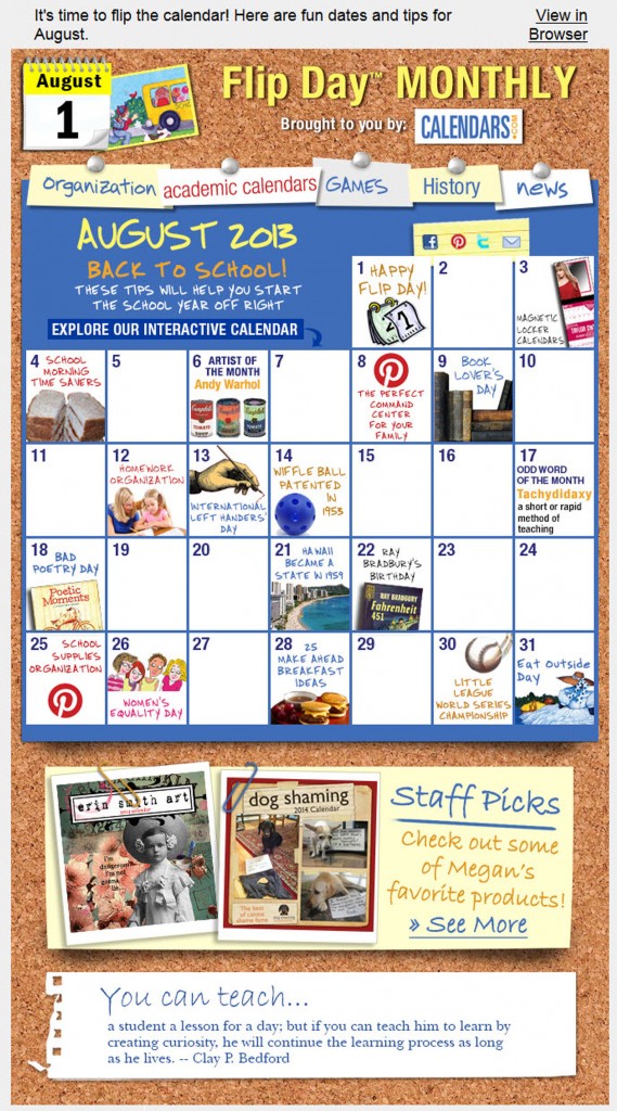
Marcia Oakes, Senior Online Marketing Manager, Calendars.com, in her Tuesday morning session spoke on her team’s tricky situation last year. The email channel was almost exclusively utilized for promotion, and had no real “voice” despite sending roughly 50 million emails a year.
“We were only talking at our customers, not really talking with them. We wanted to evolve beyond that,” she said.
Find your voice in unexpected places
When Marcia’s team decided to break away from promotions with a monthly newsletter establish a voice, they had to integrate two previously underutilized assets into the email sphere.
Calendars.com social media provided the voice with the plethora of quirky blog posts via Calendars.com’s official blog, “The Daily Grid,” useful tips and boards on Pinterest and a trademarked phrase, “Flip Day,” which gave the brand a fun excuse to reach out with content on the first of every month.

Even the interactive design of the Flip Day newsletter conveys the voice with an interactive grid calendar design that reinforces the brand with engaging and fun imagery. Marcia said they needed to consistently supply newsletter content that:
- Entertains
- Informs
- Is seasonal and timely
The most important aspect, she added, was that if the voice and the content of the send didn’t provide a benefit to the subscriber, it would fail.
To provide that benefit, the days of each month are filled with celebrity’s birthdays, a “word of the month” and historical facts and helpful hints such as “25 make-ahead breakfast ideas” in every Flip Day newsletter. All of this content is interactive and links to Calendars.com Pinterest, Facebook and blog content.
Creating a consistent voice is more than just knocking off the company-speak, Marcia said. It’s a consistent balance of time and assets for the sake of consumer interaction. Sometimes, promotions and monetary goals have to be set aside for the sake of brand equity with your consumers.
“We’re more than just a website to order calendars for your family at Christmas,” Marcia said, adding that the Flip Day newsletter voice has allowed feedback that “is really exciting as a marketer to see someone value your content.”
Demolishing discount fatigue
Jessica Andreasen, Digital Marketing Manager, ZAGG, spoke in her Tuesday afternoon session about subscribers succumbing to discount fatigue.
“We’ve been doing the same promotions for years – buy-one-get-one, discounts, and we were just not seeing the same kind of results,” she said.
To better communicate with their customers, the team at ZAGG decided to totally reassess their email design template with an email send to loyal customers.
“A template can’t get in the way of what you need to say,” Jessica said.
Her team started with a conversation with ZAGG’s Web development team.
“Tell me everything you have. I don’t care if it’s relevant or not, tell me everything you have,” she explained.
Whatever data or information you are able to uncover can help you develop a voice that speaks to your consumer and anticipates their behavior.
With data in tow, Jessica’s team studied their current email template with the consumer in mind – how could they speak to them in the design?
She said it was decided they needed to:
- Disarm the customer by only using one call-to-action, and placing it below the fold
- Connect to the customer by using image and word selection to convey the email’s purpose to customers
- Deliver value to the customer by ensuring product details are prominent
Jessica added, “We still needed to deliver value to our customers – we attempted to do this by enlarging and simplifying the text as well as programming a personalized image.”
Some ZAGG customers had been on the list for three or four years, and Jessica wanted to reward that brand loyalty.
“These are loyal customers. I wanted to have a conversation with them,” she said.
By fighting against the discount fatigue they were seeing and developing a voice through their template to communicate with subscribers, the ZAGG team was able to increase their revenue per email by 152%.
Read more…


