Testing and Optimization: Radical website redesign program improves lead gen 89%
I’m live blogging at MarketingSherpa Lead Gen Summit 2013 in San Francisco, and attending a brand-side case study with Jacob Baldwin, Search Engine Marketing Manager, One Call Now.
To begin a testing and optimization program, Jacob launched a test on the website with a radical redesign, attempting to improve lead capture. The program was executed sequentially as opposed to A/B split testing.
Jacob said each new homepage version replaced the previous – the marketing team created new treatments and “flipped the switch” to learn how the page would perform.
An important insight from this testing approach is there isn’t necessarily a need for a complex A/B or multivariate testing program.
The testing program was run on the homepage, and there were several objectives:
- Increase conversion rate
- Increase traffic
- Reduce bounce rate
- Provide niched messaging via enhanced segmentation
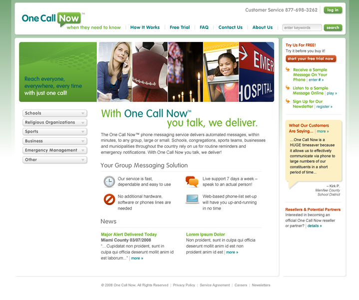
Here is the test control and original website:
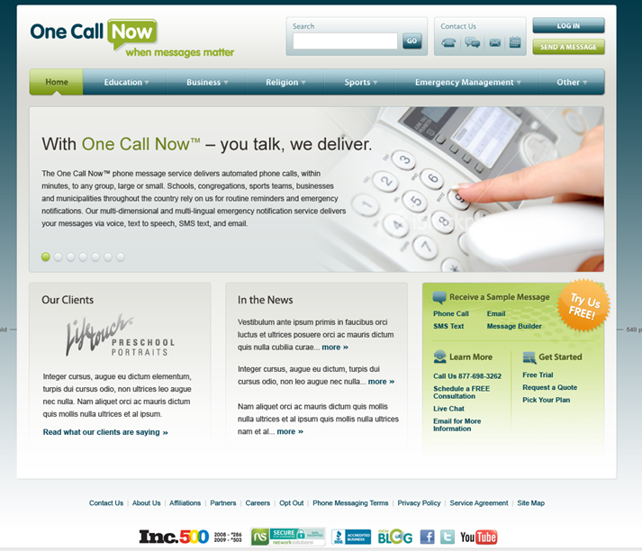
And, here is the radical redesign treatment:
There were several key differences with the treatment:
- Restructured navigation
- Consolidated calls-to-action (CTAs)
- Single value proposition – no competing headlines on the page
- Trust indicators
- Color palette
- New tag line
- New content
The original homepage, the control in this test, achieved 2.40% lead capture, and the radical redesign treatment pulled in 2.85% lead capture – an 18.75% lift over the control.
Jacob says the radical redesign was based on a revamped segmentation model.
“The new segmentation model drove the basic navigation structure and information architecture of the new homepage,” he explained.
This test with an early “win” was part of an ongoing optimization program. Not every test uncovered a lift, but every test did garner a discovery. The testing protocol involved taking the “winning” treatment and then refining the webpage layout, calls-to-action and length of the sign-up process for lead capture.
Through optimization, the sign-up process was shortened, and free trial sign-ups increased 55.3%, and the overall redesign of the entire website garnered a 89% lift in lead generation.
For the big takeaway, Jacob says, “Never stop improving. Complacency is lead capture optimization’s worst enemy and perfection is impossible. Complacency is conversion rate optimization’s worst enemy.”
Related Resources:
A/B Testing: One word will unclog your conversion testing
Marketing Concepts: 3 telltale signs your homepage is not customer-focused
Test Planning: Create a universal test planner in 3 simple steps
Categories: Website And Landing Page Design conversion rate optimization, landing page optimization, lead generation, online testing, radical redesign, sequential testing, website optimization


Many site owners provide the content for the website but a web designer needs to be able to edit and even rewrite the content if necessary. Web designers also normally do the usability testing for the navigation and site loading speed.