A/B Testing: 4 tests from a crowdfunding site with double-digit results
Before you start an optimization program, you have to be clear on what you are trying to optimize. Or, as Brad Damphousse, the CEO of GoFundMe, a crowdfunding site, puts it, “What’s the one thing that really matters?”
The GoFundMe team determined that, for its site, it had to focus on making it easy for anyone to receive donations. To achieve that goal, the team would have to optimize for both of its customer segments (which are essentially on both sides of the transaction): users asking for donations and donors making those donations.
So, Brad launched a series of A/B tests to help convert more new users and to gain more donations from donors.
Test #1: Sell the service
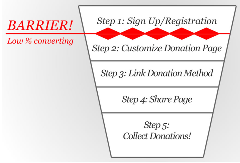
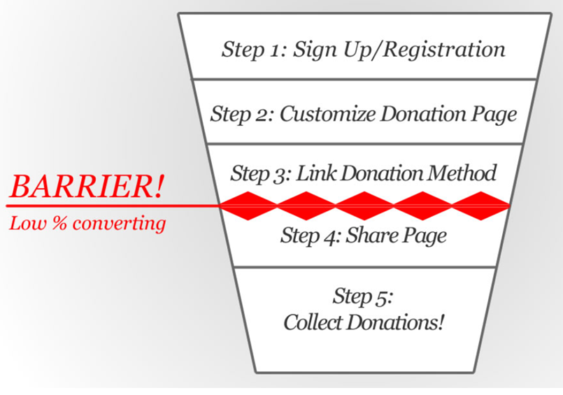
For the first test, the team mapped out its funnel and identified where leaks were occurring.
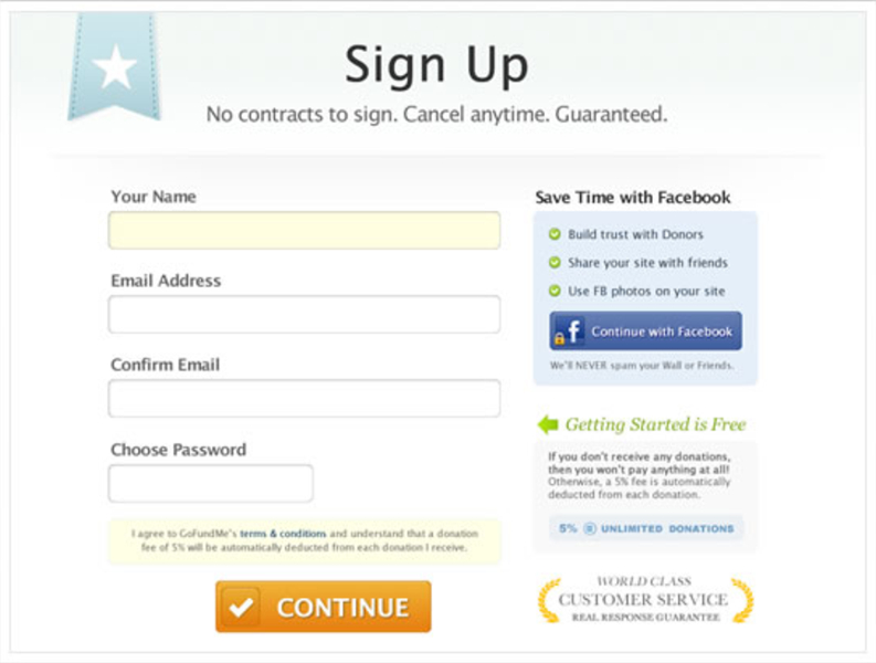
Version A
Version A was pretty sparse and lacked focus, according to Brad.
“Sometimes less is actually less, instead of more,” he said.
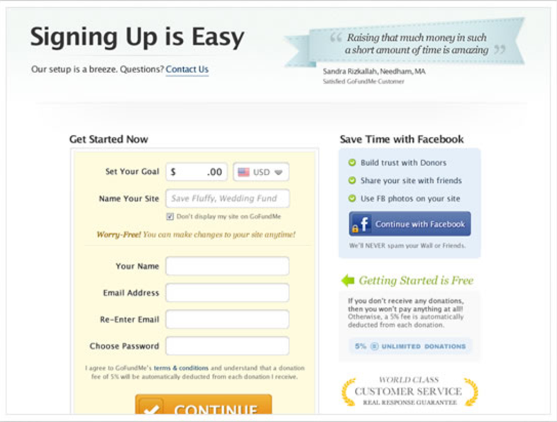
Version B
“With Version B, we were really trying to ‘sell’ the service with value propositions, social proof (in this case, a user quote), and make the process more focused with the yellow-bounding box – and more engaging by asking users to set a goal and name their site,” Brad said.
Result
Version B was the winner, increasing conversion by 16%.
Test #2: Try to beat the winner
In the next test, the GoFundMe team tried to further optimize Version B to increase results.
“Version B was a good start, but what we were finding is that people wanted to dive right into the product,” Brad remarked.
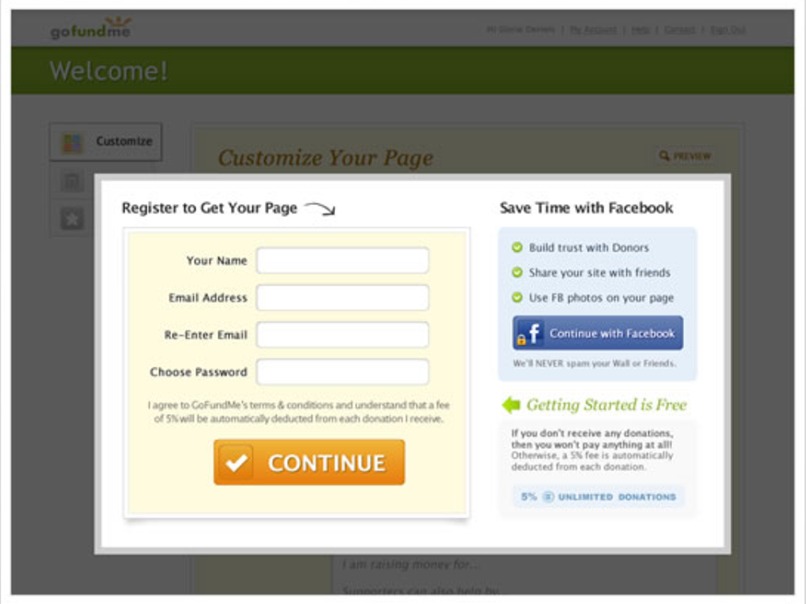
Version C
“Version C allowed users to get a quick look at our ‘customize-page’ page before being prompted with the sign-up lightbox,” Brad said. “At this point, you have to register in order to proceed.”
Results
A new winner, with Version C producing 14% more conversions than Version B.
“Sign-ups increased and so did the subsequent page creation numbers,” Brad said. “More people raising more money is a very good thing.”
Test #3: Reduce barriers
For the next series of tests, the team focused on a leak a little deeper into the funnel.
Version A
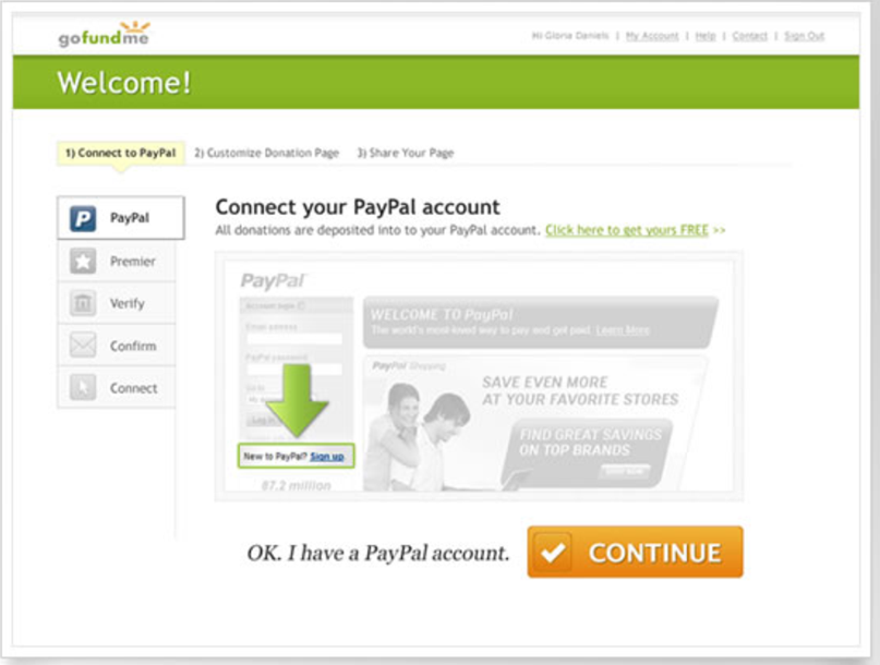
Version A illustrates the old barriers to the site’s setup process. The team hypothesized that it could increase conversion by reducing these barriers.
“Version A shows the five-step process required to simply link your PayPal account. Their requirements, not ours,” Brad remarked.
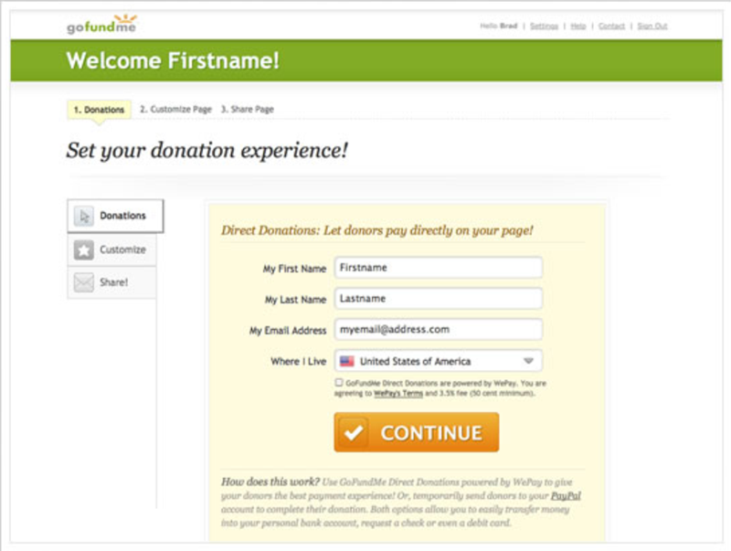
Version B
“Version B demonstrates the reduced barrier as a result of our integration with our new and preferred payment partner, WePay. One single step!” Brad said.
Results
As I’m sure you can tell by Brad’s explanation of Version B, it was the winner, producing 17% more conversions.
Test #4: The donor perspective
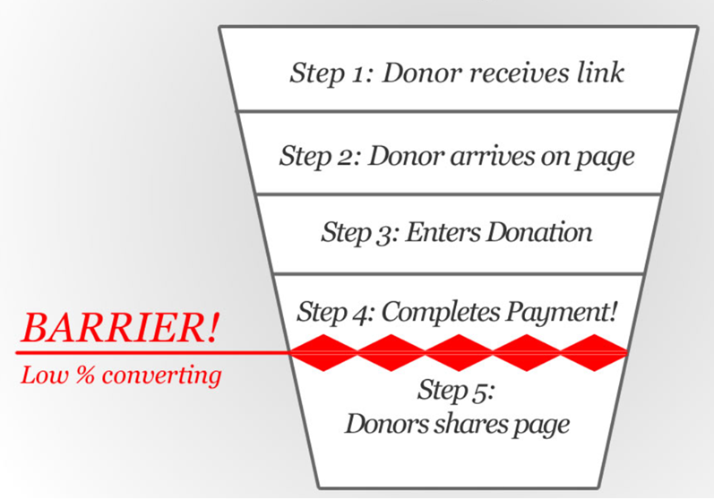
Now, the team moved on to its other customer segment, and focused on donors. After reviewing that funnel, the team identified a leak there as well.
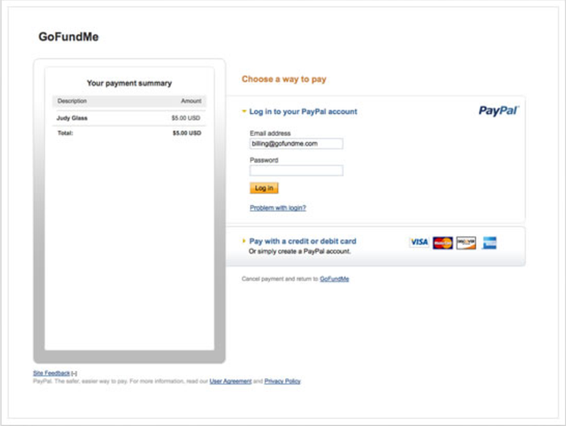
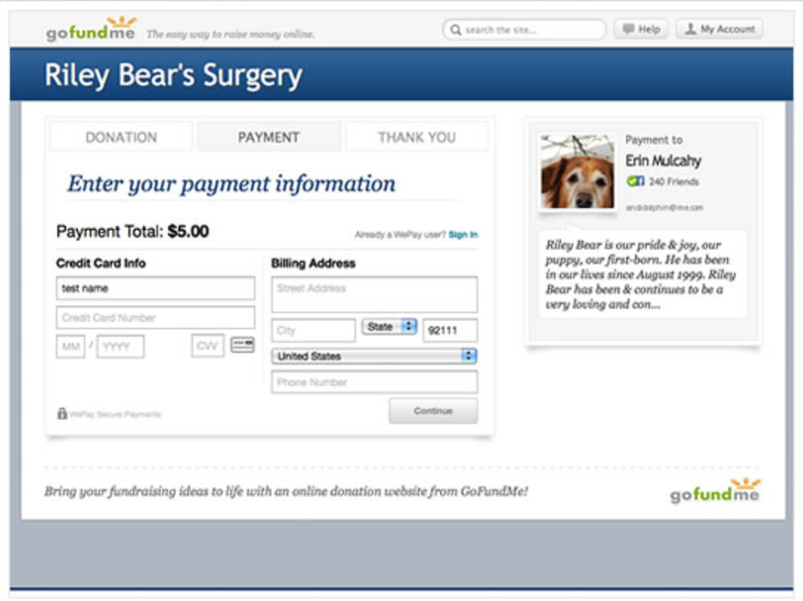
In Test #3, users either signed up using PayPal or WePay. The treatments in Test #4 show the different donation experiences from the potential donors’ perspective.
Version A
“Version A shows donors who are forced through a PayPal redirect and login screen, etc. The process is at least three to four steps to complete your payment,” Brad said.
Version B
“Version B is self-explanatory – one screen and you’re done. Plus, you stay on GoFundMe ,” Brad remarked.
Results
Version B was the winner, generating 28% more conversions than Version A.
What you can learn from these tests
While it is always helpful to see the before, after and results from fellow marketers’ tests, let’s look at the deeper lessons from this series of tests, according to Brad:
- Just that, test! Something that can’t be measured isn’t worth doing. Without the data, you’ll never know if you’re going in the right or wrong direction with your changes.
- Dig for answers! The story of how GoFundMe came to be can be summed up as never being satisfied with the options PayPal provided. We were successful in getting our feedback to the right people at PayPal, but the critical changes never came to be. We searched high and low for better payment partners to work with and have had a great relationship with WePay.
- One luxury we had was an ability to test against real traffic. Sites that are just starting out will have a hard time testing with limited traffic. We recommend starting with an SEO strategy from day one … this will help get the visitors trickling in. Creating demand via SEO, mailing lists and affordable ads BEFORE building your product is a smart idea. See Eric Ries’ “The Lean Startup” and Brant Cooper’s Lean Entrepreneur.
Another lesson you can learn from the team at GoFundMe is to not run one-off tests in a vacuum, but to have an overall process. Here is the process the team used:
- Identify opportunities
- Measure experiments
- Verify data and act
- Repeat
Sources
WePay – online payments platform used by the team
Related Resources:
A/B Testing: Why don’t companies track ROI of testing and optimization programs?
Website Optimization: Testing program leads to 638% increase in new accounts
Categories: Website And Landing Page Design A/B testing, funnel optimization, nonprofit marketing, traffic




Daniel, this is an amazing post!! What great insight into the funnel and customer behavior. WePay sounds like a great cart solution, too. Thanks for sharing.
Thanks, Daniel, for the insights into the importance, in marketing terms, of paying attention to the donor’s experience and perspective.
My question to you would be, doesn’t “ease of entry” have its flip side? For example, if a donor found GoFundMe a very user-friendly partner when it came to taking donations, but then found that the recipient was not experiencing “ease” in receiving his donations, what kind of impact do you think that would have, from a marketing outlook? If Damphouse and his team paid a lot of attention to making it easy for people to make pages and receive donations, but were indifferent to the kinds of difficulties users experienced on the exit side, couldn’t that generate a lot of hostility?
That would mean that, before GoFundMe had received the user’s money, they were anxious to clear away obstacles, but once the money was already in their hands, their anxiety had evaporated. Their anxiety was never for the customers to have a good experience overall, only that the customers be persuaded to give up their money. What do you think?