Designing Slides That Don’t Suck: 20 questions to ask before you present
When I first started at MarketingSherpa, I was hired under the title of “Visual Storyteller.” Although that title is ambiguous, I learned that I was hired to address a pain point that many professionals face: using PowerPoint efficiently.
My title has since changed, but I remain an advocate for fluent visual expression in the same way that editors are keen on using words efficiently.
As part of my position, I’ve consulted with many speakers over the past few years on creating effective presentations.
Time and time again, I find that confusion lies in how to treat PowerPoint. Many think of PowerPoint as a presentation buddy — that content is on the slides and coming out of the speaker’s mouth and bullet points are simply needed to reinforce the speaker’s message.
This is not true. A person can only process about 1.6 conversations at a time. He can choose to either listen to you or read your slides. The other .6 gets split between emails, texts and interior monologue, to name just a few other channels.
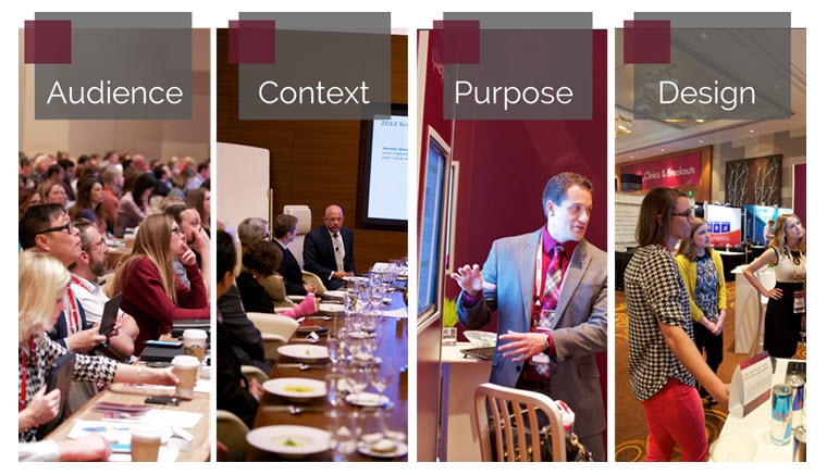
The dictators of any presentation include: audience, context, purpose and design.
About your audience
A speakers’ first priority when beginning to draft their presentation is their audience.
The purpose of speaking is to serve the listeners, not your own ego. Consider whether or not PowerPoint is the right way to get your message across, if it helps to convey your message or if it only dilutes it.
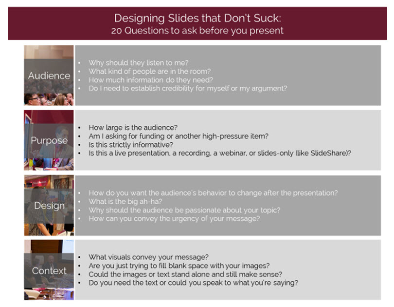
Consider these questions when framing your slides:
- Who is my audience?
- Why should they listen to me?
- How much information do they need?
- Do I need to establish credibility for myself or my argument?
The context
Like knowing your audience, contextualizing your deck is vital to the life of your presentation. Don’t use the exact same deck for an audience of 15,000 that you would for an audience of 12. Personalizing and adapting to your audience breaks down the barrier between the stage and the seats.
Consider, for example, a presentation on health and nutrition. The same speaker would present information differently to a group of medical students than a group of kindergartners. The content would be similar and the principles the same, but the language and structure would vary greatly.
Many speakers also struggle with the amount of text to put on the slides.
For live events, much of my time is spent slashing text from slides, adding beautiful imagery and eliminating animations. However, on academic presentations, training and webinars, text is important to reinforce the message since the speaker is teaching from the slides rather than presenting a story.
After establishing the audience, ask yourself these questions about the context:
- How large is the audience?
- Am I asking for a high-pressure item, such as funding?
- Is this strictly informative?
- Is this a live presentation, a recording, a webinar or slides-only (like SlideShare)?
Your overall goal and purpose
The content of your slides should be determined by the goal of your presentation. They usually fall into educational, persuasive, storytelling or paradigm-shifting.
With any of these types of presentations, ask yourself these questions when deciding the framework of your presentations — from structure to individual slides:
- How do you want the audience’s behavior to change after the presentation?
- What is the big ah-ha?
- Why should the audience be passionate about your topic?
- How can you best convey the urgency of your message?
Strategizing design
I am a snob when it comes to PowerPoint design. However, design is secondary to messaging. There have been pretty decks that should have never been presented because the content wasn’t there.
Having great content and messaging is more important than how it looks. That being said, good design lends credibility and quality to your presentation or speech that would otherwise seem lackluster and amateurish.
Like in biology, design speaks to the form and function of a presentation.
To help you draft the images on your deck, close your eyes and recite the content. What do you see? If you see clip art, stock photos or endless bullet points — try again. Look for more sophisticated inspiration on Pinterest, Flickr or SlideShare.
Here are some guidelines to help you determine if your slide design is helpful or detrimental:
- Do the visuals convey your message?
- Are you just trying to fill blank space with your images?
- Could the images or text stand alone and still make sense?
- Do you need the text, or could you speak to what you’re saying?
- Experiment with blank slides and whitespace to catch your audience’s attention.
Building out effective presentations takes practice, not talent. It’s a learned skill that develops over time. Creating something new and finding powerful images that reflect your speech helps to build rapport with your audience and adds a polish to your message.
I encourage you to practice — learn what works, throw out what doesn’t and create really ugly design mistakes in search of something beautiful and unique.
Also, tell me your presentation secrets in the comments section below, and share what works for you.
You can follow Jessica Lorenz, Event Content Manager, MECLABS Institute, on Twitter at @JessicaPLorenz.
You might also like
Marketing Automation: Precor achieves 74% lift in new leads via segmented database overhaul [MarketingSherpa case study]
Email Summit 2015: Top Takeaways from this year’s best sessions [MarketingSherpa webinar replay]
Social Media: Understanding Pinterest consumers [More from the blogs]
Email Design: How to optimize for all environments in a mobile world [MarketingSherpa video archive]
Blogger Intervention: 3 reasons why no one is engaging with your content [More from the blogs]
Categories: Copywriting content, design, PowerPoint, presentation, storytelling, visual




the slide above is horrendous … how about showing a slide that is good and follows best practices. what am I missing? this was not at all helpful.
@Loren McDonald
Hi Loren,
Thanks for your comment, I’ve made a couple of edits on the blog to address your points. I’ve added a caption below the checklist so that it’s clear that it’s not supposed to be a slide — yikes! You’re right that would have been terrible to present with.
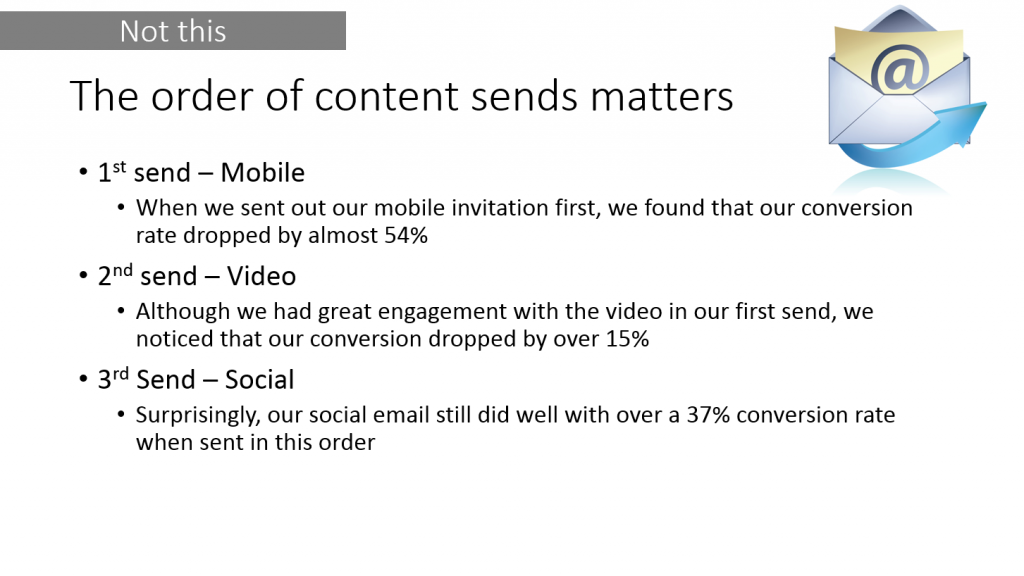
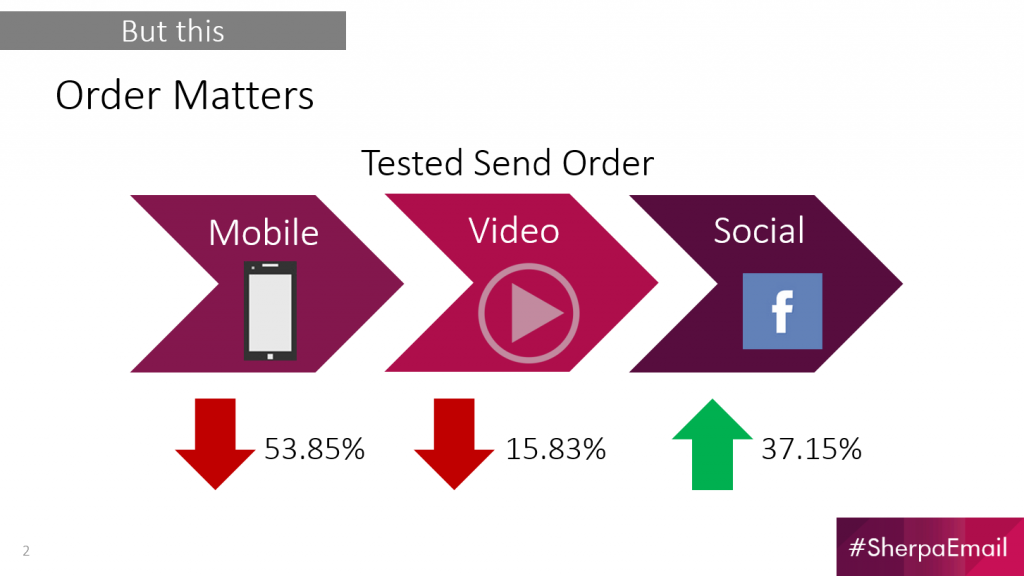
I also added an example of a good and bad example — I think that was super helpful feedback and I think it adds a lot of value.
– Jessica