
Mobile Email Marketing Optimization: Tips for beginner and advanced marketers from four experts
In the article from today’s MarketingSherpa Chart of the Week newsletter, we share data produced exclusively for MarketingSherpa by Adestra and Econsultancy, which identified the mobile email marketing optimization techniques that most commonly produce excellent email marketing ROI.
You can take a closer look at the data in the article – Email Marketing Chart: ROI from optimizing email for mobile devices – but here’s the punchline: Optimizing emails for mobile is more than three times as likely to generate ROI.
If you need data to help justify the budget, resources, and buy-in you need from business leaders or clients for optimized mobile email marketing (or if you’re already optimizing your mobile email marketing but need resources to move to the next level), the chart is an excellent asset.
So now what? Let’s say you get the resources … where do you begin? Or perhaps you’re already several years down the road, but are running out of ideas on what to do next.
To help with your mobile email marketing, we interviewed four experts who gave us invaluable tips for both beginner and advanced mobile email marketers. We’re including all the tips in one blog post to allow you to easily scan because, let’s face it, one marketer’s “beginner tactic” is another marketer’s “advanced idea.”
Let’s get started …
Tip #1. Start simple
No matter your budget or resources, adding tasks to your department’s already overflowing plate is no easy feat. This is especially true when you consider the proliferation of mobile device types, screen sizes, operating systems, email readers, and download speeds.
(You can multiply that complexity several times over if you have an international customer base.)
But the experts we interviewed encouraged marketers to simply get started on the changes you’re capable of making right away, and not trying to swallow all that complexity with one bite.
“Most of those just starting on the mobile optimization journey feel overwhelmed, so they should keep in mind that simplicity is often the best route,” said Monica Savut, Senior Research Manager, Econsultancy. “Focusing on the core components is key, from using a single-column design and hiding content that might not be essential in a mobile view, to including a mobile-friendly pre-header and designing for ‘fingers and thumbs.’”
“For companies just starting to put a mobile strategy together, simplifying is key,” agreed Aaron Pearson, Product Manager, Listrak. “Simplify you template and layout; simplify your content such as copy, buttons, and images. A mobile-optimized template doesn’t necessarily have to be responsive, so don’t worry about spending time developing a hugely complex system to deliver content to your subscribers. Instead, focus on iterating your content strategy and begin to improve the conversation with your audience.”
Tip #2. “Mobile first”
In the latest Chart of the Week, we discovered that performing all of the surveyed mobile email optimization tactics had relatively equal impact on ROI. However, one was slightly “more equal” than the others; 35% of companies that selected “Thinking ‘mobile first,’ everything we do is optimized for mobile” reported an excellent email marketing ROI.
With responsive design, you can create a better experience for users since no matter which device they access your email and landing pages with, they will receive an optimized experienced. However, to make that happen, responsive design involves designing templates for several device sizes and writing code to ensure that the right template appears on the right device. A mobile-first approach can be much simpler.
If you’re unfamiliar with a mobile-first approach, the idea is to develop all of your emails and landing pages for mobile devices. Although they will likely also be viewed on desktops and tablets, the “shorter text/more negative space” approach typical of mobile first design will also be able to be consumed on larger devices. Conversely, trying to view a landing page designed for desktop on a mobile device can be an awkward and difficult experience.
There is a tradeoff since desktop email recipients and website visitors receive a worse experience. However, at least mobile email recipients and website visitors can more reasonably access your content and offers.
If you look at your analytics and discover you have enough of a mobile audience to justify this approach, here are three important mobile-first components suggested by Jonathan Levey, Digital Marketing Manager, Flexjet:
- Start with a design layout that’s either scalable, fluid or responsive.
- Then, develop engaging content for the email by utilizing visual contrast.
- Finally, test emails in different mail clients using either Litmus or Email on Acid before you click send on the campaign.
“The most memorable email I received was an email from Noodles & Company that was only 480 pixels wide, taking the ‘mobile first’ approach quite literally,” Pearson said. “I assumed they probably didn’t have a developer on staff capable of coding responsive emails, but they still understand the importance of testing what impact mobile optimization will have on their subscribers.”
Beginner Tip #3. Consider user behavior
Don’t forget user behavior when creating any mobile-oriented design. After all, the device doesn’t matter as much as how customers experience content on that device.
“A clickthrough is now a tap-through, scrolling is an innate behavior so the fold does not exist anymore and smartphones are part of the personal space of consumers; they lean in to them and keep them close,” said Liz Smith, Head of Marketing and Partnerships, Adestra. “If we understand that behavior, then we are more likely to understand the changes behind them.”
Liz provided a few examples:
- Links become buttons to aid easy tap-throughs.
- The length of the email increases as content and design are shifted into one continuous column.
- Images zoom out and text size increases.
This isn’t to suggest that beginners need to optimize for every possible use case. Just understand the basics of user behavior, and create emails with this unique behavior in mind.
Beginner Tip #4. A mobile-optimized email is only the first step of a mobile-optimized customer journey
“If the journey is not seamless, the user experience is broken and conversion is likely abandoned,” Smith cautioned.
When we interviewed Laura Velasquez, Marketing Program Manager, REI, at MarketingSherpa Email Summit 2013, she shared that in the early days of the company’s mobile email optimization, they made the mistake of sending customers from a mobile-optimized email to a landing page with a 2,000-product search result.
Map out and understand every step of the customer experience, and how that plays out for customers on the devices they use.
“Marketers need to understand that optimizing the email without the website or vice versa won’t have a positive effect on their readers,” Smith said.
Advanced Tip #1. Integrate your app
Email is a frequent activity for interacting with brands when customers are out and about. When we asked customers how they prefer companies communicate with them when they are away from their computer, the second most popular option was “email on my smartphone,” selected by 37% of surveyed marketers.
But email isn’t the only way customers use mobile devices – 12% chose “company’s mobile app” in the survey.
While apps may be less popular than email, they are a more intimate form of connection with the consumer on a platform your brand owns and controls. While your company likely has some form of customer buying journey that directs them from an email to a landing page, advanced marketers should consider integrating an app into their mobile email marketing, as well.
Flexjet’s Jonathan Levey suggests, “Connect email subscribers to the app through mobile deep linking because it is a powerful acquisition and retention channel.
“Branch.io is a free SDK that enables app developers and marketers to link emails seamlessly with app content. The deep links will work whether they are clicked on mobile or desktop, and connect to the right app content even through a new install.”
Advanced Tip #2. Don’t design myopically
Mobile first has its advantages. For instance, it will help ensure smartphone users don’t have a horrible user experience. But it will also water down the experience for desktop users. You’re essentially marketing to “the middle.”
What looks user-friendly on a 5-inch iPhone will look oversized on a 27-inch widescreen monitor. The recipient will be able to interact with the email, sure. But they won’t be optimally engaged, or become more likely to convert.
This applies to any design focused on universal compatibility.
“Unfortunately, certain aspects that make up responsive design, like CSS, are ignored on popular email clients such as Outlook and Gmail. So even though companies invest in responsive design, they should not expect that to be the ‘one-size-fits-all’ solution,” said Adestra’s Liz Smith.
“Just because Outlook cannot support a lot of the forward-thinking email design techniques, that doesn’t mean that users utilizing different email clients shouldn’t have a better-than-average experience with email,” Smith said. “That’s not to say Outlook users should be ignored though! What it means is designing email from the most engaging, innovative level and implementing fallbacks so that compatibility is maintained across devices.”
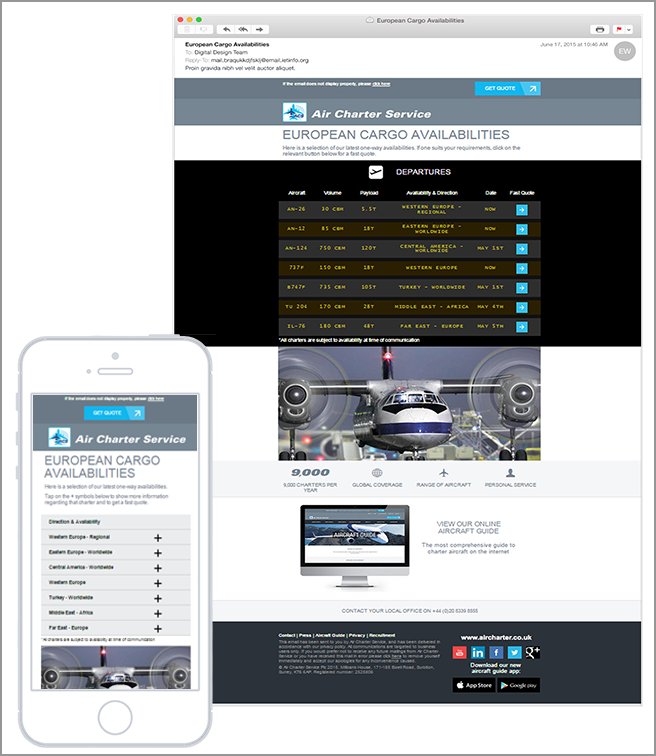
An example of not focusing on the lowest common denominator is Adestra’s work with Air Charter Service to design an email for the company’s cargo availability options. On desktop, it looks like a departure lounge board. But on mobile, it uses a completely different design with collapsing menus to match user expectations for that device.
“Rather than squishing the departure board into a mobile format, the layout has been adapted completely to make the message, not the medium, the star of the email,” Smith added.
Always keep the fundamentals in mind …
In mobile email marketing optimization, you shouldn’t stay focused solely on the “mobile” element, but rather on the heart of the customer decision-making journey – marketing.
You can create mobile emails with huge buttons and plenty of white space, but none of that matters if you overlook the fundamentals of marketing.
Help customers understand the value of your products and services by delivering the right message to the right person at the right time.
Jonathan Levey believes, “A common misconception is that all mobile users are the same. The message should still be contextually relevant based on the segmentation of your subscribers. In order for email campaigns to be successful, they need to be personalized for the audience segment receiving the message.”
Liz Smith added, “It’s not about email marketing for mobile, it’s about successful email marketing regardless of device and that can only be achieved with message-led rather than device-led design … What we mean by that is, focusing on the central message that needs to be communicated and then optimize the delivery in such a way that user experience is natural; users understand what is expected of them and what they need to do should they wish to act on the message.”
You might also like
Download the Quick Guide to Email Marketing
Email Design: How to optimize for all environments in a mobile world
Bags ETC. saw an 850% increase in their mobile revenue from email by going mobile(via Adestra)
MarketingSherpa Call for Speakers 2017 [Jonathan shared the story of his mobile success through the Call for Speakers, which is where I found him as a source]
Categories: Email Marketing Email Marketing, mobile email marketing, mobile email marketing optimization, mobile first, mobile marketing, responsive design