


Mobile Email: Tips on getting started
For email marketers, tackling mobile email is a relatively new challenge, but a challenge that needs to be addressed. According to research from Litmus, the email testing and analytics vendor, 49% of people access email via a smartphone — a figure that’s risen fivefold since 2011 and continues to trend upward.
To provide some insight for you, the MarketingSherpa Blog reader, I reached out to five email marketers who addressed the mobile email challenge with two basic questions on the topic.
Read on to find out what this expert panel had to say about mobile email:
MarketingSherpa Blog: What one tactic has the most impact on mobile email campaigns?
Justine Jordan, Marketing Director, Litmus
Ah, the million dollar question! As with most things with email, it’s hard to make a generalization since it can vary greatly based on your industry and audience. If I had to pick just one tactic, I’d go broad and say responsive design has the most impact on mobile email. MailChimp sends billions of emails every year, and they’ve seen a 15% increase in unique clicks for mobile users when responsive design is used. Even without huge gains in performance, sending responsive campaigns sends the message that you care about providing the best possible user experience for your subscribers.
Brian Graves, UI Team Lead, DEG
Simplifying the experience. In addition to helping deal with the smaller amount of screen real estate available on mobile devices, statistics show that customers typically spend less than 15 seconds reading marketing emails, with iOS users spending the least amount at around 3 seconds or less. Look at repositioning your email layout to lead with your most important messaging. The most effective emails are typically concise and have a clear focus. This is not only a good tactic for mobile but is one way in which a mobile-first approach can help improve your campaigns across every platform.
Ted Goas, Designer and Developer, Canfield Scientific
Work as a unified team from day one. Having product managers, marketers, designers and developers working together from planning through to execution helps ensure a campaign’s quality doesn’t degrade as it gets ‘thrown over the wall’ in a waterfall process. Everyone knows what’s happening and why.
Dan Denney, Front-End Devevloper, Code School
Designing an email for scanability has the most impact. We want everyone to read every word, but people want to find what they’re interested in and move on. Make it easy for them.
Fabio Carniero, Lead Email Developer, MailChimp
Spongy development (sometimes called hybrid development), in my opinion, has the most impact. There are a fair number of pitfalls associated with mobile email, and the spongy development method — a combination of fluid and non-fluid email markup — can generally resolve most of them. The most pertinent example is the Gmail app on Android and iOS; the app doesn’t support media queries, which are generally necessary for responsive design. The spongy/hybrid technique serves as a work-around for providing ‘responsive’ email in clients that don’t support the technology specifically.
This development technique, with its inherent flexibility and robustness, also has the benefit of being stable in a very wide variety of email clients and platforms, from desktop to tablet to phones.
MSh Blog: What advice would you give a marketer just getting started adding a mobile element to their email strategy?
Justine:
Strategically speaking, I’d encourage marketers getting started with mobile email to get to know their audience — how many subscribers are opening on mobile? Do they open on iPhone or Android? Getting insight into audience behavior and preferences can help you determine where to prioritize your efforts.
When it comes to tactics, start small. You don’t need to jump right into responsive email. Instead, focus on the things that are easier to impact without knowledge of HTML and CSS. Reduce word counts in your copy, making content easier to display on small screens. Adopt a ‘bigger is better’ mantra — larger buttons, more whitespace and larger fonts all go a long way to making email more readable on mobile.
Brian:
Know your audience and design for where they’re opening. Looking at analytics on where opens are occurring can help tell you the best place to invest your time and effort. If you’re heavier into B2B, for instance, the adage of 50% of your audience being on mobile most likely doesn’t hold true. If that’s the case, it might make more sense focusing on a simplified fluid layout, rather than going all in on responsive design. At DEG, we’ve taken this approach in several instances with great success.
If your audience is highly mobile, which is often the case in B2C, you have to stay aware of the huge differences in rendering capabilities between the major email clients on mobile platforms. For a soon-to-be rolled out redesign DEG is working on, we looked at client level details to determine where opens were happening and noted that a high percentage of our clients’ audience was opening in Gmail. Not wanting to neglect a decent part of their audience, we opted for a hybrid design approach, which allowed us to give those opening in the Gmail App a mobile optimized layout even though media queries aren’t supported by the client.
In another recent redesign DEG worked on, a key requirement of the project was keeping the overall file size of each campaign to a minimum. Doing so allowed us to better serve our clients’ audience[s], a large portion of which [are] in emerging markets, where bandwidth limitations become a key factor in design decisions.
In all of these cases, the most important factor was determining where the audience was opening and then making design decisions based on that information.
Ted:
Mobile email is still relatively new, so don’t be afraid to try new things and fail. Learn what’s appropriate for your own market and customers. Pay attention to your own numbers; ignore the rest. And never be afraid to hit that ‘Send Now’ button!
Dan:
If you have to choose between designing for small screens or large screens, choose small screens. Engagement is significantly better on mobile devices, so it should be the priority. A message that is well designed for small screens will also be clear on large ones, even if you don’t take advantage of the additional space.
Fabio:
Use the shift from fixed-width to mobile-friendly as a place to re-evaluate everything you do with your email. There’s a fair amount of work involved in making an email responsive as it is, so why not go all the way?
The move to mobile is a perfect time to take another look at how you do content. To experiment with what’s sent. Simplicity and clarity are important in any email and doubly so when mobile readership becomes a consideration, so look for ways to pare down and tighten the content you send. Strip away fluff until the content’s down to the bare essentials, then focus on quality. Keep in mind that email can afford a direct, intimate connection to readers, and that it’s part of the sender’s job to take that responsibility seriously and be respectful of the time commitment that readers put in.
The quality of content plays a huge role there. If it’s feasible, go even further and talk to the audience. Email is a medium for conversation, after all, and the process for refining the experience an email provides should be based not only on metrics, but also on feedback from readers.
Look for ways to surprise and delight those readers as well. The more-comprehensive HTML and CSS support found in mobile email clients allows for some bells and whistles like more complex styling and CSS3 animation, both of which can add a little bit of creative personality to an email.
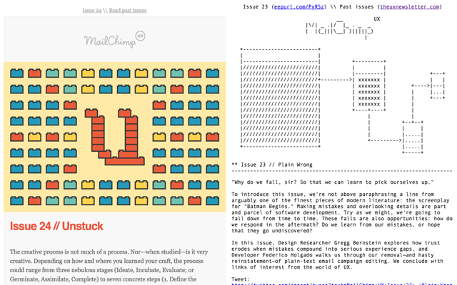
Even playing with your established design conventions to send something completely different from the norm can be powerful, which MailChimp’s UX newsletter has done:
This sort of thing takes time and effort on the design and development side, but, thankfully, isn’t something that needs to be done with precise regularity. An occasional surprise can be just as powerful — sometimes more so — than regularly-scheduled wizardry.
If you have any insights about mobile email, or maybe challenges or pain points, share in the comments section below for your marketing peers. You might just get a pat on the back for insights or a solution to your challenge.
Top Photo Courtesy of: THINKMULE MISTER
You might also like
Email Design: How to optimize for all environments in a mobile world [MarketingSherpa video archive]
Email Marketing: 4 steps to optimize a mobile experience for better conversion [More from the blogs]
Mobile Email Marketing: 50% more app downloads from device-targeted ads [MarketingSherpa case study]
Mobile Marketing: 31% of marketers don’t know their mobile email open rate [More from the blogs]
Categories: Mobile Email Marketing, mobile email, mobile marketing, responsive design


A jam-packed blog article with a wealth of information! I especially appreciated what Ted had to say about working as a unified team. Mobile e-mail will be at its best if the teams works together and make sure that, in the end, the message is still clear. Thank you, David!
With mobile e-mail you have to keep in mind mobile readers have a lot less patience. Your design has to be clean, and your message brief and to the point.
Phone are about as personal as you can get. The subscriber is inviting you into their phone, yet so many emails are of little obvious benefit to the reader. Rather, they are just more plugs for affiliate products.
Short, easily read with a large font would be my own contribution to the discussion, but with a large, clear ACTION button large enough for clumsy fingers to find.