Marketing 101: What are beneficial buttons?
Marketing has a language all its own. This is our latest in a series of posts aimed at helping new marketers learn that language. What term do you find yourself explaining most often to new hires during onboarding? Let us know.
This article was originally published in the MarketingSherpa email newsletter.
A beneficial button is a call-to-action (CTA) button that explains a benefit the customer will receive by clicking on it. In other words, the button has a process-level value proposition.
This may sound obvious when you read the above sentences. If you’re asking the customer to take an action, of course, the button should have a benefit. However, I challenge you to navigate around the web right now and see how many buttons are truly beneficial.
Three categories of CTA buttons
There are three categories of CTA buttons:
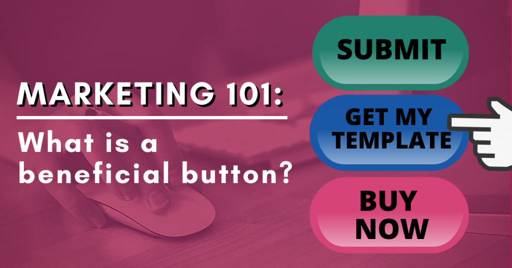
- Value-neutral buttons – These buttons don’t have a positive or negative value. For example, using the word “Submit” or “Go.”
- Value-negative buttons – These buttons have a higher cost than value. For example, “Buy Now.”
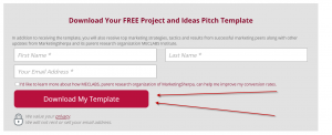
- Value-positive buttons – These are beneficial buttons. They show the customer the benefit of taking action. For example, “Download My Template.” By filling out the form and clicking the button, you will get the value of a template download.
You can see the full landing page yourself: Free Template to Help You Win Approval for Proposed Projects, Campaigns and Ideas
How to categorize your CTA buttons
Two marketers can see the same button and disagree on whether it’s a beneficial button.
For example, Kodak considered a “Subscribe” button to be a beneficial button for its email registration page while a “Submit” button was not. (From the case study List Growth Tactics: How Kodak added 33% more email subscribers and 53% more YouTube followers).


