Archive

Posts Tagged ‘mobile marketing’

How Seamless Email Turns Ecommerce Prospects into Buyers

October 14th, 2014

Only 2.6% of the people browsing an ecommerce site actually buy during that visit, but, according to Charles Nicholls, that doesn’t mean they’re not going to eventually make a purchase.

Charles is the Founder and Chief Strategy Officer for SeeWhy, a provider of cloud-based behavioral target marketing. He discussed what it takes to transform browsers into buyers with Daniel Burstein, Director of Editorial Content, MECLABS, at the 2014 Internet Retailer Conference and Exhibition in Chicago.

Charles exhorted marketers to rethink the channel mindset and optimizing websites for a single session, and instead, think about optimizing the entire buying process. The key, he explained, is seamless use of email across desktops, tablets and smartphones.

Why? Customers may use all of these devices before finally making a purchase.

Consider this: SeeWhy has been tracking smart phone conversions, and, according to Charles, smartphones are outpacing tablets, which have become a desktop substitute. Also, 67% of smartphone conversions are done via email.

Watch the video below to learn about the importance of seamless emailing:

  Read more…

Email Marketing: Taking advantage of responsive design [Video]

September 16th, 2014

If your experience is anything like the typical email marketer in 2014, a growing portion (possibly a very large percentage) of your list is opening email on a mobile device — maybe a tablet or, more likely, one of the many smartphones out there.

To fully reach and engage that audience, you can either design and build custom emails for every single platform your audience is using …

Or, to make things a bit simpler on the design and execution end of things, take the responsive design plunge for all your email campaigns to ensure your sends have the best look, feel and, more importantly, clickability on any mobile (or non-mobile) platform your recipients use.

To address this issue, watch this excerpt from a panel discussion at the MarketingSherpa Email Summit 2014:


This excerpt features Pamela Jesseau, Senior Director of Marketing, MECLABS (parent company of MarketingSherpa); Amy Carpenter, Digital Marketing Team Leader, Whole Foods Market; and Ewa Badaruk, Global eCRM Marketing Manager, adidas Group.

Read more…

Mobile Marketing: 3 tips from ModCloth on mobile app engagement

August 8th, 2014

Seldom do I condone a selfie.

Nothing makes me want to cut a slice of humble pie for someone more than a pointless, self-taken snapshot. If you’re doing absolutely nothing but think you look darn good, it’s pretty clear you’re pulling for some strokes to the ol’ ego.

In the driver’s seat of your car? Not a photo op. Working at your computer but having a great hair day? Don’t click the cam.

However, I do think there are some exceptions — and perhaps even necessary occasions — for a selfie. If I run into Jennifer Aniston on the street but no one’s there to take the pic, you best bet I’ll hold up my iPhone and do it on my own.

While my iPhone’s photo album doesn’t have celebrity-accompanied shots (I’m working on it), it’s not selfie-free, which brings me to my other exception: fashion.

Putting an outfit together or buying a piece of clothing is often stressful. I can look in the mirror as long as I want to see if I think a shirt looks funny or if my shoes go with my dress, but there’s nothing better than a second opinion.

I can get that second opinion by taking a photo of myself in the outfit, texting it to my girlfriends to weigh in. What do you think of this top? How does this skirt look with these earrings? Should I buy it? All of my friends and I do this.

Fashion retailer ModCloth, a brand my wallet knows all too well, integrated this selfie behavior into its mobile app. I learned all about it when ModCloth’s Chief Technology Officer Udi Nir chatted with me in the MarketingSherpa Media Center at IRCE.


Udi co-hosted an IRCE session in Chicago titled, “Mobile Commerce: Get Ready Today for Tomorrow,” where he gave me the scoop on ModCloth selfies along with how crucial it is to have a strong mobile presence.

“It’s really important because that’s where our girl, our customer, is,” Udi told me. “We are wherever she is. If we want to serve her, we have to be in all those places she wants to access our site.”

On the marketing side, mobile unlocks new opportunities for marketers to reach customers in ways and at times they couldn’t have before.

“Mobile basically provides us new moments of found time,” he said. “Those two minutes in line, a few minutes on the bus or whatnot that weren’t able to be used before.”

ModCloth has channeled its mobile focus into its app, which has helped the company achieve both entertainment and engagement among its customers.

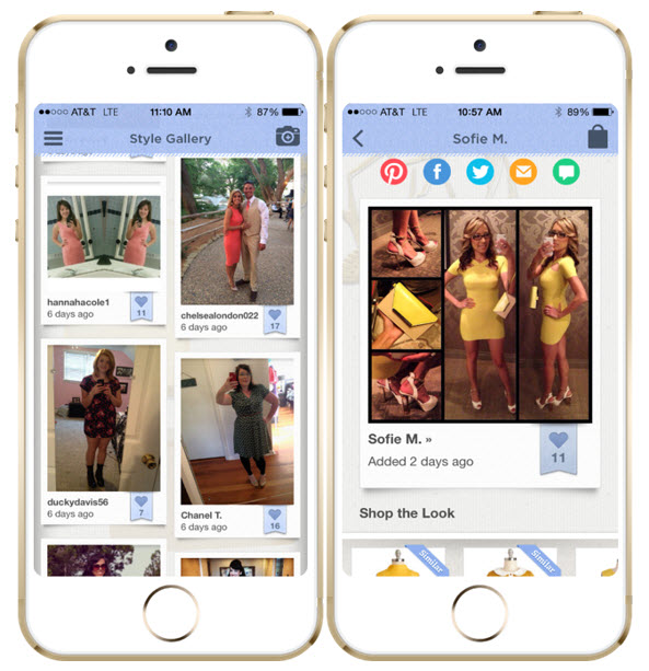
One particular feature is the app’s Style Gallery, a place where ModCloth customers can upload their outfit photos to show how they’ve styled their clothing to give others inspiration, Udi explained.

modcloth-style-gallery

  Read more…

Email Marketing: Combining design and content for mobile success

July 1st, 2014

400%.

That’s how much mobile email opens have increased in just three years.

“Which is kind of crazy,” Justine Jordan, Marketing Director, Litmus, said following the recent statistics from Litmus’ research on mobile.

And she’s right. How many channels increase that much in usage in that short amount of time? Not many.

Because of the sudden growth, not all marketing departments have been able to keep up with the trend.

With 50% of emails being opened on a mobile device, mobile email strategy is worth considering for any market, even B2B companies.

Justine spoke at MarketingSherpa Email Summit 2014 as an industry perspective in the session, “Email Design: How to optimize for ALL environments in a mobile world.”

She joined Allison Banko, Reporter, MECLABS, in the MarketingSherpa Email Summit 2014 Media Center. There, she recapped her industry perspective session, as well as hit on two mistakes she still sees among mobile emails: content strategy and best practices of mobile design.

“It’s key to get those two things working in tandem to really optimize the full experience,” she said.


In addition to her industry perspective session, Justine also joined a diverse panel of experts, solution providers and brand-side marketers on responsive email design. Watch a brief excerpt from that panel discussion below:

  Read more…

Email Marketing: The evolution of value in messaging

May 9th, 2014

Brian Clark, Founder and CEO, Copyblogger Media, has been in email marketing for 16 years.

“Which is a million years in Internet time,” he said.

At MarketingSherpa Email Summit 2014 in Las Vegas, Brian sat down with Allison Banko, Reporter, MarketingSherpa, in the Media Center to share some of his email marketing background.

“As much as email remains the primary sales channel, how we do it is evolving and getting a little bit more sophisticated,” Brian explained.

Watch this brief video from the MarketingSherpa Email Summit 2014 Media Center to learn more about the evolution of email marketing, particularly in mobile marketing, and how to provide value in messaging.


You can also check out Brian’s full session from Email Summit 2014 to learn how Copyblogger used content and a free paywall to grow its email list by 400%. Watch a brief excerpt of his presentation below:

Read more…

Email Marketing: 4 steps to optimize a mobile experience for better conversion

April 15th, 2014

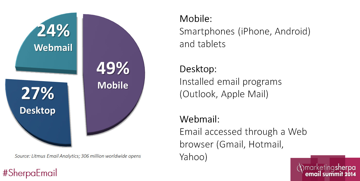
Mobile is big, but just how big is it?

Justine Jordan, Marketing Director, Litmus, posed that question during her Industry Perspective session, “Email Design: How to optimize for all environments in a mobile world,” at MarketingSherpa Email Summit 2014.
mobile-demographics-chart


Almost half of all emails are opened on mobile devices, according to Litmus research. That’s definitely big – especially since it was just three years ago that Litmus found only 10% of emails were opened on mobile.

So what can we do to capitalize on this drastic shift?

Justine said we need to re-examine the subscriber experience from the mobile user’s perspective. While she covered the whole path, we’ll hit on four of the steps subscribers experience.

 mobile-conversion-path


Step #1. Don’t ignore pre-header text

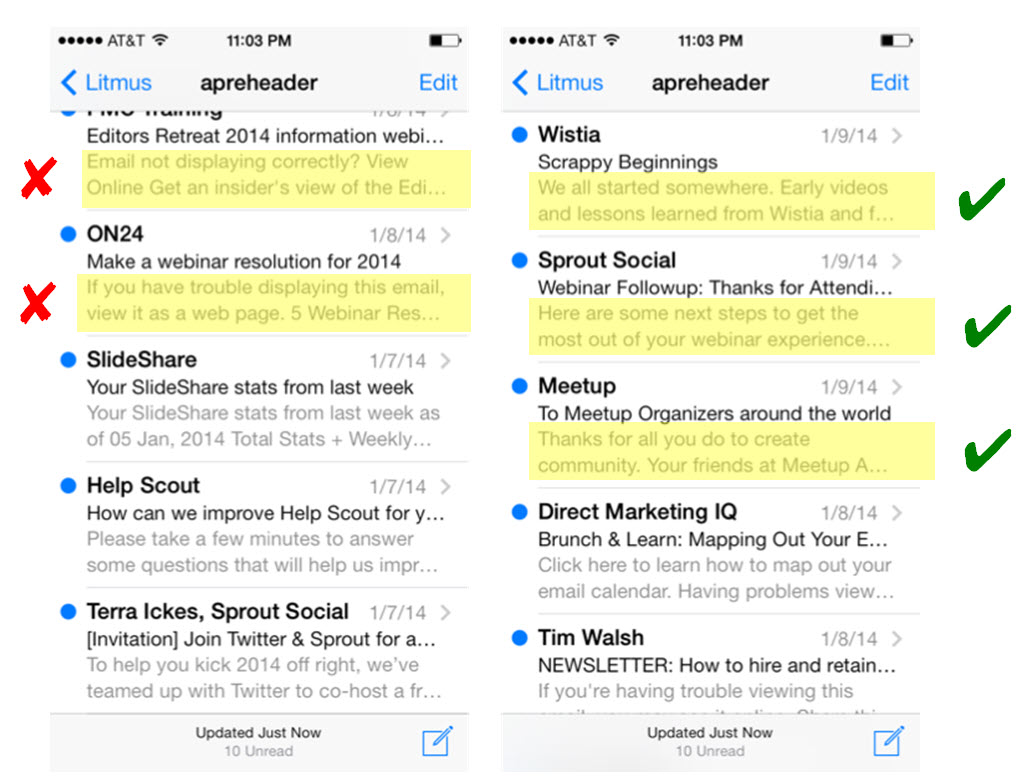
Many inboxes are formatted so that users can see not only the subject line, but also a line of additional text in the email. This text is pulled from the first bit of text at the top of your email. However, you can hide this text and still have it show in the pre-header area if you wish.

The default text for most templates is not very valuable messaging. She showed these examples of dos and don’ts to the Summit audience:
mobile-preheader-examples


“My challenge to you is, is this a positive brand experience? Is this really what you want people to associate with your ‘From’ name and subject line? Go back and re-evaluate your pre-header text – it’s showing up in mobile inboxes everywhere,” Justine advised.

She suggested making your pre-header “tie into the subject line, bringing [readers] in and encouraging the click.”

The pre-header is another opportunity to infuse value into your email – don’t let it go to waste. iPhones cut your subject lines off at about 35 characters.


Step #2. Embrace scrolling in an opened email
mobile-email-comparison


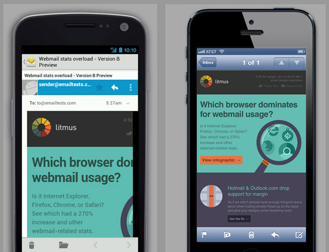
This is the same email but it looks completely different. Why?

“It’s because not every smartphone or mobile device is going to support HTML and CSS or even display the email in similar way,” Justine said.

Plus, Android devices vary in what they do and don’t support, so they can be challenging to work with. Some scale the email, some cut off the right side of an email and some support responsive design. Justine said iPhones are a little friendlier, scaling to a 320-pixel width.

But with scaling comes other issues to keep in mind: text and images resize as well.

Justine hit on another key aspect of the user’s experience after opening an email on your email: scrolling.

“Scrolling is a really natural behavior on any mobile device,” she said. “Clicking, or tapping, represents a decision. It’s a point of friction that people are going to either have to embrace or move past.”
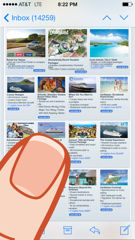
mobile-site-clicksIn an email like the one to the right, you don’t know where you’ll be tapping. Where will your finger land with so many small choices? You need to make the user experience more friendly in emails. You don’t need to compact as many options as possible “above the fold.” There is no fold on your iPhone.

“Embrace the scroll; people are inherently going to scroll on mobile devices,” Justine said.


Step #3. Recognize a finger is the new mouse

On mobile devices, people are not clicking. Instead, they’re tapping, rendering your “Click Here” call-to-action illogical. There is no mouse to click on a smartphone – only a finger, or stylus, to tap.

“’Click Here’ is a really crappy call-to-action anyway. You need to add a lot value, make sure the buttons are topical, and tell people what they’re going to get when they click or tap on your emails,” Justine said.

The “tap” experience is more than the text of your buttons and calls-to-action. It’s also about the area or location you want to physically tap.

Justine said, “You no longer have a one by one [pixel] target area. It’s more like a 40 by 40 target area.”

A finger requires more tapping space than a mouse needs clicking space. Make sure they can actually tap on that valuable CTA you crafted.

  Read more…

Mobile Commerce: 4 creative approaches for using Flipboard

January 28th, 2014

Creating an awesome experience that engages users across desktop, tablet and mobile devices is tough.

When you factor in additional research projecting significant growth in Internet usage among mobile users, the need for brands to build a presence in the mobile marketplace is also increasing.

In short, the mobile monster is growing and the race is on, so what do you do?


Creativity drives mobile engagement

Mobile apps are a powerful tool to help bridge the gap in connecting with mobile users, but the trick is taking a creative approach to using them.

Flipboard, for example, is an app that helps users turn aggregated Web content into customized magazines. Other users can subscribe to your magazine, creating a captive audience for your curated content.

In today’s MarketingSherpa Blog post, we will take a look at how some brands have incorporated Flipboard into mobile marketing to provide examples that will hopefully inspire your efforts to tame the mobile monster.


Cisco’s “The Futurist Feed” aggregates tech news from around the Web


Cisco’s “The Futurist Feed” is an aggregate of tech content from around the Web.

In my view, this is one of the easier approaches to marketing on Flipboard, as aggregating content is really a core part of the app’s functionality. Consider this approach as a gateway tactic to help get your feet wet and experiment a little while keeping brand top-of-mind.


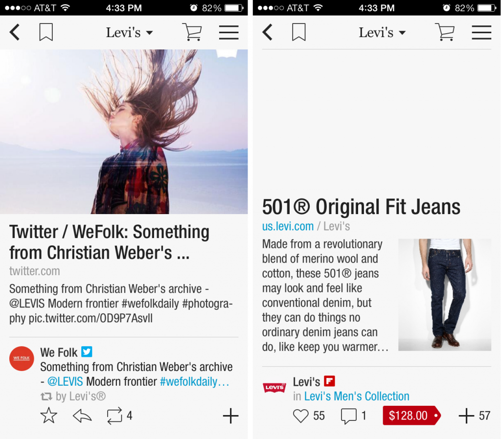
Levi’s Jeans uses fashion news to create a social catalog


Levi’s Jeans Flipboard magazine was an early adopter of using the app for e-commerce. Its magazine launched in late 2012 as part of a larger campaign. I like this approach as it has helped pave the way for integrating cart functionality into a social content experience.

Read more…

Social Media: 3 brands that totally get using Vine

January 3rd, 2014

In social media, if 2013 was the emergence of Vine, then 2014 will likely be the year of more Vine videos.

The creative potential that surrounds the app will be fun to watch this year as more brands adopt it into their marketing mix.

I personally like Vine, and consider it the equivalent of a living breathing Pinterest; a mashup of all the goodies social media can offer in low calorie servings of six second videos.

Vine’s success in social media is also no real surprise to me.

Considering its story as a company founded in June 2012, it was gobbled up by Twitter three months later only to skyrocket to the status of most downloaded free app in Apple’s iOS app store before blowing out the candle on its first birthday cake.

What’s also exciting is with any new technology, there are always those few early adopters who set the bar only high enough to be outdone in ways that are as exciting as they are unique.

In this MarketingSherpa Blog post, I wanted to highlight three trailblazing brands that are using Vine to reach their customers that you can use to help get your creative mojo going.


Lowe’s “fix in six” tips help customers build know-how

Lowe’s uses the app to create mini “tutorials” that are strung together to help customers keep home repair D.I.Y.


Oreo Cookie shows its followers how to “Snack Hack”

I’m not too surprised by Oreo’s early adoption of Vine given its prior success with Twitter. Oreo’s use of the app serves as a great example of combining creativity, product and entertainment to engage an audience.


General Electric uses contests and tech mashups to engage consumers and drive new innovation

In the last few years, GE has really made any excuses B2B marketers have for slow adoption of social media quite tough to accept.

The brand’s use of Vine for holding contests to redesign jet engine parts using 3D printing is truly setting a bar for creative uses of social media in B2B marketing.

Read more…

What the Country Music Awards Can Teach Us About Social Engagement

November 22nd, 2013

A few weeks ago, I was watching this year’s Country Music Awards (CMAs) with friend of mine and her mother. I was surprised by a few parallels I noticed between the awards show and some of our recommended best practices at MECLABS.


Set goals that encourage awareness

For the CMAs, its goal, according to the mission statement on the website, is to “heighten the awareness of country music and support its ongoing growth by recognizing excellence in the genre.”

Consequently, the CMAs serve as an outlet for recognizing excellence, while providing an entertaining awards show to heighten viewer awareness.

The goals of the CMAs are not explicitly stated at the beginning of the show. This falls in line with a best practice of not stating your goals on your website, but rather, your intended goals should be the conclusion customers reach on your landing page.

To help you accomplish this, you should answer the question: “What do I want the visitor to do on this page?”


Active engagement matters

Another aspect I found interesting about the CMAs was its drive to involve the audience. For example, during each artist’s performance, their Twitter handle was placed at the bottom of the screen.

This encouraged audience participation with their favorite artists.


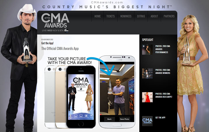
Yes, it even had a phone app.

Throughout the night, the hosts encouraged viewers to download the Shazam app. Viewers who used the app would receive exclusive access to content and free music downloads.

So, how did this engagement strategy pay off?

Well, according to Country Music Rocks, an online music news source, the strategy was a huge success.

People went directly from Shazam’s CMA experience to iTunes and Amazon approximately 50,000 times during the broadcast to buy the tracks and albums of the nominees, winners and performers – this does not include the two free tracks available for download.

– Country Music Rocks


Here are a few ways you can encourage active engagement on your website.

Leverage social media: Actively post and manage related content on your social media feeds. In addition, encourage your visitors to share, retweet or email this information to their friends.

Try to offer exclusive content: What you can offer will depend on your industry, but providing exclusive content will encourage visitors to come back and interact with your site in the future.

Offer lots of related resources: This can be anything from previous blogs or articles to encourage the visitor to stay on your website for a longer duration.


Ease of use is always appealing

The CMAs did a variety of things to appeal to every element of its audience demographics and made it easy for viewers to participate.

For starters, there were performances from artists both young and old, comedy skits and emotional speeches from award winners.

My point here is that appeal never gets old for your customers, even when delivered in large doses. There’s nothing more appealing I can think of than a landing page that is easy to use.

I recommend taking some time for usability testing, as this can go a long way to make sure the focus of your site remains customer-centric.

  Read more…

Email Marketing: Verizon, REI share ideas to profit from growing mobile e-commerce traffic

August 30th, 2013

If your emails and websites aren’t optimized for smart devices, you’re likely losing at least 20% of your marketplace, according to an analysis of more than 500 million online shopping experiences by Monetate, a website testing platform.

In the Ecommerce Quarterly (EQ1 2013) report, Monetate revealed more than 21% of e-commerce traffic comes from smartphones, up from 2% merely two years ago. Yet, it reports only 14% of companies optimize websites and emails for smart devices. Verizon Wireless and REI are among them.

At MarketingSherpa Email Summit 2013, Laura Velasquez, Marketing Program Manager, REI, and Jason Jennings, Associate Director, Digital CRM, Verizon Wireless, discussed their success and lessons learned in the mobile optimization process.

Check out highlights from their discussion in this video excerpt of their mobile email panel.


:10 Jason outlines what you must consider when optimizing for mobile.

1:11 Laura discusses how REI developed a single, focused mobile strategy from many strategies.

1:53 Jason explains Verizon’s approach to developing pages that load fast, and why he designs for mobile before designing for desktop.

3:05 Laura explains how to begin optimizing for mobile. Hint: Look for small programs with a big impact.

Read more…