Archive

Posts Tagged ‘testing’

Email Clickthrough Rate: 9-point checklist to get more clicks for your email marketing by reducing perceived cost

April 5th, 2018

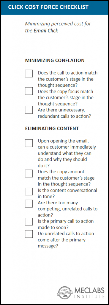
To help you increase the clickthrough rate of your email marketing, here’s a nine-point checklist for minimizing your recipients’ perceived cost of clicking in your emails. This checklist is from the Email Messaging online certification course taught by MECLABS Institute (MarketingSherpa’s parent research organization).

You can click here to download a PDF of the Email Click Cost Force Checklist (no form fill required, instant download), and I will walk through the checklist step-by-step in this blog post.

EMAIL CLICK COST FORCE
For macro decisions, like a purchase, you likely spend significant time and resources ensuring that customers want to purchase the product.

However, it’s all too easy to overlook the smaller decisions your customers are making every day — the micro-yes(s) — like clicking through an email.

Every decision you ask prospective customers to make has a perceived value to the customer as well as a perceived cost. The “force” of value or cost is a term designed to discuss the strength of the effect of those elements on the customer’s decision-making process.

Put simply, if the value force is stronger, your customer will take the action you are asking. If the cost force is stronger, your customer will not take the action.

For example, could the customer be concerned that you are sending a phishing email, and by clicking through they will get a virus or be scammed in some other way? That is a cost, a major cost.

But every click has a cost. Even if it’s just the time it takes their phone to load the data of the landing page they are clicking through to.

Now, the actual value or cost of the email click isn’t what determines if your subscribers will act (although it could affect their likelihood to take future actions). It is the perceived cost or value before customers even take that action. After all, they don’t know what value they will really receive or cost they will incur until they act.

This checklist will help you minimize the perceived cost of an email click to help you increase your brand’s email clickthrough rate. For a checklist that will help you maximize the perceived value of the email click, along with checklists to help you grow your email list and increase open rate, you can download this bundle of six email marketing checklists.

Read more…

Marketing 101: What is an A/B split test?

February 2nd, 2018

Marketing has a language all its own. This is our latest in a series of posts aimed at helping new marketers learn that language. What term do you find yourself explaining most often to new hires during onboarding? Let us know.

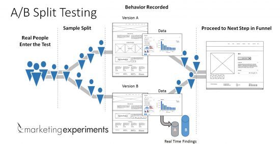
An A/B split test refers to a test situation in which two randomized groups of users are sent different content at the same time to monitor the performance of specific campaign elements.

A/B split testing is a powerful way to improve marketing and messaging performance because it enables you to make decisions about the best headline, ad copy, landing page design, offer, etc., based on actual customer behavior and not merely a marketer’s opinion.


Let’s break down the process of A/B split testing.

Real People Enter the Test

This is part of the power of A/B split testing as compared to other forms of marketing research such as focus groups or surveys. A/B split testing is conducted with real people in a real-world purchase situation making real decisions, as opposed to a survey or focus group where you’re asking people who (hopefully) represent your customers what they might do in a hypothetical situation, or to remember what they have done in a past situation.

Not only can you inadvertently influence people in ways that change their answer (since the research gathering mechanism does not exactly mimic the real-world situation), but people may simply tell you what they think you want to hear.

Or, many times, customers misjudge how they would act in a situation or misremember how they have acted in the past.

That doesn’t mean you shouldn’t use surveys, focus groups and the like. Use this new information to create a hypothesis about your customers. And then run an A/B split test to learn from real customers if your hypothesis is correct.

Read more…

Marketing 101: What is deduping?

October 6th, 2017

Marketing has a language all its own. This is our latest in a series of posts aimed at helping new marketers learn that language. What term do you find yourself explaining most often to new hires during onboarding? Let us know.

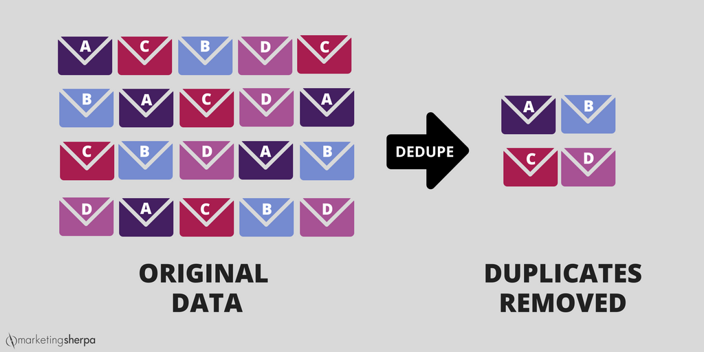
Deduplication, or deduping for short, is the process of removing identical entries from two or more data sets such as mailing lists.

Also known as merge and purge, deduping can be done for a lot of reasons. For example, the marketing team for MECLABS Institute, MarketingSherpa’s parent company, need to dedupe lists for its online certification courses.

Basically, if a student is enrolled in all four courses, they would be on four lists as a student.

So if Erin Donker, Associate Director of Marketing for MECLABS, wants to send an email to all the course students, she would dedupe the master list of enrolled students so that a particularly industrious one who is enrolled in all four courses wouldn’t receive the email four times.

Read more…

How to Drive Conversion Using a Value Proposition-focused Testing Strategy in Email Marketing

September 27th, 2017

Your company’s value proposition is its answer to the question, “If I’m your ideal customer, why should I buy from you over your competitors?”

While this might seem like something that lives and dies on your landing page, value proposition needs to be brought into every aspect of your marketing, especially your email. It is the channel where customers are going to be interacting with you most.

Plenty of email marketers have begun at least light A/B testing — subject lines, images, button colors — but value proposition is often an untapped area of email testing that could lead to serious returns.

There are four elements that increase or decrease the force of your value proposition:

  • Appeal: How badly do I want this offer?
  • Exclusivity: Where else can I get this offer?
  • Credibility: Can I trust your claims?
  • Clarity: What are you actually offering?

Take this recent case study with Willow Creek, which dabbles in all four of these elements, for example.

Read more…

Live from MarketingSherpa Summit 2017: Jeff Ma on harnessing the power of analytics to better understand customers

April 12th, 2017

As a member of the famous MIT Blackjack Team and the inspiration for the main character in the book Bringing Down the House and the Kevin Spacey film 21, Jeff Ma knows a thing or two about gambling.

Scratch that — Jeff Ma isn’t a gambler. That’s because every move in blackjack has one correct decision. It’s just about understanding basic strategy, and implementing it. Remove human instincts, or “gut feelings,” and you will stack the odds in your favor.

Currently the senior director of analytics at Twitter (after selling his startup to the social network) and a former predictive analytics expert for ESPN, Jeff spoke to the MarketingSherpa Summit audience about how to use data and analytics to come out on top with customers.

1K2A9210 - Version 2

By using data to overcome emotional biases, Ma said, not only can marketers win big with customers, but they’ll also build influence within their organizations.

Learning to make better decisions

It all begins with increasing your odds by using basic strategy.

“A lot of people don’t use basic strategy, which is why we’re so bad at making decisions as a people,” Jeff said. “Decisions are best when you have data behind them.”

One common mistake people fall prey to is omission bias. Basically, people don’t want to be perceived as the agent for harm to themselves — or their company. As Jeff put it, people would rather make a decision with a lower chance of success if the “dealer” or “fate” beats them, rather than going with a higher chance of success that, if it fails, will mean they’ve made a “bad” decision.

Or to put it in Vegas terms: big risk, big reward.

There are no bad decisions — only ones informed by data

Read more…

Landing Page Optimization: Which ninja turtle is your page?

April 12th, 2016

Turtle SketchAssuming you don’t live in a shell, you have probably seen or heard of the Teenage Mutant Ninja Turtles. They’re the immensely popular superhero group that began as a comic in the 80s, and reached peak popularity in the 90s, and to this day, maintains a cult following with children and adults alike.

Even as fun and interesting as the premise is, we can still ask the question: Why have they stayed so popular over the years?

My take is it’s because of the characters.

The dynamic brothers, consisting of Leonardo, Raphael, Donatello and Michelangelo, have so much variety in their personalities, which allows them to approach problem-solving situations in any multitude of ways. This also allows for a lot of creative freedom on the creators’ end.

Personality is what captures an audience, as well as builds a brand.

Your landing page has, or can have, just as much personality as a character, whether you realize it or not. Below are four different characteristics of landing pages, named after the four different turtles:

  • Leo:  clear, simple, collected, peaceful
  • Raph:  aggressive, loud, attention-grabbing, urgent
  • Donnie:  calm, intelligent, factual, to-the-point
  • Mikey: fun, silly, lighthearted, nonchalant, social

Read more…

3 Strategies for Overcoming Banner Blindness

January 19th, 2016

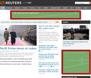
To be honest, I don’t even see them most of the time. It is as if the top and sides of the webpage I’m looking at are blurred—I know they’re there, but I don’t even notice them. For this, I thank “banner blindness.”

Banner blindness is the result of templated or “best practice” page layouts that place banner ads in specific places, such as the very top center of the page or on the far right side of the page. See the red boxes below:

common-ad-layout


Why is it called “blindness”?

The ad is there, but we ignore it because our minds have “seen that, done that” so many times before. We have established the typical banner areas as distracting from our goal on the page.

As marketers, if we are stuck in these blind areas, what can we do to increase the effectiveness of our banner ads? For questions like this, I always like to refer to the MECLABS Institute’s (MarketingSherpa’s parent company) Online Ad Sequence  heuristic for guidance:  

Read more…

3 Content Tips from StumbleUpon for Reaching Millennials

December 18th, 2015

When marketers talk about Millennials, the reigning opinion is that it’s a demographic of 24-year-olds, according to Anne Gherini, Head of Marketing, StumbleUpon.

Anne explains this fallacy in her interview with Daniel Burstein, Director of Editorial Content, MarketingSherpa, at the MarketingSherpa Media Center at DMA’s &THEN 2015. She also goes in-depth about how marketers can effectively reach and resonate with these 18-34 year olds.

“40% of Millennials are parents. So when we talk about Millennials in general, we have to think about how vast this demographic really is. So testing becomes key,” she said.


With so much content out there to choose from, authenticity and trust is key, Anne said.

Read more…

Learning About Your Customers Through Testing

November 20th, 2015

Mike Loveridge, Digital Marketing Manager, Humana, runs the conversion rate optimization program at Humana, which is comprised of a team of 15 testers and supporting staff.

In his interview at the MarketingSherpa Email Summit 2015 Media Center, Mike explained that the team has spent the past year getting a process in place that would walk a tricky tight rope: keeping costs down, while improving the quality of the test. Locking down this process can be difficult in an enterprise-grade company, Mike said, but especially in the insurance industry with government regulations.


“This year it’s more just branching into other areas of the site and the experience that we weren’t able to touch last year,” he said, listing the member’s portal and company firewall.

Mike’s goal is to spur a company-wide transformation with testing culture, starting with his team.

“I think [with] insurance companies in general, the big push is to go from being an insurance company … to being a health partner with the consumer so that there is a level of trust that hasn’t existed before,” he said.

Read more…

How Ancestry.com Personalized Its Offer Page to Specific Customer Segments

October 30th, 2015

Every marketer wants to help their customers discover something. Even if your product or service is not as personal as family history, that doesn’t mean that your marketing can’t be personalized.

In the case of Ancestry.com, the team uses information from users’ family trees to search its vast collection of historical content and records. While making a family tree is free, users must sign up and become a subscriber through an offer page to access any of the content.

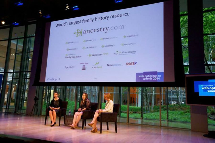
“Our mission at Ancestry is to help everyone discover, preserve and share their family history,” Emily Titcomb, Senior Manager of Product Marketing, Ancestry.com, said.

The offer page can be accessed through a variety of paths on the Ancestry.com site. However, despite Ancestry having 2.7 million paid subscribers around the world searching 13 billion pieces of digitized content, the offer was the same for everyone.

Watch the full session replay on MarketingSherpa.com: Inbound Marketing: How Ancestry.com increased conversion by 20% with reduced choice barriers and targeted content

Ancestry

Read more…