Marketing 101: What is a sticky footer?
Marketing has a language all its own. This is our latest in a series of posts aimed at helping new marketers learn that language. What term do you find yourself explaining most often to new hires during onboarding? Let us know.
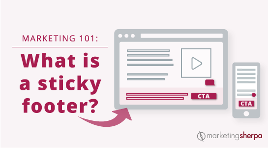
A footer is the information at the bottom of a webpage. On a traditional website, a visitor would scroll down to see the information at the bottom of a webpage in the footer. However, with a sticky footer (sometimes known as a fixed footer) that information is always present at the bottom of the visitor’s web browser as the visitor scrolls down. They do not have to get to the bottom of the page to see it.
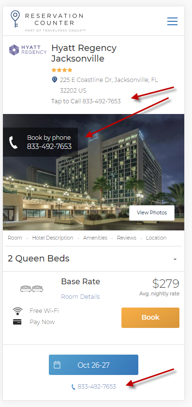
For example, the team at Reservation Counter discovered that having the contact center phone number prominently displayed on the website increased orders, so they included it in a sticky footer for their mobile visitors.
The below image from the article Conversion Rate Optimization Case Study: How a travel website doubled website conversion rates in one year points out the places that the phone number was included on the mobile site. The phone number at the bottom of the page is in the sticky footer.
Creative Sample #1: Mobile sticky footer with telephone number CTA
The Infinite Scroll: A never-ending attempt to find the footer
Another website design tactic that has gained traction over the past decade or so is the infinite scroll. An infinite scroll is when more content loads automatically at the bottom of the web browser as a visitor scrolls down a webpage.
Infinite scroll designs were adopted because they reduce the friction of having to click to the next page. This is especially true on a smartphone where it’s far easier to continue to swipe than to click on a link or button.
However, most infinite scroll designs essentially remove the footer as a website element since the visitor never gets down to the bottom of the page. Anytime they think they’ve reached the bottom, more content loads on the page, and the page just gets longer. It’s a lot like that dream where you’re eating spaghetti — the more spaghetti you eat, the more gets added to the bowl, so you never finish.
This is one use case where a sticky footer can help. By combining a sticky footer with an infinite scroll design, you can reduce friction for the users while still providing the information they would expect from a footer.
Footers add credibility to a website
At this point, you might be thinking “I like my infinite scroll design. The footer was a relic from the early days of the internet. Who needs footers anyway?”
For visitors accustomed to websites designed with footers, the footer can add credibility by providing general information about the company, such as:
- Link to about page
- Link to contact us form
- Link to customer service forum
- Link to FAQ
- Link for press requests
- Phone number
- Mailing address
- Customer service email address
- Privacy policy
- Name of the person or company that owns the website (usually accompanied by a copyright)
- Link to social media accounts (Pro tip: If you’re using a template, make sure you update the icons for Facebook, Twitter, LinkedIn, etc., with links to your accounts. If customers click and get nothing, it only reduces credibility)
Now you might think “my customers never send me postal mail, so why does my mailing address matter in the footer?” Even if your customers don’t try to contact you in these ways, simply having a physical mailing address can reduce anxiety for the customer and help them understand that your company is legitimate.
The long landing page
While many marketers try to keep their landing pages as short as possible, fearing that customers simply won’t read a long landing page, long landing pages can be effective for some products. Here’s an example of a long landing page that netted 220% more leads for an addiction and mental health rehabilitation facility. And here’s a long landing page that generated 638% more leads for an insurance call center.
With a long landing page, you don’t have the same problem that you do with an infinite scrolling page. Visitors can scroll down and eventually get to the bottom to see the footer. However, if the page is long enough, they may lose patience. So you may want to test a sticky footer. It could help increase conversion by giving them the credibility information they desire. Or it could hurt conversion because it presents a distracting element on the page. The results will depend on how your unique visitors react to your unique products’ pages, and they will likely vary by industry, product type and visitor type.


