Archive

Archive for the ‘Ecommerce Eretail’ Category

Holiday E-commerce: Make online shopping a rewarding experience for customers, not just an extension of the holiday hassle

December 1st, 2011

I think it goes without saying that online shopping is no longer just a convenient option for consumers. It’s a retail mainstay, and a key to holiday marketing success.

Wasting no time in supporting this point once again, IBM has just unveiled the findings of its fourth annual Cyber Monday Benchmark, revealing that online spending for Cyber Monday 2011 eclipsed the previous year’s sales  by 33%, and even this year’s Black Friday sales by 29.3%.

As crazy as it can be for consumers, holiday retail is like bacon-flavored manna for marketers. While the online opportunity is huge, it’s crucial to stand out from the crowd, by remembering those who make up the crowd.

You must offer shoppers a thorough, convenient, enjoyable online experience, and promote your shopping experience as part of the holiday solution, not a digital extension of the traditional holiday hassle.

With the growth of e-commerce as a viable alternative to in-store retail, aided by more Web-exclusive discounts, free shipping offers, and the like, you can help boost business by providing an efficient, but personal online shopping experience that ensures your customers will never again long for crowded malls and crazed deal-hunters.

Here are three tips to help make the holidays happy, for your customers and your bottom line.

Read more…

Holiday Marketing: 3 last-minute ideas to boost conversion

November 22nd, 2011

The holiday shopping season is upon us – the proverbial golden goose for consumer marketers. I’m sure you’ve planned thoroughly throughout the year, and just have to focus on how to execute, execute, execute in these last remaining days before December 25 rolls around.

But, it’s too late to make impactful changes to your plans, right?

Right?

Well, I’ve been listening to one of those “challenge the model” books on tape (you know, the ones that tell you, “Burn the status quo! The only rules that exist are the ones we impose on ourselves!”). So, I’m understandably pretty worked up. All the same, I say we take on this beast. Let’s try to make a few last-minute shifts and move that needle.

If you can spare a minute away from your daily transactional data, let’s brainstorm a few last-minute ideas to help you get an extra bump in sales this holiday season (and I’d love to hear your ideas in the comments section, as well). After all, anything’s possible. As long as you commit.

Read more…

On-site Search: How to help your customers find what they want (to buy)

January 7th, 2011

“And I still…haven’t found…what I’m looking for.” Hopefully Bono wasn’t talking about your website.

According to the MarketingSherpa Ecommerce Benchmark Report, customers who use the search box on ecommerce sites convert at nearly three times the rate of general browsers. Yet, 52% of marketers graded their internal search a ‘D’ or  ‘F.’

On Monday, I’ll be presenting on the “Exploring On-site Search with eTail, BabyAge.com and MarketingSherpa” webinar with Jack Kiefer, Founder and CEO, BabyAge.com, and Kelly Hushin, Editor, the eTail Blog.

But before we share some of our research and case studies about on-site search, we wanted to hear what you had to say…


Four major points

1. Understanding of misspellings and synonyms

Search today must tolerate typing errors, spelling mistakes, and other altered forms, without requiring a preset dictionary. We use our patented algorithm(FACT) to first of all understand what visitors are looking for in a shop. Phonetic is king.

On BabyAge.com when you search for “armchair” instead of “arm chair” you get no results. It looks like BabyAge.com is trying to maintain search by manual optimization because “sleighbed” works!

So you can point out the long tail of search again. Same for fischer-price instead of fisher-price or “chocolat” instead of “chocolate” or “sumer” instead of “summer”.

What about “schanon” instead of “shannon”? It doesn’t work. In Europe, we deal with many languages and understanding the phonetic is really important. Even spaces matter – “infantseat” (21 results) instead of “infant seat” (1000 results).

2. Relevance

The order of the right products that are displayed on the result page is vital.

Top-sellers and revenue boosters should always be placed on top, while sale items and bad sellers should be placed below the fold or on the next page.

Make sure to show only deliverable products, because nothing is more frustrating for a customer than finding out that the just-found-present takes 5 weeks to deliver.

Use an intelligent result system that incorporates information like relevance, top sellers and availability status, to avoid frustration and to turn more visitors into buyers.

3. Speed and filter

A survey of 600 Internet users showed that more than half felt that a “suggest” feature is “important” to “very important.” An additional 25% found the feature to be “rather important.”

When online retailers provide such a suggest feature, the drop-down menu should note the number of matches for each of the terms listed.

General search terms (such as “shirt” for an online clothing retailer) normally produce a very large number of results. The right filter navigation prepares the list for the user, permits sorting and selections to be made, and displays appropriate navigation tools. The user can now quickly narrow down the results according to brand, price, size or other attributes.

4. Merchandizing and optimization

Today on-site search is one key factor to understand the customer in your online shop. But you should also be able to generate insights from this data and use on-site information to generate AdWord campaigns and optimize, test and configure your shop for a higher conversion rate.

– Mathias Duda, Head of Sales, FACT-Finder


Simple things

There are many simple things companies can do to improve performance of their site search to deliver a more user-friendly experience, and potentially result in higher conversions (for e-commerce sites, in particular). Here are a few of them:

1.  Incorporate rich auto complete

This feature significantly enhances the usability of your site, by not only suggesting possible terms when visitors start typing the first letters of a keyword (like most search engines do today), but also showing images, start reviews, price, discount info, short product description, and even a “buy now” or “check availability button,” without the need to press the search button and wait for the results page to appear. This powerful feature gives people an easier way to click through to the items they’re searching for and typically results in higher conversions.

2.  Test different positions for the search box, and not which positions generate the most search traffic

One online retailer – Black Forest Decor – took this approach, moving its search box from the right-hand upper corner of its site to the center. The company made other changes at the same time, including increasing the size of the search box. The company found that site search revenue per customer increased 84% and the conversion rate increased 34%.

3.  Offer “add to cart/buy now” options directly from the site search results page

Smart e-commerce companies create as few steps as possible from search to checkout. When you allow visitors to add products to shopping carts or to go to checkout directly from search results, they’re more likely to complete the purchase – particularly if they know exactly what they want and they see it in the results at a price they’re comfortable with.

4.  Show ratings and reviews in search results

Site visitors place high value on the opinions and feedback of other people who’ve shopped for similar products or services, and showing the average rating in search results helps them better determine what they want to click on. You should allow visitors to further refine or reorder their search results based on ratings. You should also show, in the search results, the number of reviews that a product has.

5. Be sure to include refinement options that are relevant to the search query

Refinements are a useful way for visitors to narrow down results by certain criteria – for example, brand, gender, price range, etc. Refinements should be relevant to the search term, so will vary from one search to another.

For example, if a visitor to your site has searched for “camera,” it may be useful to have refinement options for the number of megapixels and the screen size. If someone searches for “TV,” then you may want to offer screen size and resolution refinement options. Apparel retailers can offer refinements for men’s and women’s items, as well as size, color, or other relevant attributes.

The trick with refinements is to keep them relevant and useful. This can be done by tracking the most popular and related search terms for each product category, and dynamically creating the refinements based on the keywords that people have entered.

Shaun Ryan, CEO, SLI Systems


The new slang

Know your audience’s slang. Aside from plain old keywords, there’s going to be all sorts of wacky short-hand terms, acronyms and inside jokes you ought to be aware of. You can nab your market from folks inside the bubble already that way.

Erica Friedman, President, Yurikon


Related Resources

Internal Search Data Inspires Store Page Re-Designs: 4 steps to boost revenue 50% – Members’ Library

Four Simple Steps to Tweak Site Search Box & Lift Conversions 20% – Members’ Library

How Eretailer Tripled Conversions with Internal Search Changes – Members’ Library

How to Improve Your Company’s Internal Search and Lift ROI – 9 strategies and tips – Members’ Library

How to Use Internal Site Search Data to Revamp Your Home Page: People’s Bank – Members’ Library

photo by WellspringCS

Testing Interactive Ecommerce Features

June 21st, 2010

Social ecommerce technology has lifted sales and turned one-way websites into two-way conversations. Ratings and reviews, for example, have tremendously improved the consumers’ shopping experience, as well as many marketers’ conversion rates.

Frank Malsbenden, VP and General Manager, Shoeline.com and his team are already looking for the next winning interactive ecommerce feature. The team maintains several footwear ecommerce sites, including SuperShoes.com, which Maslbenden calls “the perfect sandbox.”

The team often tests new ideas on this smaller site, giving it a unique feature set that’s worth browsing for ideas. Features include:

– One-click voting and tagging

On product pages, visitors can click to declare they “like” or “hate” a product. A score is tallied on the page. They can also tag products, similar to how blog posts are tagged. Visitors can view the most “liked” or “hated” products, or products bearing the same user-generated tag.

– Drag-and-drop sharing

On product category pages, visitors can click product images and drag them onto icons to share their links on Facebook, Twitter or via email.

– Profile and live feed

Customers are given profile pages, where they can track all the shoes they’ve “liked,” “hated,” tagged and shared. They can create a vanity URL and have their profile’s page views tallied and displayed. The profile also shows a live feed of all activity on the site, such as:
o Products recently viewed
o Products recently liked, hated, shared or emailed

Malsbenden’s team is testing these features and others, such as a possible live feed integration on the homepage. Features they deem as winners will be incorporated into the fall redesign of the team’s flagship website, Shoeline.com.

‘Do Not Contact Us’ Forms

April 6th, 2010

As a reporter, I will contact a company through any means necessary. I prefer using a phone number or an email address for a specific person — but sometimes I’m stuck filling out a ‘contact us’ form.

I’ve filled out more contact forms than I’d like to admit. I really dislike them. About a quarter of them do not work, and I’m never sure if my messages reach my intended audience: the marketing department.

Some common problems I’ve seen:
o Errors after clicking ‘submit’
o Tiny message length limits (such as 200 characters)
o Bounced emails in response
o Claims of ‘improper formatting’

Even worse is after receiving an error, you can lose your entire message. I learned long ago to write messages in a separate program and to copy-and-paste them into forms, in case I need to resubmit.

I’m just a reporter trying to get a marketer on the phone — can you imagine if I was a dissatisfied customer? My frustration level would skyrocket. If I was a potential business lead, I’d likely leave and never return.

‘Contact us’ forms are similar to social media in that they provide a way to receive customer feedback — which is very valuable. Broken ‘contact us’ forms send a clear message: “we don’t care about your feedback. Don’t contact us.”

But I’m sure that’s not true. You must care about your customers’ feedback. Their satisfaction keeps you in business.

So if you have a minute, check your website’s contact forms. Make sure they’re flexible, easy to use, and most importantly, that they work. A small effort can go a long way in preventing customers from walking away for good.

Wish Lists Lift Conversions

March 17th, 2010

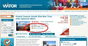
Personal travel arrangements often require coordination with other parties, whether it’s your spouse, friends or other family members. That’s why travel activity retailer Viator’s sharable wish lists are such a great idea.
Viator Product Page - add to wish list
Many ecommerce sites offer wish lists to visitors. They’re especially useful during the holiday season when families are figuring out what to buy one another. The impression I’ve gleaned from marketers is wish lists are useful, but they’re not a strong ongoing performance driver.

Online travel, on the other hand, has a more practical application for wishing. Friends and family members going on trips often coordinate what to do and send each other ideas. Viator’s wish lists make it easy for travelers to share ideas, and the team places “Add to my wish list” links prominently on their product pages.

I noticed these lists during a conversation with Kelly Gillease, Marketing Director, Viator. Visitors can view items on their wish lists directly on the homepage. From the homepage, with one click, they can view a form to send the list to up to three people with a personalized message.

“We do get a fair number of people creating wish lists, emailing them and sharing them,” Gillease says. “We’ve found it really does help boost our conversion rates.”

Gillease’s team plans to build on this success by creating account pages where site visitors can view all their lists, among other features.

Are there other effective applications for wish lists that you’re seeing? Are they helping lift your conversion rates? Let us know in the comments, and thank you.

Capturing Attention on Twitter

February 9th, 2010

A well-timed and well-crafted message always has a chance to generate buzz through social media. If people like your message enough, they’ll send it to their friends. But they have to see it first.

During a call with Gary Wohlfeill, Creative Director, Moosejaw Mountaineering, I realized that getting attention is easier through some channels than others. Wohlfeill and I discussed his team’s recent holiday promotion (keep an eye on our free newsletters for the article). They ran the effort mostly through Facebook and Twitter.

Leading up to launch, the team sent messages through the social channels to build anticipation. They got some attention through Facebook, but it was harder to gain traction in Twitter, Wohlfeill says.

“Twitter is much more like a river. You drop a pebble in the river and you have to be standing there to see it go by. So you have to drop a lot of pebbles to reach a lot of people.”

Wherever you send a message, it’s going to have to compete for attention. Whether it’s a billboard competing with highway traffic, or an email competing with an inbox, competition is there.

Twitter, it seems, thrives on limited attention. Being seen can be a challenge. And once you’re seen, you can only hold attention for 140 characters–unless you get a click.

Two good ways to increase your chances at capturing more attention:
1. Be interesting enough to entice people to share with friends
2. Link to relevant content

Twitter Surveys for Quick Opinions

May 19th, 2009

Marketing decisions are best made with a level of certainty about an audience’s preferences. You don’t want to start offering a feature that customers aren’t interested in. And you don’t want to push a marketing offer that they don’t care about.

Social media and data mining can be used to find an audience’s preferences. And as we outline in a case study recently, online surveys are still effective strategy. Then last week I interviewed Glenn Edelman, VP Marketing, Wine Enthusiast, who has recently combined social media and surveying.

Edelman is responsible for Wine Enthusiast’s wine accessories ecommerce site, and WineExpress.com’s direct-to-consumer ecommerce wine sales. His team uncovered a great strategy for selling wine via email with product pages that include “virtual wine tastings” in two- to three-minute videos (the case study will be published by eTail later this month, and then by MarketingSherpa).

When adding video to the wines’ product pages, Edelman’s team wondered whether the videos should automatically play, or wait to be clicked by visitors before playing. The team asked Wine Enthusiast’s Twitter followers about the idea.

“We thought about testing it but said ‘hey, let’s ask our audience.’ And we got a huge, huge response to never do auto-play. ‘We hate auto-play,’ they said. It was such as negative response that we didn’t even bother testing,” Edelman says.

There you have it. Twitter can be used as a quick way to get your audience’s opinion, in addition to its other marketing applications, such as branding, PR, and promotion.

Reaching Local Searchers

May 12th, 2009

I had an interesting conversation with Scott Dunlap, CEO, NearbyNow, last week. NearbyNow helps consumers find products in local stores through its website, mobile apps, and the major search engines.

A consumer looking for a particular product in his or her area will typically be alerted via an email or a text message on the product’s availability. This service has several interesting applications for marketers–such its OnTheWay ads. These ads allow marketers to advertise in the alert messages to consumers who’ve indicated that they’re planning to visit a store near their own.

Some marketers, Dunlap says, have leveraged these ads to emphasize the core motivations that consumers have for searching for local products. The top three motivations that Dunlap’s team has uncovered,:
1. Consumers want the products immediately
2. They want to see, hold, and test the products (particularly relevant for apparel, shoes and gadgets, Dunlap says)
3. They do not like the hassles or costs of shipping

How have these motivations been applied to the ads? Some marketers are pushing immediacy to the extreme. They will give 20% off products in their stores for the next two hours. That can force some consumers to consider visiting the advertiser’s store before visiting their intended destination.

Local search and sales for products–with real time inventory updates–looks like it holds a lot of potential for retailers and brands alike. I expect the major search engines to start rolling out more ways for marketers to connect with consumers looking for products locally.

Basic Tips for Improving Ecommerce Experiences

March 31st, 2009

About a month ago I had the pleasure of interviewing Tamara Adlin about best practices in improving users’ ecommerce experiences.

She was speaking at Etail West 2009 in Phoenix and I wanted get her insight since she’s been in the field for the past 18 years. She created the Customer Experience services team at Amazon.com.

Here were her Top 3 Tips for Enhancing Users’ Ecommerce Experiences:

Tip #1. Display differentiators and value propositions on the homepage

Adlin says 99% of the sites she sees fail to apply this simple rule. It’s as easy as constructing a simple statement, or bullet points, or a general voice that relays: Welcome. Here’s who we are. Here’s what we sell. Here’s how we’re different. Here’s why you should care. Here’s what you should do.

Tip #2. Look at the site from end-to-end

Companies should get into the habit of clicking through their site every day. Go to the site, click on the sale or promotion creative. Where does it take you? How can you make that process make more sense for the user? How can you give them exactly what they want?

Tip #3. Customer service is the key

Don’t slack on customer service efficiencies. If a customer says the product doesn’t work, invest in a proactive customer service department that offers to expedite a new product immediately. The positive word-of-mouth garnered from that simple gesture is worth thousands of marketing dollars.