Archive

Archive for the ‘Marketing’ Category

AI-driven Marketing Insights: Interview with a ‘marketing professor’ who can help train your team

March 1st, 2024

On my marketing podcast, I have in-depth conversations with marketing leaders. Given the recent release of expert assistants by MECLABS AI (MECLABS is the umbrella organization of MarketingSherpa) I thought it would be interesting to ‘chat’ with these ‘experts.’ You can read my conversation with Marketing Professor below.

A little gimmicky? Somewhat, yet. But, it’s worth noting that this aligns perfectly with the intended purpose of these expert assistants. Imagine having the ability to get personalized help from a marketing expert. That’s now a reality, with the added perks of instantaneous responses and no cost (at least for the time being).

MECLABS has long been known for it courses, and while you can still take our free digital marketing course, the Marketing Professor expert assistant can customize training for you and your team.

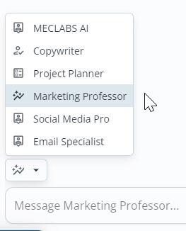
Here’s where to find the Marketing Professor expert assistant in MECLABS AI:

Creative Sample #1: Navigating to the expert assistant feature in MECLABS AI

Creative Sample #1: Navigating to the expert assistant feature in MECLABS AI

Now, let’s delve into what insights we can gather on marketing training and marketing in general. Typically, for a human interviewee, I’d note that responses have been refined for clarity and brevity, and in this case, I’ve barely touched the responses.

Read more…

Conversion Optimization Strategies: Ways to get started overcoming 6 CRO challenges

September 8th, 2023

In this week’s session of MEC400: Test Your Messaging (a research-and-learn track to help AI Guild members build a SuperFunnel), Flint McGlaughlin asked participants so share their biggest challenges in the Zoom chat.

These are difficult challenges, and I can’t solve them with a simple answer. So what I’ve tried to do with the 6 CRO challenges below, is provide some ideas, examples, and further discussions to help you get unstuck if you face a similar challenge, to spark your next great idea for overcoming these significant challenges.

Funnel and Landing Page Creation

Do you have an example of an excellent funnel / landing page? I see plenty that aren’t good. Wonder if you know of one that is stand out good?

This is very variable based on industry, business strategy, your ideal customer, and a host of other factors. That said, here are some examples to get you thinking:

  • Here is a nice, clearly mapped out funnel example from a VC advisory (see Quick Case Study #3 in the article I linked to in this sentence).
  • A nice example of a funnel pivot for an e-learning provider (see Quick Case Study #1) that changed it’s funnel flow.
  • And a nice reminder that funnels aren’t necessarily linear, and that there are many entrances to your funnel, and many paths once customers are in it – Airbnb nets 600 bookings with non-promotional email.

The same caveats hold true for landing pages as well, of course. There are many different factors. That said, here are some nice examples of some types of landing pages:

Identifying the Right Variables to Test

I struggle with building a hypothesis and building meaningful A/B tests. There are many constructions. How do you decide what variable cluster to test?

Here is the gold standard – does the test result help you make a meaningful business decision?

And here is how you get there – curiosity about the customer. Truly wanting to understand how to better serve the customer. What value will interest them, what value communication best expresses the value you deliver, the best channels to get in front of them, etc.

That is the high-level answer. And here are some resources that can help.

Utilize a structured framework, like MECLABS’ Conversion Sequence Heuristic, to guide your variable selection process. Leveraging this framework can help guide your hypothesis and variable selection. The framework focuses on variables related to motivation, value proposition, incentive, friction, and anxiety.

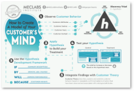
As for the actual construction of the hypothesis, here is the hypothesis framework we use.

Scientific Marketing Experiments

Getting enough traffic to test hypotheses.

To remix a line from the movie Jaws, “You’re gonna need a bigger budget.” I’m kidding, I’m kidding of course 😊.

You have a few options. You could get better at buying traffic. I am no expert in this, but we do have plenty of case studies on MarketingSherpa that could give you ideas for reducing cost per click on your ads. For example, we took an in-depth look at an affiliate product review site’s advertising experimentation (see Quick Case Study #1). Reported on a cost-per-click audit (see Quick Case Study #1). And Facebook ad targeting parameters (see Quick Case Study #3).

You could see this as a signal that you need to change your offer. For an example of the difference an offer change can make, see how an AI prompt ebook dramatically increased social media advertising leads for a tech interviewing platform (Quick Case Study #1 in that article).

If you can’t get more budget, spend that budget more effectively, or optimize the hooks you have in the water to draw in traffic (the offer), then you could change how high you set your standards for validity in your experiment. It’s not ideal, I know. But you’re marketing in the real world, not the ideal world. There are some good tips in working with a very small sample size is difficult, but not impossible.

Assessing Product-Market Fit

Stuck with knowing whether there’s a fundamental issue with the product. Whether there’s a broader issue – or it’s just timing. Not stuck with the methodology or funnel. I’m starting another one or two so I’m back in MEC200: Design Your Offer.

You are stuck with a fundamental business challenge – product-market fit. No easy answers here.

You can evaluate your product using the MECLABS conversion heuristic, as mentioned above. It could be useful to revisit this framework to analyze the five elements: motivation, value proposition, incentive, friction, and anxiety, as applied to your product. This will provide a more holistic view of your current situation and identify areas you want to dive deeper.

Then, this is where some qualitative research can help. If possible, find people who are in your ideal customer set and didn’t buy your product. You can use surveys, focus groups, phone calls, in-person interviews, etc. Start with unprimed questions – this can help you find a blind spot and not give the potential customer a bias. Then use the areas you identified in the conversion heuristic analysis, and see what people think about the specific challenges you identified with your analysis.

Then do the same with customers who did purchase. Also, ask them about their experience with and satisfaction with the product.

You are trying to determine if the product is meeting a clear customer need. Are there substantial complaints or feature requests?

Or if there are cyclical trends affecting sales. Are there seasonal patterns or market fluctuations to consider?

I’m glad to hear you are going back into MEC200: Design Your Offer (available as part of the AI Guild). This will also give you some thought-provoking tools about your customer-first objective, initial customer profile, and offer value proposition.

Lastly, this is a difficult task. So here are some conversations from How I Made It In Marketing, so you can see how your peers have handled this challenge as well:

Traffic Generation Strategies

Would like to know when to give up on an offer or channel. Have an issue with how much data I need to submit to be statistically significant. It requires a large budget.

I address the data challenge above (under ‘Scientific Marketing Experiments’) so I won’t get into that again. Let’s discuss when to give up on an offer or channel.

There are two factors I would consider – ROI and opportunity costs.

Are you getting a return on investment? If not, that could be an indication to move on. Not so fast though, because attribution isn’t perfect (great discussion on that topic with Tate Gibson, Head of Growth, Peak – attribution is a myth, but you need it).

So don’t only let ROI alone (or a similar metric like CPA) drive your decision. Take a look at customer engagement metrics as well. If people are interacting with a channel or offer but not converting, you could simply have an attribution problem.

Or (yikes there are no straightforward answers) you could be attracting the wrong people (not your ideal customer) with the wrong message (that stokes curiosity, but not the final conversion you need). This is an opportunity to engage in some conversion optimization practices.

The other factor is opportunity costs. What else could you be doing with that budget, time, resources, and focus? If you have other channels and offers that are performing, or are worth testing, it might be an indication to start shifting some budget and focus and seeing how it affects overall performance.

One way to approach it is to use some version of the 80/20 rule. Invest most of your budget and focus on your tried-and-true performers. And play around with the other 20% – pilot testing as you go. When you see a pilot or channel start to outperform, then you’ve identified some opportunity cost, and may want to start shifting more resources in its direction (instead of totally ‘giving up’ on a previous channel or offer, it might be first cutting its budget/focus by a third, or half, and keep shifting to see how the new mix performs).

These multi-dimensional approaches have been topics of episodes of the How I Made It In Marketing podcast. For example, Julien Rio, Assistant Vice President, International Marketing, RingCentral, talked about the 80/20 approach in our discussion about taking risks, failing early and learning fast (starting at 41:00).

Don’t shift that 20% pilot budget/focus too quickly though. As Colleen O’Brien, Chief Communications Officer and Head of Strategy, Armoire, mentioned when discussing a foray into podcast advertising, everything is expensive until it starts working (starting at 29:50).

Landing Page and Lead Gen Effectiveness

How to know learn what isn’t working with my landing page and getting lead gen result I want/need

A/B testing can help a lot here (there’s a nice step-by-step approach in this article about a live experiment we ran at a summit). But like with the above discussion – not just randomly testing buttons or headlines. Really trying to get in the customers’ head so you can better serve them.

Follow up these test results with further discussions with customers who bought and didn’t (as discussed above). Read reviews and general forum discussions about your product and your industry.

Lastly, while digital platforms and channels are powerful and inexpensive ways to learn from your customer, I sometimes worry we overlook the value of a little face time. How can you get in front of your ideal potential customer and discuss your value prop? And then get real, live feedback from them? Don’t try to sell them too hard (or they will just tell you what you want to hear), truly try to learn from them.

Here’s a nice example of how the founder of Cyberpack went to live events and meetups to learn from his audience and sell his product (see Quick Case Study #2).

Related resources

Conversion Rate Optimization: 7 tips to improve your ecommerce conversion rates

Conversion Rate Optimization: 3 effective marketing strategies explained by the marketers who created them

Optimizing Tactics vs. Optimizing Strategy: How choosing the right approach can mean all the difference in your optimization efforts

Marketing 101: What are beneficial buttons?

July 8th, 2020

Marketing has a language all its own. This is our latest in a series of posts aimed at helping new marketers learn that language. What term do you find yourself explaining most often to new hires during onboarding? Let us know.

This article was originally published in the MarketingSherpa email newsletter.

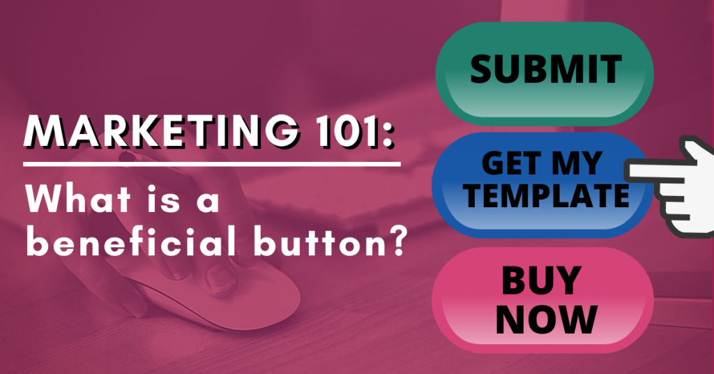
A beneficial button is a call-to-action (CTA) button that explains a benefit the customer will receive by clicking on it. In other words, the button has a process-level value proposition.

This may sound obvious when you read the above sentences. If you’re asking the customer to take an action, of course, the button should have a benefit. However, I challenge you to navigate around the web right now and see how many buttons are truly beneficial.

Three categories of CTA buttons

There are three categories of CTA buttons:

  • Value-neutral buttons – These buttons don’t have a positive or negative value. For example, using the word “Submit” or “Go.”
  • Value-negative buttons – These buttons have a higher cost than value. For example, “Buy Now.”
  • Value-positive buttons – These are beneficial buttons. They show the customer the benefit of taking action. For example, “Download My Template.” By filling out the form and clicking the button, you will get the value of a template download.

You can see the full landing page yourself: Free Template to Help You Win Approval for Proposed Projects, Campaigns and Ideas

How to categorize your CTA buttons

Two marketers can see the same button and disagree on whether it’s a beneficial button.

For example, Kodak considered a “Subscribe” button to be a beneficial button for its email registration page while a “Submit” button was not. (From the case study List Growth Tactics: How Kodak added 33% more email subscribers and 53% more YouTube followers).

Read more…

SBA Paycheck Protection Program Loans and the Marketing Industry: 4 tips for marketers

April 13th, 2020

This blog post was originally published in the MarketingSherpa email newsletter.

If you haven’t already heard of the Paycheck Protection Program (PPP), it is part of $350 billion in aid the U.S. Congress allocated for small businesses in its recent stimulus bill (and more is being considered).

This program, in response to the economic devastation wrought by the Coronavirus (COVID-19) crisis, is meant to keep small businesses afloat as well as ensure workers on private payrolls continue to get paid.

If you want general information about the program, you can learn more directly from the U.S. Small Business Administration. In this MarketingSherpa blog post, we’ll focus on some tips that are especially relevant to marketers.

Tip #1: Understand how your workers are classified

There has been a lot of press about the PPP and how it can help small businesses cover payroll and operating expenses. For some in the marketing industry, there may be special considerations in how they should manage their organization’s human resources.

“Many marketing agencies have a lot of 1099 contractors; those freelancers are not covered under the agency’s PPP loans. Therefore, marketing agencies would have an easier time covering those types of expenses under the Economic Injury Disaster Loan Assistance Program,” advised Taylor Gibson, COO, Optima Office, an accounting firm.

Gibson advises that the Payroll Protection Program can be a better loan option if you have W2 employees since portions can be forgiven (more info below).

“You can get two-and-a-half times the qualifying monthly wages and benefits through the Paycheck Protection Program. Plus, the PPP does not require a personal guarantee — which the Economic Injury Disaster Loan Assistance Program does,” advised Gibson.

Tip #2: You may be a small business

Jay-Z once said, “I’m not a businessman, I’m a business, man!”

You may be a small business as well.

Sole proprietors, independent contractors and self-employed persons can apply to the PPP, according to the SBA website.

“If you own a one-person marketing agency and are a sole prop[rietor], then you likely do not have payroll costs in the same way. That being said, the loan amount that you are eligible for would still be calculated as a result of your payroll costs for the twelve months,” said Allan Givens, PR Manager, Finder.com, which offers a tutorial on How to apply for the SBA Paycheck Protection Program.

Read more…

Landing Page Optimization: 11 questions to ask about your landing pages to increase conversion

March 12th, 2020

We frequently receive questions from our email subscribers asking marketing advice. Instead of hiding those answers in a one-to-one email communication, we occasionally publish edited excerpts of some of these conversations here on the MarketingSherpa blog so they can help other readers as well. If you have any questions, let us know.

While most of those questions are to a general MarketingSherpa customer service inbox, this email was sent directly to Flint McGlaughlin, Managing Director and CEO, MECLABS Institute (parent organization of MarketingSherpa). The email has been stripped of any identifying information but includes general information that will likely be helpful to many of our readers.


Dear Flint McGlaughlin: I have been watching your videos, including:

Based on these videos, I’ve been putting together a treatment on our current landing page. We did not change much design-wise, but the main points I’ve tried to address are:

  • Changing the personality of the page … i.e., toning down the direct-marketing “hype” voice on the page and presenting information more objectively
  • Communicating the value proposition in a way that hopefully is more credible
  • Using short testimonials to make specific claims instead of just bullets by an anonymous copywriter
  • Trying to increase the overall credibility of the page with more evidence spread throughout —not just in the form of testimonials but also data on the underlying science, quantitative evidence, customer satisfaction and awards.

I am wondering if you might be willing to look at it and give me your immediate feedback and perhaps refer me to anything in your videos or book which I might not be understanding or using correctly.

I am not looking for free copy editing, more just feedback whether it looks like I am applying these principles correctly or not. Obviously testing is going to help determine if we have the right value proposition and appeal.

If you have a chance to do this, I would be extremely grateful 🙂 Thank you!


And here is Flint’s (generalized) response, which I thought would be helpful for many marketers, especially anyone focused on conversion rate optimization or landing page optimization…

Read more…

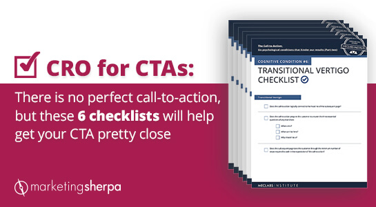
CRO for CTAs: There is no perfect call-to-action, but these 6 checklists will help get your CTA pretty close

March 5th, 2020


Isaac Newton’s first law of motion states that an object at rest remains at rest unless acted on by a net external force.

It’s a good reminder when we discuss the call-to-action. The customer’s natural state is inertia. They don’t care about our products or services without a clear, compelling reason.

The only reason they move is because the perceived value of the product (shaped by previous experiences, word of mouth, press mentions and especially your marketing) begins to pull them into motion. And usually the final piece that tips them from being at rest to in action is the aptly named call-to-action.

Which is why it’s surprising that so many calls-to-action don’t really live up to the name. CTAs like “submit” and “request a quote” give your customers very little reason to act.

Oh, let’s take a quick break for our own mid-blog post CTA:

This blog post was originally published in the MarketingSherpa email newsletter.

OK, we’re back. While the above call-to-action is not value-laced per se, our hope is that it’s surrounded by value. If you find this blog post helpful, and you would like to receive more helpful content like it in your email inbox, then making you aware of the email newsletter’s existence will encourage you to overcome inertia and act.

The quest for the perfect CTA

Now that we’ve talked about the bad, let’s talk about the good. We’ve been asked about the perfect CTA. What should the words say? What color should the button be? Friends, we can’t help you find the perfect call-to-action. It doesn’t exist.

Because CTAs are very context-dependent. The best thing you can do to improve your CTA is to understand your unique customers’ psychology as well as your own.

To help simplify that for you, we’ve created a nifty PDF download of checklists you and your team can go through as you seek to optimize the conversion rate of your CTAs. You can download it for free here: The Call to Action: Six quick checklists to help the busy marketer improve conversion rates.

I’ll walk through one of the checklists with you in this blog post, and you can get more background on the checklists along with a deeper understanding of how to improve your calls-to-action in 150 Experiments on the Call-to-Action: Six psychological conditions that hinder our results.

Read more…

Marketing 101: What are variable tags?

January 16th, 2020

Marketing has a language all its own. This is our latest in a series of posts aimed at helping new marketers learn that language. What term do you find yourself explaining most often to new hires during onboarding? Let us know.


Recently we moved our corporate office to a new location. We are in the process of updating our address on our web sites, online business listings, social profiles, templates, etc. When I checked our email templates, I realized that we had neglected to place a variable tag in our email footers. Because of this oversight, we had to manually change the address for several hundred templates. If we had used this handy tag to begin with, it would have saved us a lot of time. Variable tags have several uses and benefits in email automation, but before I explain further, let’s define the term for those who are new to email marketing.

What is a variable tag?

A variable tag, in an email context, is a bit of code that you can add to a template that will personalize customer information by pulling content from their personal records in your automated email program. The personalization possibilities can be endless, depending upon the degree of information you have gathered over time about your customers.

Automated email programs have different names for personalization tags. We use Pardot, which refers to them as variable tags. But Hubspot calls them personalization tokens. Mailchimp refers to them as merge tags. Constant Contact just calls them tags.

Probably the most common personalization tag used today is the greeting tag. It enables bulk emails being sent out to address each recipient by name rather than “Dear valued customer” or something else generic. Since customers are more likely to engage with your messaging when it’s personalized, it’s a good idea to use this tag. Even if the only information you have about a prospect is their name and email address, it is enough to insert this tag and begin greeting them personally. You can even personalize the subject line with a tag that pulls their name. Studies show this increases open rates.

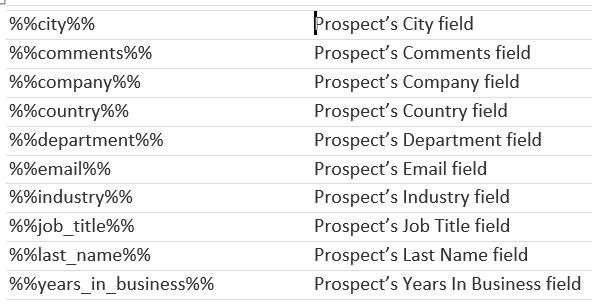
You can also use variable tags to add contact information into your email templates, like your company name and address. Here’s just a sampling of the most common ones.

In Pardot, you can add a variable tag in the body of an email by placing your cursor where you want it and then clicking on the variable tag option. It will open a window with a list of default variable tags to choose from, as well as any custom ones.

Read more…

Marketing 101: What is a sticky footer?

December 19th, 2019

Marketing has a language all its own. This is our latest in a series of posts aimed at helping new marketers learn that language. What term do you find yourself explaining most often to new hires during onboarding? Let us know.


A footer is the information at the bottom of a webpage. On a traditional website, a visitor would scroll down to see the information at the bottom of a webpage in the footer. However, with a sticky footer (sometimes known as a fixed footer) that information is always present at the bottom of the visitor’s web browser as the visitor scrolls down. They do not have to get to the bottom of the page to see it.

For example, the team at Reservation Counter discovered that having the contact center phone number prominently displayed on the website increased orders, so they included it in a sticky footer for their mobile visitors.

The below image from the article Conversion Rate Optimization Case Study: How a travel website doubled website conversion rates in one year points out the places that the phone number was included on the mobile site. The phone number at the bottom of the page is in the sticky footer.

Creative Sample #1: Mobile sticky footer with telephone number CTA


The Infinite Scroll: A never-ending attempt to find the footer

Another website design tactic that has gained traction over the past decade or so is the infinite scroll. An infinite scroll is when more content loads automatically at the bottom of the web browser as a visitor scrolls down a webpage.

Infinite scroll designs were adopted because they reduce the friction of having to click to the next page. This is especially true on a smartphone where it’s far easier to continue to swipe than to click on a link or button.

However, most infinite scroll designs essentially remove the footer as a website element since the visitor never gets down to the bottom of the page. Anytime they think they’ve reached the bottom, more content loads on the page, and the page just gets longer. It’s a lot like that dream where you’re eating spaghetti — the more spaghetti you eat, the more gets added to the bowl, so you never finish.

This is one use case where a sticky footer can help. By combining a sticky footer with an infinite scroll design, you can reduce friction for the users while still providing the information they would expect from a footer.

Footers add credibility to a website

At this point, you might be thinking “I like my infinite scroll design. The footer was a relic from the early days of the internet. Who needs footers anyway?”

For visitors accustomed to websites designed with footers, the footer can add credibility by providing general information about the company, such as:

  • Link to about page
  • Link to contact us form
  • Link to customer service forum
  • Link to FAQ
  • Link for press requests
  • Phone number
  • Mailing address
  • Customer service email address
  • Privacy policy
  • Name of the person or company that owns the website (usually accompanied by a copyright)
  • Link to social media accounts (Pro tip: If you’re using a template, make sure you update the icons for Facebook, Twitter, LinkedIn, etc., with links to your accounts. If customers click and get nothing, it only reduces credibility)

Now you might think “my customers never send me postal mail, so why does my mailing address matter in the footer?” Even if your customers don’t try to contact you in these ways, simply having a physical mailing address can reduce anxiety for the customer and help them understand that your company is legitimate.

The long landing page

While many marketers try to keep their landing pages as short as possible, fearing that customers simply won’t read a long landing page, long landing pages can be effective for some products. Here’s an example of a long landing page that netted 220% more leads for an addiction and mental health rehabilitation facility. And here’s a long landing page that generated 638% more leads for an insurance call center.

With a long landing page, you don’t have the same problem that you do with an infinite scrolling page. Visitors can scroll down and eventually get to the bottom to see the footer. However, if the page is long enough, they may lose patience. So you may want to test a sticky footer. It could help increase conversion by giving them the credibility information they desire. Or it could hurt conversion because it presents a distracting element on the page. The results will depend on how your unique visitors react to your unique products’ pages, and they will likely vary by industry, product type and visitor type.

Read more…

Marketing 101: What are microsites? (plus 3 successful microsite examples and 2 missteps)

November 21st, 2019

Marketing has a language all its own. This is our latest in a series of posts aimed at helping new marketers learn that language. What term do you find yourself explaining most often to new hires during onboarding? Let us know.


Microsites are somewhere in between a single landing page and an entire website. They are small, special-purpose websites for a single, dedicated communication (and conversion) goal set up by companies that already have a full site. They work well for the communication of an idea or product that requires more than a single landing page, for example, an event.

Successful microsite creation requires a clear goal and focus for the microsite and should be built from the ground up optimized for achieving that goal.

Here are a few tips to help you use microsites.

Tip #1: Tightly tap into visitor motivations

Microsites can be more focused on an ideal customer subset than a company’s overall website that often must serve multiple audiences. For that reason, microsites can be used to create a more forceful prospect-level value proposition.

For example, MECLABS Institute (parent organization of MarketingSherpa) was engaged in conversion marketing services for a national land and home sales organization for consumers. The company had microsites for individual communities.

In an A/B test of a community’s microsite, the control offered a community guide to prospects and used sales-oriented language like “… learn why [community name anonymized] is Paradise Found.”


The treatment offered a community map to prospects and a more helpful tone. The map was described as something that would help prospects. “Be prepared for your visit to …”

By better tapping into the motivations of people interested in visiting the community, the control produced a 326% increase in conversions.

Tip #2: Use microsites to target specific locations to garner local search

A large brand that sells warranty and car servicing options was performing well on keywords for the United Kingdom as a whole, but there were towns with service garages where the brand was off the top of the search rankings.

The team at agency DFY Links built three microsites for their client’s least competitive towns — Bath, Chepstow and Swindon. There was a similar technical setup to the main site, but with a heavy focus on the town, and the team went to work building links to these microsites every month. The team chose microsites because any increased effort to help the main site rank in certain areas would dilute the UK search and also reduce rankings in other local areas, according to Brett Downes, SEO Specialist, DFY Links.

“Within a year, Chepstow and Swindon sites featured in [spots] one to five on SERP (search engine results page) results for 90% of keywords we were targeting,” Downes said. “Bath was slightly different, as competition was higher and the other sites had a lot more backlinks. However, we did rank on page one for 50% of [keywords] we were targeting, with around 10-20% ranking in position one to three, especially on long-tail keywords.”

The sites also appeared in the local map pack, the listing of nearby businesses that appear under a map on the main SERP.

“The microsites were minimal in code and very simple. Having a lean site ensured we would have a very fast-loading website, as speed has become more of an important ranking factor (especially on mobile) this has given us the advantage [over] local, bloated sites,” Downes said.

The microsites were completely different sites, not subdomains or subfolders. Local businesses they were competing against usually had less than 50 referring domain links, so the team knew they could match the best competitors within six to nine months of link building.

“We could have used the extra budget and created subfolders on the [main] site and had targeted sections for different locations. This may have diluted the main site; plus with the microsite, the assumed location managed to qualify us for proximity searches,” he said.

However, your business may have a very different competitive mix and that can affect how you consider your URL structure, so read the next tip …

Read more…

Marketing 101: What is baking in?

October 3rd, 2019

Marketing has a language all its own. This is our latest in a series of posts aimed at helping new marketers learn that language. What term do you find yourself explaining most often to new hires during onboarding? Let us know.

In a recent MarketingSherpa article, ConversionXL Research Director Ben Labay says, “I think we are getting better as an industry at baking in an experimentation process and culture into our organizations.” (from Ask MarketingSherpa: Maturity of conversion rate optimization industry)

That raised the question — what exactly is meant by “baking in” in a business and marketing context?

If you click on that link and read the final article, you’ll see that we chose to include the parenthetical statement “[including as an integral part]” to clarify the term baking in.

Baking in means including, in a sense. But that misses the nuance. When you’re baking something in, you’ve considered it from the get-go. So that’s why we went with “[including as an integral part]” not just “[including.]”

Not just a cherry on top

Just like when learning a new language, understanding the nuance to a term is crucial to speaking the business lingo fluently in an industry. In this case, the nuance is meant to communicate that the thing being discussed is not just included, but included as an essential, core part from the very beginning.

I suspect the analogy comes from baking itself. You could just add icing to the top of a cake. Or a cherry on top.

But when you bake something in, it’s really part of the dessert.

Words mean what people think they mean

Language is a funny thing. As marketers, we may be trying to convey a certain denotation (literal meaning) or implying a certain connotation (the idea of feeling invoked by a word), but if our audience doesn’t get the essence of what we are trying to communicate, that communication has not happened.

So I wanted to reach out to some others and get their thoughts on the term “baking in” to see how it aligned (or diverged) with my own understanding. And perhaps with yours as well.

It’s a pretty interesting little experiment. We take this business lingo for granted. But miscommunication happens when we assume we know what the other person is talking about, and professionals (especially newer workers in a field) rarely like to admit their ignorance of an inside term.

As you read the responses below, note how we all generally tend to agree on the meaning of the term. And yet, we all add our own little nuances to the meaning. A good example of why we should always confirm that others understand what you’re talking about, especially when using insider lingo.

Read more…