Marketing 101: What are grids (design)?
Marketing has a language all its own. This is our latest in a series of posts aimed at helping new marketers learn that language. What term do you find yourself explaining most often to new hires during onboarding? Let us know.
This article was originally published in the MarketingSherpa email newsletter.
In a previous Marketing 101 post on MarketingSherpa, you might have read about the rule of thirds, “… a basic guideline for framing and image composition that results in the viewer seeing a balanced, more naturally flattering image.” (Check out the blog post here if you haven’t read it yet.)
The rule of thirds is an example of a grid, specifically a 3 x 3 grid that’s used primarily for images, photographs, paintings, and possibly other mediums, such as landing pages. While it may be the most well-known grid, there are a whole lot of other grids out there that can help structure the layout of your landing page, approved by web designers everywhere.
A grid is a framework of intersecting vertical and horizontal (or angular) lines that are used to subdivide a page into margins, columns and modules (boxes) to structure content on a layout. Basically, it’s a visible guide for placing images, text and graphic elements onto a page with purpose or rational logic.
Why should you use grids?
- It saves a lot time.
After some practice, it becomes easier and faster for you to see where text and images could perfectly align. You also don’t have to design the grid yourself (unless you want to) as there are many popular grids used in web design layouts that are one Google search away (and mentioned below.)
- It makes collaborations run smoother.
Grids can become part of a guideline that each member of a design team must follow, making it easier to collaborate on a project. It keeps the layout design consistent.
- Webpages look organized and balanced overall.
Using the same grid or similar grids for multiple pages will help unify them, making these pages predictable for visitors and easy to navigate — although be careful not to make it so predictable that the layout becomes boring.
How do you use grids?
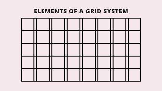
Grids have basic elements; here’s an overview:
- Flowlines are the standard alignments that guide the eye across a page.
- Margins are the negative space between the edges of the page and the content.
- Columns are the vertical containers that divide and contain and organize the content.
- Modules are the individual units (boxes) of space created by columns and rows and also help organize the content.
- Spatial zones are areas formed by more than one module to organize the content.
(Here’s a visual GIF):
What are the types of grids?
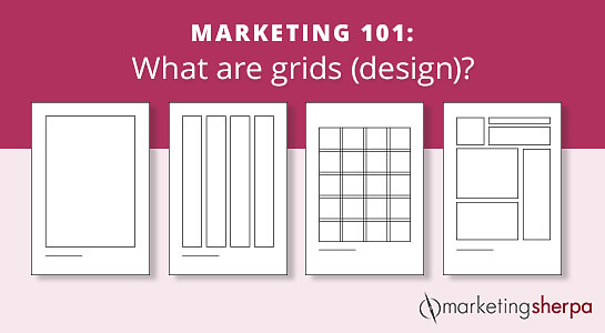
You can design your own grid or customize one of the main four grid types: manuscript, column, modular and hierarchical.
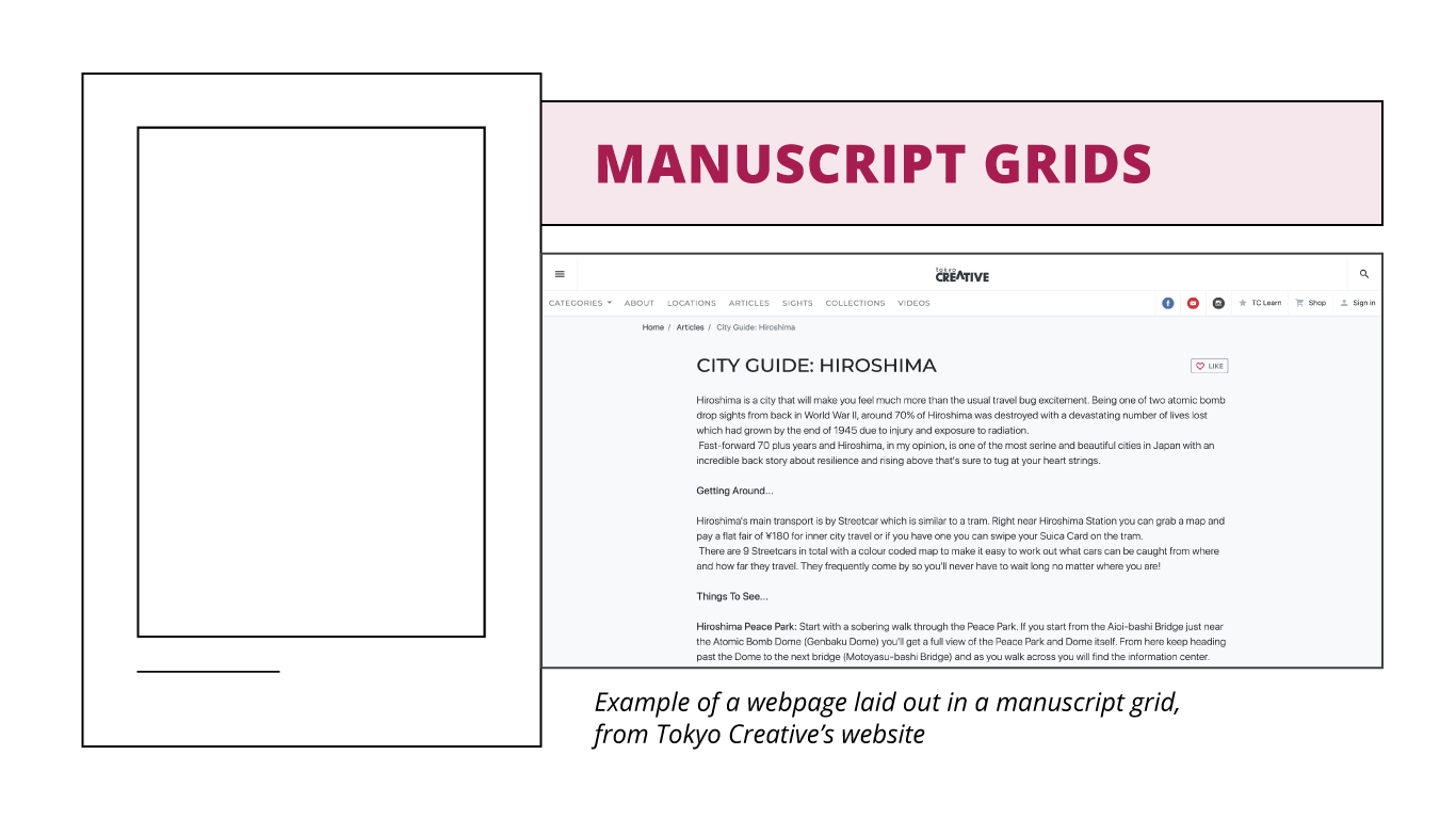
- Manuscript grids are a single column layout, mainly for text-based design. They’re great for text-heavy content, like e-books and blogs. TokyoCreative’s page uses a manuscript grid with text and images organized one after another in a single column.
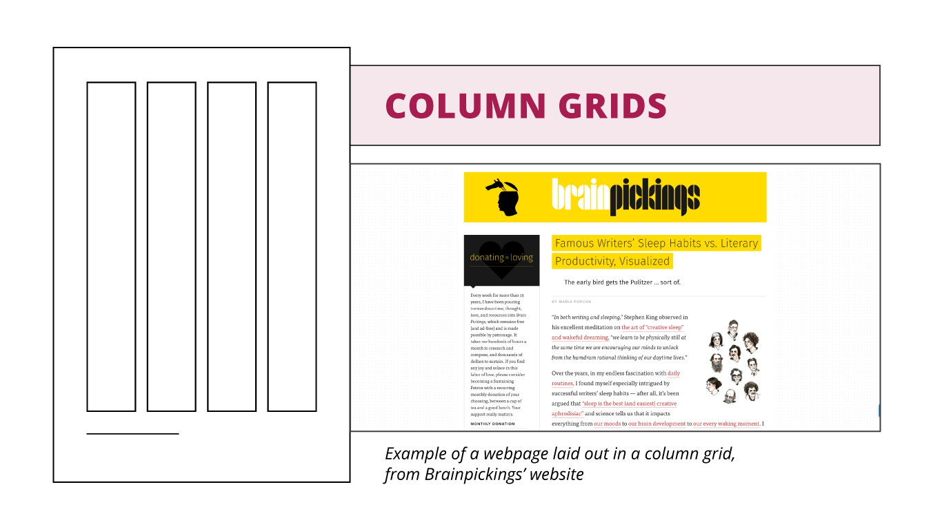
- Column grids are multiple columns and gutters. They’re mostly used in designs that have elements in different sizes and order. Columns are typically the same width, but sometimes the layout design calls for one or two columns smaller or bigger than the rest. The below example from Brainpickings might seem like a stretch at first, but if you look closer, there appear to be two visible columns on a 12-column grid. The text on the left is three columns wide, and the text on the right is nine columns wide.
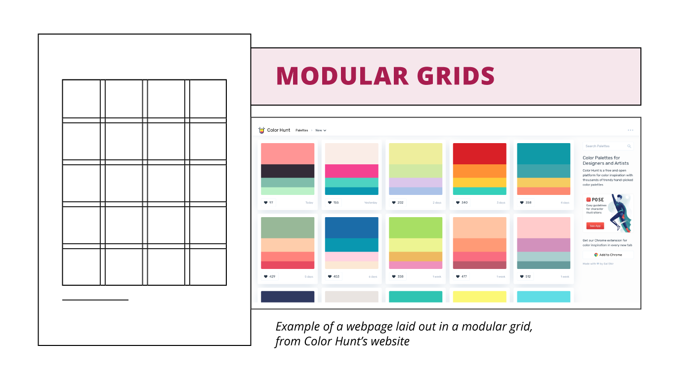
- Modular grids are even columns, gutters AND rows that create modules (equal-sized boxes).
- Spatial zones are made up of more than one module, for example, combining the space of four modules to fit a large image. It’s great to use modular grids when designing in equal proportion, such as displaying items on an online store. Color Hunt has color palette examples displayed in equal-sized boxes and evenly spaced apart on their page.

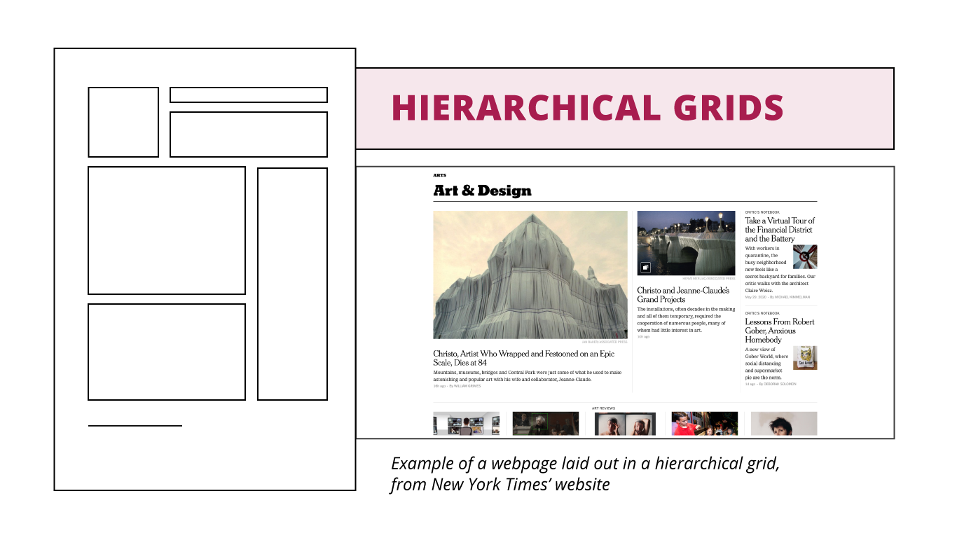
- Hierarchical grids are a combination of manuscript grids, column grids and modular grids. They’re set up to emphasize the most important elements on the page, using elements from one or more of the other grids in a combination to fit what the design needs. For example, this grid is often used by newspaper websites, like The New York Times.
Using grids to design webpages
The most commonly used grids for web pages are hierarchical grids and column grids, although it has become more common to use four-column grids for mobile, eight-column grids for tablet and 12-column or 16-column grids for desktop.
The measurements of those columns, gutters and margins are entirely up to you and what your landing page needs, but it should follow a ratio. If you’re using wireframing tools, such as Adobe XD, Axure, Sketch, InVision and many others, there are column grids built-in for different device sizes.
You might also like …
This Just Tested: Stock images or real people?
Marketing 101: What is a mobile breakpoint?
Marketing 101: What are widows and orphans (in design)?
Categories: Design b2b, B2C, b2c marketing, beginner design, design, design 101, design elements, design grids, flowlines, grids, marketing design, spatial zones, webpage design