Archive

Posts Tagged ‘conversion’

Holiday E-commerce: Make online shopping a rewarding experience for customers, not just an extension of the holiday hassle

December 1st, 2011

I think it goes without saying that online shopping is no longer just a convenient option for consumers. It’s a retail mainstay, and a key to holiday marketing success.

Wasting no time in supporting this point once again, IBM has just unveiled the findings of its fourth annual Cyber Monday Benchmark, revealing that online spending for Cyber Monday 2011 eclipsed the previous year’s sales  by 33%, and even this year’s Black Friday sales by 29.3%.

As crazy as it can be for consumers, holiday retail is like bacon-flavored manna for marketers. While the online opportunity is huge, it’s crucial to stand out from the crowd, by remembering those who make up the crowd.

You must offer shoppers a thorough, convenient, enjoyable online experience, and promote your shopping experience as part of the holiday solution, not a digital extension of the traditional holiday hassle.

With the growth of e-commerce as a viable alternative to in-store retail, aided by more Web-exclusive discounts, free shipping offers, and the like, you can help boost business by providing an efficient, but personal online shopping experience that ensures your customers will never again long for crowded malls and crazed deal-hunters.

Here are three tips to help make the holidays happy, for your customers and your bottom line.

Read more…

Holiday Marketing: 3 last-minute ideas to boost conversion

November 22nd, 2011

The holiday shopping season is upon us – the proverbial golden goose for consumer marketers. I’m sure you’ve planned thoroughly throughout the year, and just have to focus on how to execute, execute, execute in these last remaining days before December 25 rolls around.

But, it’s too late to make impactful changes to your plans, right?

Right?

Well, I’ve been listening to one of those “challenge the model” books on tape (you know, the ones that tell you, “Burn the status quo! The only rules that exist are the ones we impose on ourselves!”). So, I’m understandably pretty worked up. All the same, I say we take on this beast. Let’s try to make a few last-minute shifts and move that needle.

If you can spare a minute away from your daily transactional data, let’s brainstorm a few last-minute ideas to help you get an extra bump in sales this holiday season (and I’d love to hear your ideas in the comments section, as well). After all, anything’s possible. As long as you commit.

Read more…

Homepage Optimization: No single metric will do

May 19th, 2011

Landing pages get a lot of love. Here at MarketingSherpa and MarketingExperiments we often write about landing page optimization, and offer case studies on how marketers are testing and improving landing page performance. And landing pages deserve all that attention because often those pages are the direct connection between a marketing campaign and a closed deal. We think so highly of landing pages at MarketingSherpa we just released a publication dedicated to LPs — the 2011 Landing Page Optimization Benchmark Report.

The homepage is a channel, not a destination

But because landing pages command so much real and virtual ink, the homepage can seem neglected. The first thing to consider is the homepage is unique to a website. For companies that only offer one product or service, the homepage may be no different than a landing page.

But companies with many products, services, divisions, etc., must look at homepages as a drastically different animal than a landing page. Unlike the landing page where you want to get website visitors to the LP, the homepage is channel where your goal is to get the visitor through the page.

The homepage is possibly the toughest page on a website to test because it “serves many masters” and typically has multiple objectives to achieve.

The usual elements in a homepage to test do overlap with landing pages:

  • Eye path direction
  • Strength of value proposition
  • Color combination
  • Image relevance

And testing a homepage involves five basic steps:
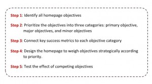
Click to enlarge

You may notice one word features prominently in each step — objectives. Homepage objectives should be broken into three categories:

  1. Primary — these are long-term and should have high revenue potential
  2. Major — short-term and are typically tied to a marketing campaign or other internal need
  3. Minor — functionally necessary elements to the page such as navigation or legal copy

Taking a closer look at homepages, how they differ from landing pages and how tricky they are to actually test and optimize, caused one chart from the Landing Page Optimization Benchmark Report to really stand out.
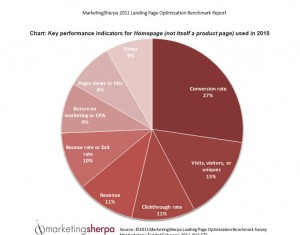
Click to enlarge

Boris Grinkot, Associate Director of Product Development, MECLABS, is the author the Landing Page Optimization Benchmark Report and he took a few moments to share his thoughts on homepage optimization and metrics.

Before we get into the questions, here’s a quote from the report (I highlighted the final sentence):

A critical issue becomes the quality of the traffic that the homepage sends into the website. The quality of the traffic is broadly the degree of match between the visitor and the offer – in other words, the predisposition to convert. Reducing bounce rate may be a short-sighted key metric if more visitors get through, yet those are not the visitors that would ever be interested in becoming customers. Dedicating significant page real estate to a $10 gift card offer can explode the clickthrough rate (and conversely, minimize bounces), but it may turn away visitors exploring a multimillion dollar RFP.

In your LPO Benchmark Report, you mention the homepage is possibly the most difficult page for designing a test …

Boris Grinkot: Measurement on the homepage is complicated because so many things typically happen between it and the conversion step. The general point is that when looking at the funnel holistically, a test on the homepage can affect different metrics differently, and sometimes you can get contradictory results — bounce rate reduced = good, conversion rate reduced = bad.

The homepage as any entrance page acts as a filter, and changing it does not only linearly affect clickthroughs to the rest of the funnel, but can affect the quality of visitors that click through — in other words, the segments.

So, what metrics are most important when testing a homepage?

BG: It’s important that marketers monitor several different metrics to get a complete picture of what’s going on. Bounce rate or clickthrough rate measures what happens immediately on the homepage, or wherever it’s measured, but misses how this page affects the rest of the funnel. Overall conversion rate (CR) measures performance of the site as a whole, but ignores where the leaks might be.

More intricate measurement — such as using “active segments” or “goals” — can tell you what happens with visitors who viewed a particular page, meaning that a virtual segment is created based on what the visitor experienced. Segment-specific CR can be much more meaningful because it takes specific page(s) into account.

Boris Grinkot will be providing insights from his Landing Page Optimization Benchmark Report and moderating a panel on “Overcoming institutional barriers to optimization implementation” at the first MarketingSherpa Optimization Summit coming up June 1-3 in Atlanta.

Related Resources

Homepages Optimized web clinic

Homepage Optimization: How sharing ideas can lead to more diverse radical redesigns

Homepage Optimization: How a more logical eye-path led to 59% increase in conversions

Homepage Optimization: Radical redesign ideas for multivariable testing

B2C Testing: A discount airline looks to increase conversion

(Members library) — Office Depot Site Overhaul Lifts Conversions 10%: 7 Tactics to Target High-Impact Improvements

Online Marketing Conversion: “Free” is a Pretty Strong Incentive

November 18th, 2010

I recently ran across a somewhat informal, but interesting none-the-less, study on the power of “free” to drive a conversion. Behavioral economist, Dan Ariely, heard that a New York nightclub was promoting an event featuring “free tattoos,” so he sent a research assistant to see if this incentive led to a conversion in the form of a tattoo.

The power of “free”

The resulting research isn’t scientifically or statistically rigorous, but it does offer a little insight into the command that the simple incentive of “free” adds to an offer.

  • The average age of “participants,” that is club-goers at that establishment on that night, was 26
  • Of the people in line to get a free tattoo, 68 percent said they would not be getting the tattoo if it wasn’t free
  • 90 percent of those in line were aware of the free tattoo promotion
  • Only 15 percent made the decision to get a tattoo after arriving at the nightclub
  • 85 percent arrived that night planning on getting the free ink

The results of this informal test:

The results indicate that the power of “free” is surprisingly influential.  When we face a decision about a tattoo, one would hope that the long term permanency of the decision, coupled with the risks of getting different types of infections would cause people to pay little attention to price, and certainly not to be swayed one way or another by the power of free.  But sadly, the reality (at list in the nightclub scene in New York) suggests that the power of free can get us to make many foolish decisions.

(From danariely.com)

The big incentivized picture

Okay, not scientific. And plenty of test subjects were likely fairly impaired by chemicals in the decision process, but the raw numbers show that 68 percent of the people made their conversion decision (getting a tattoo) based on the incentive alone.

Where does that fit in the larger world of marketing? In the Landing Page Optimization training course found at our sister company, MarketingExperiments, incentive is defined as an appealing element you introduce to stimulate a desired action. That action might be a clickthrough, or to fill out an online form, or even an actual sale.

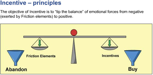
And the incentive has a key objective – to “tip the balance” of emotional forces from negative friction elements to positive to achieve conversion.

Here’s a chart from the MarketingExperiments Landing Page Optimization course illustrating that concept:

Here’s the thing with incentives, even if they are free – some are better than others. Depending on the goal of the offer, the incentive might be a free webinar, or a free computer mouse, or $100 off of a training session. The possibilities are practically limitless, so the key is to test incentives. All too often companies will try one incentive offer then quit. For any offer, an “ideal incentive” probably exists – you just need to keep testing until you find it.

Related Resources

Become a Certified Professional in Landing Page Optimization

Dances with Science: Are you better off not A/B testing?

Landing Page Optimization: Clean air or a free backpack? (Which is the bigger incentive for Sierra Club members?)

Internet Marketing: Landing page optimization for beginners