Archive

Posts Tagged ‘landing page optimization’

Marketing 101: What is CRO (Conversion Rate Optimization)?

September 1st, 2017

Marketing has a language all its own. This is our latest in a series of posts aimed at helping new marketers learn that language. What term do you find yourself explaining most often to new hires during onboarding? Let us know.

Conversion rate optimization, often abbreviated as CRO, is the practice of improving the conversion rate in any advertising, marketing, sales or other business practice that has a goal of getting a person to take an action. (The conversion rate measures the number of prospects who take an action that you’re requesting.)

For example, let’s say you have an email that asks people to click to a landing page to buy a product. CRO would focus on getting more people to click on that email (improving the conversion rate of clickthrough), in addition to getting more people to purchase on the landing page.

CRO (or at least elements of it) is sometimes also referred to as marketing optimization, website optimization, landing page optimization (LPO), growth hacking, optimization and testing, customer experience (CX), usability (UX) or marketing experimentation.

Despite the prevalent use of the word “optimization,” it is a very different discipline from search engine optimization (SEO). CRO is focused on optimizing for human behavior, and SEO is focused on optimizing for machine behavior.

Web design, copywriting and analytics interpretation are key skills that go hand-in-hand with CRO. This is because many CRO changes are either to design or copy. Also, the ability to understand analytics will (1) give ideas on where in the conversion process you should make CRO changes to have the biggest impact, and once you’ve made the changes, (2) how impactful they have been to your conversion goals.

Read more…

Email Marketing for Nonprofits: Communicating value proposition

June 26th, 2015

We generally think of only companies or campaigns having value propositions. For nonprofit companies, communicating the value proposition effectively is necessary for survival.

There is a value prop behind every action, including each email sent — why should people read your entire email or click through to a landing page? In the case of nonprofits, it seems this challenge is stronger, with no promise of a product at the end of the cycle.

This value proposition of action for email marketing answers the question behind why customers should take a specific action when they get your email — click.

Once people land on your page, that’s when you give them the reason to take action.

At Web Optimization Summit 2014, Tim Kachuriack, Chief Innovation and Optimization Officer, NextAfter, shared his experiences of working with nonprofits on email and landing page designs.

He explained that he was inspired at a MarketingSherpa conference a few years prior, when his page was selected for live optimization and critiqued in front of the entire MarketingSherpa audience.

Although confident that the page could more effectively communicate his value proposition, he mentioned his reservations when asking to test this page for the first time, saying,

“You guys helped me create this ugly, Frankenstein-looking version of the landing page,” Tim said. “It took much convincing and pleading, and many adult beverages. I convinced my client to actually let us,  in fact, test this.”

It resulted in a 274% increase in revenue for the nonprofit.

Read more…

Web Optimization: How AARP Services boosted renewals by increasing usability

March 11th, 2014

Eyeglasses launched across the table. A focus group member was irritated, experiencing difficulty reading the AARP Services website.

“‘I can’t see this content because you’ve got a grey background!” the member complained. “There is no place for me to increase the font size!”

This was just one of the observations that helped drive the optimization of the AARP Services website, making it more user-friendly for its senior demographic. At Optimization Summit 2013, two members of the company’s team shared AARP Services’ secrets to success.

In this excerpt of the presentation “How AARP Services increased referrals and membership renewals,” we learned how focus groups helped fuel the first test’s goal – make the site easy to read and share.


Preeti Sood, Digital Channel Manager, AARP Services, admitted that she was initially opposed to using a focus group. However, by observing frustrations of customers, AARP Services was able to use data from a focus group to convince management to perform additional testing around readability and social media sharing.

This short clip showcases how changing the background color, font size and placement of the “email” button resulted in a 12% decrease in page bounce rate and 7% increase in social sharing – all beginning with information collected from a focus group.

Gaurva Bhatia, VP of Digital Strategy, AARP, also said he was skeptical about focus groups, especially given the subject matter at hand. He thought that website visitors could easily just change font size through their browsers. Why waste time and effort on this? After witnessing the frustrations from the focus group, it became clear that this was an area that needed priority when it came to testing.

This left Guarva with a valuable lesson.

“Listen to the members,” he explained. “Test what they’re telling you versus assuming about them and doing what you think is right.”

Watch the full free session from Optimization Summit 2013 to discover:

  • How AARP Services adopted a “teach and learn” culture
  • The benefits that can come from focus groups
  • Items to keep in mind with the “newspaper generation”
  • And much more

  Read more…

E-commerce: Does your website appeal to hunter-gatherer instincts?

March 7th, 2014

For thousands of years prior to the advent of agriculture in 8,000 BCE, our ancestors survived as hunter-gatherers. I would say we are still, at our core, hunter-gatherers.

This idea becomes really interesting when we stop and consider some of our shopping behaviors.

Think about the last time you went shopping – where did you go?

My favorite place to shop, for example, is about 20 minutes from my house. After I park my car and walk into the store, I’ve committed maybe 30 minutes of my time to the shopping experience.

Once inside, I generally walk around the store counterclockwise. I look high and low, feeling fabrics, examining products and “hunting” for the items I want to buy. If I go without a specific need in mind, I generally end up buying the coolest, newest item that catches my eye. I also see many people wandering around just looking to buy something.

They have a perceived need; it’s just not clearly defined.


Hunter-gatherer instincts go beyond the bounds of brick-and-mortar

For an example, I need a new pair of jeans. As I walk over to the men’s department, I scan up and down. Retailers have a knack for placing impulse buying items where people will normally look. By the time I get to the jeans area, I may have invested 45 minutes in my quest to buy a pair of Levi 550 jeans.

When I arrive at my goal, I find out they have one pair of 550s that are the correct size, but they are perhaps too faded, or too dark or otherwise not quite right.

Now I have a decision to make and a few options: go to another store and search there, go home without any jeans, or buy the jeans that are there.

In this case, I buy the jeans and head home happy, having spent a total of about 90 minutes in total.

Now, what happens when I go hunting online?

My trip is likely going to begin with a search engine, where I enter “Levi’s 550 jeans” in the search bar and 324,000 listings are shown in to me in about 0.45 seconds – a little faster than my trip to the store.

As I scan the different listings, I see Levi’s, Amazon, J.C. Penney and Kohl’s.

So I click on Levi’s first, and it has my 550s front and center. But for some reason, before I can shop with the  company, it wants my email address first. 
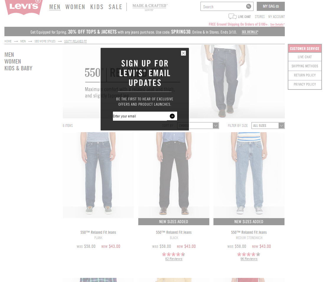
 

Now don’t get me wrong here, Levi’s is taking some interesting and creative approaches to engage customers, as one of my colleagues recently shared.

But in this particular instance, the experience is not so welcoming as the perceived cost for hunting here is rather high right off the bat, so I immediately back out and search elsewhere.


When the hunt is overwhelming, choice becomes paralyzing

Amazon is next. Now I must admit, I am not a regular shopper on Amazon, so I’m a little overwhelmed by all of my choices. All I want is a pair of jeans.
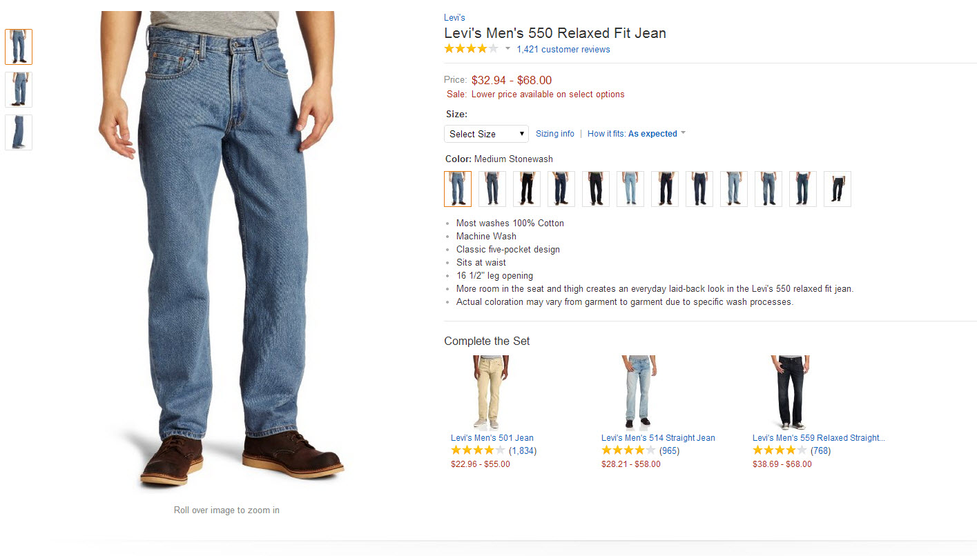
 

One more click and I am back out again.

Although my lack of Amazon savvy is no fault of the company, I like this example because it highlights the paradox of consumer choice: While consumers want choices, having too many options can lead to indecision.

So the challenge in building a fantastic customer experience is in finding the right balance of options to make consumer choices easier whilst plentiful.


When you’re loaded for bear, nothing else will do

My next stop was J.C. Penney and although the hunting here is a little less overwhelming, there was one interesting thing I noticed.
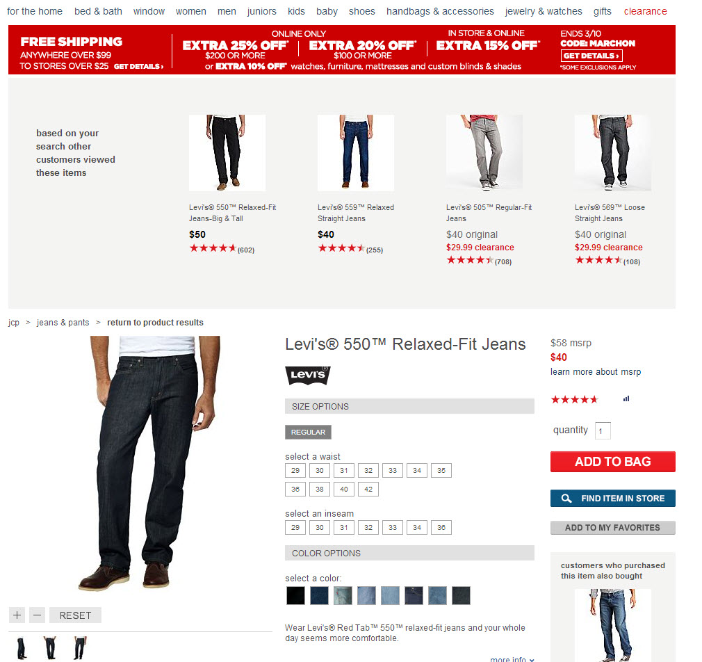
 

In this shopping experience, I was offered alternatives to the Levi’s I wanted first, which made me a little confused and uncomfortable.

To play the devil’s advocate here, the research manager in me think’s it’s absolutely plausible that J.C. Penney’s could be doing some testing, you just never really know.

Ultimately, the distraction I experienced here prevented me from moving towards the ultimate “yes” and here’s why.

The psychological investment required to discern between my perceived need for Levi’s and the alternatives offered was much higher than I expected.

So I backed out and continued hunting.

Read more…

Web Optimization: 3 considerations for testing personalized webpage content

January 31st, 2014

Content personalization is perhaps one of the fastest-growing optimization tools, enabling formerly static websites to segment visitors and deliver a more personalized message to optimize conversion.

With social media providing more data than ever about customers, online marketers can cleverly deliver a message.

Personalized messages are delivered through various audience segments, built according to customer data pulled from the user’s cookie. When a user with a qualifying cookie visits a page, their cookie will trigger the display of a more personalized message.

When effectively designed and utilized, this personalized page may closely match customer motivation, resulting in a higher conversion rate.

Recently, one of our Research Partners, a large mobile network carrier, challenged us with designing a test that would allow them to compare the performance of 10 personalized audience segments against a control.

Our Partner presented the question, “Does a personalized version of our webpage increase the chances of conversion?” Although it sounded like a simple task, we learned that there are many pitfalls when testing multiple personas.

Here are three considerations to keep in mind when designing your test for personalized webpage content.


Account for an overlap in personas or prepare for duplicated data

When designing personas for your webpage, it is important to remember there is no one-size-fits-all audience segment. There will inevitably be some overlap because we humans typically don’t fit into one box that defines us.

Our Partner’s test included segments ranging from DIYers, bookworms, the upwardly mobile and gift givers. But what if I am an upwardly mobile individual with a love of books, home repair and gift giving?

Which page will I see, and how will you know?

Another contributor to overlapped personas will be shared devices. It is important to remember we are only capable of evaluating visitors’ cookies, not the visitor personally. If the visitor’s device is shared with others who each fit into vastly different audience segments, we may not be able to accurately segment the visitor into the correct category.

To combat this challenge, we set up our test so our audience segments were mutually exclusive. This meant that only users qualifying for one segment were taken to a treatment, and any user qualifying for multiple segments were taken to the control.

However, this approach will inevitably result in less traffic to each persona. Keep this in mind when selecting the number of segments your test should have.

  Read more…

E-commerce: 3 tactics retailers are rolling out for the holidays

November 12th, 2013

This holiday season might be another tough one for retailers. According to The National Retail Federation, sales could rise 3.9% to $602.1 billion. Not great when compared to the 5% gain seen in 2011 and 2010.

This means that competition among retailers just got tougher. For instance, it has been reported that close to 50% of retailers will start their holiday campaign sooner than usual.

So, I decided to browse around 20 top online retailers’ sites and explore whether they had launched any holiday campaign or not. To my surprise, my small sample more or less confirmed the forecast.

Out of the 20 retailers I checked, seven had some sort of holiday campaign going on.

So, how are these seven retailers getting a head start with the holidays? Mainly by using one of these three tactics.


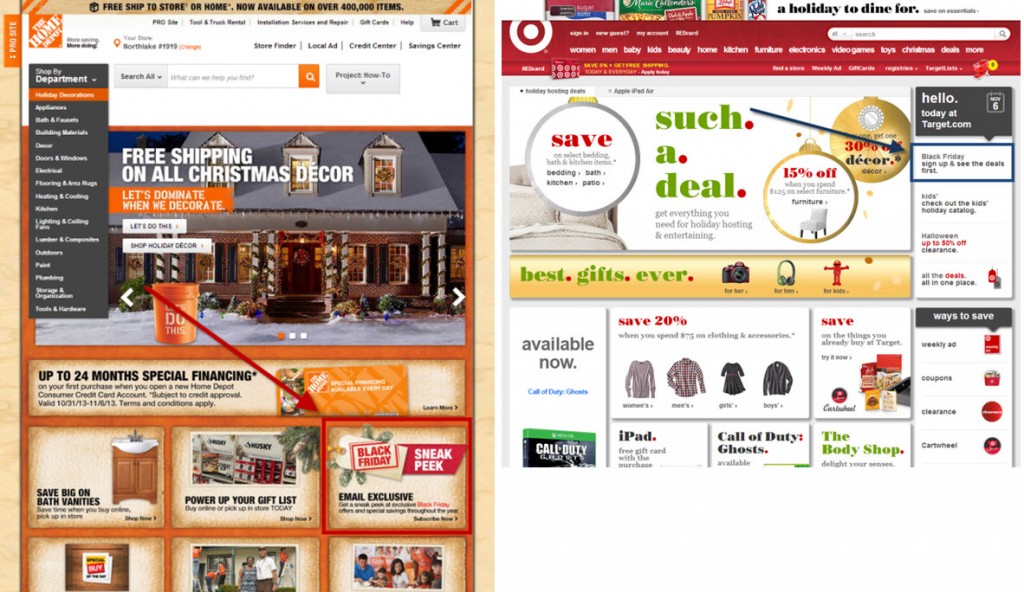
Tactic #1. Sneak peek-terest Black Friday board


Lowes is running an interesting and unique Black Friday campaign using Pinterest. Many items have been added to its new Black Friday Deal Reveal board, but they are disguised.

Followers are asked to guess what the items are, which in turn generates good engagement and excitement for the shopping day.

The nice aspect about this campaign is how it leverages the core value of Pinterest as a social network. People in this channel are interested in collecting pictures with a purpose: their lifestyle, seasonal or tactical. By tactical, I mean that Pinterest is slowly becoming the holiday shopping list of online consumers.

Why keep a list on paper when you can pin the items you like or want for the holidays? Even better, you can share your board with family and friends.


Tactic #2. Email sneak peeks

There’s nothing tactically new here, except the campaigns are rolling out just a little earlier than usual due to the lackluster sales I mentioned earlier.

But, there is something to be learned from these front-runners. 


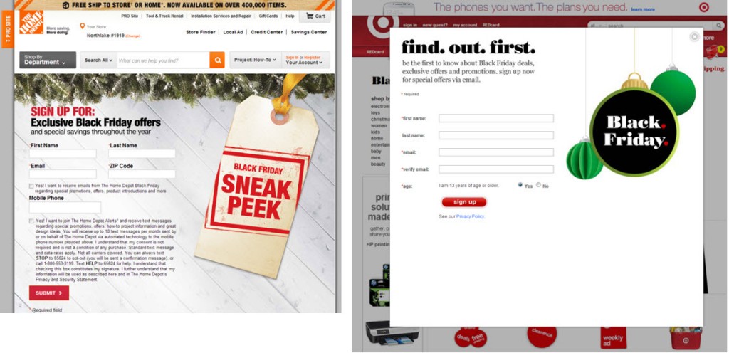
In these cases, The Home Depot and Target are asking visitors to give up their email address or mobile phone number to receive updates on special offers.


There is no clear value of what customers will receive beyond exclusive offers. Even worse, the disclaimers clearly suggest they will be targeted to receive any type of offer year-round, not just Black Friday offers.

That is disappointing.

Starting holiday campaigns sooner than your competitors is one thing, but putting out a campaign without clear value because it’s too far ahead of the crowd is another.

By launching holiday campaigns sooner, some retailers may feel the illusion of a head start.

But how will that illusion hold up as the Black Friday creep controversy continues to push shopping further into Black Thanksgiving territory?


Tactic #3. Holiday gift guides

This is also not a new tactic, but there are some interesting new spins on it.

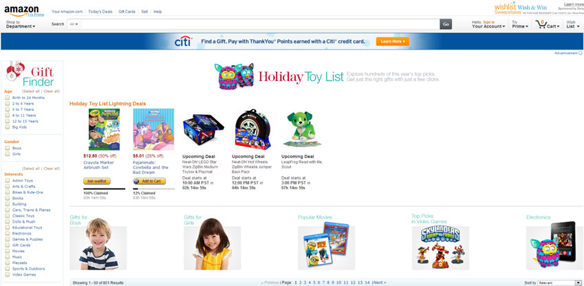
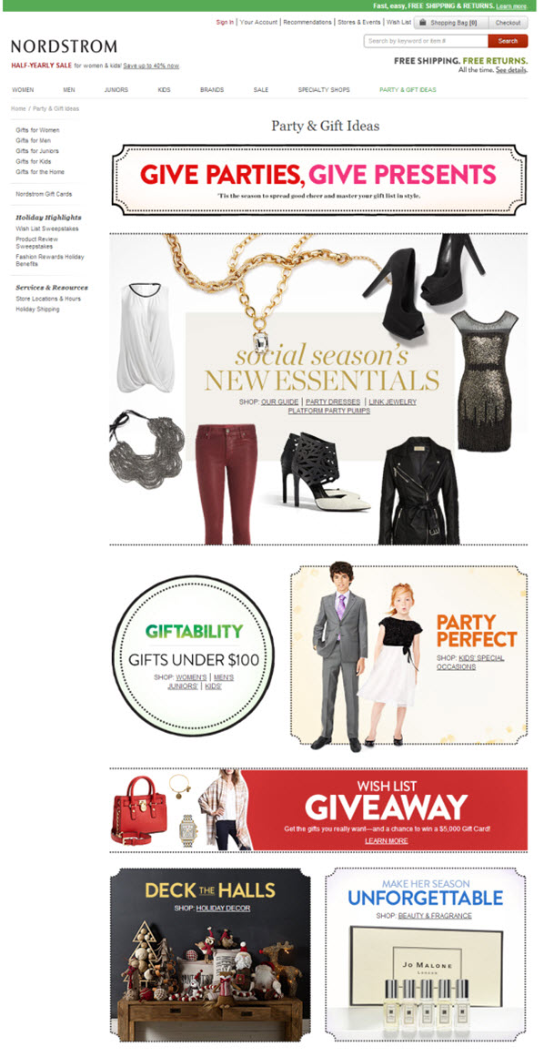
Amazon.com, Nordstrom, West Elm and Barnes & Noble are all running holiday gift guides. Visitors can search products by price, gender, interest and other filters. Only Amazon.com and Nordstrom have added some features to generate engagement with their guides.


Amazon.com offers a holiday-specific forum where visitors can solve any type of concern they might have. There were already 316 discussion strings when I was writing this post and the list was growing! To me, this reflects that people are indeed not just thinking about what to buy, but actively researching the best buys.


Nordstrom, on the other hand, is trying to go viral. The company is running a sweepstakes that requires visitors to create their wish list and share it with friends and family in order to be eligible to win a $5,000 gift card. Pretty nice incentive.

  Read more…

Testing and Optimization: Radical website redesign program improves lead gen 89%

October 1st, 2013

I’m live blogging at MarketingSherpa Lead Gen Summit 2013 in San Francisco, and attending a brand-side case study with Jacob Baldwin, Search Engine Marketing Manager, One Call Now.

To begin a testing and optimization program, Jacob launched a test on the website with a radical redesign, attempting to improve lead capture. The program was executed sequentially as opposed to A/B split testing.

Jacob said each new homepage version replaced the previous – the marketing team created new treatments and “flipped the switch” to learn how the page would perform.

An important insight from this testing approach  is there isn’t necessarily a need for a complex A/B or multivariate testing program.

The testing program was run on the homepage, and there were several objectives:

  • Increase conversion rate
  • Increase traffic
  • Reduce bounce rate
  • Provide niched messaging via enhanced segmentation

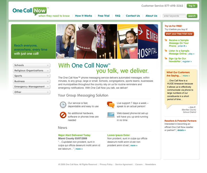
Here is the test control and original website:


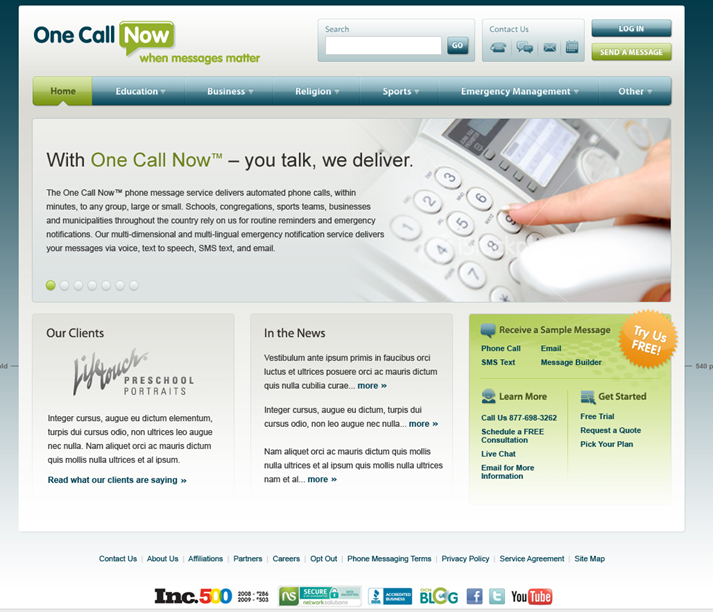
And, here is the radical redesign treatment:


There were several key differences with the treatment:

  • Restructured navigation
  • Consolidated calls-to-action (CTAs)
  • Single value proposition – no competing headlines on the page
  • Trust indicators
  • Color palette
  • New tag line
  • New content

The original homepage, the control in this test, achieved 2.40% lead capture, and the radical redesign treatment pulled in 2.85% lead capture – an 18.75% lift over the control.

Jacob says the radical redesign was based on a revamped segmentation model.

“The new segmentation model drove the basic navigation structure and information architecture of the new homepage,” he explained.

This test with an early “win” was part of an ongoing optimization program. Not every test uncovered a lift, but every test did garner a discovery. The testing protocol involved taking the “winning” treatment and then refining the webpage layout, calls-to-action and length of the sign-up process for lead capture.

Through optimization, the sign-up process was shortened, and free trial sign-ups increased 55.3%, and the overall redesign of the entire website garnered a 89% lift in lead generation.

For the big takeaway, Jacob says, “Never stop improving. Complacency is lead capture optimization’s worst enemy and perfection is impossible. Complacency is conversion rate optimization’s worst enemy.”

  Read more…

Email Marketing: Verizon, REI share ideas to profit from growing mobile e-commerce traffic

August 30th, 2013

If your emails and websites aren’t optimized for smart devices, you’re likely losing at least 20% of your marketplace, according to an analysis of more than 500 million online shopping experiences by Monetate, a website testing platform.

In the Ecommerce Quarterly (EQ1 2013) report, Monetate revealed more than 21% of e-commerce traffic comes from smartphones, up from 2% merely two years ago. Yet, it reports only 14% of companies optimize websites and emails for smart devices. Verizon Wireless and REI are among them.

At MarketingSherpa Email Summit 2013, Laura Velasquez, Marketing Program Manager, REI, and Jason Jennings, Associate Director, Digital CRM, Verizon Wireless, discussed their success and lessons learned in the mobile optimization process.

Check out highlights from their discussion in this video excerpt of their mobile email panel.


:10 Jason outlines what you must consider when optimizing for mobile.

1:11 Laura discusses how REI developed a single, focused mobile strategy from many strategies.

1:53 Jason explains Verizon’s approach to developing pages that load fast, and why he designs for mobile before designing for desktop.

3:05 Laura explains how to begin optimizing for mobile. Hint: Look for small programs with a big impact.

Read more…

Marketing Concepts: 3 telltale signs your homepage is not customer-focused

August 9th, 2013

As a research manager, when I look at a homepage, I always ask myself two questions …

  • Who are the customers?
  • Was the homepage designed with those customers in mind?

I often find a homepage design makes perfect sense to the company’s executives, but not to the most important audience, the customers.

As homepages increasingly become the center of a company’s marketing and sales universe, making sure your focus is on the customer is more important than ever.

In today’s MarketingSherpa Blog post, I wanted to share three common telltale signs your homepage is driven by company-centric marketing.

I’m sure this post is likely to raise a few eyebrows, but my goal here is to help you raise revenue by helping you see your marketing efforts through the eyes of your potential customers.


Sign #1. Our homepage is a collage of department products instead of popular products

I generally tend to hope the most popular products and services offered on a homepage within direct eye-path, which is also prime real estate on a homepage, are what customers came to your homepage to find, versus products and services the company wants to sell.

However, it is not always that simple when you are in a large company with various departments with different sales goals all competing for that prime real estate on the homepage.

The big issue with this is when departments become only focused on the product or service, and marketers lose sight of what the customers want.

If a product or service that is not the primary driver of your sales traffic is overtaken on the homepage by a minimal interest product or service, should it really be placed within the customer’s direct eye-path?

The obvious answer is no, and I understand it is more complicated than that.

I also understand the chances of success for a business model that tries to force the sale of products or services to people who don’t need or want them are also slim in the long run.

So, if you find yourself in this position, I encourage you to take a step back and develop a strategy to work collaboratively with other departments to build a homepage that improves the overall customer experience.


Sign #2. Our value copy talks “at” our customers instead of “to” our customers

Have you ever read about a new product and still had to ask yourself, “What is this thing and what will it do for me?”

Unfortunately, this happens frequently.

Sometimes, we try to impress our customers with creative copy, hoping to sound professional and intelligent. This is great as long as it makes sense to the customer.

Remember, you understand your products/services inside and out and your potential customers are more than likely just learning about it for the first time.

The value copy from a customer’s perspective should answer one essential question – what is in it for me?


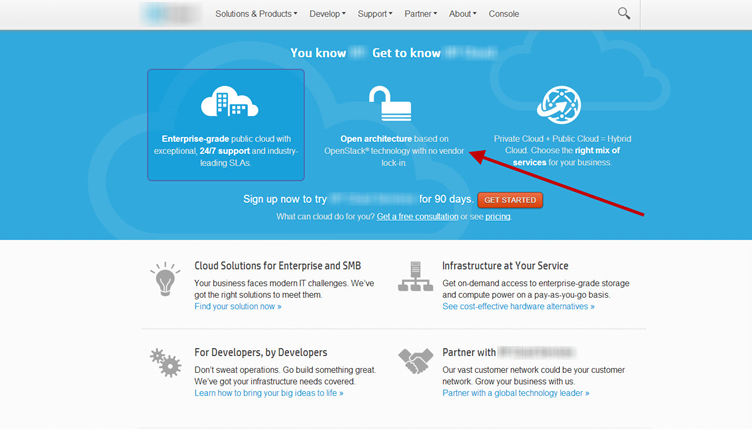
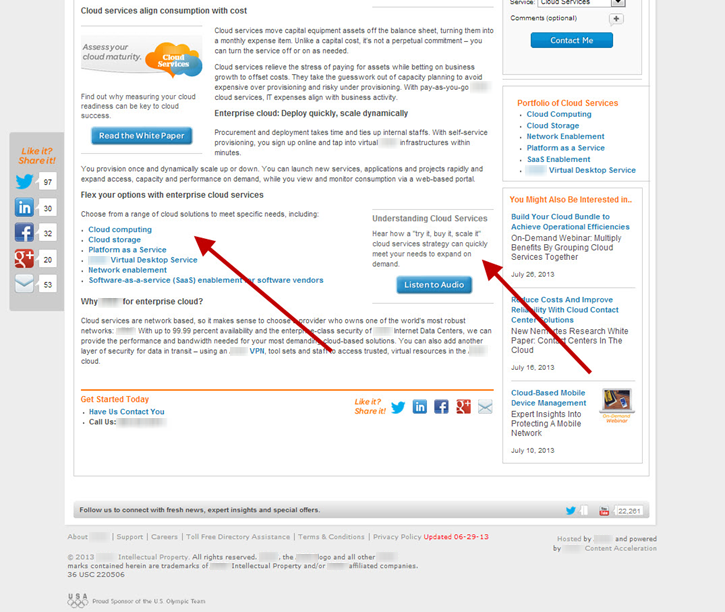
For example, I did a quick search online about cloud services, which is a complex product, and the first homepage I found left me even more confused.

Some of the cloud’s value copy explained this company’s service features“Open architecture based on OpenStack technology with no vendor lock-in.”

That may be an awesome feature, but I have no idea what it means.

Some of this company’s customers may understand this terminology, but the majority of customers are likely left just as confused as I am. Failing to provide clear and digestible information for customers could induce anxiety, increase frustration and ultimately leave visitors with no choice but to exit your page.

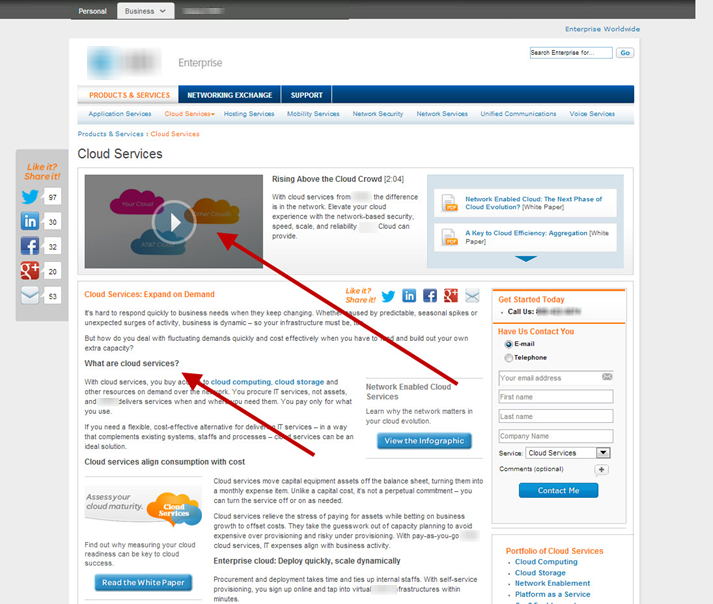
So, when I looked at the next cloud service homepage in my search, here’s what I found …


This homepage makes no assumptions about my level of IT sophistication.

It offers a short video and even lays out copy explaining what cloud service is and how it can help me.

And, there’s more …


Further down the page I found links to the options available that offer additional short videos combined with value copy explaining what cloud computing is and how the option can help me.

Now don’t get me wrong, there’s plenty to optimize on this homepage as well.

The overall point here is to understand that I left the first homepage confused about how a solution could help me and I left this one with a clear understanding of what cloud service is and how it could help me.

  Read more…

Online Marketing: 3 website optimization insights I learned from baking

July 26th, 2013

Ever since I was a little girl, baking has been a hobby of mine.

There has always been something satisfying about attempting to master the complexities of baking.

Although the realist in me knew I wasn’t going to hit the big bucks through baking, I have found a few ways to apply some of the lessons I’ve learned from baking to my work as a research manager at MECLABS.

In today’s MarketingSherpa blog, I wanted to share three insights into how I think about testing and marketing as a result of my baking attempts.


Don’t stick with the directions on the box

Some of my best cakes have come from getting creative and literally thinking outside the box by adding different ingredients, or from asking friends what kind of crazy cake ingredients they’d like to try.

When working with one of our Research Partners to create a testing strategy, I often find myself confined to my own thought track – which I’ll admit can cause the creativity of test ideas to become stale and truthfully, can even get a little boring sometimes.

So, brainstorming with others in our peer review sessions is a great way to add those “new ingredients” to a test design to hopefully help our Research Partners learn more about their customers.


Beware of offering coupons in the Sunday paper too soon

Betty Crocker’s coupons excite me every time, and it’s a marketing tactic that stretches all the way back to 1929.

That’s when the company first decided to insert coupons into the flour mixture part of the box mix. And, I’ll admit the tactic works on me because I often find myself staring at the Save $1.00 off TWO boxes of cake mix coupon and debate a trip to the store.

But, here’s the big question … am I being motivated to buy more because of my aggregate experience with the product, or because of the value proposition offered in the coupon?

Before I even saw the coupon, I wasn’t planning on buying cake mixes, but now I’m thinking about it – why should I buy more cake mix from you?  It will cost me more regardless of the coupon savings.

Now, I understand the idea of incentives and they can work – people have a hard time letting savings slip through their fingers, but offering incentives right off the bat isn’t always the best answer to increasing conversion and here’s why …

At MECLABS, we generally stress incentives should be the last resort in your testing efforts to see a quick win. The reason for this is offering incentives can skew your understanding of true customer motivation, as you can tell from my coupon example above.

My need for cake mix is why I initially purchased, and a coupon incentive may not be the optimal solution to keeping me as a return customer or attracting new customers.

So, before you worry about the coupons and other incentives, try to make sure you have the basics covered first:

  • A website that visitors can easily navigate and find what they’re looking for.
  • A simplified purchase flow for potential customers.
  • Easy, accessible support for your customers when they can’t figure things out.

If those items are in place and you’ve tested for the optimal user experience, then you can begin to explore incentives.

Read more…