Archive

Posts Tagged ‘marketing terms’

Marketing 101: What is source/medium?

September 15th, 2020

Marketing has a language all its own. This is our latest in a series of posts aimed at helping new marketers learn that language. What term do you find yourself explaining most often to new hires during onboarding? Let us know.


This article was originally published in the MarketingSherpa email newsletter.

If you’ve ever been in a meeting with people who work on the data analytics for your company’s website, you may hear them refer to the metrics of Source and Medium. Sometimes, they’ll say the words so quickly together it sounds like one compound word “Sourcemedium.” (Just like people who work in digital advertising can make pay-per-click sound like “paper click.”)

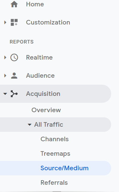
Source and Medium are actually two distinct pieces of information that together help you understand where the traffic going to your website comes from. They are referred to together because they share a report in Google Analytics. You can find them in the left-hand column of Google Analytics, under Acquisition, then All Traffic, then finally Source/Medium.


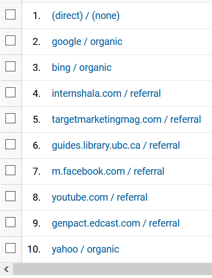
The source is the specific website that sent traffic to your website, and the medium is the category that website resides under. Here’s a look at a Source/Medium report for our websites for a random day.


The word before the slash is the source, and the word after the slash is the medium.

As you can see, the top source of traffic was direct, which is not assigned to any medium. Direct traffic can come from someone typing in your website’s address to their browser, clicking on a bookmark, or clicking on a link from a non-website source like a PDF or presentation. As the name implies, people went directly to your website. However, direct is also the default source Google Analytics uses to report any traffic that it cannot assign another source to.

As you see, some traffic comes from the medium organic, like Google, Yahoo, and Bing. This refers to organic search.

And some traffic is listed with the medium referral, this means that visitors clicked on a link from another website to get to your website. In the example above, some of those websites (sources) were Internshala, Target Marketing magazine, and the University of British Columbia.

How you can use this information

According to the MECLABS Conversion Heuristic — a methodology to help marketers understand and optimize the factors that affect the probability of conversion — the motivation of the potential customer is the factor that most affects conversion. (MECLABS Institute is the parent organization of MarketingSherpa).

Understanding the source and medium of traffic to your website can help you better understand your customers’ motivations so you can better serve them and ultimately increase conversion. It can also help you understand if you are not getting the right types of customers to your website and need to change your traffic-driving and traffic-attracting initiatives.

Here is an example from work the MECLABS team is doing with the nonprofit TenbyThree as part of the show The Marketer as Philosopher — Become a Force for the Good:

Read more…

Marketing 101: What is a sticky footer?

December 19th, 2019

Marketing has a language all its own. This is our latest in a series of posts aimed at helping new marketers learn that language. What term do you find yourself explaining most often to new hires during onboarding? Let us know.


A footer is the information at the bottom of a webpage. On a traditional website, a visitor would scroll down to see the information at the bottom of a webpage in the footer. However, with a sticky footer (sometimes known as a fixed footer) that information is always present at the bottom of the visitor’s web browser as the visitor scrolls down. They do not have to get to the bottom of the page to see it.

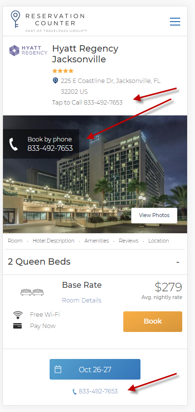
For example, the team at Reservation Counter discovered that having the contact center phone number prominently displayed on the website increased orders, so they included it in a sticky footer for their mobile visitors.

The below image from the article Conversion Rate Optimization Case Study: How a travel website doubled website conversion rates in one year points out the places that the phone number was included on the mobile site. The phone number at the bottom of the page is in the sticky footer.

Creative Sample #1: Mobile sticky footer with telephone number CTA


The Infinite Scroll: A never-ending attempt to find the footer

Another website design tactic that has gained traction over the past decade or so is the infinite scroll. An infinite scroll is when more content loads automatically at the bottom of the web browser as a visitor scrolls down a webpage.

Infinite scroll designs were adopted because they reduce the friction of having to click to the next page. This is especially true on a smartphone where it’s far easier to continue to swipe than to click on a link or button.

However, most infinite scroll designs essentially remove the footer as a website element since the visitor never gets down to the bottom of the page. Anytime they think they’ve reached the bottom, more content loads on the page, and the page just gets longer. It’s a lot like that dream where you’re eating spaghetti — the more spaghetti you eat, the more gets added to the bowl, so you never finish.

This is one use case where a sticky footer can help. By combining a sticky footer with an infinite scroll design, you can reduce friction for the users while still providing the information they would expect from a footer.

Footers add credibility to a website

At this point, you might be thinking “I like my infinite scroll design. The footer was a relic from the early days of the internet. Who needs footers anyway?”

For visitors accustomed to websites designed with footers, the footer can add credibility by providing general information about the company, such as:

  • Link to about page
  • Link to contact us form
  • Link to customer service forum
  • Link to FAQ
  • Link for press requests
  • Phone number
  • Mailing address
  • Customer service email address
  • Privacy policy
  • Name of the person or company that owns the website (usually accompanied by a copyright)
  • Link to social media accounts (Pro tip: If you’re using a template, make sure you update the icons for Facebook, Twitter, LinkedIn, etc., with links to your accounts. If customers click and get nothing, it only reduces credibility)

Now you might think “my customers never send me postal mail, so why does my mailing address matter in the footer?” Even if your customers don’t try to contact you in these ways, simply having a physical mailing address can reduce anxiety for the customer and help them understand that your company is legitimate.

The long landing page

While many marketers try to keep their landing pages as short as possible, fearing that customers simply won’t read a long landing page, long landing pages can be effective for some products. Here’s an example of a long landing page that netted 220% more leads for an addiction and mental health rehabilitation facility. And here’s a long landing page that generated 638% more leads for an insurance call center.

With a long landing page, you don’t have the same problem that you do with an infinite scrolling page. Visitors can scroll down and eventually get to the bottom to see the footer. However, if the page is long enough, they may lose patience. So you may want to test a sticky footer. It could help increase conversion by giving them the credibility information they desire. Or it could hurt conversion because it presents a distracting element on the page. The results will depend on how your unique visitors react to your unique products’ pages, and they will likely vary by industry, product type and visitor type.

Read more…

Marketing 101: What is baking in?

October 3rd, 2019

Marketing has a language all its own. This is our latest in a series of posts aimed at helping new marketers learn that language. What term do you find yourself explaining most often to new hires during onboarding? Let us know.

In a recent MarketingSherpa article, ConversionXL Research Director Ben Labay says, “I think we are getting better as an industry at baking in an experimentation process and culture into our organizations.” (from Ask MarketingSherpa: Maturity of conversion rate optimization industry)

That raised the question — what exactly is meant by “baking in” in a business and marketing context?

If you click on that link and read the final article, you’ll see that we chose to include the parenthetical statement “[including as an integral part]” to clarify the term baking in.

Baking in means including, in a sense. But that misses the nuance. When you’re baking something in, you’ve considered it from the get-go. So that’s why we went with “[including as an integral part]” not just “[including.]”

Not just a cherry on top

Just like when learning a new language, understanding the nuance to a term is crucial to speaking the business lingo fluently in an industry. In this case, the nuance is meant to communicate that the thing being discussed is not just included, but included as an essential, core part from the very beginning.

I suspect the analogy comes from baking itself. You could just add icing to the top of a cake. Or a cherry on top.

But when you bake something in, it’s really part of the dessert.

Words mean what people think they mean

Language is a funny thing. As marketers, we may be trying to convey a certain denotation (literal meaning) or implying a certain connotation (the idea of feeling invoked by a word), but if our audience doesn’t get the essence of what we are trying to communicate, that communication has not happened.

So I wanted to reach out to some others and get their thoughts on the term “baking in” to see how it aligned (or diverged) with my own understanding. And perhaps with yours as well.

It’s a pretty interesting little experiment. We take this business lingo for granted. But miscommunication happens when we assume we know what the other person is talking about, and professionals (especially newer workers in a field) rarely like to admit their ignorance of an inside term.

As you read the responses below, note how we all generally tend to agree on the meaning of the term. And yet, we all add our own little nuances to the meaning. A good example of why we should always confirm that others understand what you’re talking about, especially when using insider lingo.

Read more…

Marketing 101: What is the rule of thirds?

September 22nd, 2017

Marketing has a language all its own. This is our latest in a series of posts aimed at helping new marketers learn that language. What term do you find yourself explaining most often to new hires during onboarding? Let us know.

The rule of thirds is one of the first principles that all graphic designers, videographers, photographers and other creative roles learn. It’s a basic guideline for framing and image composition that results in the viewer seeing a balanced, more naturally flattering image.

To apply the rule, take your image and divide it into three parts vertically and again horizontally (it should look similar to a tic-tac-toe board.)

The rule states that the audience’s eye is naturally more drawn to the areas of the image nearest the intersection points. So, when you’re designing an image for a landing page, a social post, a PowerPoint slide, or even if you’re shooting a video, be sure to put the most important pieces of your image near these intersection points.

Applying the rule to video

Here is an example of a video frame from one of the most recent recent Quick Win Clinics published by our sister company, MarketingExperiments. The Quick Win Clinic series helps marketers with problems that are easy to solve but difficult to detect. Every week, Flint McGlaughlin, Managing Director, MECLABS Institute, takes a page submitted by the audience and optimizes it on the fly.

The primary piece of information we’d like the audience to see in this image is the person speaking, in this case, Flint McGlaughlin. You can see that Flint’s eyes are framed near the top left intersection point. As people, we are taught to look into the eyes of another person when talking to them. So framing an image so that a person’s eyes are near one of the points where the audience’s eye is naturally drawn makes a lot of sense.

Read more…

Marketing 101: What is taxonomy?

July 7th, 2017

Janine Silva, Director of Email Marketing and Integrated Marketing, Investopedia, used the term, “taxonomy,” many times as she described her team’s behavioral marketing efforts in a recent case study.

It made me realize that even with as many marketers as I’ve spoken to and interviewed, this term marked a gap in my knowledge. What does taxonomy really mean in our field?

As Janine’s case study explores, taxonomy is vital to breathing life into journey-based marketing. According to Merriam Webster, taxonomy is the “orderly classification of plants and animals according to their presumed natural relationships.”

Obviously, marketing’s adoption of the term isn’t too far off from that. When putting together personas, or any kind of personalized marketing system, it’s setting up the structure and process by which people are going to be categorized. Read more…