Archive

Posts Tagged ‘online testing’

3 Tips to Improve Your Marketing from Doctor Who

August 22nd, 2014

(Editor’s note: Courtney Eckerle, Manager of Editorial Content, MarketingSherpa, also contributed her knowledge – and love of “Doctor Who” – to this blog post.)

There are a lot of nerds in our office, and if you’ve read this blog for any length of time, this is probably not news to you. Recently, we’ve realized something nerds everywhere have known for a long time – we are not alone.

In our case studies, blogs and events, we’ve seen how other marketers utilize pop culture to help convey complex ideas – for instance, emergency alert systems provider One Call Now used “Star Trek” characters to represent its customer personas.

Since we have seen the success others have had, we wanted to try this idea out for ourselves using an office favorite: BBC’s science fiction cult classic “Doctor Who,” which is having its latest series premiere on August 23.

doctor-who

For those who are unfamiliar, the titular Doctor is a Time Lord (a time-traveling alien species very similar to humans) who faces various foes in attempts to save civilizations and right wrongs using intellect over force while exploring all of time and space.

Intellect over force is a driving principle behind our work here – marketing through testing and optimization over gut feelings and intuition.

Read on for three tips we’ve taken to heart from “Doctor Who” about how to make the customer your companion in your marketing efforts.


Tip #1. Test every (seemingly) insignificant thing

Doctor: Stone dust.

Kate: Is it important?

Doctor: In 1,200 years, I’ve never stepped in anything that wasn’t. … Now, I want this stone dust analyzed. And I want a report in triplicate, with lots of graphs and diagrams and complicated sums on my desk, tomorrow morning, ASAP, pronto …

Doctor Who,” The Day of the Doctor, 2013

Every single thing, down to the dust he has stepped on, is something the Doctor considers important. He’s been testing, scanning and analyzing all of his surroundings for 1,200 years.

You may think that you know the answer to every question anyone could ask about your customers. But when you begin testing, you could discover that you’ve totally overlooked a simple concept that was right under your nose (or boots).

For example, at MarketingSherpa Lead Gen Summit 2013 in San Francisco, Jon Ciampi, Vice President Marketing, Corporate Development, Business Development and Strategic Accounts, CRC Health, presented a case study where his team tested what they considered to be best practices.

They took their control page of concise copy with an above the fold call-to-action, and created a treatment full of copy with a below the fold call-to-action.

What Jon and his team discovered was an “aha moment,” realizing that not only had the treatment outperformed the control by 220%, but they hadn’t understood their customers’ motivations at all.

While they had been promoting luxury and statistics, it took one test to realize that customers weren’t asking, “What is your doctor-to-patient ratio?” but rather, “Can I trust you with my loved one?”

“We test in the eternal hope that we can possibly understand the motivations of our customers and adjust our practices accordingly,” Jon summed up in his presentation.

Read more…

Web Optimization: Can you repeat your test results?

May 21st, 2014

This week, I’m deep in the heart of the Big Apple (also known as enemy territory if you share my love for the Red Sox) for Web Optimization Summit 2014.

Day 1 has delivered some fantastic presentations and luckily, I was able to catch Michael Zane, Senior Director Online Marketing, Publishers Clearing House, in his session that covered “How to Personalize the Online Experience to Increase Engagement.” 

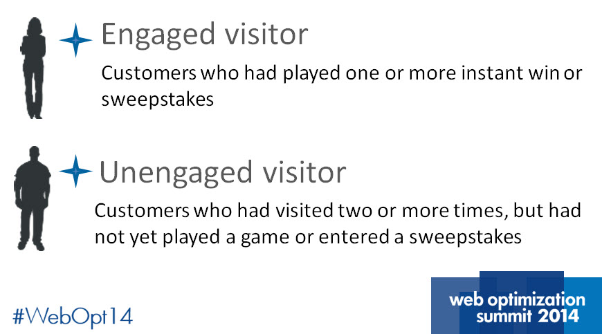
Publishers-Clearing-HouseMichael’s take on personalization starts with a key distinction between visitors to PCH he mentioned early on.

“You have to define your personas,” he said. “It only made sense for us to take a simplistic approach at first and then dig deeper.”

According to Michael, the challenge rests in driving engagement in unengaged visitors. To help the company’s engagement efforts, Michael and his team turned to testing and optimization.

identify-customer-personas


In this MarketingSherpa Blog post, we’ll take a look at some of his team’s testing efforts including one key aspect that often goes unspoken.

Before we get started, let’s look at the research notes for some background information on the test.


Objective: To convert unengaged visitors into engaged customers.

Primary Research Question: Will a simple, but attention-grabbing, header convince unengaged visitors to play a game?

Test Design: A/B split test


Experiment #1. Side by side

game-engagement-test


Michael and his team decided to test a header they hypothesized would encourage visitors to play a game.

“The text in the treatment was innocent at the top of the page and it wasn’t really competing with the other content,” Michael said. 

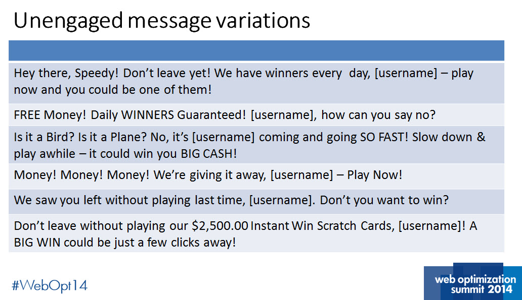
unengaged-message-variations


The team also used a variety of messages in the experiment to help them dial into their core value proposition.


Results

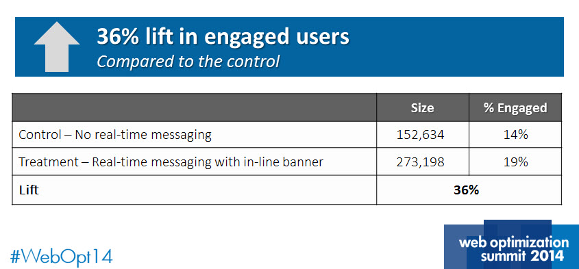
real-time-messaging-results


The treatment outperformed the control by a relative difference of 36%. There are plenty of marketers that would be thrilled by these results.

However, Michael made an interesting point here that should be mentioned a lot more than it usually is.

“The initial test showed strong results, but they are only valuable if it can be repeated,” Michael said.


Experiment #2. Testing for the two-peat

pop-up-test


Michael’s team set up a second test to continue to build on their engagement success. For this experiment, the team devised a lightbox pop-up that interrupted users after two seconds on the site.


Results

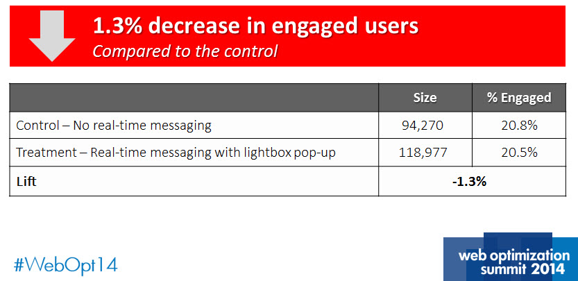
pop-up-test-results


After only four days, Michael and his team concluded that the new lightbox approach was decreasing conversion.

“Having this failure helped us validate the metrics,” Michael said. “We didn’t want to rely just on third-party metrics. Not every test is a winner.”

Read more…

E-commerce: Does your website appeal to hunter-gatherer instincts?

March 7th, 2014

For thousands of years prior to the advent of agriculture in 8,000 BCE, our ancestors survived as hunter-gatherers. I would say we are still, at our core, hunter-gatherers.

This idea becomes really interesting when we stop and consider some of our shopping behaviors.

Think about the last time you went shopping – where did you go?

My favorite place to shop, for example, is about 20 minutes from my house. After I park my car and walk into the store, I’ve committed maybe 30 minutes of my time to the shopping experience.

Once inside, I generally walk around the store counterclockwise. I look high and low, feeling fabrics, examining products and “hunting” for the items I want to buy. If I go without a specific need in mind, I generally end up buying the coolest, newest item that catches my eye. I also see many people wandering around just looking to buy something.

They have a perceived need; it’s just not clearly defined.


Hunter-gatherer instincts go beyond the bounds of brick-and-mortar

For an example, I need a new pair of jeans. As I walk over to the men’s department, I scan up and down. Retailers have a knack for placing impulse buying items where people will normally look. By the time I get to the jeans area, I may have invested 45 minutes in my quest to buy a pair of Levi 550 jeans.

When I arrive at my goal, I find out they have one pair of 550s that are the correct size, but they are perhaps too faded, or too dark or otherwise not quite right.

Now I have a decision to make and a few options: go to another store and search there, go home without any jeans, or buy the jeans that are there.

In this case, I buy the jeans and head home happy, having spent a total of about 90 minutes in total.

Now, what happens when I go hunting online?

My trip is likely going to begin with a search engine, where I enter “Levi’s 550 jeans” in the search bar and 324,000 listings are shown in to me in about 0.45 seconds – a little faster than my trip to the store.

As I scan the different listings, I see Levi’s, Amazon, J.C. Penney and Kohl’s.

So I click on Levi’s first, and it has my 550s front and center. But for some reason, before I can shop with the  company, it wants my email address first. 


Now don’t get me wrong here, Levi’s is taking some interesting and creative approaches to engage customers, as one of my colleagues recently shared.

But in this particular instance, the experience is not so welcoming as the perceived cost for hunting here is rather high right off the bat, so I immediately back out and search elsewhere.


When the hunt is overwhelming, choice becomes paralyzing

Amazon is next. Now I must admit, I am not a regular shopper on Amazon, so I’m a little overwhelmed by all of my choices. All I want is a pair of jeans.


One more click and I am back out again.

Although my lack of Amazon savvy is no fault of the company, I like this example because it highlights the paradox of consumer choice: While consumers want choices, having too many options can lead to indecision.

So the challenge in building a fantastic customer experience is in finding the right balance of options to make consumer choices easier whilst plentiful.


When you’re loaded for bear, nothing else will do

My next stop was J.C. Penney and although the hunting here is a little less overwhelming, there was one interesting thing I noticed.


In this shopping experience, I was offered alternatives to the Levi’s I wanted first, which made me a little confused and uncomfortable.

To play the devil’s advocate here, the research manager in me think’s it’s absolutely plausible that J.C. Penney’s could be doing some testing, you just never really know.

Ultimately, the distraction I experienced here prevented me from moving towards the ultimate “yes” and here’s why.

The psychological investment required to discern between my perceived need for Levi’s and the alternatives offered was much higher than I expected.

So I backed out and continued hunting.

Read more…

Web Optimization: 3 considerations for testing personalized webpage content

January 31st, 2014

Content personalization is perhaps one of the fastest-growing optimization tools, enabling formerly static websites to segment visitors and deliver a more personalized message to optimize conversion.

With social media providing more data than ever about customers, online marketers can cleverly deliver a message.

Personalized messages are delivered through various audience segments, built according to customer data pulled from the user’s cookie. When a user with a qualifying cookie visits a page, their cookie will trigger the display of a more personalized message.

When effectively designed and utilized, this personalized page may closely match customer motivation, resulting in a higher conversion rate.

Recently, one of our Research Partners, a large mobile network carrier, challenged us with designing a test that would allow them to compare the performance of 10 personalized audience segments against a control.

Our Partner presented the question, “Does a personalized version of our webpage increase the chances of conversion?” Although it sounded like a simple task, we learned that there are many pitfalls when testing multiple personas.

Here are three considerations to keep in mind when designing your test for personalized webpage content.


Account for an overlap in personas or prepare for duplicated data

When designing personas for your webpage, it is important to remember there is no one-size-fits-all audience segment. There will inevitably be some overlap because we humans typically don’t fit into one box that defines us.

Our Partner’s test included segments ranging from DIYers, bookworms, the upwardly mobile and gift givers. But what if I am an upwardly mobile individual with a love of books, home repair and gift giving?

Which page will I see, and how will you know?

Another contributor to overlapped personas will be shared devices. It is important to remember we are only capable of evaluating visitors’ cookies, not the visitor personally. If the visitor’s device is shared with others who each fit into vastly different audience segments, we may not be able to accurately segment the visitor into the correct category.

To combat this challenge, we set up our test so our audience segments were mutually exclusive. This meant that only users qualifying for one segment were taken to a treatment, and any user qualifying for multiple segments were taken to the control.

However, this approach will inevitably result in less traffic to each persona. Keep this in mind when selecting the number of segments your test should have.

  Read more…

Is Social Media Better for Building Product Credibility?

October 29th, 2013

I had a conundrum once at dinner when I was a young military guy stationed in Tampa, Fla.

I wanted to try something new, and I had my mind set on Chinese food. In an attempt to get an unbiased opinion, I fired up my trusty laptop and Googled “Chinese food Tampa.”

After sorting through a few million results, I arrived at a few good recommendations based on star ratings and other such nonsense. Just to double check, I phoned a friend who had eaten at the spot I chose.

Knowing my personality and my legendary picky eating habits, he recommended that I not go to my top choice. Of course, I completely ignored him and did it anyway.

Gripped in the depths of gastrointestinal distress two hours later, and surrounded by throngs of hipsters, I realized a simple truth: star ratings are a ridiculous way to gauge a product or service.

As it turns out, most Americans agree with me, at least in principle.

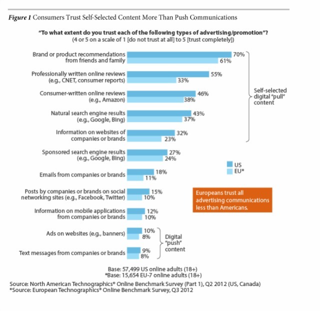
A recent report from Forrester Research indicated 70% of Americans trust brand or product recommendations from friends and family. To give you an idea of how high that percentage is, only 46% of Americans said they trusted consumer-written online reviews.

The takeaway from this research is Americans trust personal recommendations at a much higher rate than reviews from strangers.


That creates an interesting dichotomy since most e-commerce stores offer consumer ratings, but not friend and family recommendations via social media.

Take a look at this product page. It just so happens to be the Amazon product page for my recently published book. 


You’ll notice the product page offers a star-based review system whereby people who have read the book are able to review it.

This represents the traditional attempt by retailers to reduce customer anxiety about their purchase and increase credibility of the product by allowing real people to give their unfettered opinions of the product. The problem, of course, is the Forrester report has introduced an element of doubt about how effective consumer-written online reviews are at influencing the purchasing behavior of individuals shopping online.

Let’s compare Amazon’s attempt to assuage anxiety to another approach, below:


I really like this example of integrating a Facebook comment into a product page because it illustrates the potential for using social media to build your products’ credibility. The widget will allow anyone to comment on your product or service, provided they have a Facebook account.

The widget can be coded to display socially relevant results first. In other words, you can show any comments from your customers’ friends and relatives at the top of the list, and as we’ve discovered, the recommendations of friends can be much more trustworthy.

The only problem I can foresee with this approach is having a lack of comments on a particular product.

Could the Facebook commenting process be so foreign to people that it scares them away?

Do customers understand this is the functionality that they should use to leave a recommendation?

We don’t have answers to those questions.

It seems as if we’re left with a valid research question: which attempt at alleviating anxiety and boosting credibility will be most effective?

Will it be the traditional user-based “star” concept that made me sick, or the socially empowered “friends and family” approach?

Read more…

E-commerce: Why a forced checkout registration is never a good idea

October 8th, 2013

“If you don’t eat yer meat, you can’t have any pudding.”

  • Pink Floyd, “Another Brick in the Wall (Part 2)”

The song was an outlet for bassist Roger Waters to express his dislike for the forceful approach to learning that was popular in the British education system during his youth. This serves as a great analogy for why forcing your customers to register for accounts is not always a good idea.

In today’s MarketingSherpa Blog post, I want to demand that you allow your consumers to have their pudding, even if they don’t eat their meat.

But in some cases, I know that “required” just can’t be avoided, so I’ll also share two methods you can try when your company just won’t budge on “leaving the kids alone,” as the song goes.


Make buying easier for users with low motivation

Unless your brand has the near cult-like following of Apple or Coca-Cola, then it’s likely your website will play host to visitors with low motivation.

Now, what will chase away users – and metaphorical British schoolchildren – with low motivation faster than a 12-inch ruler?

Having to submit their information to yet another website!

If a new visitor – most likely an important demographic to your business’ revenue – is forced to commit to an account before they make a purchase on your site, then you could lose this new customer.


Avoid cart abandonment by keeping new users moving through your checkout

Another reason to avoid a required registration is the dreaded cart abandonment.

Combine a visitor with low motivation and subject them to a rather lengthy checkout process, and you are just adding another brick in the wall.

But sometimes, registered accounts simply can’t be avoided for whatever reason …

What do you do then?

Well, it’s all in how you approach a customer with your demands for their data. While I discourage required accounts, consider these two account registration methods from our research that you can test to hopefully increase your sales and minimize cart abandonment:


Method #1. Front-end option

Provide an optional account registration option at the beginning of the checkout process for users with high motivation or brand loyalty.

However, you may need to provide some incentives to convince that user the registration option is in their best interest.


Method #2. Back-end option

Most businesses still need to ask customers to fill out billing and shipping information during the checkout process.

Why not offer customers an opt-in to a registration after their information has been submitted?

This only requires one action from the visitor (a “yes” or “no” answer) and can be placed before or after the completion of the order.

You may also need some additional value copy to convince users that a registration option is in their best interest, but the beauty here is that you’re not making them jump through the same hoop twice.

No matter which option your pick, the goal here is testing your sales funnel to discover the most strategic place for a required account registration if you can’t avoid it.

  Read more…

Marketing Careers: Why gut instincts are only artificial marketing brilliance

October 4th, 2013

At some point in your marketing career, you’ve had a moment of artificial marketing brilliance.

It was a moment where you suspected your customers might respond better to a shorter form or a bigger and more colorful call-to-action button inviting them to a unique experience.

You might have even had the sneaking suspicion that changing some of the value copy on your homepage would boost sales of your product or service because no other competitor can boast figures close to your product’s success rate.

So, you make changes as your gut tells you, “Of course this will work.”

Afterwards, you kick back to watch the ROI roll in.

And then, it happens.

Your brilliant idea bombs in glorious fashion and you’re left scratching your head.

If your marketing is driven by intuition, at some point, you are going to fail and it’s one of the best things that can happen for your customers and your career. Read on to find out why.


Failure starts at relying on your gut

Many marketers use gut instinct in hopes of delivering optimal results, but when they fall short of expected results, those marketers never fully understand why.

But, if we use the hypothetical situation above, some clues emerge that can help us understand what leads to failure.

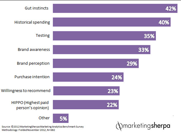
According to the MarketingSherpa 2012 Marketing Analytics Benchmark Report (free excerpt at that link), when marketers were asked …

Q: Instead of analytics data to make marketing decisions, we rely on the following:


Nearly half (42%) responded with gut instincts, followed by historical spending trends.

So, with almost half of marketers proclaiming instinct and prior spending as their decision engines, let’s fill in the blanks with a few primary sources of inspiration:

  • Case studies performed by other companies
  • Best practices picked up along the way
  • Marketing research

Now, I’m not saying there’s anything wrong with these resources because, let’s face it, it’s easier to borrow from a seemingly good idea than it is to create a new one from scratch.

The inherent problem is not where you get an idea. The problem is how you intend to use it.

This is the point at which many marketing campaigns were doomed to underperform because ideas untested are always at the mercy of uncertainty.


Life beyond using your gut

Your gut failed you … now what?

One of the best career moves you can make is to move away from gut instinct marketing and begin using an evidence-based approach that is methodical and systematic. Chances are, you’re going to have some questions after your first radical redesign where shorter landing pages resulted in a 10% decrease in clickthrough.

Did the larger hero image take away from the copy? Was the award for customer satisfaction from 2004 recent enough to provide credibility? What turned the audience away?

You’ll also have questions if your redesign brought you a 5% lift in clickthrough. You might even be pretty content and let things rest, even if you could do better.

Those strokes of “marketing brilliance” are coming from a different source – online testing results that can be used to build a customer knowledge base.

Did your customers like your new vivid red button? Did they respond well to reading you were the only company in your field to offer one-on-one tutorials with an expert?

If you changed the eye-path on the page, could you have achieved a 10% lift? 20%?


The inevitable question – Why?

You must realize that success and failure lead to an inevitable conclusion in marketing – you have to test to truly discover, “Why?”

You can try to isolate the factors that seemingly impacted your audience, or you can test them and measure their performance to know for sure.

Understanding the “why” of customer behavior is really the product of methodical trial and error through testing, discovering and optimizing what you think works …

And then, it’s time for more testing.

Both the small gains and big flops lead you to learning more about your customers, a path riddled with failure, success and discovery, that no gut instinct on the planet can come close to.

Read more…

Testing and Optimization: Radical website redesign program improves lead gen 89%

October 1st, 2013

I’m live blogging at MarketingSherpa Lead Gen Summit 2013 in San Francisco, and attending a brand-side case study with Jacob Baldwin, Search Engine Marketing Manager, One Call Now.

To begin a testing and optimization program, Jacob launched a test on the website with a radical redesign, attempting to improve lead capture. The program was executed sequentially as opposed to A/B split testing.

Jacob said each new homepage version replaced the previous – the marketing team created new treatments and “flipped the switch” to learn how the page would perform.

An important insight from this testing approach  is there isn’t necessarily a need for a complex A/B or multivariate testing program.

The testing program was run on the homepage, and there were several objectives:

  • Increase conversion rate
  • Increase traffic
  • Reduce bounce rate
  • Provide niched messaging via enhanced segmentation

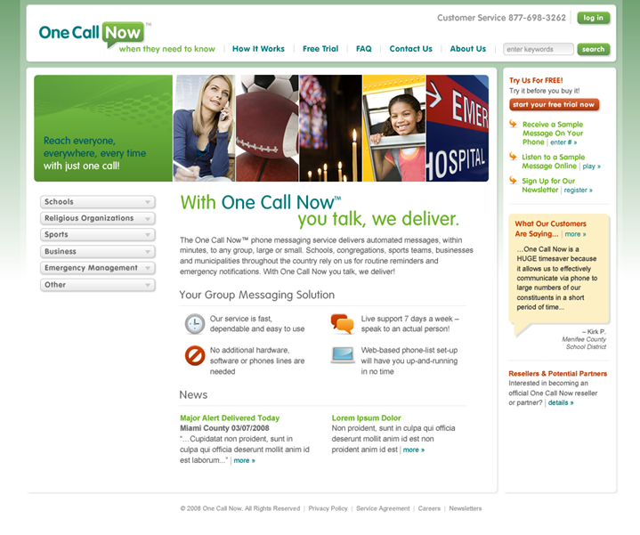
Here is the test control and original website:


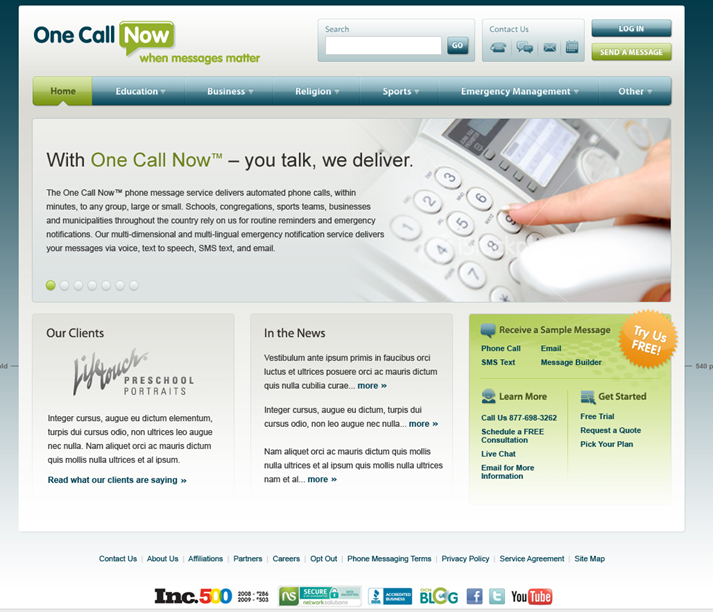
And, here is the radical redesign treatment:


There were several key differences with the treatment:

  • Restructured navigation
  • Consolidated calls-to-action (CTAs)
  • Single value proposition – no competing headlines on the page
  • Trust indicators
  • Color palette
  • New tag line
  • New content

The original homepage, the control in this test, achieved 2.40% lead capture, and the radical redesign treatment pulled in 2.85% lead capture – an 18.75% lift over the control.

Jacob says the radical redesign was based on a revamped segmentation model.

“The new segmentation model drove the basic navigation structure and information architecture of the new homepage,” he explained.

This test with an early “win” was part of an ongoing optimization program. Not every test uncovered a lift, but every test did garner a discovery. The testing protocol involved taking the “winning” treatment and then refining the webpage layout, calls-to-action and length of the sign-up process for lead capture.

Through optimization, the sign-up process was shortened, and free trial sign-ups increased 55.3%, and the overall redesign of the entire website garnered a 89% lift in lead generation.

For the big takeaway, Jacob says, “Never stop improving. Complacency is lead capture optimization’s worst enemy and perfection is impossible. Complacency is conversion rate optimization’s worst enemy.”

  Read more…

Customer Relevance: 3 golden rules for cookie-based Web segmentation

September 13th, 2013

Over the years, the Internet has become more adaptive to the things we want.

It often seems as if sites are directly talking to us and can almost predict the things we are searching for, and in some ways, they are.

Once you visit a website, you may get a cookie saved within your browser that stores information about your interactions with that site. Websites use this cookie to remember who you are. You can use this same data to segment visitors on your own websites by presenting visitors with a tailored Web experience.

Much like a salesman with some background on a client, webpages are able to make their “pitch” to visitors by referencing  information they already know about them to encourage clickthrough and ultimately conversion.

Webpages get this information from cookies and then use a segmentation or targeting platform to give visitors tailored Web experiences.

Cookies can also be used to provide visitors with tailored ads, but in today’s MarketingSherpa Blog post, we will concentrate on your website, and how segmentation can be used on your pages to provide more relevant information to your potential customers.


Test your way into cookie-based segmentation

At MECLABS, we explore cookie-based segmentation the only way that makes sense to us – by testing it.

It’s fairly easy to identify the different variables you would want to segment visitors by, but how to accurately talk to them should be researched. It’s also easy to become distracted by the possibilities of the technology, but in reality, the basic principles of segmentation still apply, as well as the following general rules.


Rule #1. Remember you are segmenting the computer, not the person

There are more opportunities for error when segmenting online because multiple people may use the same computer.

Therefore, online segmentation has some mystery to it. You can tailor your message to best fit the cookies, but that may not accurately represent the needs of the specific person sitting in front of the computer at that time.

Many segmentation platforms boast a 60% to 80% confidence level when it comes to how accurately they can segment visitors, but I think a better way to position this information is there is a 20% to 40% margin of error.

That is pretty high!

Be cautious with how you segment. Make sure the different experiences you display are not too different and do not create discomfort for the visitor.

For visitors who do not share a computer, error can still be high. They may be cookied for things that do not accurately describe them.

I bet if you looked at your browser history, it may not be the most precise representation of who you are as a person. Therefore, don’t take cookie data as fact because it most likely isn’t. It should be used as a tool in your overall segmentation strategy and not serve as your primary resource for information about your customers.


Rule #2. Be helpful, not creepy

People are getting used to the Internet making suggestions and presenting only relevant information to them.

Some have even come to expect this sort of interaction with their favorite sites. However, there is a fine line between helpful and creepy. Visitors probably don’t want to feel like they are being watched or tracked. Marketers should use the data collected about their visitors in a way that does not surpass their conscious threshold for being tracked.

For example, providing location-specific information to visitors in a certain region is alright, but providing too much known information about those visitors may not be.

Cookies can tell you income level, demographic information, shopping preferences and so much more. Combining too much known information could seem overwhelming to the visitor and rather than speaking directly to them, you risk scaring them off.

Instead of making it blatantly obvious to visitors you have collected information on them, I would suggest an approach that supplies users with relevant information that meets their needs.

Read more…

A/B Testing: One word will unclog your conversion testing

August 27th, 2013

With A/B testing, you’re examining and exploring the mind of the customer. You’re learning about your customers and you’re the one asking the questions. However, the newly released MECLABS Online Testing Course explains in great detail why you can’t ask just any question to get the answers you need.

There’s a formula for what goes into that question, and it’s all built around one imperative word.

Which.

The word “which” demands specifics and precision, allowing you to focus on something that can be answered with a split test.

Let’s expand this further by looking at one of the key principles Flint McGlaughlin, Managing Director, MECLABS, discussed in Session 2 of the course.

  • A properly framed research question is a question of “which” and sets out to identify an alternative (treatment) that performs better than the control.

The guiding force of online testing is seeking to better predict the behavior of your customers. To achieve this, you need a research question to tests your hypothesis.

“If your research question is framed wrong, the entire outcome of the test is dubious because you haven’t approached it properly,” Flint said.

Below are some of the examples presented in the course that convey the importance of this essential word.


Not this: What is the best price for product X?

This isn’t specific. The question doesn’t set out particular items to test. “Best price” could be anything.

But this: Which of these three price points is best for product X?

This utilizes the imperative “which.” The implementation of “these three price points” gives you three precise price points to test.


Not this: Why am I losing customers in the last step of my checkout process?

Sure, you may ultimately want to discover why it is you’re losing those customers, but you must start out smaller. This question doesn’t narrow anything down. The last step of the checkout process is quite complicated and there isn’t just one element present.

But this: Eliminating which form element best reduces customer drop-off?

There’s the “which” again. The “form element” is the metric allowing you to compare one specific element to another. This gives you a particular element to test rather than just presenting a broad idea.

Read more…