Content Marketing: 5 tips for WordPress blogging
When I joined the MECLABS team in January, I was fully aware I would soon become best friends with WordPress. I truly believe WordPress is one of the most efficient ways to put out great content that not only looks polished, but is very simple to use.
Clarity is extremely important when it comes to content, so producing blog posts a reader can understand relies heavily on how it is displayed.
A blog post with photos in random places, sections without a subhead and discussing a process without the use of photos to accompany text are just a few of the millions of ways a reader can get lost in your message.
However, these are all elements you can control.
Here are five tips and tricks I’ve learned to improve a WordPress blog …
Tip #1: Use invisible tables for side-by-side comparisons
Sometimes, if you have just one image in a blog post, you can get away with setting it on the left, right or even in the center of text. This works great especially if your image can stand alone. However, if you have two images (a before and after example, etc.), it is definitely worth taking the extra time to craft an invisible table and place your photos into the code.
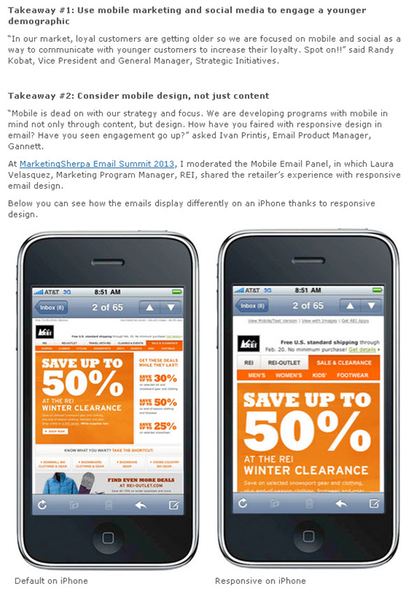
Here is an example from the MarketingSherpa blog post in which I placed two examples of an email side by side for easier comparison.
As you can see, placing the two images next to each other works well in this case. If they were placed one on top of the other, the reader would lose the before and after effect of the email. I would also recommend adding a caption to the photo, if the meaning without it is not very clear.
Coding an invisible table in HTML is an easy process that takes just a few tweaks. You want to start by uploading your images into the WordPress Media Library. Then, within the actual post, switch from the visual editor to the HTML editor. Next, paste the below code where you want your table to be:
<table style=”border: none;” cellspacing=”10″>
<tbody>
<tr style=”border: none;”>
<td style=”border: none; vertical-align: middle;”><a href=”FILE URL 1“><img class=” wp-image-11378 ” title=”IMAGE TITLE 1” src=”FILE URL” alt=”” width=”xxx” height=”xxx” /></a>CAPTION</td>
<td style=”border: none; vertical-align: middle;”><a href=”FILE URL 2“><img class=” wp-image-11379 ” title=”IMAGE TITLE 2” src=”FILE URL 2” alt=”” width=”xxx” height=”xxx” /></a>CAPTION</td>
<td style=”border: none; vertical-align: middle;”></td>
</tr>
</tbody>
</table>
Now for the important part. Go back to the Media Library, select “edit” for the image you uploaded, and copy the File URL provided. Paste that URL into your first table box, and return to the upload gallery to grab the image title.
Be mindful if what you’re putting into the table does not match the upload information, it will not work.
Once you put the image title in, you will once again need to put in the same image URL. Finally, include the dimensions of the image, indicated by “xxx” in the example above. There is no need to change “wp-image” number.
Repeat this process for other photos you want to put into the table. It is also easy to make a third or fourth photo in the table: simply copy one of the table boxes, which is the code in between “<td style… and </td>,” and paste it into the code.
Tip #2: Use padding around images to separate from text
When using smaller images, a design that works well is to nestle the photo to the right or left of text. For example, this blog post used a small image placed to the left of the text.
Sometimes, if you put in an image, it may be too close to the text, or might cause strange separation of the text. For example, you might have a lost bullet point separated from the list, or maybe a few words orphaned from the rest of the sentence it belongs to tucked away under an image. To fix this problem, play with the vertical and horizontal space of the image to place the text into a desirable format.
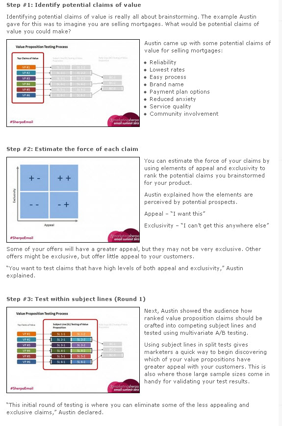
In this MarketingExperiments blog entry, the original design plan was to have images larger in size, centered and acting as separators between paragraphs.
However, with multiple images, it is easier on the eyes and for the reader to have them neatly in the margins, sized smaller, but with the ability to be viewed larger once clicked.
Plus, for a post containing steps, having smaller images adds a level of clarity as the reader can fully see the steps in the subheader and the steps of testing, all without having to scroll all over the page.
For the first image, it was necessary to add a horizontal space to the right of the photo so the bullet points would not overlap over the image. This was done after the photo was uploaded and set into the appropriate spot to the left of the bullet points.
Vertical spacing is also a great and easy way to make sure there is enough space above and below the image.
One important tip to note is moderation is key – you don’t want to have an image on the left and an image on the right back to back in the body of your content. Try keeping a series of images or photos all on the same side of the page if they are in close proximity of each other.
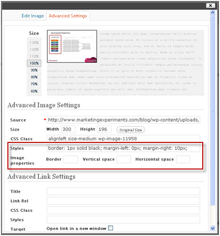
Then, by selecting the image in the visual editor and selecting Advanced Settings, you can add any amount of space into the options. Here is what I used:
Tip #3: Schedule blog posts ahead of time (if possible)
At MarketingSherpa, we work hard to plan content ahead on our editorial calendar. After all, even if you think you will have enough time to post the entry a day before you’d like to run it, obstacles always seem to arise when you least expect them.
This is why scheduling blog posts is so important to have content posted on a regular and timely basis. It’s a good idea to set the post to “Schedule” before you get too far into your post uploading process. One slip, and you may click “Publish” instead of “Schedule,” and your post is live.
Scheduling a blog post is possible on the editing page of a post. Next to “Publish immediately,” click edit, and you can decide the date and time you’d like to have the post go live. Once the “Publish” button changes to “Schedule,” your post should publish at the listed time.
Just to note, sometimes scheduling blog posts ahead of time is out of the question, and that’s alright. Even for MarketingSherpa, live blogging at events makes it impossible to be able to schedule a post ahead of time due to the time crunch and also fulfilling the purpose of a “live” blog.
Tip #4: Customize your blog URLs and add blog categories
Online marketing. Email deliverability. Social media marketing.
Our content is very diverse with many niche focuses.
To simplify how we organize our posts, we have created categories in which each blog post is filed under. For example, Taylor Kennedy’s “Online Marketing: 4 sources of customer insight on your website” post is under the category “online marketing” because of its main focus.
Then, after you choose your category, changing your URL to match the headline is also important. Pick three to five words that concisely describe the post, while keeping in mind the selected category.
You don’t want to have a URL such as “sherpablog.marketingsherpa.com/marketing-insights/4-marketing-insights.” Get creative, and find ways to avoid repeating the category name in the URL.
It doesn’t hurt to consider target keywords in your URL, as well. Of course, SEO takes much more than just including a few words in a pretty URL.
Tip #5: Embed media for cross promotion
Finally, with the popularity of social media, you may find embedding media in your post to be much better than just a simple link to a tweet or video. Embedding is incredibly easy and does not take an HTML expert to do.
Embedding Twitter posts allows viewers of your page to not only see the tweet, but also to interact with it. Instead of a screenshot, embedding tweets allows for people to retweet, respond, favorite and even follow the tweet’s owner. By selecting “Embed tweet” from the “More” drop-down menu on a single tweet, a pop-up appears with an embed code.
Check out the functionality in this example:
The best insights and stats shared on #OpSummit bit.ly/130s5akvia @brandkarmavoice
— MarketingSherpa (@MarketingSherpa) May 23, 2013
YouTube
Instead of a link, embedding a YouTube video allows viewers to stay on your website as well as view the video you’d like to feature. Similar to retrieving the Twitter embed code, start by selecting the “Share” tab under a video. Then, select “Embed” to view an HTML embed code to copy and paste to your blog. You may also manipulate how large the video display by changing the width and height in the code.
Check out the functionality in this example:
SlideShare
SlideShare also has the capability to embed an entire presentation into your blog post. To do this, simply select “Share” on any presentation, and the pop-up box provides an embed code.
Check out this example:
Related Resources:
Content Marketing: An 8-point analysis for your blog
Content Marketing: 7 tips for content repurposing
Content Marketing: 3 tips for how to get started
Content Marketing: 172% ROI for online retailer’s high-powered blog
Categories: Copywriting Blogging, blogs, content, content marketing, embed, embedded videos, html, WordPress, wordpress tips




Thanks for the tips! I didn’t even think to cross promote by embedding links into my content.
These tips are amazingly useful. I have been using wordpress for 4 years and am actually excited!
Hi Erin, great pointers. I’m curious as to HOW you embed Twitter. Is it a plugin or just code from Twitter?
Hi Ruben, thanks! To embed a tweet, hover over the tweet and you should see a “… more” next to the retweet and favorite options. Click “…more” and you’ll see “Embed tweet.” Copy and paste the code into WordPress, just make sure you’re in the HTML editor. Hope that helps!
Erin
Thanks so much Stacy! So glad I could help!
Erin
Great tips that many can really use. Here’s one for you to use so we can pin this post effectively. You could create an image that is primarily text and put it at the very beginning of the post. That catches readers eyes and encourages them to read this particular content.
For this post, it could be something like this:
4 WordPress Tips:
#1 Side-by-side Images
#2 White space around images
#3 Why schedule blog posts
#4 Customize URLs and categories
#5 Embed Tweets and YouTube videos
If you have a large pinnable image that spells out exactly what is in the post it will get more likes and pins and you’ll pull traffic from Pinterest. While I could probably pin any image in this post, none are likely to attract the people who would most benefit from reading it.
My bet is that posts like this where the writer has taken the time to create an image that spells out what is in the post will get 10x the traffic, not only from Pinterest but from any other site where we share images such as Facebook, StumbleUpon, and G+.
Many have been blogging 5-8+ years now and are likely to tune out another post about WordPress – unless your image lets them know there is a skill in THIS post about WP they don’t already know.
I will incorporate some of these tips in my next post. Many thanks for sharing!
Thanks for some useful tips & first time I can recall anyone recommending tuning urls which I’ve started doing lately
Thanks for this wonder full topic, i am using wordpress last 2 year but in this topic many things i don’t know so thanks.
I’ve been struggling with putting a blog together for recipes. I think that some of your tips here may be helpful at getting me motivated. Thanks for sharing!
Owning a WordPress can help you create a website according to your preference and niche of choice. Just go to wordpress gallery plugin and see how the magic happens. Excellent tips on how to start blogging on WP.
These are really helpful tips about blogging in WordPress. Those who are using such are truly grateful with this information. Thank you for sharing.
Useful tips, thanks for sharing! Also, I suggest you to allow guest posting for blogs and you will see the increase in traffic to your sites.
You definitely want to add in padding between images and text.