Marketing 101: What is website usability?
Marketing has a language all its own. This is our latest in a series of posts aimed at helping new marketers learn that language. What term do you find yourself explaining most often to new hires during onboarding? Let us know.
Simply put, website usability is how easy, clear and intuitive it is for visitors to use your website. This is from the visitor’s perspective, not your company’s perspective.
Of course, website usability isn’t so simple at all. You essentially have to read someone else’s mind, so the expected user experience matches the web experience you design. However, as 18th-century poet Robert Burns wrote, “The best-laid plans of mice and men / Go oft awry.”
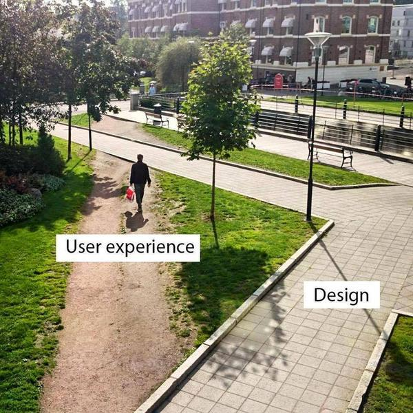
As I said, you’re trying to read someone else’s mind (many people, in fact). So the challenges of web usability aren’t necessarily unique to the web. These challenges are the very fundamentals of human behavior and interaction. Here’s a very visual example that UXer Oliver McGough shared on Twitter …
There are many terms related to website usability that you might have heard:
- User experience — how people experience your website. This may be very different than you intended because you may not be able to take an outside perspective of your website and assume visitors will understand something that they don’t, or understand differently, from you (more on this in a bit).
- User experience design (or UX) — the practice of creating websites, computer programs, apps, etc. with the user in mind. UX can also be used as shorthand for website usability. (e.g., “That site has good UX.”)
- User interface (UI) — where man meets machine. For example, an operating system has a graphical user interface. UI continues to evolve and isn’t always visual. Thanks to virtual assistants like Alexa, the human voice now interacts with a UI as well.
- Usability — in general. This is, after all, broader than just websites. Any digital offering has (or lacks) usability, from a website to a computer game. But physical objects have usability considerations as well. For example, OXO is a company that is well known for kitchen utensils and housewares usability. When I first learned about usability, the instructor used a car brake pedal as an example. I had never noticed before, but it is a lot wider than the gas pedal for a reason. If you’re accidentally going to stomp on one of them, it’s better to be the stop than the accelerate!
- User testing — Get your visitors’ opinions about what works well on the site and what doesn’t, what processes and mechanisms are intuitive and which are confusing
- A/B testing — Measuring your visitors’ behavior to see how well they are able to actually use the site, and if the actual user experience matches the intended website design
Why something that is outwardly so simple is actually quite hard
To the neophyte, website design and usability seem quite simple. Maybe coding is hard, but all websites look pretty similar, don’t they? And there are endless website templates to choose from.
Website templates and themes can help website usability. When a design element becomes a standard convention, more visitors will know how to interact with it. For example, a hamburger menu.
But a template will only take you so far. For one, how you fill out the template can have a huge effect. If your words aren’t clear, it won’t matter if they are in a well-designed place.
Also, every product and customer is unique. A template that works well with a 14-year-old might totally lose a 64-year-old. A theme that might fit well for the sale of guitars might work horribly for the sale of clothes.
Here is the big challenge and why website usability is so difficult. For you and your web designers and your programmers, you see things through your own eyes. You can’t help it. This is part of the human condition. But it makes website usability difficult for two reasons:
- You are not your customer
- Your customer doesn’t care (like you do)
You are not your customer
You are a 27-year-old marketing manager and your customer is a 44-year-old plumber. You live in San Francisco and your customer lives in Wisconsin. Your first language is English, and your customer’s first language is Mandarin. You use iOS, and your customer uses Android. You’re a 22-year-old junior copywriter, and your customer is a 57-year-old CEO.
The list could go on.
A major narrative of the last election is that there are two Americas. And not only do we vote differently, but we don’t even speak each other’s language or understand each other’s lifestyle. One country. Two entirely different realities.
I’m not remotely going to get into politics, but this narrative is a great analogy for marketing and website usability. The most important thing you need to understand is … well, you will never understand many of your customers. At least not entirely.
And then do everything you can to be empathetic. Use tools that help you step outside your own mindset. Engage in usability testing and A/B testing. Learn a new perspective.
I should note, from my experience, while this is difficult for marketers it’s a far greater challenge for programmers and software developers. Thanks to their far greater understanding of both the frontend and backend of websites and programs, it can be even more difficult for them to comprehend how a customer may not appreciate what they’ve created and know how to interact with it.
Your customer doesn’t care (like you do)
Your challenge is compounded by the fact that most marketers (or copywriters, web designers, programmers, website experience specialists, etc.) spend an inordinate amount of their waking hours on their own website. You know it forward and backward.
Most customers, however, will give your website mere moments of their sometimes-divided attention. And if there is any friction or confusion, they will bounce.
As @iconfinder said, “A user interface is like a joke. If you have to explain it, it’s not that good.”
Things fall apart. Things like websites.
To make the challenge even harder, websites are not static entities. I remember when I used to write brochures. When the brochure is done, it’s done.
I’ve found that entropy reigns supreme on websites. Or, to borrow from Chinua Achebe, websites fall apart.
The SSL certificate needs to be updated, but your site search wasn’t included and now it’s not working. In transferring to HTTPS, all of your old HTTP images broke. Your image hosting service went down. Your website administrator inadvertently broke a pop-up while updating your website. And the list goes on.
According to our research, the more frequently and proactively ecommerce companies evaluated site usability, the faster their revenue was growing.
So where to begin?
At the very least, have someone unfamiliar with the website go through it while you’re watching them, and tell you their thoughts.
Even better, engage in some usability testing and A/B testing.
Where to begin? Here is an example of some elements that affect website usability:
- Navigation
- Amount of on-page messaging
- Amount of on-page content
- Clarity of on-page messaging
- Location of on-page messaging
- Call-to-action
- Pop-up forms
- Form error codes
- Form field descriptions
- Continuity between traffic referrers (for example, Facebook or LinkedIn ads) and your website
We’ve gotten so used to it in the industry, we forget that it’s a funny sounding word — usability. But that is the very least our visitors should expect from our websites — that they can use them.
You can follow Daniel Burstein, Senior Director, Content & Marketing, MarketingSherpa and MECLABS Institute, on Twitter @DanielBurstein.
If you’re reading this blog post, you are likely interested in website usability, so you might also like …
Web Usability: The Squint Technique And Other Insights From Your Peers
Web Usability: When Should You Avoid Navigation?
Web Usability: Long Landing Page Nets 220% More Leads Than Above The Fold Call-To-Action
Categories: Design, Website And Landing Page Design A/B testing, B2B marketing, customer-centric, digital marketing, landing page optimization, marketing strategy, Online Advertising, Online Marketing, SEO


