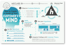
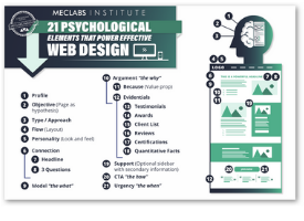
As a research manager, when I look at a homepage, I always ask myself two questions …
- Who are the customers?
- Was the homepage designed with those customers in mind?
I often find a homepage design makes perfect sense to the company’s executives, but not to the most important audience, the customers.
As homepages increasingly become the center of a company’s marketing and sales universe, making sure your focus is on the customer is more important than ever.
In today’s MarketingSherpa Blog post, I wanted to share three common telltale signs your homepage is driven by company-centric marketing.
I’m sure this post is likely to raise a few eyebrows, but my goal here is to help you raise revenue by helping you see your marketing efforts through the eyes of your potential customers.
Sign #1. Our homepage is a collage of department products instead of popular products
I generally tend to hope the most popular products and services offered on a homepage within direct eye-path, which is also prime real estate on a homepage, are what customers came to your homepage to find, versus products and services the company wants to sell.
However, it is not always that simple when you are in a large company with various departments with different sales goals all competing for that prime real estate on the homepage.
The big issue with this is when departments become only focused on the product or service, and marketers lose sight of what the customers want.
If a product or service that is not the primary driver of your sales traffic is overtaken on the homepage by a minimal interest product or service, should it really be placed within the customer’s direct eye-path?
The obvious answer is no, and I understand it is more complicated than that.
I also understand the chances of success for a business model that tries to force the sale of products or services to people who don’t need or want them are also slim in the long run.
So, if you find yourself in this position, I encourage you to take a step back and develop a strategy to work collaboratively with other departments to build a homepage that improves the overall customer experience.
Sign #2. Our value copy talks “at” our customers instead of “to” our customers
Have you ever read about a new product and still had to ask yourself, “What is this thing and what will it do for me?”
Unfortunately, this happens frequently.
Sometimes, we try to impress our customers with creative copy, hoping to sound professional and intelligent. This is great as long as it makes sense to the customer.
Remember, you understand your products/services inside and out and your potential customers are more than likely just learning about it for the first time.
The value copy from a customer’s perspective should answer one essential question – what is in it for me?

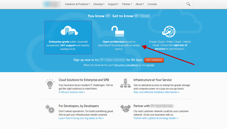
For example, I did a quick search online about cloud services, which is a complex product, and the first homepage I found left me even more confused.
Some of the cloud’s value copy explained this company’s service features“Open architecture based on OpenStack technology with no vendor lock-in.”
That may be an awesome feature, but I have no idea what it means.
Some of this company’s customers may understand this terminology, but the majority of customers are likely left just as confused as I am. Failing to provide clear and digestible information for customers could induce anxiety, increase frustration and ultimately leave visitors with no choice but to exit your page.
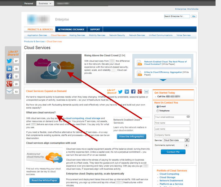
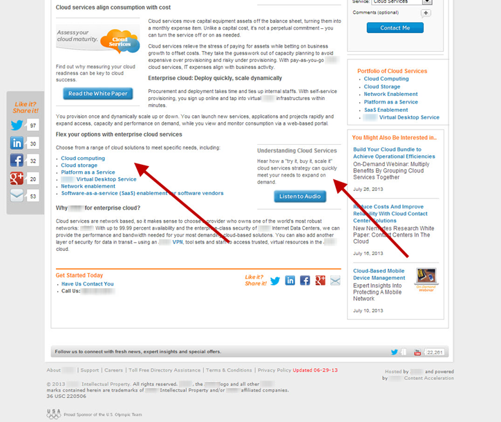
So, when I looked at the next cloud service homepage in my search, here’s what I found …

This homepage makes no assumptions about my level of IT sophistication.
It offers a short video and even lays out copy explaining what cloud service is and how it can help me.
And, there’s more …

Further down the page I found links to the options available that offer additional short videos combined with value copy explaining what cloud computing is and how the option can help me.
Now don’t get me wrong, there’s plenty to optimize on this homepage as well.
The overall point here is to understand that I left the first homepage confused about how a solution could help me and I left this one with a clear understanding of what cloud service is and how it could help me.
Read more…


