Archive

Posts Tagged ‘responsive design’

B2C Marketing: How Skyjet developed an app to increase leads through cost transparency

August 10th, 2017

With a lot of disruption due to the evolution of mobile marketing habits in the charter marketplace in Q4 of 2014, said Jonathan Levey, Senior Digital Marketing Manager, Flexjet, his company began experimenting as well.

Jonathan oversees the company’s digital marketing, analytics and advertising as well as covering those same areas for its sister brand, Skyjet. In his MarketingSherpa Summit session, he focused on the development of Skyjet’s mobile app, which he also spoke about with me in the Media Center.

Jonathan and his team had a mobile website and began doing Google advertising for it as well, specifically with mobile-only campaigns. In Q1 of 2015, the team saw a 50% increase in mobile traffic to the site quarter-over-quarter and a 177% increase in quote requests from mobile from this strategy.

Read more…

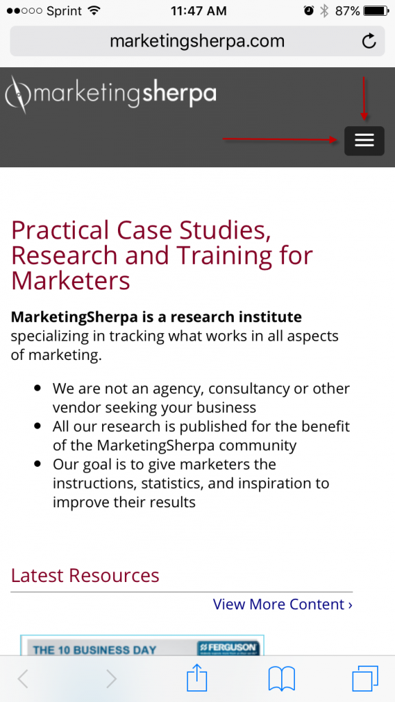
Marketing 101: What is a hamburger menu?

June 30th, 2017

There are no dumb questions, only dumb marketers who don’t bother to ask. That’s why we’ve decided to begin publishing quick, snackable posts that will help you expertly navigate any project, no matter what team you’re working with.

Today’s term is one you might encounter when working with your dev or design teams, and it has a particularly delicious moniker: the hamburger menu.

It’s something you’ve seen a thousand times before, and now you’re cocking your head thinking, “Huh. That DOES kind of look like a hamburger.”

Read more…

Mobile Email Marketing Optimization: Tips for beginner and advanced marketers from four experts

May 10th, 2016

In the article from today’s MarketingSherpa Chart of the Week newsletter, we share data produced exclusively for MarketingSherpa by Adestra and Econsultancy, which identified the mobile email marketing optimization techniques that most commonly produce excellent email marketing ROI.

You can take a closer look at the data in the article – Email Marketing Chart: ROI from optimizing email for mobile devices – but here’s the punchline: Optimizing emails for mobile is more than three times as likely to generate ROI.

If you need data to help justify the budget, resources, and buy-in you need from business leaders or clients for optimized mobile email marketing (or if you’re already optimizing your mobile email marketing but need resources to move to the next level), the chart is an excellent asset.

So now what? Let’s say you get the resources … where do you begin? Or perhaps you’re already several years down the road, but are running out of ideas on what to do next.

To help with your mobile email marketing, we interviewed four experts who gave us invaluable tips for both beginner and advanced mobile email marketers. We’re including all the tips in one blog post to allow you to easily scan because, let’s face it, one marketer’s “beginner tactic” is another marketer’s “advanced idea.”

Let’s get started …


Tip #1. Start simple

No matter your budget or resources, adding tasks to your department’s already overflowing plate is no easy feat. This is especially true when you consider the proliferation of mobile device types, screen sizes, operating systems, email readers, and download speeds.

(You can multiply that complexity several times over if you have an international customer base.)

But the experts we interviewed encouraged marketers to simply get started on the changes you’re capable of making right away, and not trying to swallow all that complexity with one bite.

“Most of those just starting on the mobile optimization journey feel overwhelmed, so they should keep in mind that simplicity is often the best route,” said Monica Savut, Senior Research Manager, Econsultancy. “Focusing on the core components is key, from using a single-column design and hiding content that might not be essential in a mobile view, to including a mobile-friendly pre-header and designing for ‘fingers and thumbs.’”

“For companies just starting to put a mobile strategy together, simplifying is key,” agreed Aaron Pearson, Product Manager, Listrak. “Simplify you template and layout; simplify your content such as copy, buttons, and images. A mobile-optimized template doesn’t necessarily have to be responsive, so don’t worry about spending time developing a hugely complex system to deliver content to your subscribers. Instead, focus on iterating your content strategy and begin to improve the conversation with your audience.”

Read more…

Mobile Marketing: How Voices.com involved its customers in a responsive design campaign [video]

June 5th, 2015

Today’s MarketingSherpa Blog post features an excerpt from a MarketingSherpa Optimization Summit 2014 presentation — “Mobile Optimization: How a B2B ecommerce company used responsive design to increase revenue by 180%” — with David Ciccarelli, Chief Executive Officer, Voices.com, providing insights into how the company utilized its customers in a mobile marketing campaign on responsive design.


In this video David explains how Voices.com tested its website with click tracking and heatmaps, saying that the first goal was to find out what website elements the team needed to keep when rolling out a new, responsive version that would be effective on both desktops and mobile devices.

“That’s how we identified the [website] elements that we were going to keep,” he says.

Another aspect of taking a customer-centric approach was that the team made a change in how interaction with the website was explained in help guides, tips and tutorials, email instruction and FAQs. This was done in order to reflect that mobile users will be tapping, spreading and pinching rather than navigating with mouse clicks like desktop users.

Read more…

Mobile Email: Tips on getting started

March 20th, 2015

For email marketers, tackling mobile email is a relatively new challenge, but a challenge that needs to be addressed. According to research from Litmus, the email testing and analytics vendor, 49% of people access email via a smartphone — a figure that’s risen fivefold since 2011 and continues to trend upward.

mobile


To provide some insight for you, the MarketingSherpa Blog reader, I reached out to five email marketers who addressed the mobile email challenge with two basic questions on the topic.

Read on to find out what this expert panel had to say about mobile email:


MarketingSherpa Blog: What one tactic has the most impact on mobile email campaigns?

Justine Jordan, Marketing Director, Litmus

Ah, the million dollar question! As with most things with email, it’s hard to make a generalization since it can vary greatly based on your industry and audience. If I had to pick just one tactic, I’d go broad and say responsive design has the most impact on mobile email. MailChimp sends billions of emails every year, and they’ve seen a 15% increase in unique clicks for mobile users when responsive design is used. Even without huge gains in performance, sending responsive campaigns sends the message that you care about providing the best possible user experience for your subscribers.


 Brian Graves, UI Team Lead, DEG

Simplifying the experience. In addition to helping deal with the smaller amount of screen real estate available on mobile devices, statistics show that customers typically spend less than 15 seconds reading marketing emails, with iOS users spending the least amount at around 3 seconds or less. Look at repositioning your email layout to lead with your most important messaging. The most effective emails are typically concise and have a clear focus. This is not only a good tactic for mobile but is one way in which a mobile-first approach can help improve your campaigns across every platform.


Ted Goas, Designer and Developer, Canfield Scientific

Work as a unified team from day one. Having product managers, marketers, designers and developers working together from planning through to execution helps ensure a campaign’s quality doesn’t degrade as it gets ‘thrown over the wall’ in a waterfall process. Everyone knows what’s happening and why.


Dan Denney, Front-End Devevloper, Code School

Designing an email for scanability has the most impact. We want everyone to read every word, but people want to find what they’re interested in and move on. Make it easy for them.


Fabio Carniero, Lead Email Developer, MailChimp

Spongy development (sometimes called hybrid development), in my opinion, has the most impact. There are a fair number of pitfalls associated with mobile email, and the spongy development method — a combination of fluid and non-fluid email markup — can generally resolve most of them. The most pertinent example is the Gmail app on Android and iOS; the app doesn’t support media queries, which are generally necessary for responsive design. The spongy/hybrid technique serves as a work-around for providing ‘responsive’ email in clients that don’t support the technology specifically.

This development technique, with its inherent flexibility and robustness, also has the benefit of being stable in a very wide variety of email clients and platforms, from desktop to tablet to phones.

Read more…

Email Marketing: Taking advantage of responsive design [Video]

September 16th, 2014

If your experience is anything like the typical email marketer in 2014, a growing portion (possibly a very large percentage) of your list is opening email on a mobile device — maybe a tablet or, more likely, one of the many smartphones out there.

To fully reach and engage that audience, you can either design and build custom emails for every single platform your audience is using …

Or, to make things a bit simpler on the design and execution end of things, take the responsive design plunge for all your email campaigns to ensure your sends have the best look, feel and, more importantly, clickability on any mobile (or non-mobile) platform your recipients use.

To address this issue, watch this excerpt from a panel discussion at the MarketingSherpa Email Summit 2014:


This excerpt features Pamela Jesseau, Senior Director of Marketing, MECLABS (parent company of MarketingSherpa); Amy Carpenter, Digital Marketing Team Leader, Whole Foods Market; and Ewa Badaruk, Global eCRM Marketing Manager, adidas Group.

Read more…

Email Marketing: Combining design and content for mobile success

July 1st, 2014

400%.

That’s how much mobile email opens have increased in just three years.

“Which is kind of crazy,” Justine Jordan, Marketing Director, Litmus, said following the recent statistics from Litmus’ research on mobile.

And she’s right. How many channels increase that much in usage in that short amount of time? Not many.

Because of the sudden growth, not all marketing departments have been able to keep up with the trend.

With 50% of emails being opened on a mobile device, mobile email strategy is worth considering for any market, even B2B companies.

Justine spoke at MarketingSherpa Email Summit 2014 as an industry perspective in the session, “Email Design: How to optimize for ALL environments in a mobile world.”

She joined Allison Banko, Reporter, MECLABS, in the MarketingSherpa Email Summit 2014 Media Center. There, she recapped her industry perspective session, as well as hit on two mistakes she still sees among mobile emails: content strategy and best practices of mobile design.

“It’s key to get those two things working in tandem to really optimize the full experience,” she said.


In addition to her industry perspective session, Justine also joined a diverse panel of experts, solution providers and brand-side marketers on responsive email design. Watch a brief excerpt from that panel discussion below:

  Read more…