Archive

Posts Tagged ‘landing page’

Marketing 101: What is a point-first headline?

May 28th, 2021

Marketing has a language all its own. This is our latest in a series of posts aimed at helping new marketers learn that language. What term do you find yourself explaining most often to new hires during onboarding? Let us know.


Marketing 101: What is a point-first headline?

This article was originally published in the MarketingSherpa email newsletter.


A point-first headline is a headline that begins with the main point you are trying to make to the reader.

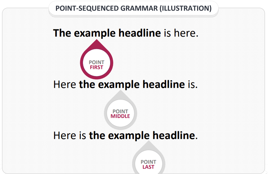
There are three types of sentences: point first, point middle, and point last.


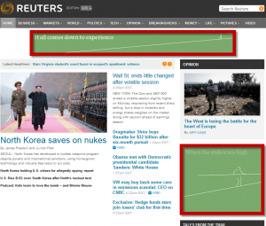
Creative Sample #1: Illustration of point-sequenced grammar

Essentially, when you write a point-first headline, you are leading with the information that is most appealing and relevant to the reader. So placing the main point of value for the customer in the front of the sentence increases the probability it will be read and understood by potential customers. For this reason, the best-performing headlines are typically point first.

Writing a point-first headline is the equivalent of the inverted pyramid in journalism. Writing a story this way encourages the reporter to put the most newsworthy info first.

Another journalistic saying that is very applicable to a point-first headline is “Don’t bury the lede.” In other words, make sure the most newsworthy part of the story is front and center. For marketing, “most newsworthy” translates to “main point of value to the customer.”


A headline experiment

MECLABS Institute worked with a survey company to research which headlines would be most effective to recruit panelists to take surveys (MECLABS is the parent organization of MarketingSherpa).

The experiment tested a series of point-first and point-last headlines. Below you can see each headline along with its conversion rate and relative difference compared to the control (original) headline. We’ve also underlined the main point in each headline.

Point-first headlines

  • Get Paid to Take FREE Surveys: 28.76% conversion rate, 10.44% relative difference
  • Here’s Your First Survey, and an Invitation to Join Our Research Community: 28.35% conversion rate, 8.97% relative difference
  • Get Paid to Fill Out Online Surveys: 27.98% conversion rate, 7.46% relative difference
  • Get Rewarded for Your Opinion: 27.92% conversion rate, 7.23% relative difference
  • Surveys – Quick, Easy and FREE: 27.52% conversion rate, 5.67% relative difference
  • Win Cash & Prizes for Online Surveys: 27.37% conversion rate, 5.12% relative difference

Point-last headlines

  • Set Up Your FREE Account Today and Start Earning Money!: 27.35% conversion rate, 5.03% relative difference
  • You’re Invited to Join the [Company Name] Community and to Earn Rewards For Your Opinions: 27.14% conversion rate, 4.24% relative difference
  • Join the [Company Name] Community and Have Your Opinions Count: 26.92% conversion rate, 3.36% relative difference
  • Take Online Surveys From Home and Win Cash & Prizes: 26.81% conversion rate, 2.95% relative difference

As you can see, point-first headlines tended to outperform point-last headlines.

While no point-middle headlines were included in this experiment since they tend to underperform both point-first and point-last headlines, here are a few examples of what point-middle headlines for this landing page might look like.

Point-middle headlines

  • Sign up today and get paid to take free surveys
  • Take free surveys and get rewarded for your opinion
  • Share your opinions and win cash with online surveys

As these examples show, the main value to the customer is easier to overlook in a point-middle headline.


Page Templates That Work

The tendency for point-first headlines to outperform point-last and especially point-middle headlines (all else being equal) led MECLABS to recommend to marketers that you should test point-first headlines on your landing pages.

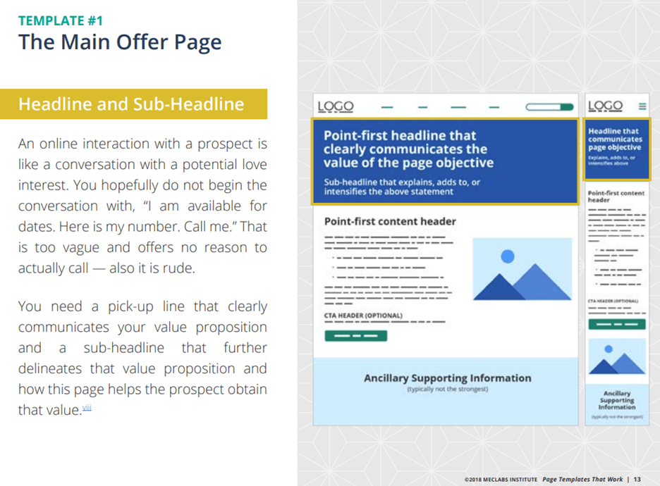
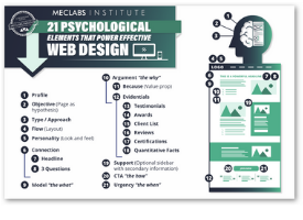
In the free resource Page Templates That Work: Improve conversions with these scientifically proven webpage templates, the templates advise marketers to use a “Point-first headline that clearly communicates the value of the page objective.”


Creative Sample #2: Excerpt from Page Templates That Work

Creative Sample #2: Excerpt from Page Templates That Work

You can follow Daniel Burstein, Senior Director, Content & Marketing, MarketingSherpa and MECLABS Institute, on Twitter @DanielBurstein.


If you are interested in point-first headlines, you might also like…

Copywriting: See immediate lifts by applying these 5 principles to your headlines

Headline Optimization: How testing 10 headlines revealed a 3-letter word that improved conversion more than major changes

Email Marketing: 3 letters to drive subject line success


If you are interested in entry-level marketing content, you might also like…

Marketing 101: What is funnel creation?

Marketing 101: What is PPC in marketing?

The Beginner’s Guide to Digital Marketing: 53 articles (and 1 video) to help with onboarding

Ask MarketingSherpa: How to get high-paying customers and clients

September 6th, 2018

We frequently receive questions from our email subscribers asking marketing advice. Instead of hiding those answers in a one-to-one email communication, we occasionally publish edited excerpts of some of them here on the MarketingSherpa blog so they can help other readers as well. If you have any questions, let us know.

Dear MarketingSherpa: I am so happy I came across your site. Just flipping through and reading this email alone convinced me I’ll learn a lot from you. I am also grateful for the high-value report, I have downloaded it and will schedule time to really consume it.

My current challenge in my business is how to package my services for high-profile clients and charge them the premium fees for what I am worth. My business suffers from [in]consistent cashflow and high-paying clients.

I appreciate your help in transforming my businesses to target the affluent.

Dear Reader: So glad you found it helpful. Here are a few pieces of advice to help you overcome your challenges. This is a very frustrating challenge I’ve heard expressed by business leaders and companies ranging from ecommerce sites to consulting firms.

To charge premium fees you must have a powerful and unique value proposition.

What you offer must be appealing, however, in your situation where you are able to sell the service but must sell it at a low price, the likely culprit is lack of exclusivity in your value proposition.

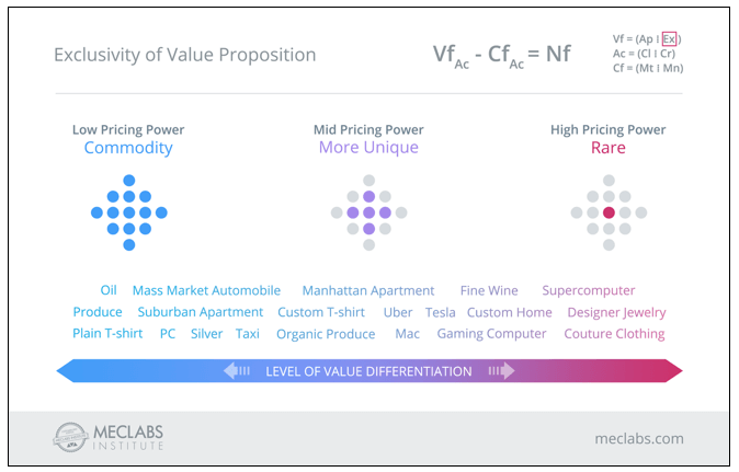
To illustrate the point, I worked with James White, Senior Designer, MECLABS Institute (parent research organization of MarketingSherpa), on the below visual. Let’s walk through it.

The letters in the equation-looking grouping in the upper right are from the MECLABS Net Value Force Heuristic, a thought tool based on almost 20 years of research to help you understand which elements to adjust to increase the force of a value proposition. As you can see, exclusivity isn’t the only element of a forceful value proposition.

To the left are products and services with a low level of value differentiation. And to the right are products with a high-level of value differentiation.

Read more…

Marketing 101: What is a vanity link (or vanity URL)?

September 15th, 2017

Marketing has a language all its own. This is our latest in a series of posts aimed at helping new marketers learn that language. What term do you find yourself explaining most often to new hires during onboarding? Let us know.

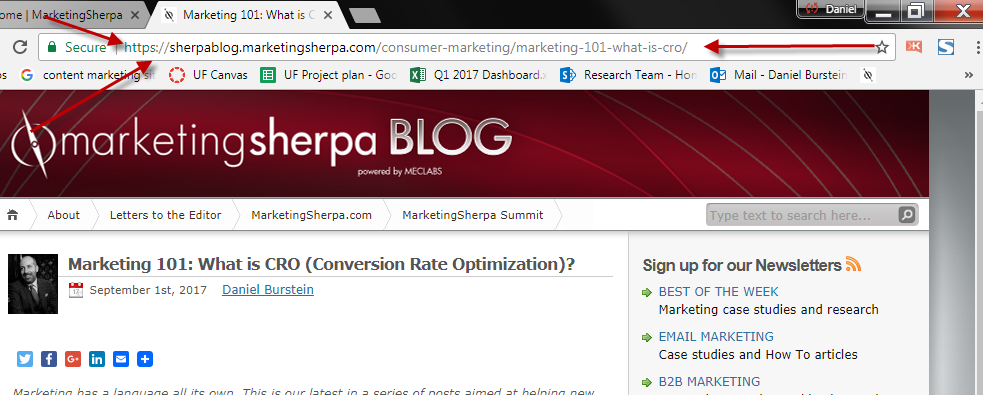
A vanity link is a URL that is in plain English and very easy for a potential web visitor to type in. URL is an acronym for Uniform Resource Locator — the webpage address. Every page on the World Wide Web has a URL, even this one. To find the URL of any webpage, simply look in the browser bar at the top.

Vanity links make it easier for people to visit your landing pages

If you’re sending people to a landing page, blog post or online article from a webpage, it’s easy enough to use a hyperlink — like this — to allow your visitors to click and visit the other page.

However, there are times when you would like to create a call-to-action to a webpage that readers or listeners will actually have to type into a web browser themselves. An example might be a TV or radio ad. Or a print advertisement. For this reason, a vanity link isn’t technically a “link” at all, but rather a URL (i.e., the web address).

For example, the URL for our customer satisfaction study is fairly easy compared to some URLs: http://www.marketingsherpa.com/freestuff/customer-first-study

However, why put that on the customer? It’s in the “Free Stuff” section of MarketingSherpa, so that’s why those words are in the URL. But why make the customer type that in? Or even the hyphens between “customer” and “first” and “study.” The HTTP and www aren’t necessary either.

When we wanted to direct someone to that website and couldn’t use a link, we created this simple vanity URL: MarketingSherpa.com/ConsumerStudy

Notice how much easier that is to type in and remember. Also notice the camel casing — I made the first letter of each word a capital letter so the URL is easier to read and remember, although visitors could type the URL with all lowercase letters and still get to the webpage.

Read more…

Landing Page Optimization: Which ninja turtle is your page?

April 12th, 2016

Turtle SketchAssuming you don’t live in a shell, you have probably seen or heard of the Teenage Mutant Ninja Turtles. They’re the immensely popular superhero group that began as a comic in the 80s, and reached peak popularity in the 90s, and to this day, maintains a cult following with children and adults alike.

Even as fun and interesting as the premise is, we can still ask the question: Why have they stayed so popular over the years?

My take is it’s because of the characters.

The dynamic brothers, consisting of Leonardo, Raphael, Donatello and Michelangelo, have so much variety in their personalities, which allows them to approach problem-solving situations in any multitude of ways. This also allows for a lot of creative freedom on the creators’ end.

Personality is what captures an audience, as well as builds a brand.

Your landing page has, or can have, just as much personality as a character, whether you realize it or not. Below are four different characteristics of landing pages, named after the four different turtles:

  • Leo:  clear, simple, collected, peaceful
  • Raph:  aggressive, loud, attention-grabbing, urgent
  • Donnie:  calm, intelligent, factual, to-the-point
  • Mikey: fun, silly, lighthearted, nonchalant, social

Read more…

3 Strategies for Overcoming Banner Blindness

January 19th, 2016

To be honest, I don’t even see them most of the time. It is as if the top and sides of the webpage I’m looking at are blurred—I know they’re there, but I don’t even notice them. For this, I thank “banner blindness.”

Banner blindness is the result of templated or “best practice” page layouts that place banner ads in specific places, such as the very top center of the page or on the far right side of the page. See the red boxes below:

common-ad-layout


Why is it called “blindness”?

The ad is there, but we ignore it because our minds have “seen that, done that” so many times before. We have established the typical banner areas as distracting from our goal on the page.

As marketers, if we are stuck in these blind areas, what can we do to increase the effectiveness of our banner ads? For questions like this, I always like to refer to the MECLABS Institute’s (MarketingSherpa’s parent company) Online Ad Sequence  heuristic for guidance:  

Read more…

3 Tips to Improve Your Marketing from Doctor Who

August 22nd, 2014

(Editor’s note: Courtney Eckerle, Manager of Editorial Content, MarketingSherpa, also contributed her knowledge – and love of “Doctor Who” – to this blog post.)

There are a lot of nerds in our office, and if you’ve read this blog for any length of time, this is probably not news to you. Recently, we’ve realized something nerds everywhere have known for a long time – we are not alone.

In our case studies, blogs and events, we’ve seen how other marketers utilize pop culture to help convey complex ideas – for instance, emergency alert systems provider One Call Now used “Star Trek” characters to represent its customer personas.

Since we have seen the success others have had, we wanted to try this idea out for ourselves using an office favorite: BBC’s science fiction cult classic “Doctor Who,” which is having its latest series premiere on August 23.

doctor-who

For those who are unfamiliar, the titular Doctor is a Time Lord (a time-traveling alien species very similar to humans) who faces various foes in attempts to save civilizations and right wrongs using intellect over force while exploring all of time and space.

Intellect over force is a driving principle behind our work here – marketing through testing and optimization over gut feelings and intuition.

Read on for three tips we’ve taken to heart from “Doctor Who” about how to make the customer your companion in your marketing efforts.


Tip #1. Test every (seemingly) insignificant thing

Doctor: Stone dust.

Kate: Is it important?

Doctor: In 1,200 years, I’ve never stepped in anything that wasn’t. … Now, I want this stone dust analyzed. And I want a report in triplicate, with lots of graphs and diagrams and complicated sums on my desk, tomorrow morning, ASAP, pronto …

Doctor Who,” The Day of the Doctor, 2013

Every single thing, down to the dust he has stepped on, is something the Doctor considers important. He’s been testing, scanning and analyzing all of his surroundings for 1,200 years.

You may think that you know the answer to every question anyone could ask about your customers. But when you begin testing, you could discover that you’ve totally overlooked a simple concept that was right under your nose (or boots).

For example, at MarketingSherpa Lead Gen Summit 2013 in San Francisco, Jon Ciampi, Vice President Marketing, Corporate Development, Business Development and Strategic Accounts, CRC Health, presented a case study where his team tested what they considered to be best practices.

They took their control page of concise copy with an above the fold call-to-action, and created a treatment full of copy with a below the fold call-to-action.

What Jon and his team discovered was an “aha moment,” realizing that not only had the treatment outperformed the control by 220%, but they hadn’t understood their customers’ motivations at all.

While they had been promoting luxury and statistics, it took one test to realize that customers weren’t asking, “What is your doctor-to-patient ratio?” but rather, “Can I trust you with my loved one?”

“We test in the eternal hope that we can possibly understand the motivations of our customers and adjust our practices accordingly,” Jon summed up in his presentation.

Read more…