Archive

Posts Tagged ‘landing page optimization’

AI-driven Test Ideation: How to get ideas for your marketing experiments (the easy way)

April 23rd, 2024

I’ve been writing about A/B testing for 15 years at Meclabs (MarketingSherpa is part of Meclabs, as is MarketingExperiments). And one of the most common challenges I’ve heard is – ‘what do I test next?’

Because A/B testing isn’t all that hard to get the hang of. And once you catch the bug and see how it can move the needle and help you learn about and better serve customers – marketers and entrepreneurs want to keep testing.

But we’re only human. And eventually the well runs dry. ‘So what the heck should I test next?’

Enter the biggest marketing buzzword of 2024 (and 2023 as well) – artificial intelligence.

But unlike a buzzword that covers up for vaporware, AI is legit when it comes to test ideation. Because unlike me and you, it isn’t human (sorry bots reading this post, you are not part of my target audience).

So AI is a never-ending font of ideas. Are they all amazingly good? No.

But Paul McCartney originally sang “Scrambled Eggs” instead of “Yesterday,” “The Breakfast Club” was going to be called “The Lunch Bunch,” and Jane Austen came up with the title “First Impressions” before she settled on “Pride and Prejudice.”

Brilliance isn’t obvious at first. It takes a lot of ideas to get there.

Which, again, AI has. So the next time you’re struggling with a test idea, give it a shot.

Here’s an example. I’m co-teaching ‘MEC 300: Develop Your Creative’ in the AI Guild. This isn’t just meant to be training; it’s meant to guide you to build your own funnel. So between each class there is a ‘Build Your SuperFunnel’ activity (I didn’t want to call it ‘homework,’ after all, these are all adult professionals).

Read more…

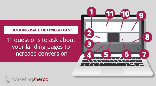
Landing Page Optimization: 11 questions to ask about your landing pages to increase conversion

March 12th, 2020

We frequently receive questions from our email subscribers asking marketing advice. Instead of hiding those answers in a one-to-one email communication, we occasionally publish edited excerpts of some of these conversations here on the MarketingSherpa blog so they can help other readers as well. If you have any questions, let us know.

While most of those questions are to a general MarketingSherpa customer service inbox, this email was sent directly to Flint McGlaughlin, Managing Director and CEO, MECLABS Institute (parent organization of MarketingSherpa). The email has been stripped of any identifying information but includes general information that will likely be helpful to many of our readers.


Dear Flint McGlaughlin: I have been watching your videos, including:

Based on these videos, I’ve been putting together a treatment on our current landing page. We did not change much design-wise, but the main points I’ve tried to address are:

  • Changing the personality of the page … i.e., toning down the direct-marketing “hype” voice on the page and presenting information more objectively
  • Communicating the value proposition in a way that hopefully is more credible
  • Using short testimonials to make specific claims instead of just bullets by an anonymous copywriter
  • Trying to increase the overall credibility of the page with more evidence spread throughout —not just in the form of testimonials but also data on the underlying science, quantitative evidence, customer satisfaction and awards.

I am wondering if you might be willing to look at it and give me your immediate feedback and perhaps refer me to anything in your videos or book which I might not be understanding or using correctly.

I am not looking for free copy editing, more just feedback whether it looks like I am applying these principles correctly or not. Obviously testing is going to help determine if we have the right value proposition and appeal.

If you have a chance to do this, I would be extremely grateful 🙂 Thank you!


And here is Flint’s (generalized) response, which I thought would be helpful for many marketers, especially anyone focused on conversion rate optimization or landing page optimization…

Read more…

Ask MarketingSherpa: Value proposition layers versus communicating the value prop concisely

August 1st, 2019

We frequently receive questions from our email subscribers asking marketing advice. Instead of hiding those answers in a one-to-one email communication, we occasionally publish edited excerpts of some of them here on the MarketingSherpa blog so they can help other readers as well. If you have any questions, let us know.


Dear MarketingSherpa: Thanks for the great resources. I have been in touch in the hopes of getting some direct support around our value proposition.

We’ve taken insights from the Value Proposition course (and Flint’s new book) and redesigned our site (note, we haven’t yet implemented these new designs).

Is it common to present the value proposition in layers or should it be communicated more concisely? How early in the user journey should the value proposition be presented? Is it typically done on the homepage? Do you have examples of companies successfully implementing the value proposition in this way? How did they guide users through the value prop from the homepage?

Thanks so much for your insights!


Dear Reader: Thanks for your email, and glad to hear you’re working on getting some direct support.

I’m also glad to hear you’ve taken some insights from the value prop course and Marketer as Philosopher book for your site redesign. If you’d ever like to share some of that work publicly to help other marketers and product managers and get some recognition for you and your team, please let me know. Happy to consider it for a MarketingSherpa article. Here are some examples:

Read more…

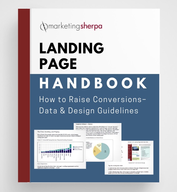
Landing Page Optimization: Original MarketingSherpa Landing Page Handbook now available for free download

June 13th, 2019

I recently received an email from a MarketingSherpa reader asking how he could point people to the Landing Page Handbook. He ended the email by saying …


“I still think the Landing Page Handbook is the best resource on the topic that has ever been produced.”

— Ken Molay, President, Webinar Success


And the data shows it. The MarketingSherpa Landing Page Handbook is one of the most popular resources we have offered in 20 years of publishing. So we dug into our archives, and are now offering this handbook free to you, the MarketingSherpa reader.


Since it’s publication over a decade ago, the Landing Page Handbook has been a frequently cited resource throughout the years. Some examples:


CLICK HERE TO DOWNLOAD YOUR FREE LANDING PAGE HANDBOOK


And of course, generated plenty of discussions when its second edition was released in 2007:


When it was first released, it elicited these testimonials:

This book is astonishing and you should read it. It’s astonishing because it will tell you very obvious things that you don’t know, didn’t realize and weren’t taking action on. As the person who invented the term Landing Page in 1995 (right after Al Gore invented the internet) I can tell you that we’ve waited a long, long time for this sort of common sense, hands on, verified info. The bad news is that you are now out of excuses.

— Seth Godin, Author, www.SethGodin.com


“I wanted to drop you a note telling you how incredible your Landing Page Handbook is. The handbook is clear about what works and what doesn’t work with loads of data to support its claims. I am in the process of implementing changes and fully expect massive improvements to my metrics. Once again, you have shown why MarketingSherpa is the only source we need to improve our Web presence.”

— Brett Hayes, RentQuick.com


“I want to thank you for putting out the landing page handbook. I found that document instrumental in getting one of our clients a 400% lift in conversion response.”

— Elliott Easterling, VP Sales and Marketing, Co-Founder, Red Bricks Media, www.redbricksmedia.com


“My honest advice? Buy this report, copy what others have done to increase their landing page conversion rates, and make more money. It’s as simple as that.”

— Nick Usborne, Publisher, www.excessvoice.com


“I bought the Landing Page Handbook. I was in two minds about buying it for ages. I am a one-man band so $250 is a lot when your sales are so low. Within the first 50 pages I was 10 for 10 on the common mistakes made on landing pages. I started applying the book’s recommendation to my site. I have gone from +-1 sale a week up to 3 a day and climbing consistently for the past 3 weeks. All the ‘Experts’ told me to up my spend on Adwords to up sales and I did. I now realize I was just wasting my money till I read this book and made the changes. Great book, worth every cent.”

— Peter Mercer, Director, Network & Perimeter Security Services

Read more…

MarketingSherpa Podcast #5: Ten things you should think about before you do your next website redesign

April 25th, 2019

Education is the ability to use other people’s experiences (mistakes) to avoid making your own mistakes.

In that spirit, we prep you for avoiding some serious potholes on your journey while taking on that biggest of digital marketing projects — a website redesign. You can listen to this episode in whichever way is most convenient for you — or click the orange “Subscribe” button to get every episode. And scroll down to read more about website redesigns.

This article was originally published in the MarketingSherpa email newsletter.


Listen to the podcast audio: Episode 5 (Right mouse click to download)


More About Episode #5 — Website redesign

“The point is: You get to capitalize on a fellow human being’s misfortune. That’s the basis of real estate.”

The above quote is from “The Money Pit,” the 1986 comedic movie where Tom Hanks and Shelley Long attempt to renovate a recently purchased home to comedic effect. Or tragic effect, depending on your point of view. After all, as Mark Twain said, “Humor is tragedy plus time.”

If you’ve ever been in charge of a web redesign project, you might think that “The Money Pit” was just a prescient allegory for a web redesign project.

After all, your company’s website is its most prime real estate. And if your site is old or large, once you start diving into a redesign project you never know quite what surprises you will unearth.

To help you avoid pitfalls with your own web redesign (both tragic and comic), Austin McCraw and I delved into 10 considerations you should keep in mind for your web redesign projects (while providing a few light house-remodeling tips as well).

We’re giving you this advice from the marketer’s point of view — not the (website or real estate) developers’ point of view. So before you create a web redesign project plan, watch out for these things (time stamps included if you would like to jump around):

Read more…

Ask MarketingSherpa: Mapping the prospect conclusion funnel [includes free PDF example]

August 29th, 2018

We frequently receive questions from our email subscribers asking marketing advice. Instead of hiding those answers in a one-to-one email communication, we occasionally publish some of them here on the MarketingSherpa blog so they can help other readers as well. If you have any questions, let us know.

Dear MarketingSherpa: Hi Daniel, I’m following up on the conversation started on Twitter about your blog post. My questions are:

– What was the main realization that took you to write this article?

– Do you think that this works for businesses in any industry? For example, some businesses are mostly offline, is it wise to invest time in creating a funnel for those as well?

FYI, this is the article I’m talking about — Marketing 101: What is funnel creation?

Looking forward to hearing back from you.

Thanks.

Dear Reader: I wrote the article because I received questions following the publication of this article: Website Development: How a small natural foods CPG company increased revenue 18% with a site redesign

Yes, the funnel works for any fairly complex purchase. This was true before the internet. Think about buying a car before the internet. First you saw the ad. Then maybe you filled out a business reply (BRC) card. Got invited in for a test drive. Test drove cars at competitors. Get to price negotiations. Etc, etc.

The funnel is a human decision-making phenomenon

I’ll go a step further. The funnel works for any fairly complex human decision, not just purchases, and certainly not just online. For example, you don’t instantly decide someone you meet in college is going to be your best friend. There’s a process.

And that begins with exposure to that person in the first place. You made micro-decisions to attend the same club meeting that person did, you approached them after the meeting, you had a good conversation, you invited them to hang out with your buddies, your buddies liked that person (third-party verification), you hung out more and more, you confided trust in that person (form fill with annual revenue info), that person confided trust in you … 40 years down that funnel, your best friend is giving a toast at your daughter’s wedding (the final purchase).

In a vacuum, the funnel still exists

The reader asked if it is it wise to create a funnel. It’s important to note that the funnel exists whether you choose to actively manage it or not. Take the example above. Your best friend didn’t choose to create a funnel to end up giving a toast at your daughter’s wedding. There were a set of decisions that you naturally made to get to that point.

It’s the same with the buyer’s journey. If you’re selling a car, there are a series of decisions a buyer will make on the path to deciding whether to purchase that car, whether you’ve set up a funnel or not.

What you can do is try to discover what these paths to purchase are, and then how you can use your marketing, sales and other resources to help them make that decision.

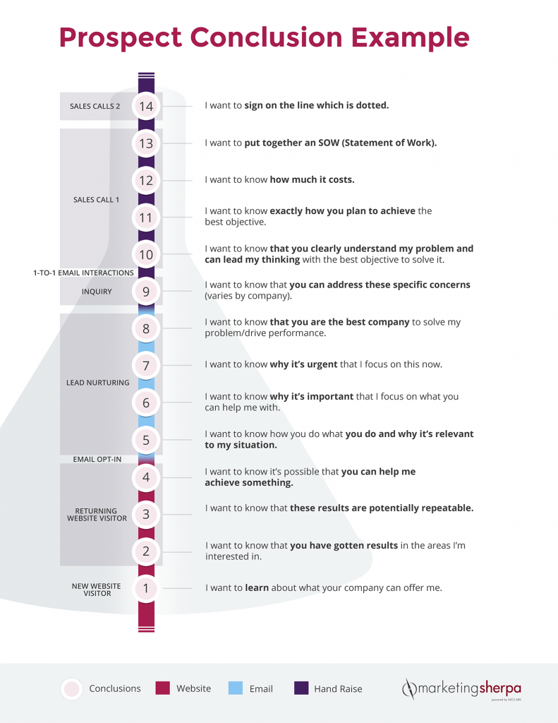
Let’s look at an example where we map business activities in a funnel to a set of conclusions a prospect has to reach for a B2B services contract.

Prospect conclusion funnel example

[Click here for an instant, free download of a PDF version of the Prospect Conclusion Funnel Example]

Let’s break down the example.

Read more…

Marketing 101: What is website usability?

April 19th, 2018

Marketing has a language all its own. This is our latest in a series of posts aimed at helping new marketers learn that language. What term do you find yourself explaining most often to new hires during onboarding? Let us know.

Simply put, website usability is how easy, clear and intuitive it is for visitors to use your website. This is from the visitor’s perspective, not your company’s perspective.

Of course, website usability isn’t so simple at all. You essentially have to read someone else’s mind, so the expected user experience matches the web experience you design. However, as 18th-century poet Robert Burns wrote, “The best-laid plans of mice and men / Go oft awry.”

As I said, you’re trying to read someone else’s mind (many people, in fact). So the challenges of web usability aren’t necessarily unique to the web. These challenges are the very fundamentals of human behavior and interaction. Here’s a very visual example that UXer Oliver McGough shared on Twitter …

There are many terms related to website usability that you might have heard:

  • User experience — how people experience your website. This may be very different than you intended because you may not be able to take an outside perspective of your website and assume visitors will understand something that they don’t, or understand differently, from you (more on this in a bit).
  • User experience design (or UX) — the practice of creating websites, computer programs, apps, etc. with the user in mind. UX can also be used as shorthand for website usability. (e.g., “That site has good UX.”)
  • User interface (UI) — where man meets machine. For example, an operating system has a graphical user interface. UI continues to evolve and isn’t always visual. Thanks to virtual assistants like Alexa, the human voice now interacts with a UI as well.
  • Usability — in general. This is, after all, broader than just websites. Any digital offering has (or lacks) usability, from a website to a computer game. But physical objects have usability considerations as well. For example, OXO is a company that is well known for kitchen utensils and housewares usability. When I first learned about usability, the instructor used a car brake pedal as an example. I had never noticed before, but it is a lot wider than the gas pedal for a reason. If you’re accidentally going to stomp on one of them, it’s better to be the stop than the accelerate!
  • User testing — Get your visitors’ opinions about what works well on the site and what doesn’t, what processes and mechanisms are intuitive and which are confusing
  • A/B testing — Measuring your visitors’ behavior to see how well they are able to actually use the site, and if the actual user experience matches the intended website design

Read more…

Marketing 101: What is above the fold?

March 2nd, 2018

Marketing has a language all its own. This is our latest in a series of posts aimed at helping new marketers learn that language. What term do you find yourself explaining most often to new hires during onboarding? Let us know.

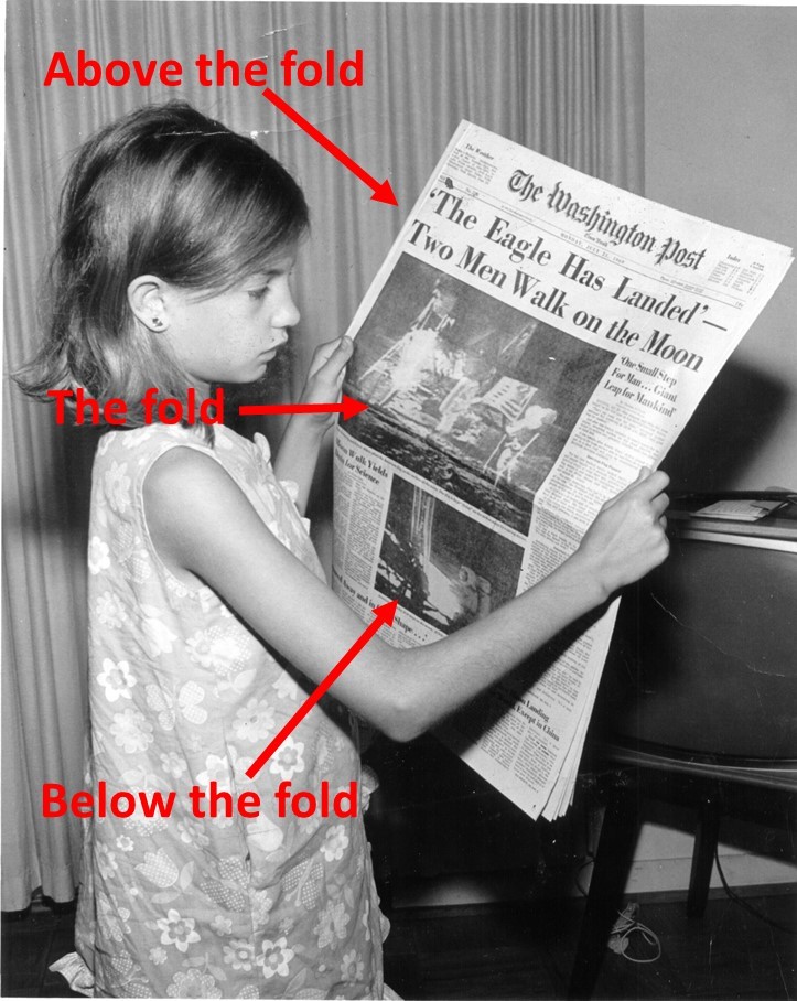
Above the fold refers to the part of an email message or webpage that is visible without scrolling. It refers to a printing term for the top half of a newspaper which is, literally, above the place in the newspaper where it is folded in half.

Unlike a newspaper, however, email and webpage fold locations aren’t predictable. The fold may be affected by the user’s preview pane, monitor size, monitor resolution, device type (i.e., mobile vs. desktop) and any headers placed by email programs such as Gmail or Yahoo!

Material in the above-the-fold area is considered more valuable because the reader sees it first. According to the Wikipedia entry for Above the fold, “Most web design advice available today encourages designers to place important information at the top of the website, but also to prioritize usability and design.”

Read more…

Call-to-Action Optimization: 132% increase in clickthrough from changing four simple words

February 14th, 2018

Think of all the money you invest in attracting customers before they even get to the call-to-action … buying media or traffic, designing websites and landing pages, crafting just the right offer.

If you can squeeze just a bit higher conversion rate out of your calls-to-action (CTAs), it increases the ROI on the rest of your marketing investment.

And that’s just a few percent. What about more than doubling the conversion of that CTA? Without the need for any IT or development resources?

A recent experiment MECLABS Institute (parent research organization of MarketingSherpa) ran with a Research Partner did just that. Let’s walk through the simple word changes and what you can learn from them as you craft your own calls-to-action and button copy.

Experiment design

This experiment was a landing page test that encouraged people to get a physical copy of a textbook mailed to them. These people are decision makers. They choose a product that will lead to significant product sales from others. By getting the sample in these decision makers’ hands, they are more likely to select this product and, therefore, drive significant sales.

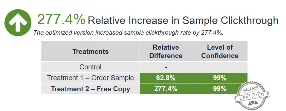
The experiment had a control and two treatments. There were several differences between the control and the treatments including changing the image, headline and call-to-action. Both treatments improved clickthrough rate (CTR), with the second treatment generating a 277% increase in CTR at a 99% level of confidence.

That clickthrough increase carried its way through the funnel to an increase for the final conversion as well — an 82% increase in conversion for Treatment 2 at a 99% level of confidence.

But here’s where it gets more interesting. While the team changed several variables between the control and the treatments, they only changed a single variable between Treatment 1 and Treatment 2 — the call-to-action — to discover the impact of the CTA wording.

Read more…

Marketing 101: What is a vanity link (or vanity URL)?

September 15th, 2017

Marketing has a language all its own. This is our latest in a series of posts aimed at helping new marketers learn that language. What term do you find yourself explaining most often to new hires during onboarding? Let us know.

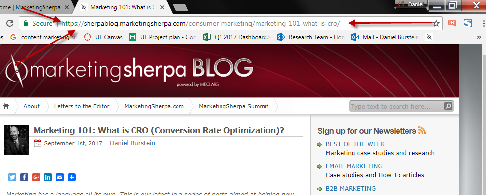
A vanity link is a URL that is in plain English and very easy for a potential web visitor to type in. URL is an acronym for Uniform Resource Locator — the webpage address. Every page on the World Wide Web has a URL, even this one. To find the URL of any webpage, simply look in the browser bar at the top.

Vanity links make it easier for people to visit your landing pages

If you’re sending people to a landing page, blog post or online article from a webpage, it’s easy enough to use a hyperlink — like this — to allow your visitors to click and visit the other page.

However, there are times when you would like to create a call-to-action to a webpage that readers or listeners will actually have to type into a web browser themselves. An example might be a TV or radio ad. Or a print advertisement. For this reason, a vanity link isn’t technically a “link” at all, but rather a URL (i.e., the web address).

For example, the URL for our customer satisfaction study is fairly easy compared to some URLs: http://www.marketingsherpa.com/freestuff/customer-first-study

However, why put that on the customer? It’s in the “Free Stuff” section of MarketingSherpa, so that’s why those words are in the URL. But why make the customer type that in? Or even the hyphens between “customer” and “first” and “study.” The HTTP and www aren’t necessary either.

When we wanted to direct someone to that website and couldn’t use a link, we created this simple vanity URL: MarketingSherpa.com/ConsumerStudy

Notice how much easier that is to type in and remember. Also notice the camel casing — I made the first letter of each word a capital letter so the URL is easier to read and remember, although visitors could type the URL with all lowercase letters and still get to the webpage.

Read more…