Archive

Posts Tagged ‘Online Marketing’

Inbound Marketing: Do you care about the quality of your brand’s content?

August 20th, 2019

If I had to break down the world of content marketing into two groups, it would be these:

  • Those who care about the quality of their content
  • And those who don’t

Ouch. Seeing those words in writing, my statement is a little harsh. So let me try to rephrase:

  • Those who only see content as a means to an end
  • And those who view content as an (often free) product that should have value in and of itself

To further refine this split, we could say there are two content marketing approaches we can simply label:

  • Quantity
  • Quality

Of course, every piece of content offers some level of value. You need a certain level of consistent production for even the most high-quality content. And there are shades of gray between the two extremes.

That said, I’ve noticed more and more of a focus on the “high quantity/means-to-an-end” approach as the content marketing industry has matured. Brands that seem like they don’t care about the quality of the content they’re producing, or at least not nearly as much as the volume. I thought this would make a fitting topic of exploration in today’s MarketingSherpa blog post.

This article was originally published in the MarketingSherpa inbound newsletter.

Content pollution

Content marketing has shown impressive growth as a marketing tactic. One reason for that is the proliferation of digital platforms and the growth of computing power allowing for less expensive production of content.

If you’ve ever listened to a talk by content guru Joe Pulizzi, you know that content marketing isn’t necessarily new. But when the means of production transitioned from a printing press and six-figure Avid system to a free blogging platform and smartphone, it was inevitable for content marketing to grow.

But there’s another reason it grew as well. It was effective. And it was effective because it was disruptive.

The traditional advertising and marketing model was built around selling to the prospective customer. The core of content marketing is helping the customer. When done well, customers sell themselves.

The low barriers to entry and “free” cost compared to paid media led to explosive growth in the amount of content. This has created plenty of helpful content. But content creation has also been used as part of a major quantity push by companies viewing it as a means to an end to attract traffic.

Read more…

Ask MarketingSherpa: Value proposition layers versus communicating the value prop concisely

August 1st, 2019

We frequently receive questions from our email subscribers asking marketing advice. Instead of hiding those answers in a one-to-one email communication, we occasionally publish edited excerpts of some of them here on the MarketingSherpa blog so they can help other readers as well. If you have any questions, let us know.


Dear MarketingSherpa: Thanks for the great resources. I have been in touch in the hopes of getting some direct support around our value proposition.

We’ve taken insights from the Value Proposition course (and Flint’s new book) and redesigned our site (note, we haven’t yet implemented these new designs).

Is it common to present the value proposition in layers or should it be communicated more concisely? How early in the user journey should the value proposition be presented? Is it typically done on the homepage? Do you have examples of companies successfully implementing the value proposition in this way? How did they guide users through the value prop from the homepage?

Thanks so much for your insights!


Dear Reader: Thanks for your email, and glad to hear you’re working on getting some direct support.

I’m also glad to hear you’ve taken some insights from the value prop course and Marketer as Philosopher book for your site redesign. If you’d ever like to share some of that work publicly to help other marketers and product managers and get some recognition for you and your team, please let me know. Happy to consider it for a MarketingSherpa article. Here are some examples:

Read more…

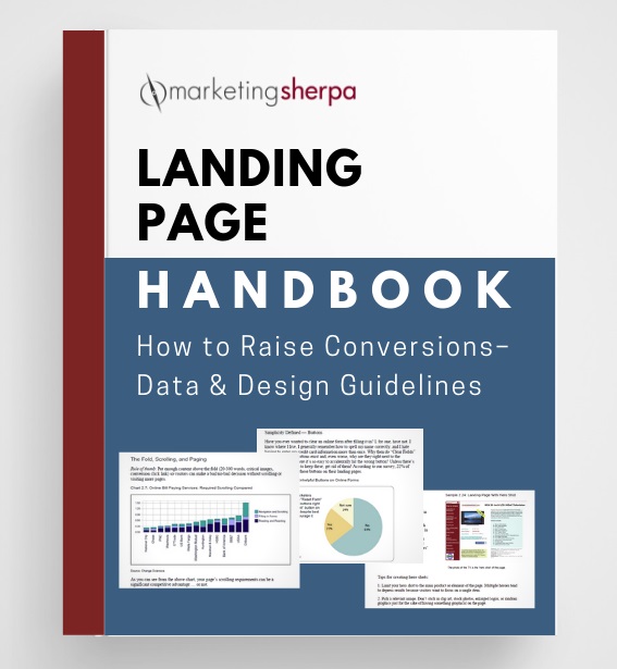
Landing Page Optimization: Original MarketingSherpa Landing Page Handbook now available for free download

June 13th, 2019

I recently received an email from a MarketingSherpa reader asking how he could point people to the Landing Page Handbook. He ended the email by saying …


“I still think the Landing Page Handbook is the best resource on the topic that has ever been produced.”

— Ken Molay, President, Webinar Success


And the data shows it. The MarketingSherpa Landing Page Handbook is one of the most popular resources we have offered in 20 years of publishing. So we dug into our archives, and are now offering this handbook free to you, the MarketingSherpa reader.


Since it’s publication over a decade ago, the Landing Page Handbook has been a frequently cited resource throughout the years. Some examples:


CLICK HERE TO DOWNLOAD YOUR FREE LANDING PAGE HANDBOOK


And of course, generated plenty of discussions when its second edition was released in 2007:


When it was first released, it elicited these testimonials:

This book is astonishing and you should read it. It’s astonishing because it will tell you very obvious things that you don’t know, didn’t realize and weren’t taking action on. As the person who invented the term Landing Page in 1995 (right after Al Gore invented the internet) I can tell you that we’ve waited a long, long time for this sort of common sense, hands on, verified info. The bad news is that you are now out of excuses.

— Seth Godin, Author, www.SethGodin.com


“I wanted to drop you a note telling you how incredible your Landing Page Handbook is. The handbook is clear about what works and what doesn’t work with loads of data to support its claims. I am in the process of implementing changes and fully expect massive improvements to my metrics. Once again, you have shown why MarketingSherpa is the only source we need to improve our Web presence.”

— Brett Hayes, RentQuick.com


“I want to thank you for putting out the landing page handbook. I found that document instrumental in getting one of our clients a 400% lift in conversion response.”

— Elliott Easterling, VP Sales and Marketing, Co-Founder, Red Bricks Media, www.redbricksmedia.com


“My honest advice? Buy this report, copy what others have done to increase their landing page conversion rates, and make more money. It’s as simple as that.”

— Nick Usborne, Publisher, www.excessvoice.com


“I bought the Landing Page Handbook. I was in two minds about buying it for ages. I am a one-man band so $250 is a lot when your sales are so low. Within the first 50 pages I was 10 for 10 on the common mistakes made on landing pages. I started applying the book’s recommendation to my site. I have gone from +-1 sale a week up to 3 a day and climbing consistently for the past 3 weeks. All the ‘Experts’ told me to up my spend on Adwords to up sales and I did. I now realize I was just wasting my money till I read this book and made the changes. Great book, worth every cent.”

— Peter Mercer, Director, Network & Perimeter Security Services

Read more…

Marketing 101: What is website usability?

April 19th, 2018

Marketing has a language all its own. This is our latest in a series of posts aimed at helping new marketers learn that language. What term do you find yourself explaining most often to new hires during onboarding? Let us know.

Simply put, website usability is how easy, clear and intuitive it is for visitors to use your website. This is from the visitor’s perspective, not your company’s perspective.

Of course, website usability isn’t so simple at all. You essentially have to read someone else’s mind, so the expected user experience matches the web experience you design. However, as 18th-century poet Robert Burns wrote, “The best-laid plans of mice and men / Go oft awry.”

As I said, you’re trying to read someone else’s mind (many people, in fact). So the challenges of web usability aren’t necessarily unique to the web. These challenges are the very fundamentals of human behavior and interaction. Here’s a very visual example that UXer Oliver McGough shared on Twitter …

There are many terms related to website usability that you might have heard:

  • User experience — how people experience your website. This may be very different than you intended because you may not be able to take an outside perspective of your website and assume visitors will understand something that they don’t, or understand differently, from you (more on this in a bit).
  • User experience design (or UX) — the practice of creating websites, computer programs, apps, etc. with the user in mind. UX can also be used as shorthand for website usability. (e.g., “That site has good UX.”)
  • User interface (UI) — where man meets machine. For example, an operating system has a graphical user interface. UI continues to evolve and isn’t always visual. Thanks to virtual assistants like Alexa, the human voice now interacts with a UI as well.
  • Usability — in general. This is, after all, broader than just websites. Any digital offering has (or lacks) usability, from a website to a computer game. But physical objects have usability considerations as well. For example, OXO is a company that is well known for kitchen utensils and housewares usability. When I first learned about usability, the instructor used a car brake pedal as an example. I had never noticed before, but it is a lot wider than the gas pedal for a reason. If you’re accidentally going to stomp on one of them, it’s better to be the stop than the accelerate!
  • User testing — Get your visitors’ opinions about what works well on the site and what doesn’t, what processes and mechanisms are intuitive and which are confusing
  • A/B testing — Measuring your visitors’ behavior to see how well they are able to actually use the site, and if the actual user experience matches the intended website design

Read more…

Marketing 101: What is above the fold?

March 2nd, 2018

Marketing has a language all its own. This is our latest in a series of posts aimed at helping new marketers learn that language. What term do you find yourself explaining most often to new hires during onboarding? Let us know.

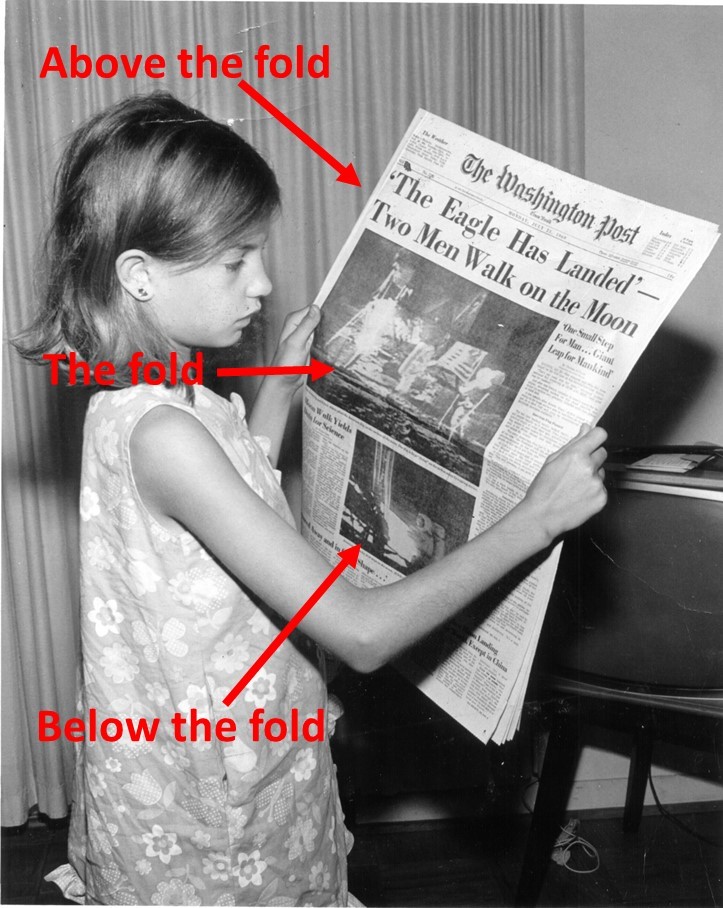
Above the fold refers to the part of an email message or webpage that is visible without scrolling. It refers to a printing term for the top half of a newspaper which is, literally, above the place in the newspaper where it is folded in half.

Unlike a newspaper, however, email and webpage fold locations aren’t predictable. The fold may be affected by the user’s preview pane, monitor size, monitor resolution, device type (i.e., mobile vs. desktop) and any headers placed by email programs such as Gmail or Yahoo!

Material in the above-the-fold area is considered more valuable because the reader sees it first. According to the Wikipedia entry for Above the fold, “Most web design advice available today encourages designers to place important information at the top of the website, but also to prioritize usability and design.”

Read more…

There’s Treasure Everywhere: Turning waste into profit

February 9th, 2018

Hobbes: Why are you digging a hole?

Calvin: I’m looking for buried treasure!

Hobbes: What have you found?

Calvin: A few dirty rocks, a weird root, and some disgusting grubs.

Wait for it … Wait for it …

Hobbes: On your first try??

Calvin: There’s treasure everywhere!

I thought of this cartoon by Bill Watterson (which he also used to name a cartoon collection book) while reading the Harvard Business Review article Searching for New Ideas in the Curious Things Your Customers Do by Taddy Hall and Eddie Yoon.

Turning a waste product into a $500 million brand

Hall and Yoon tell the story of Steve Hughes, now the CEO of Sunrise Strategic Partners. He was walking through a Tropicana factory when he noticed some workers on break taking the excess pulp (a waste product in orange juice production) and mixing it into juice they would drink themselves.

Instead of ignoring the workers or just assuming their behavior was odd, Hughes got curious and asked them about it. They explained that it made the juice taste fresh squeezed. This interaction gave Hughes the idea to launch Tropicana Grovestand  “the taste of fresh-squeezed orange juice,” which after four years became a $500 million brand.

That is just one example of turning waste into profit. Throughout history, curious business people have not only used this process to launch complementary brands in their own company like Hall and Yoon’s Tropicana example, they’ve also launched entirely new companies off their company’s waste (Kingsford was created when Henry Ford turned wood scraps from Model T manufacturing into charcoal briquets) and launched new brands off other companies’ waste (I interviewed TerraCycle CEO Tom Szaky back in 2007, and since then, the company has made everything from pencil cases to furniture out of other brands’ waste).

Read more…

Customer Satisfaction Segmentation: Customer expectations extend beyond the end users of your products

January 26th, 2018

When measuring customer satisfaction after the purchase of your products, it’s all too easy to think of the process in a linear fashion:

  • I produce marketing and advertising that sets an expectation for my product
  • A customer then buys and uses my product
  • I will then ask that customer if they are satisfied with the product

However, while reading Customer Expectations: 7 Types All Exceptional Researchers Must Understand by Scott Smith, Ph.D., as part of my studies in the University of Florida/MECLABS Institute Communicating Value and Web Conversion graduate certificate program, there was a line from Dr. Smith that really stood out to me: “The product purchaser, influencer and user may have each been a different type of individual, each having different expectations.”

Notice he doesn’t just say a different individual, but a different type of individual. The key lesson here is that you should not only segment your marketing but segment your customer satisfaction measurement as well.

And while many B2B marketers will see how this is instantly applicable to them, it likely applies to many B2C and nonprofit marketers as well.

Let’s take a look at each type of customer, with an example for each type of marketer.

                                                                                Photo courtesy Flickr CC Village9991

Read more…

Customers as Value-Creating Partners, Not Just Value-Extraction Targets

January 12th, 2018

What is a customer anyway? According to the definition you get when you type the term into Google, a customer is “a person or organization that buys a good or service from a store or business.”

This is a very one-sided view of a customer — let’s get the money from customers, as much as we can. Sure, we give them value in return. But mostly, customers are the cow and brands are trying to pump them for as much milk as they can.

However, in the Harvard Business Review article What Most Companies Miss About Customer Lifetime Value (an article I’m reading as part of the Communicating Value and Web Conversion graduate certificate program form the University of Florida and MECLABS Institute), Michael Schrage insinuates a very different definition.

Customers as members of a company’s value-delivery ecosystem

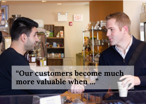
In the article, Schrage, a research fellow at MIT Sloan School’s Center for Digital Business, explains workshops he runs with companies where he asks them to answer the question “Our customers become much more valuable when …”

                                                                   photo courtesy: Didrik, Creative Commons, Flickr

Here’s what really stuck with me about the exercise: “It doesn’t take long before the answers start to incorporate an investment ethos that sees customers more as value-creating partners than as value-extraction targets,” Schrage said.

How do customers add value? Everything from providing feedback, to word-of-mouth marketing, to being early adopters for new products.

However, I would argue that customers must first be satisfied before they are willing to engage in any of these activities.

Read more…

Marketing 101: What is the happy path?

December 11th, 2017

The happy path is a quick, linear path to the purchase of a product or service where the customer doesn’t get sidetracked, either by their own distracted actions or by a company’s poorly designed process or because the customer has a more complex use case. Let’s take a closer look at why this is important and how it might look.

The Value Exchange Happy Path

Often, companies require users to fit within certain criteria to be eligible for the simplest outcome.

An example of a happy path that MECLABS optimized with one of our Fortune 20 Research Partners would be the “Happy Path Upgrade Funnel.” The happy path would be what is experienced by a customer who chose to start the upgrade process with the following conditions:

  • Fully paid off their old device
  • Was upgrade eligible based on the rules of their phone plan
  • Had no account problems they had to resolve in order to upgrade today

This would allow them to complete the upgrade funnel in the shortest, simplest number of steps possible and with the least amount of cost experienced as part of the value exchange.

Read more…

Real-Time Marketing: How Publishers Clearing House increased engagement through testing

May 8th, 2015

Publishers Clearing House is winning the real-time marketing game. Their online brand, PCH.com, currently gets 16 million unique visits per month, and those visitors spend an average of 17 minutes on the site. The marketing team achieved this by delivering a personalized message to every visitor  on the site — messages that were designed to be relevant to what visitors were doing on the site.

At MarketingSherpa MarketingExperiments Web Optimization Summit 2014, Michael Zane, Senior Director of Online Marketing, Publishers Clearing House, revealed how, in just under a year, the marketing team has increased:

  • Time spent on their site by 43%
  • Overall engagement by 46%
  • Revenues per 1,000 visitors by 12%


They achieved this by:

1. Identifying two personas with very simple audience segmentation:

  • Engaged visitors — customers who had played one or more instant-win or sweepstakes games
  • Unengaged visitor — customers who had visited at least twice but had not yet played a game or entered a sweepstakes

2. Determining what they wanted visitors to do as a result of real-time marketing. This involved:

  • Engaging the unengaged
  • Driving the somewhat-engaged visitors to go deeper into the site

3. Testing to learn what will drive engagement. The team set a testing baseline by gathering data for six weeks

  • They conducted A/B tests targeting their unengaged visitors. The control was the site without special messaging, and the treatment featured a very simple one-line header. The result achieved a 36% lift in engaged users.
  • The team tested again. They suspected that they were on the right track and were eager to try a pop up designed by their graphic artists. After all, Zane was certain a designed pop-up would get results. He was right, but not in the way he expected. However, what they learned was still very valuable and influenced future tests. Find out more in this below clip:

Read more…